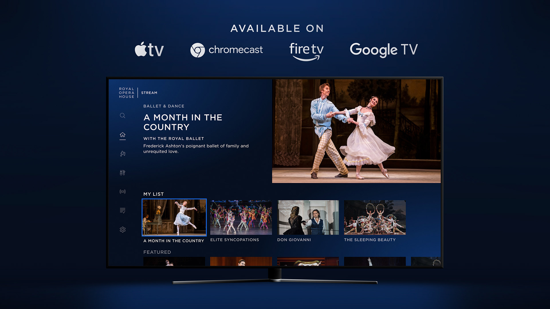
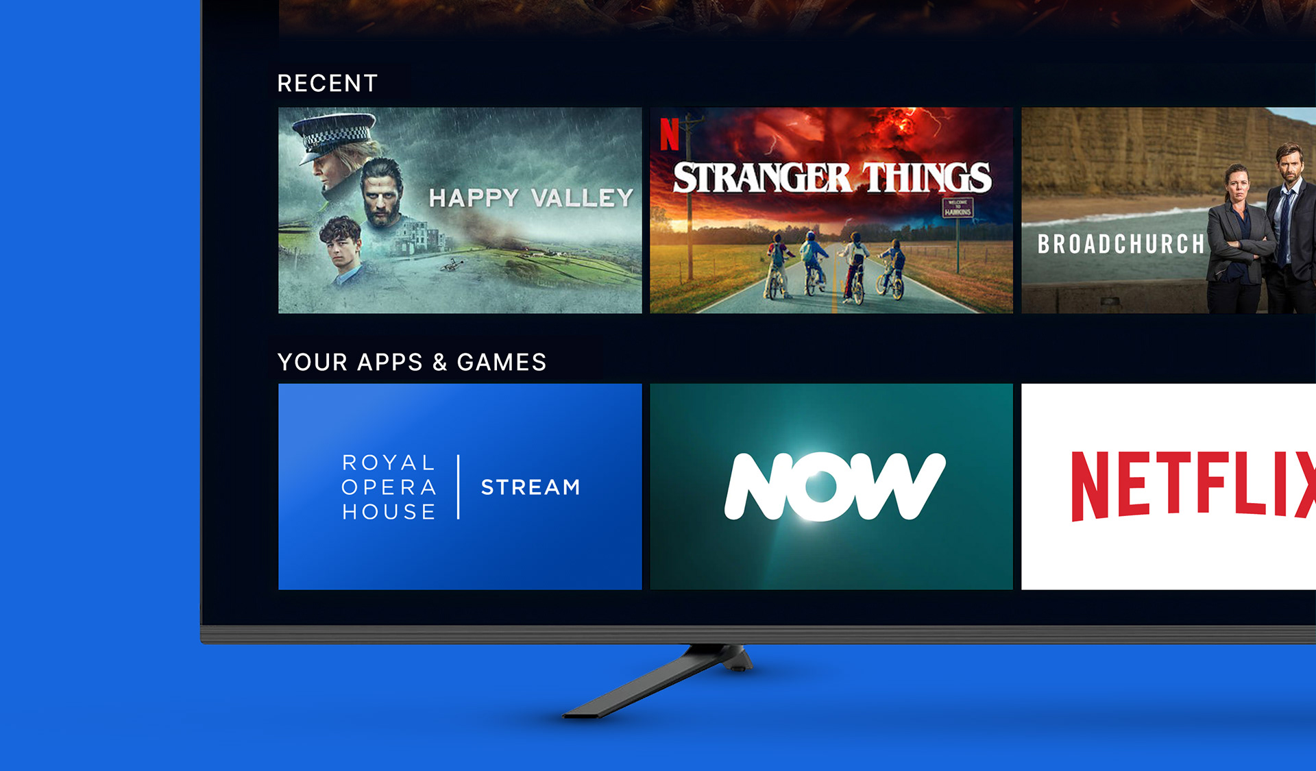
With the launch of the Royal Opera House’s streaming platform, they wanted to build a TV App to give a better and more rounded offering to users. With the decision to build it bespoke, it meant the experience could be completely tailored to the content and how users consume it. The App was devised to be purely their streaming content so it could appeal to users who are not familiar with the ROH site and brand in general, but still had a big interest in Opera and Ballet. With a hard deadline to meet, there was only a few months between conception and launch, meaning the design and testing process was fast-tracked. This was all done in line with the new Chord design system.
The Royal Opera House wanted a TV App which was in line with the best TV experiences, which also displayed their range of content in the most engaging way.
Initial Concepts
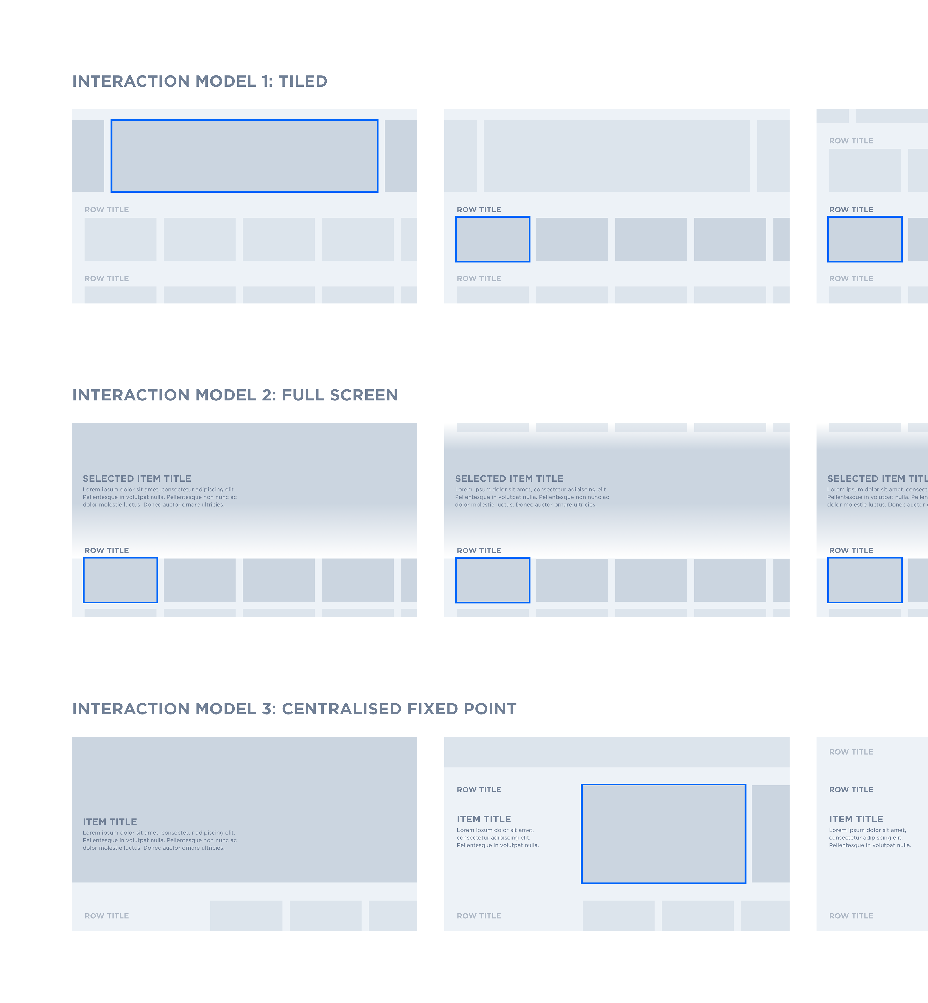
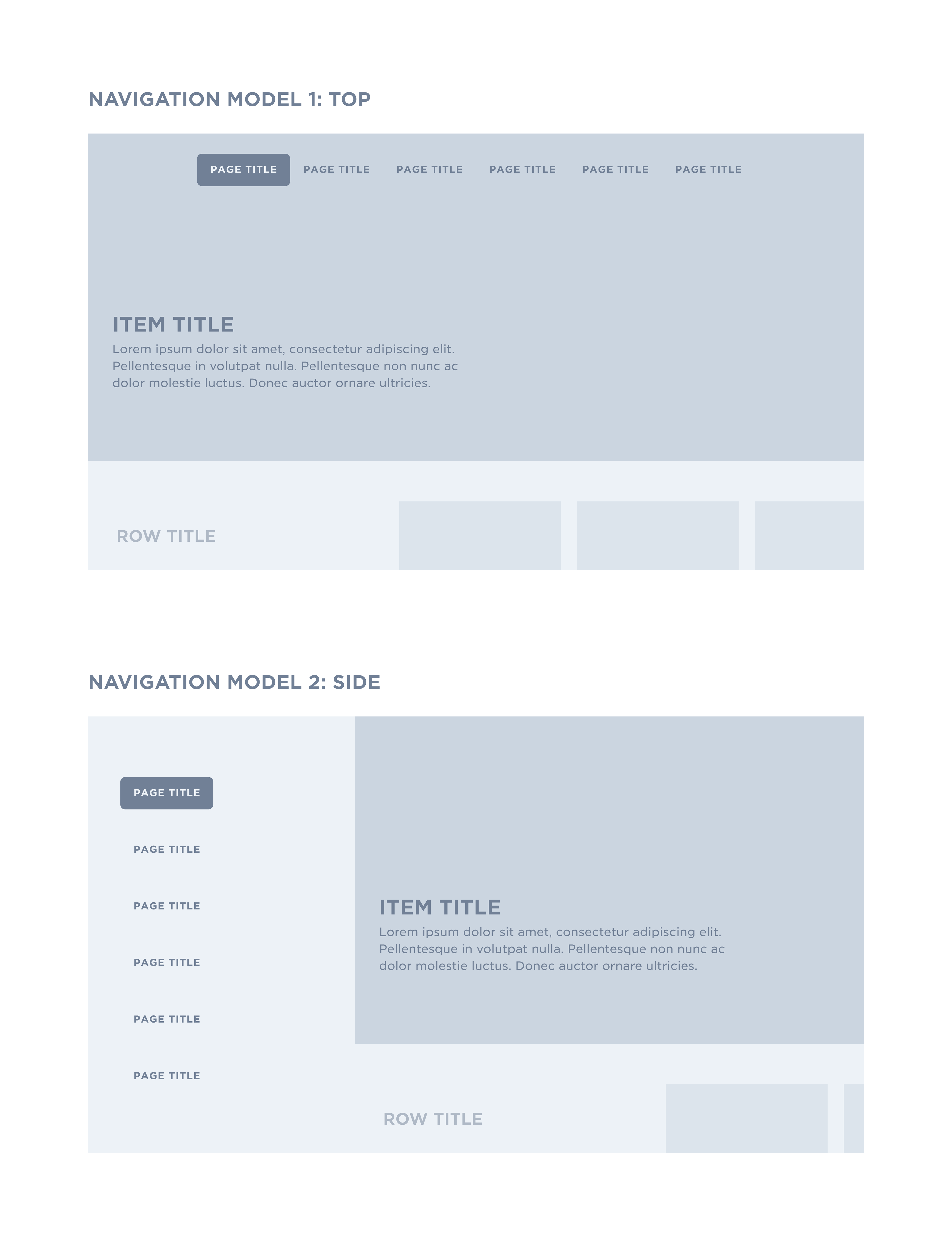
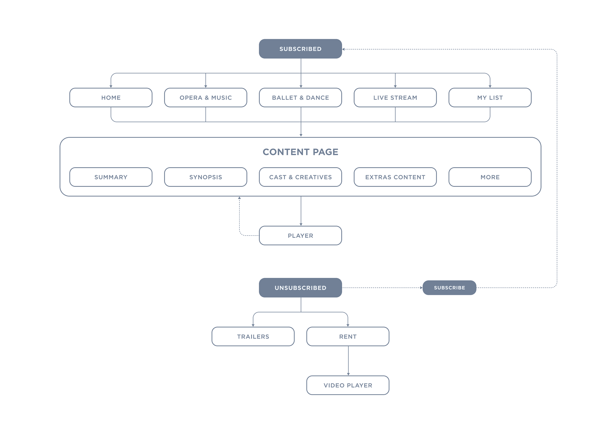
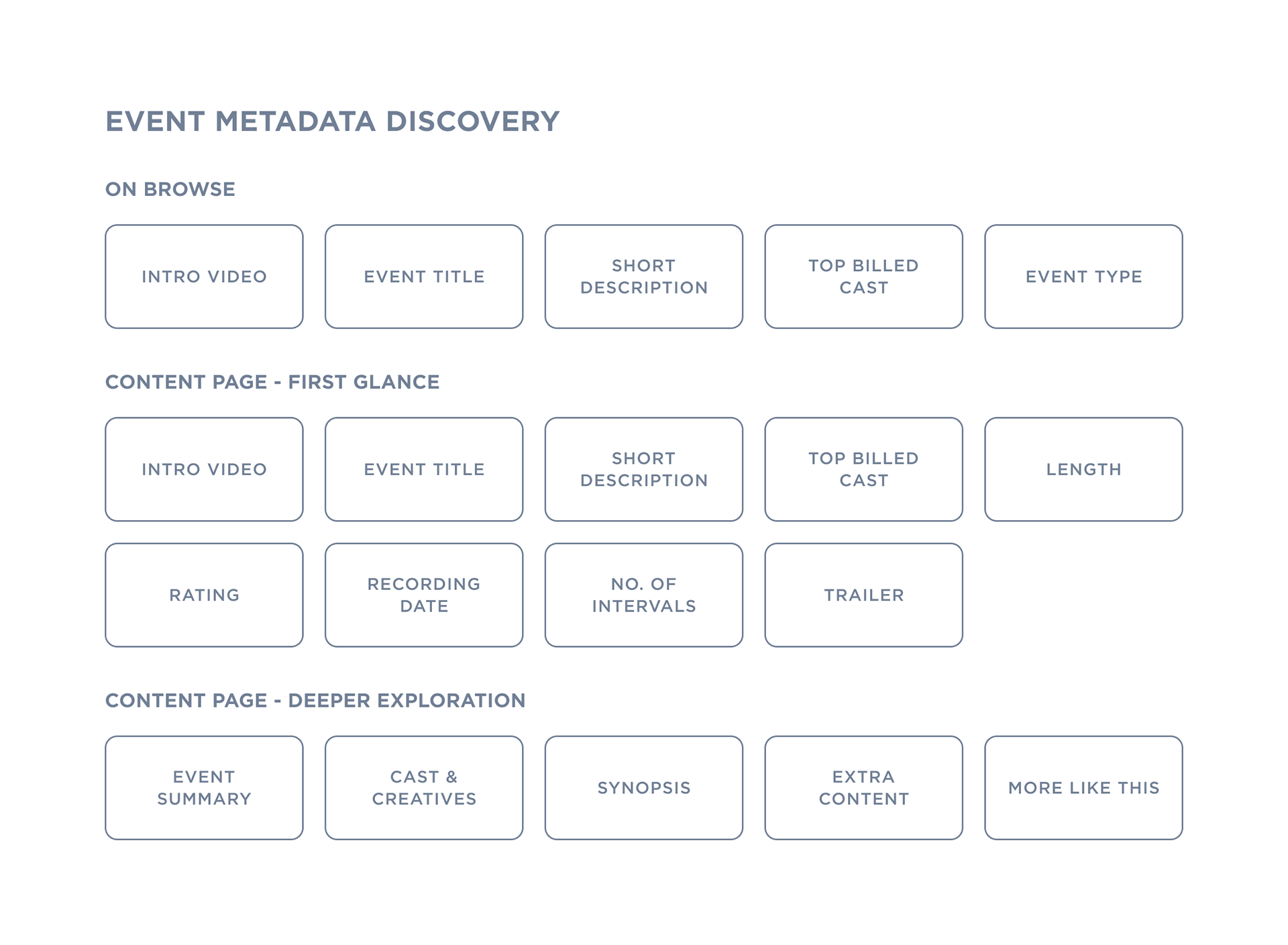
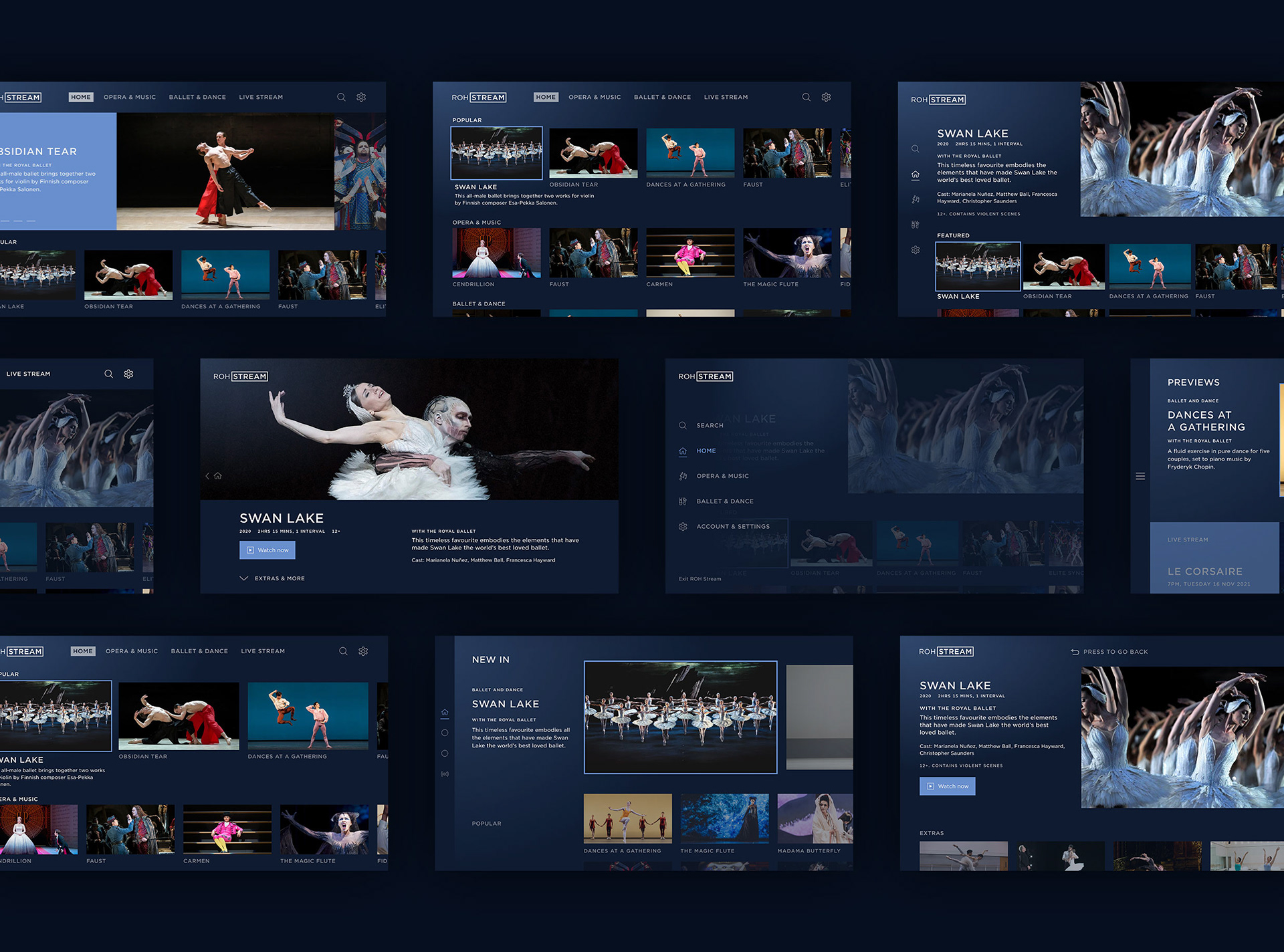
As the App was going to be built bespoke, and from scratch, it meant there was a number of possible routes for the overall look and interaction model. Research was done into the leading entertainment Apps to see what they did well and where learnings could be taken. This led to three possible interaction models and two navigation models which suited the ROH's initial release of limited content. These were turned into low-fidelity prototypes to test what felt the most natural. Following this all of the different user flows were mapped out so it was clear what pages would be required to make the experience feel simple, but also cater to more avid fans who would want contextual information around content.
Proposition and User Testing
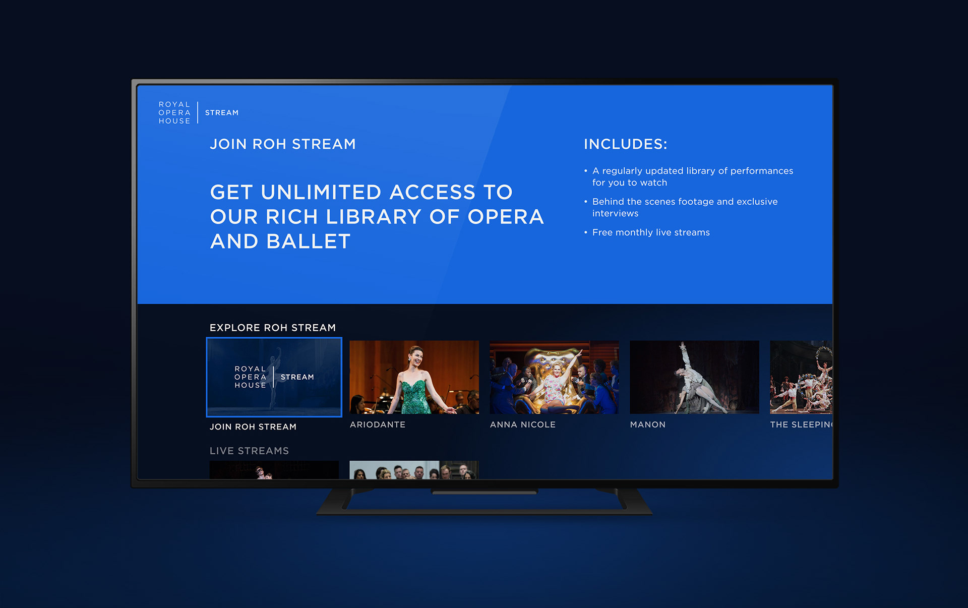
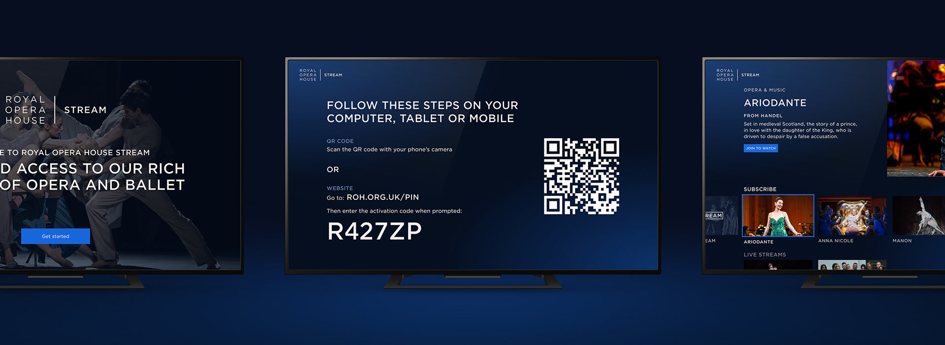
A big consideration of the experience was how the unsubscribed area would function. With the decision to keep subscriptions and payments through the website only, it meant it was key to create an experience which made them want to subscribe, and clearly understand how to do so. Following exploration, two rounds of user testing was done to assess the overall usability and comprehension of the App, taking a user through the entire process, from browsing the unsubscribed area to creating an account on the website and then exploring the App once subscribed. As the final ROH Stream brand was not yet confirmed, the design followed the new brand guidelines but used a pseudo logo and colour.
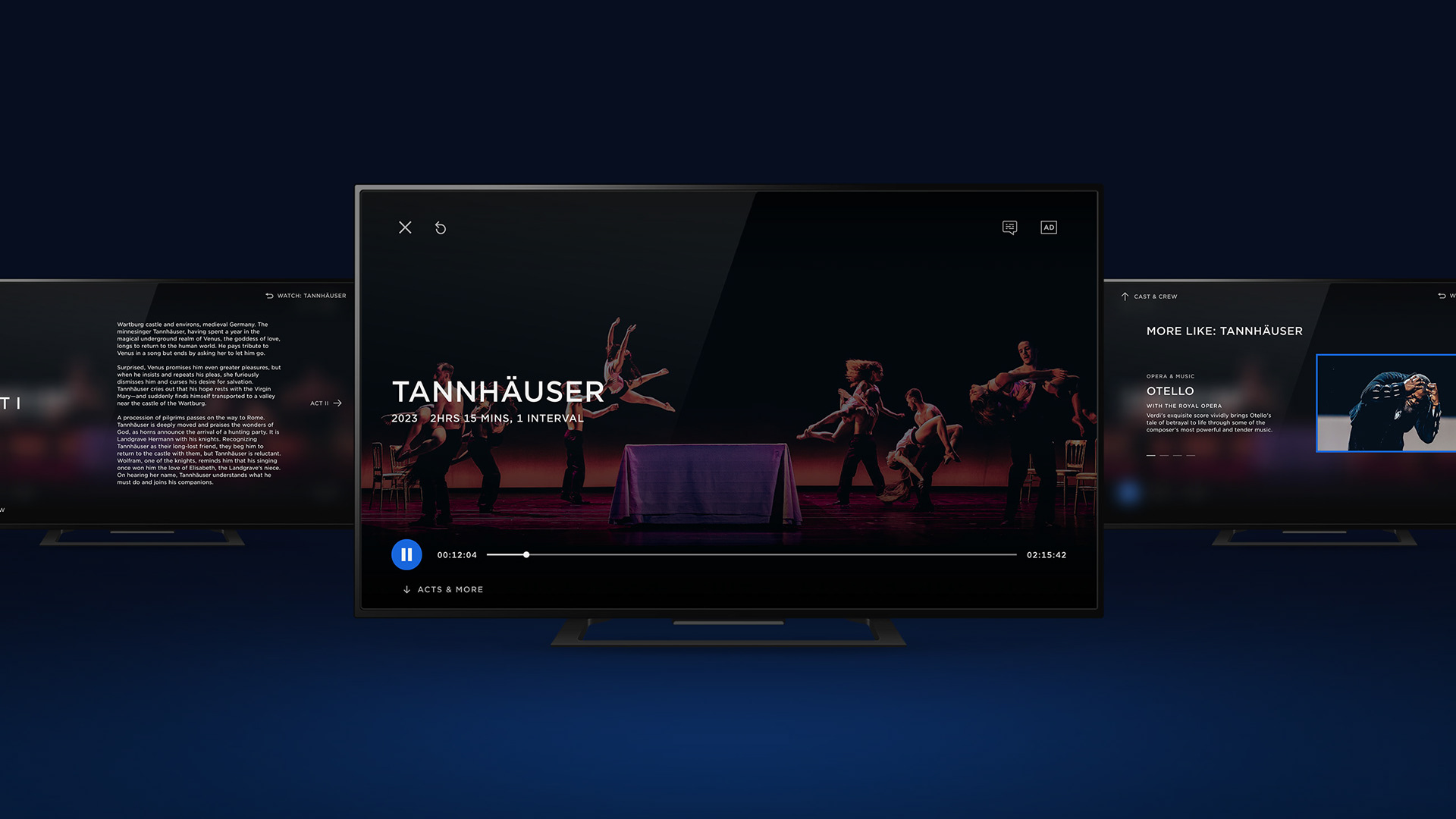
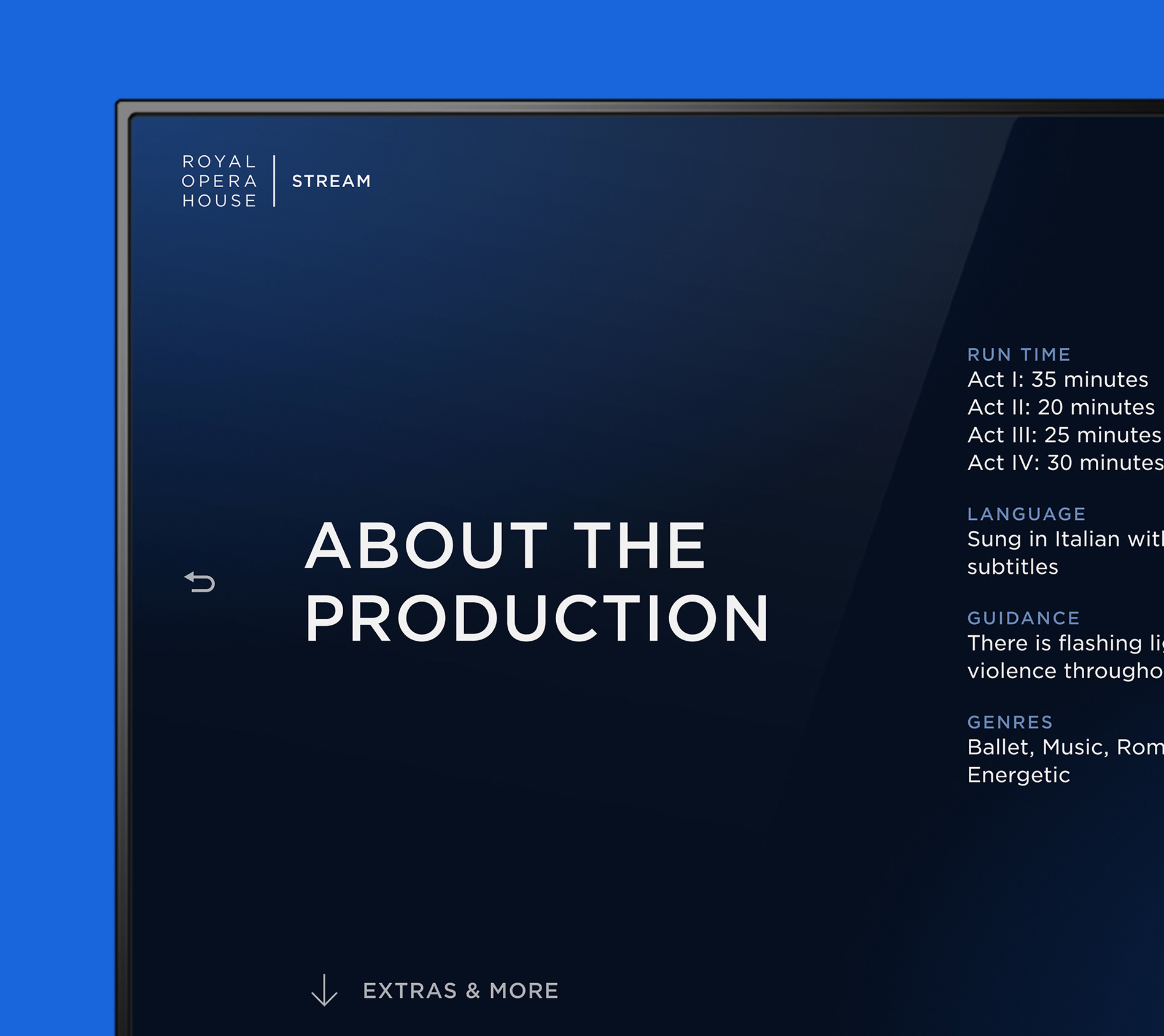
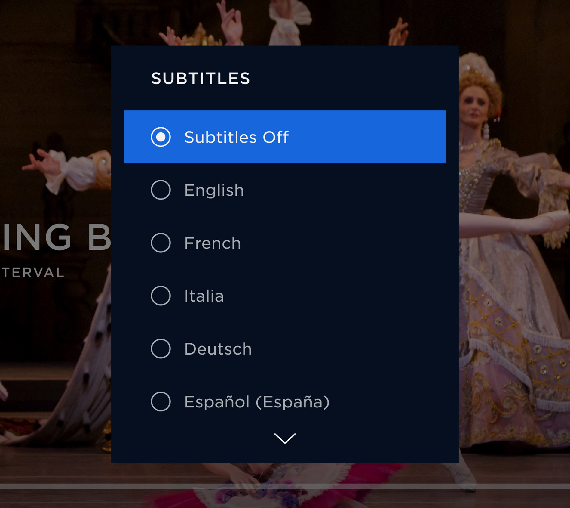
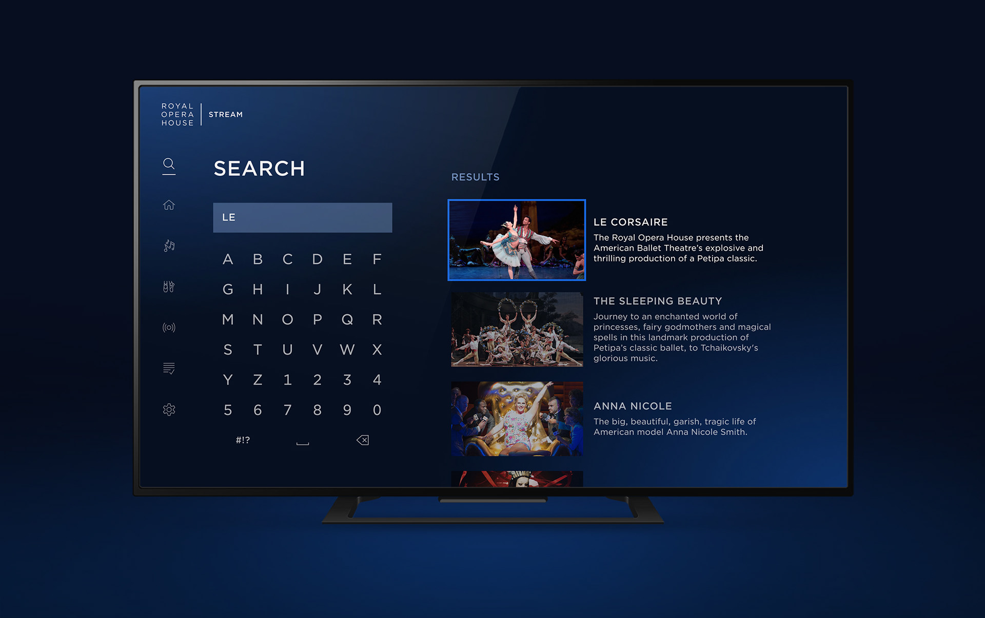
Refining the App
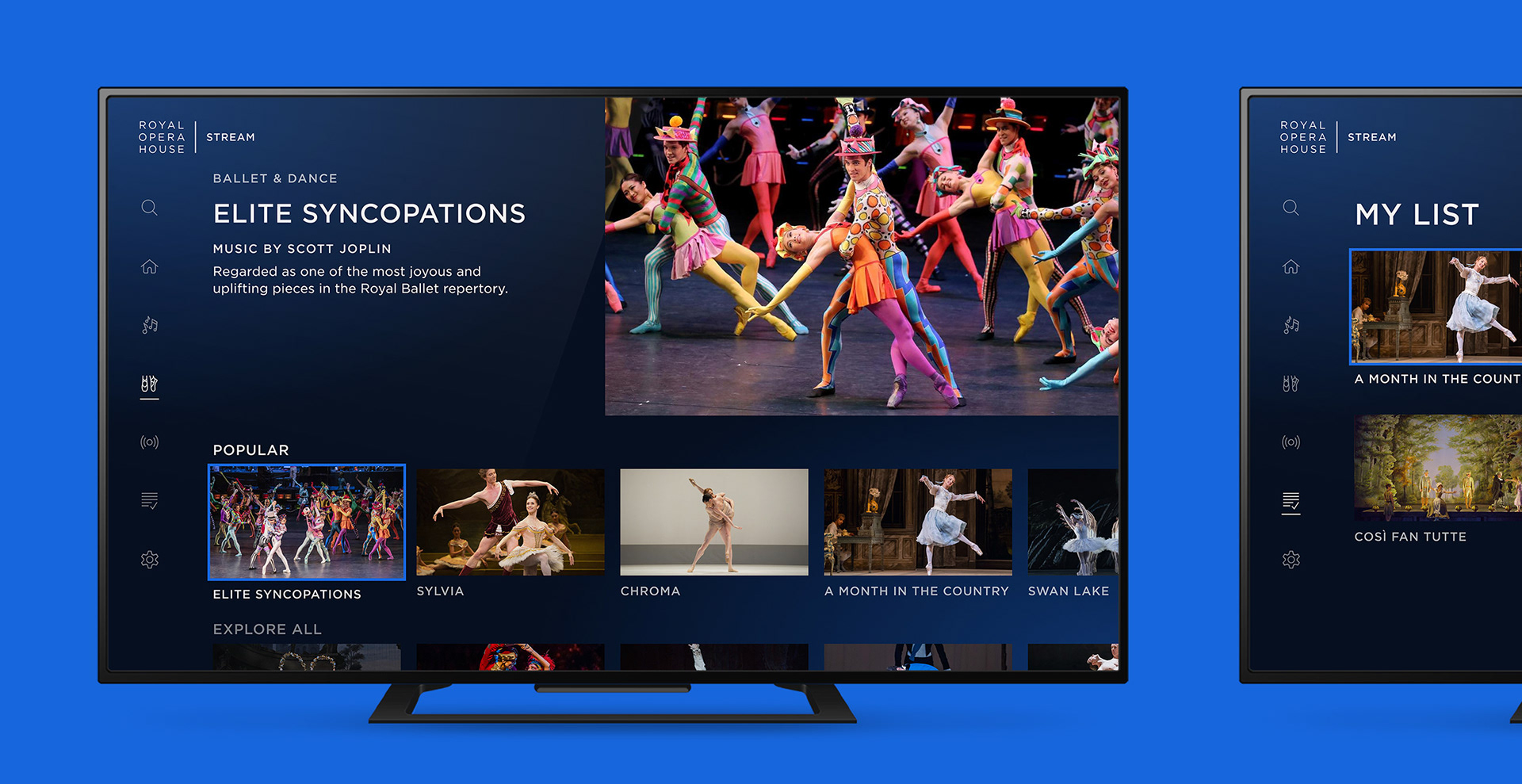
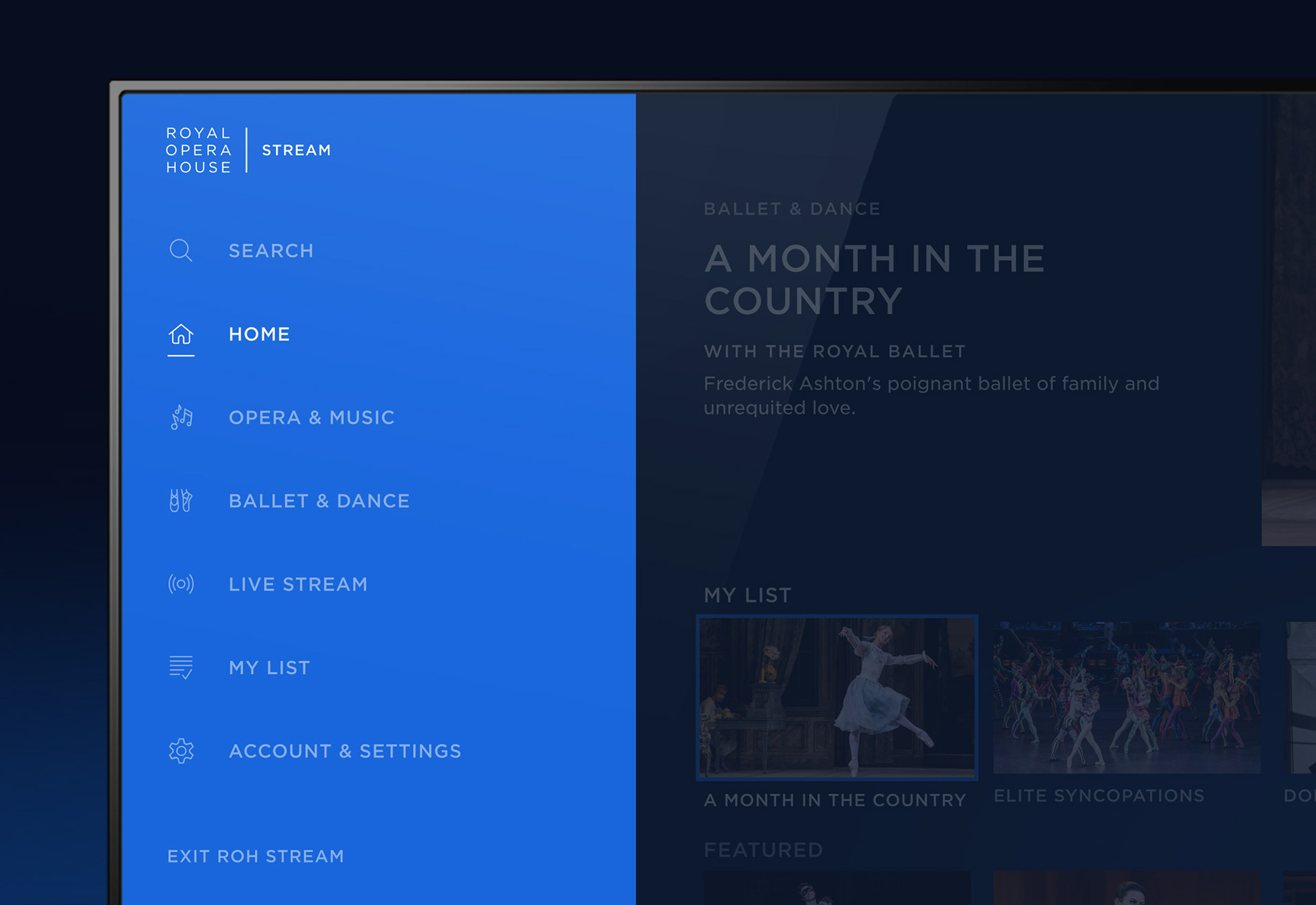
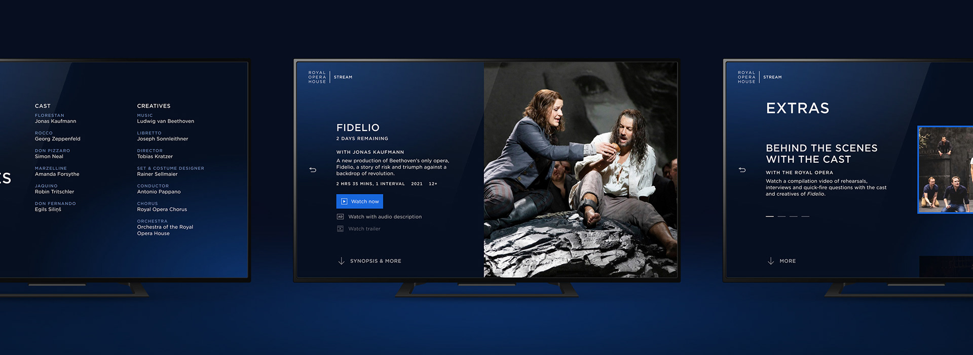
Following the user testing, the findings were consolidated down into key improvements that needed to be made. This led to a final execution which also included features which helped flesh out the experience, including Search, Favouriting and Settings. The App's UX was mapped out to ensure all user journeys and scenarios were covered. At this point the final 'ROH Stream' branding was also completed so the overall look of the App was refined to have this integrated in and overall visual improvements were made across every part of the App.
Completed at Ostmodern.