Barkers, established in 1882, is a well-known retailer located in Northallerton, North Yorkshire. With two successful stores in the centre of the town, an identity update and complete digital restructure and redesign was required to bring the brand up to date, while celebrating the heritage and rich history.
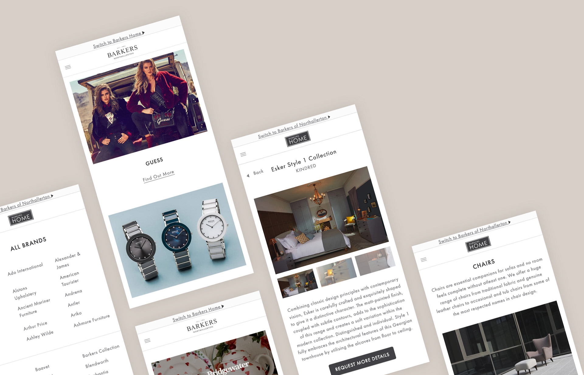
The main aim was to create new websites for both stores, tailored for their individual customer bases, but create brand harmony with a consistent experience & design.
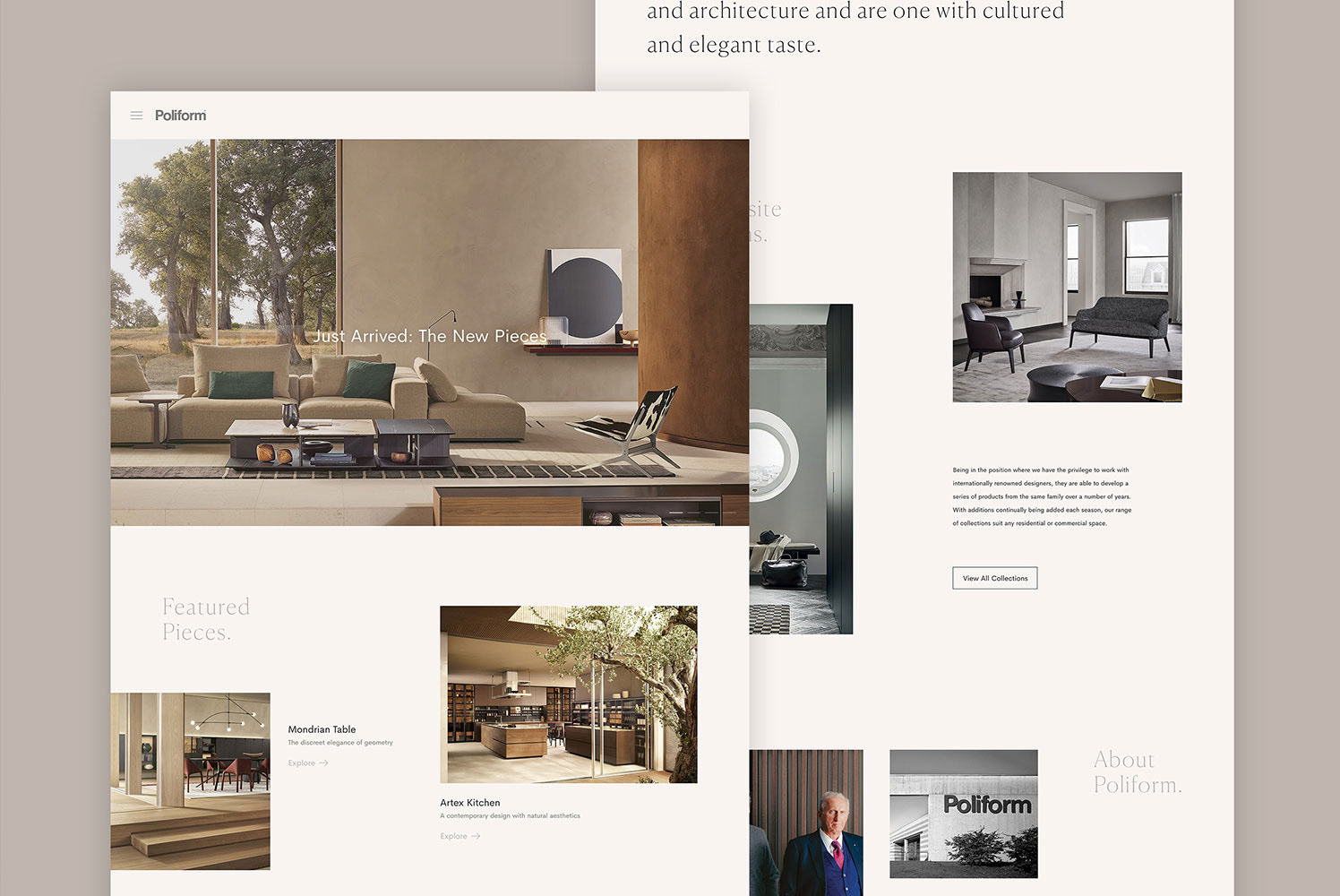
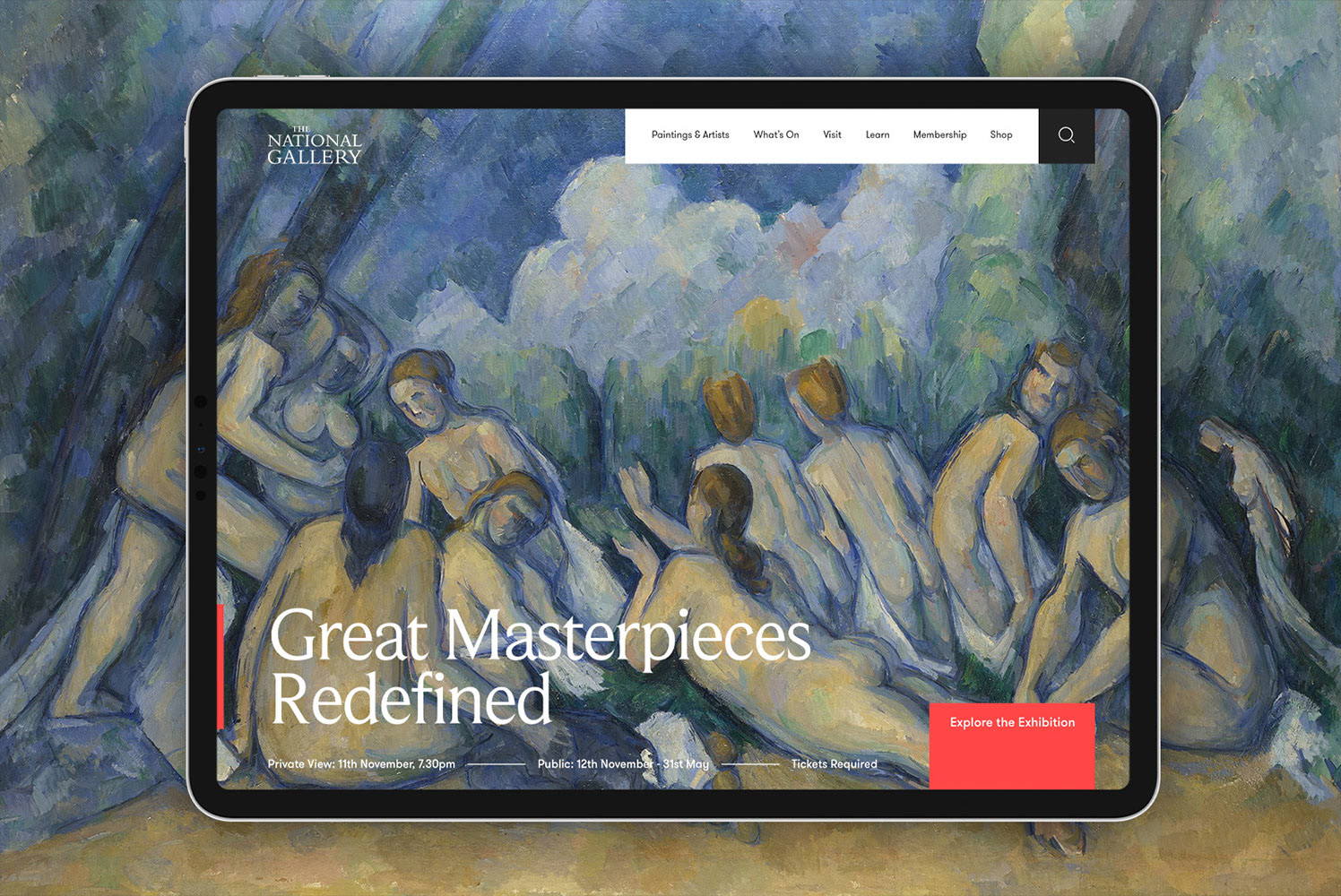
Redesigning the User Experience
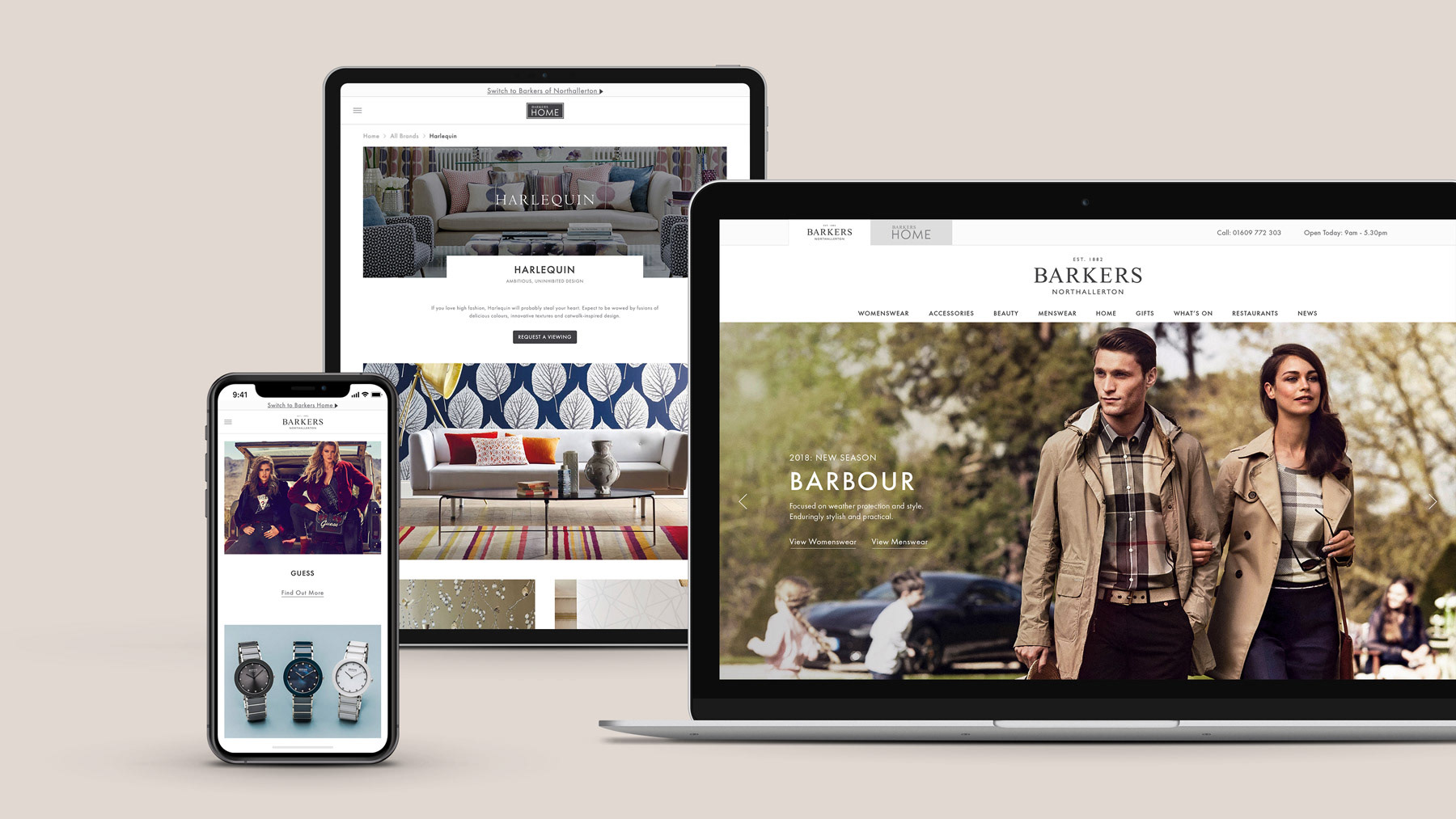
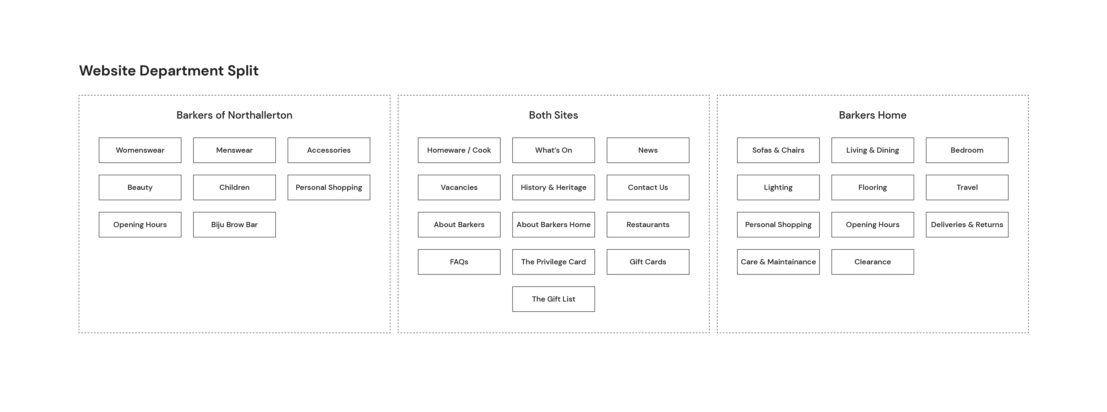
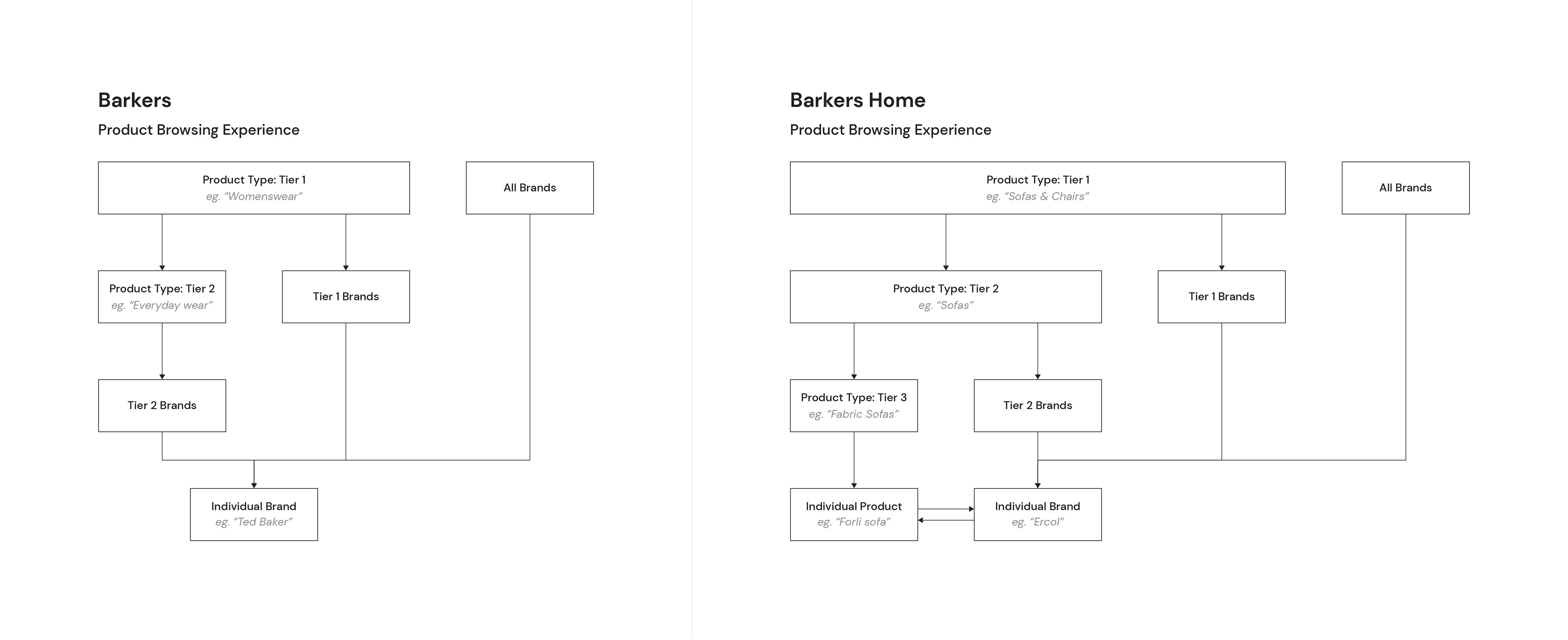
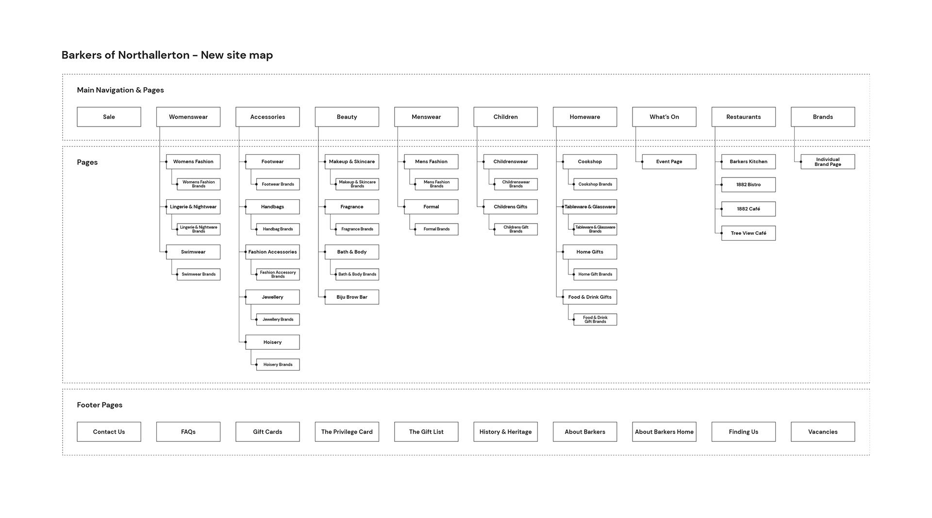
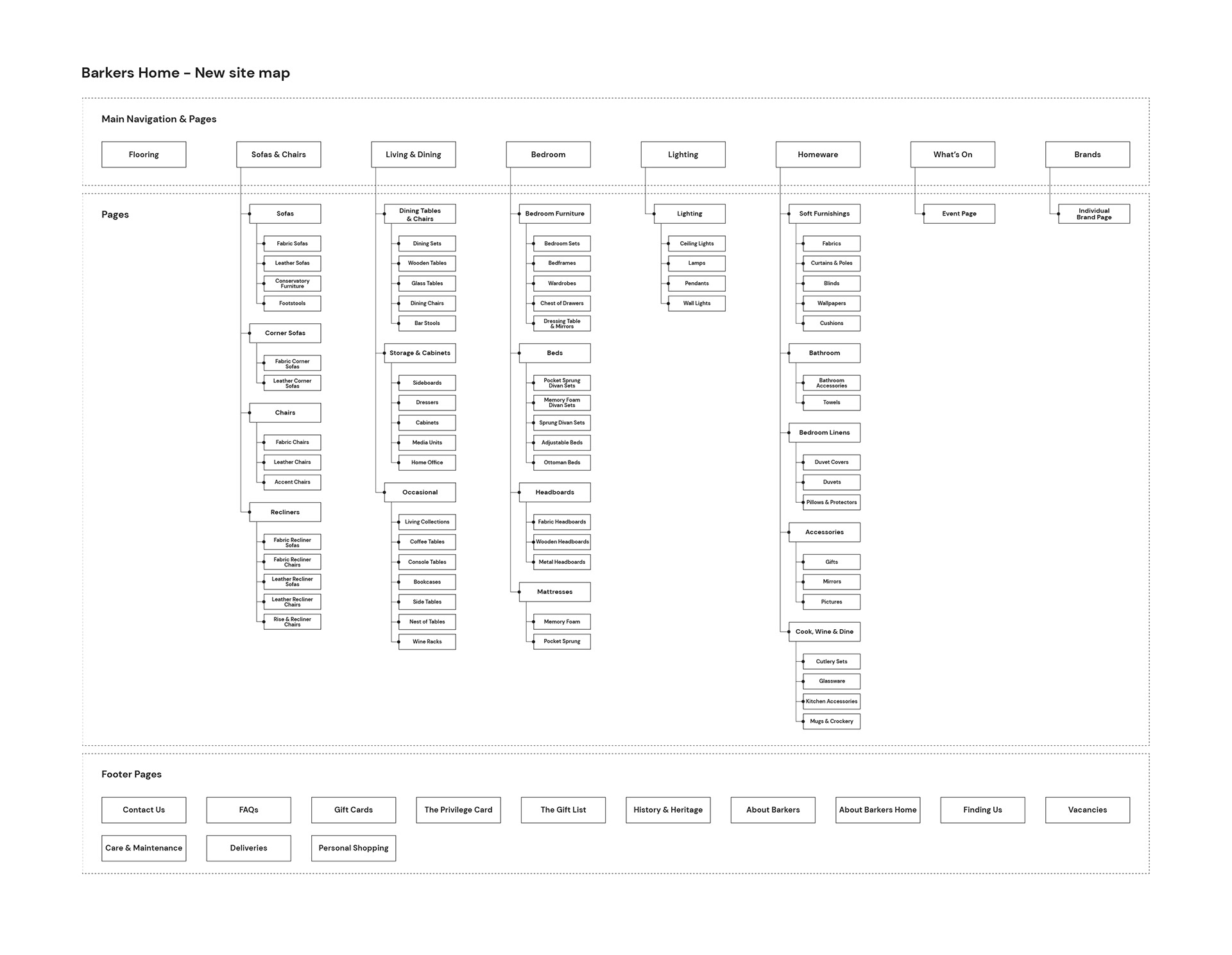
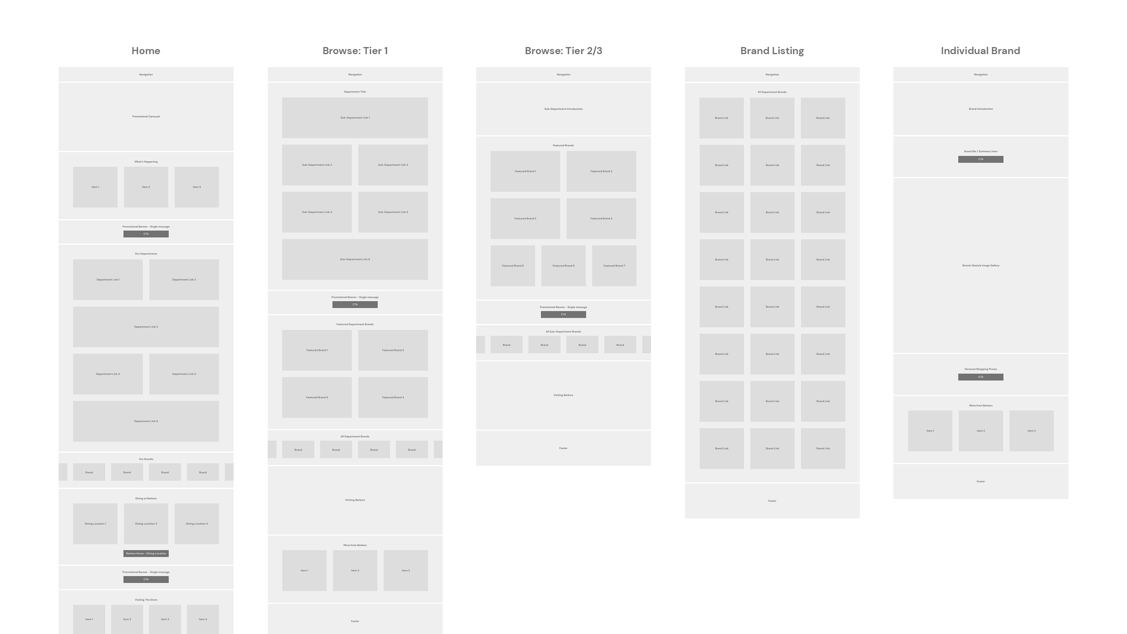
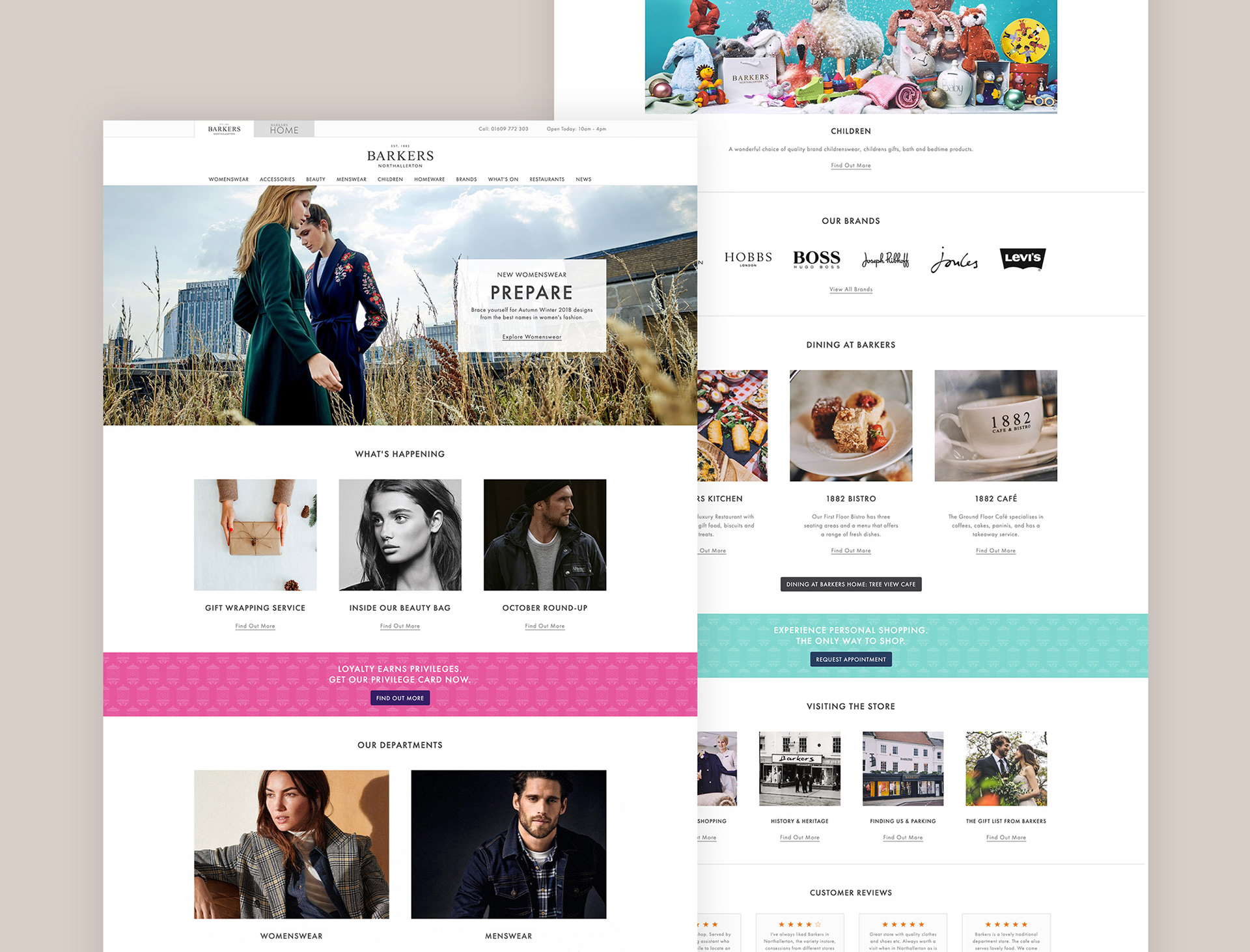
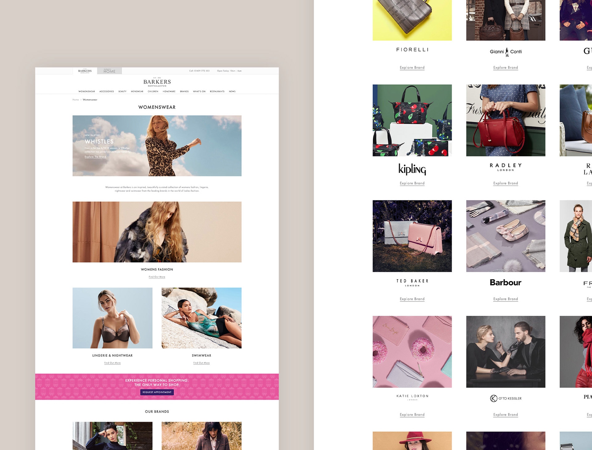
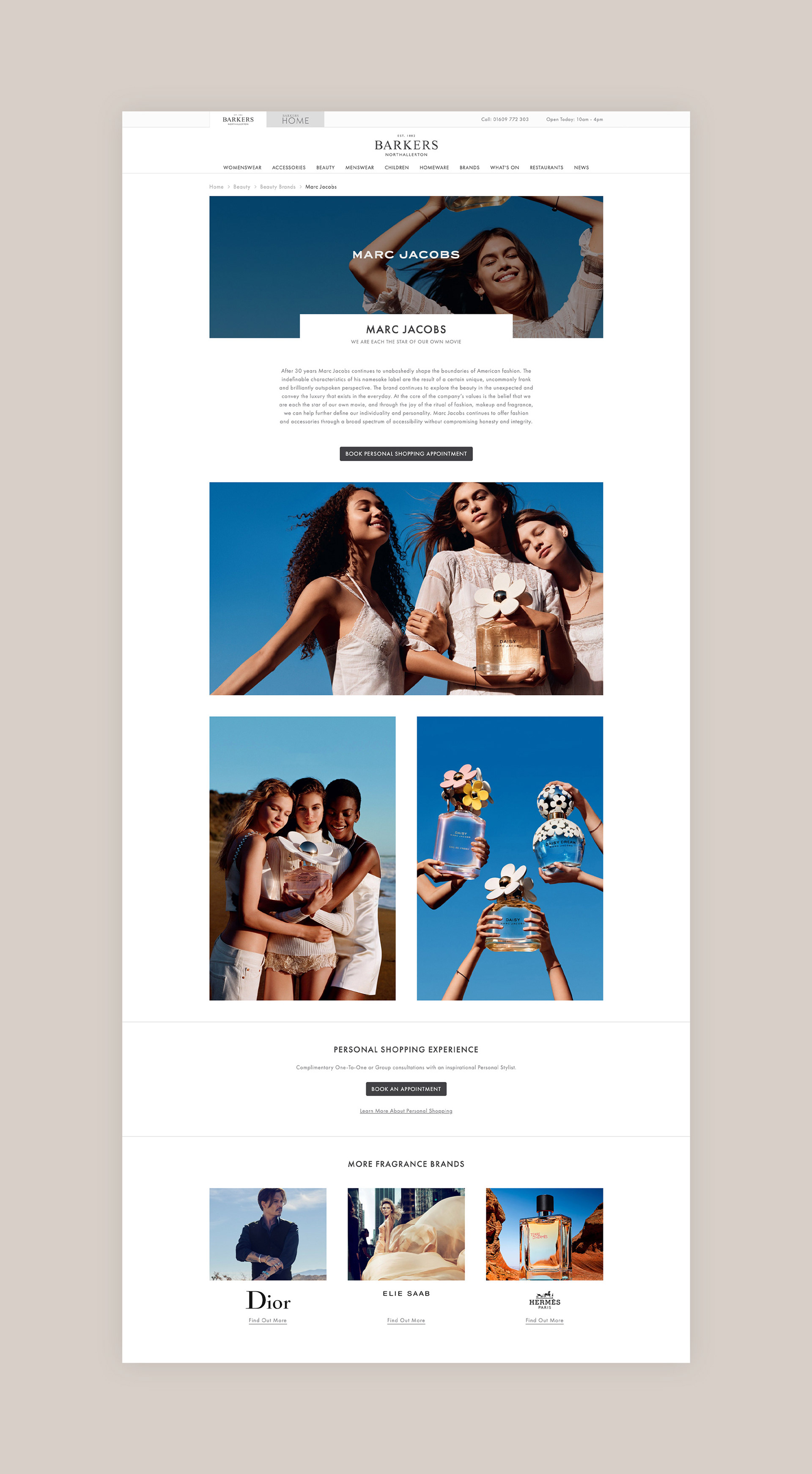
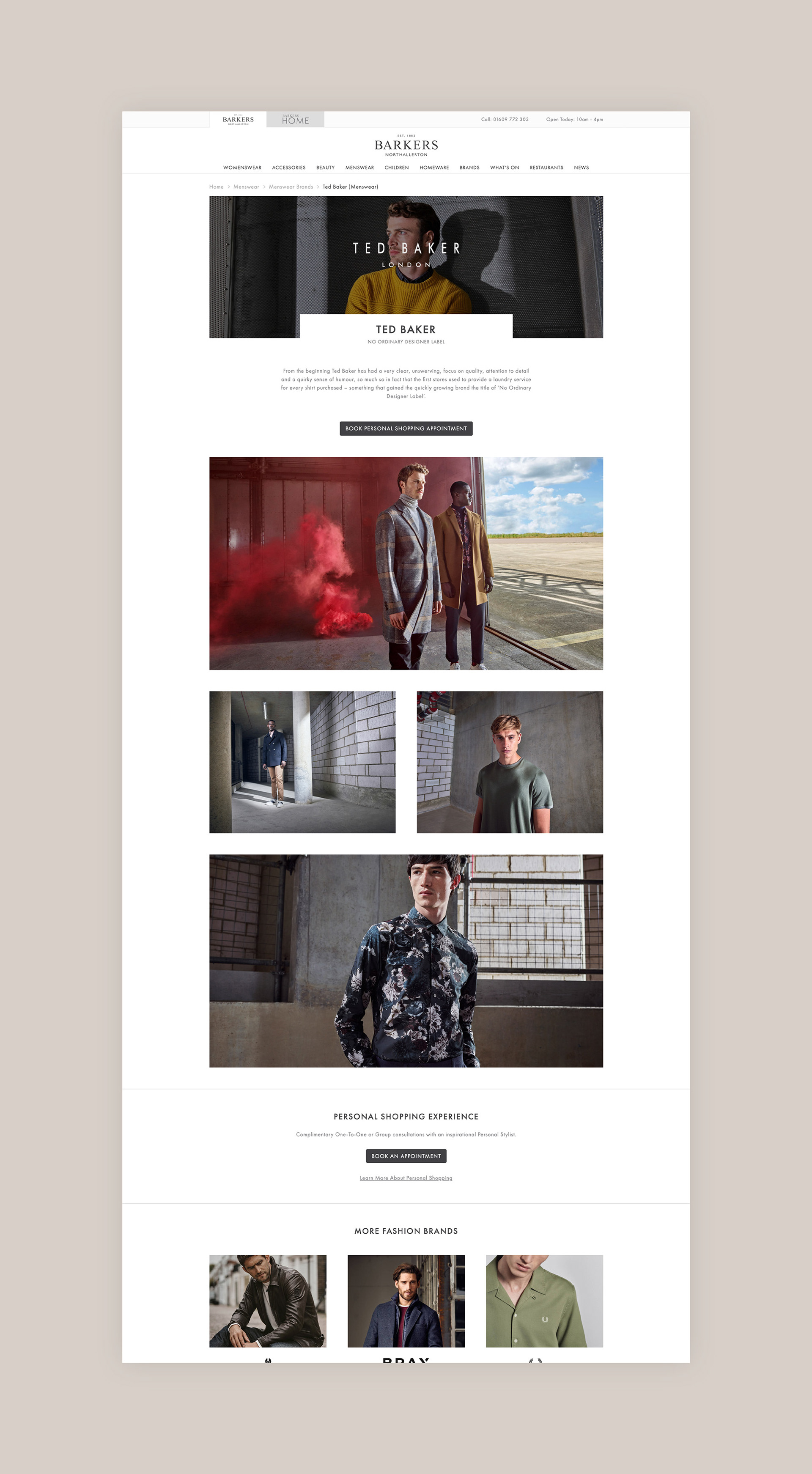
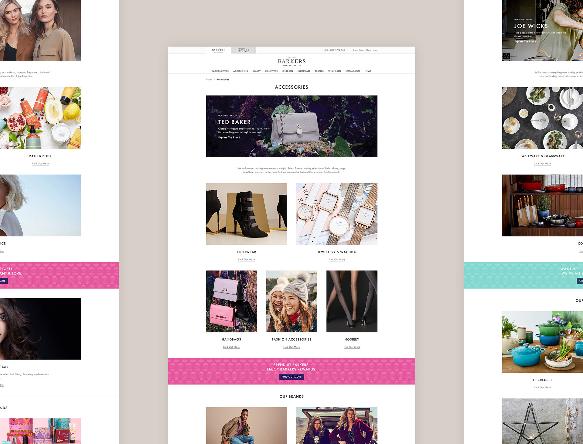
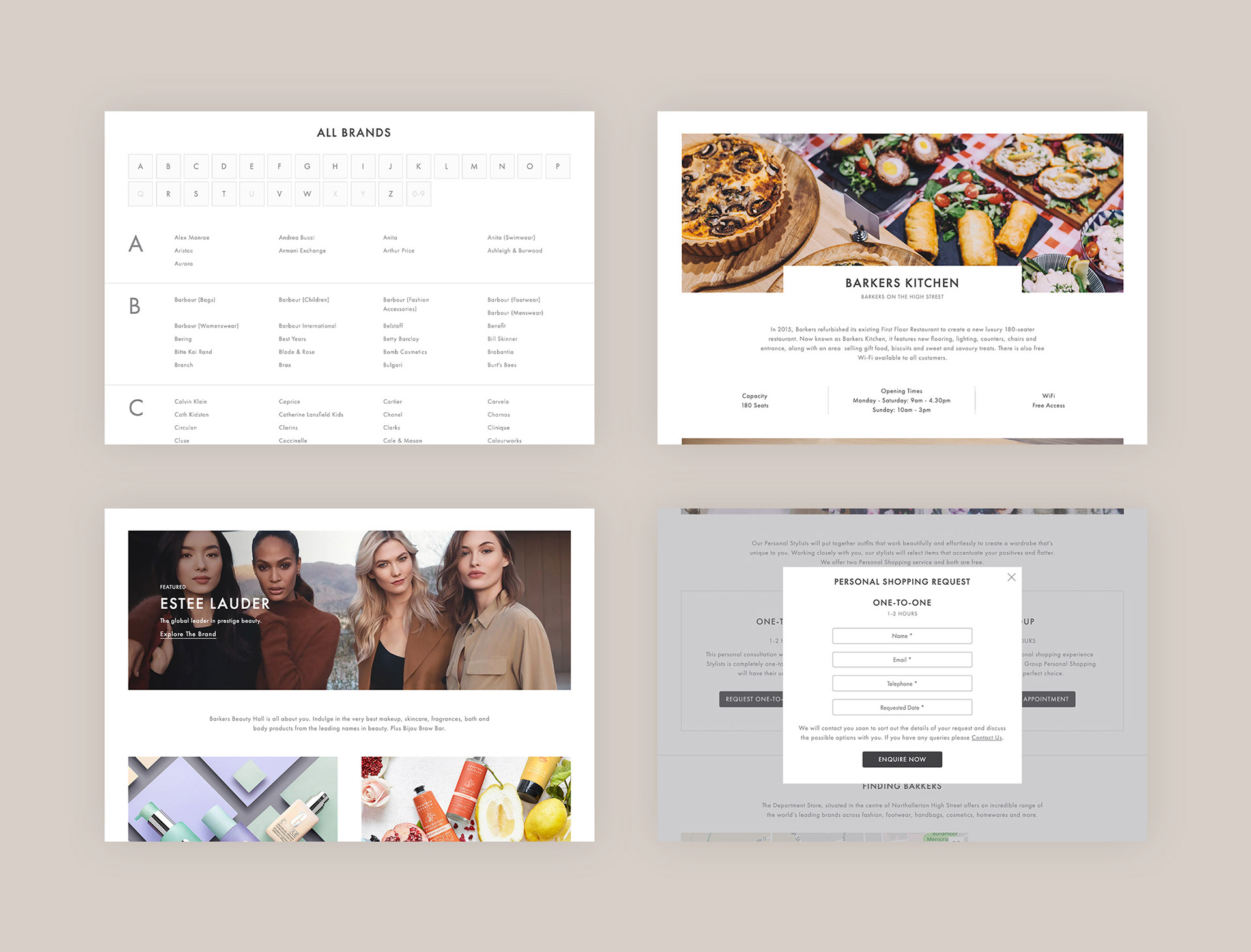
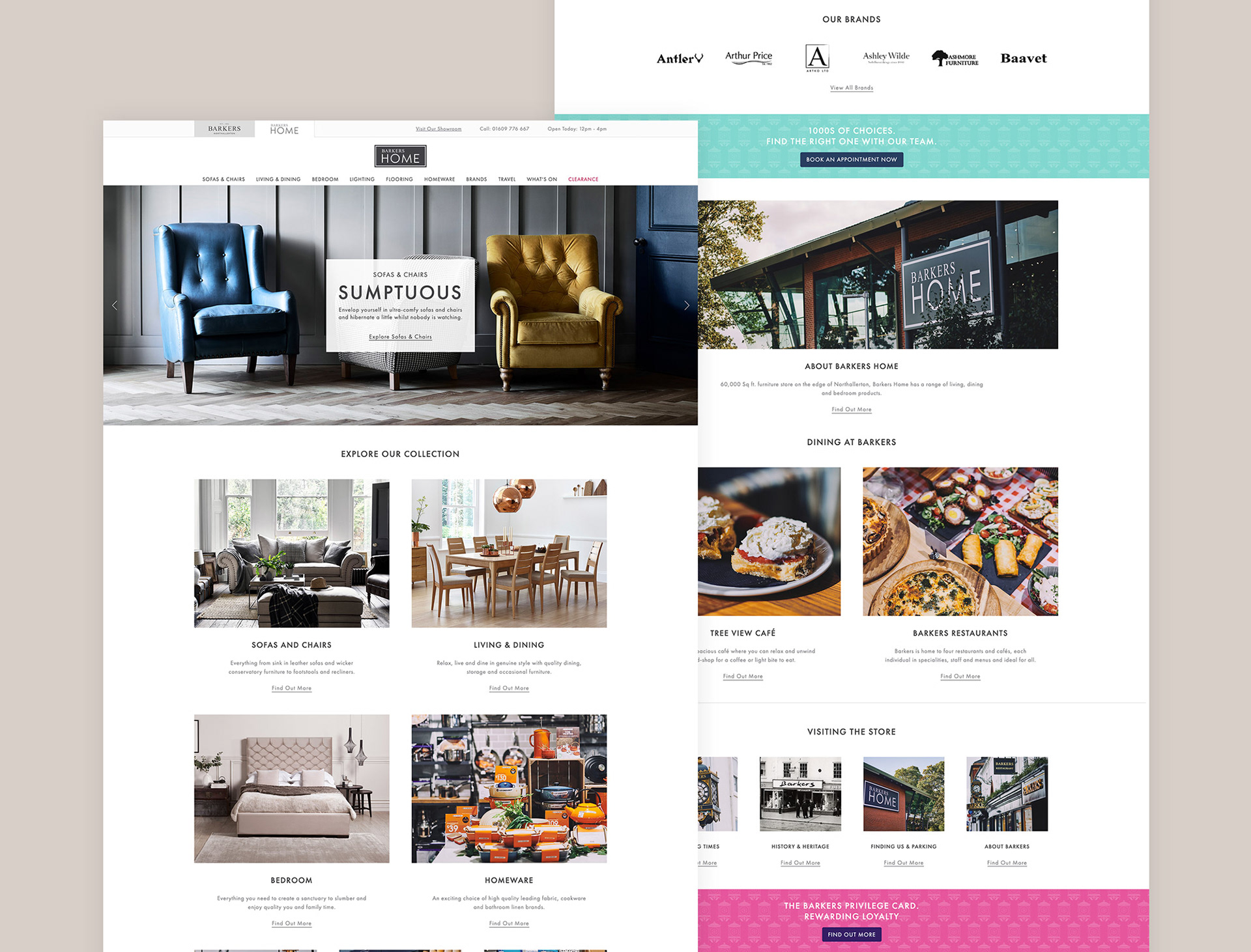
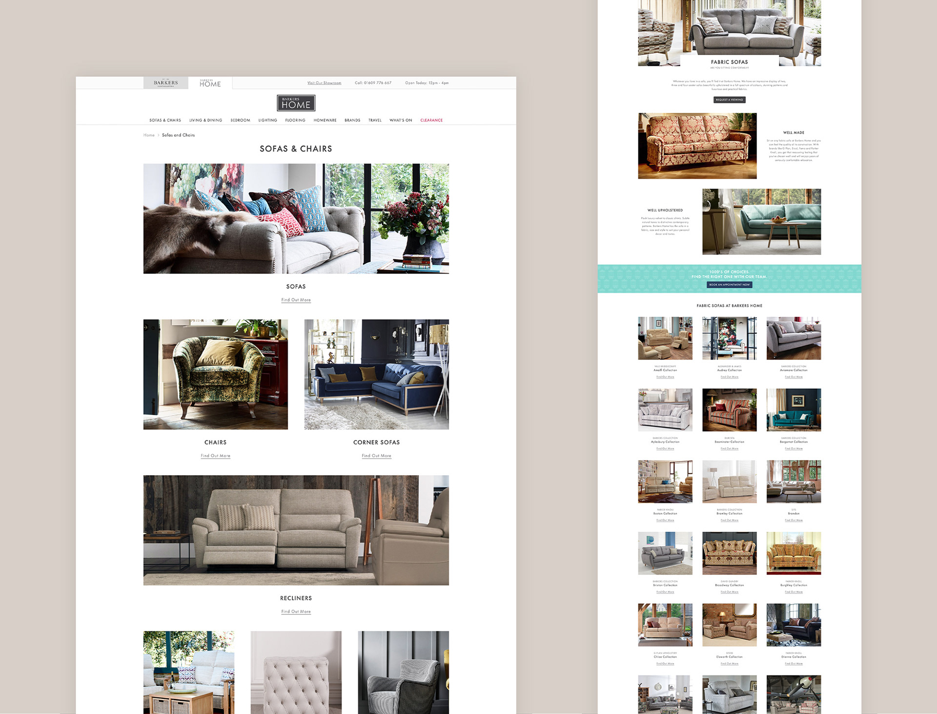
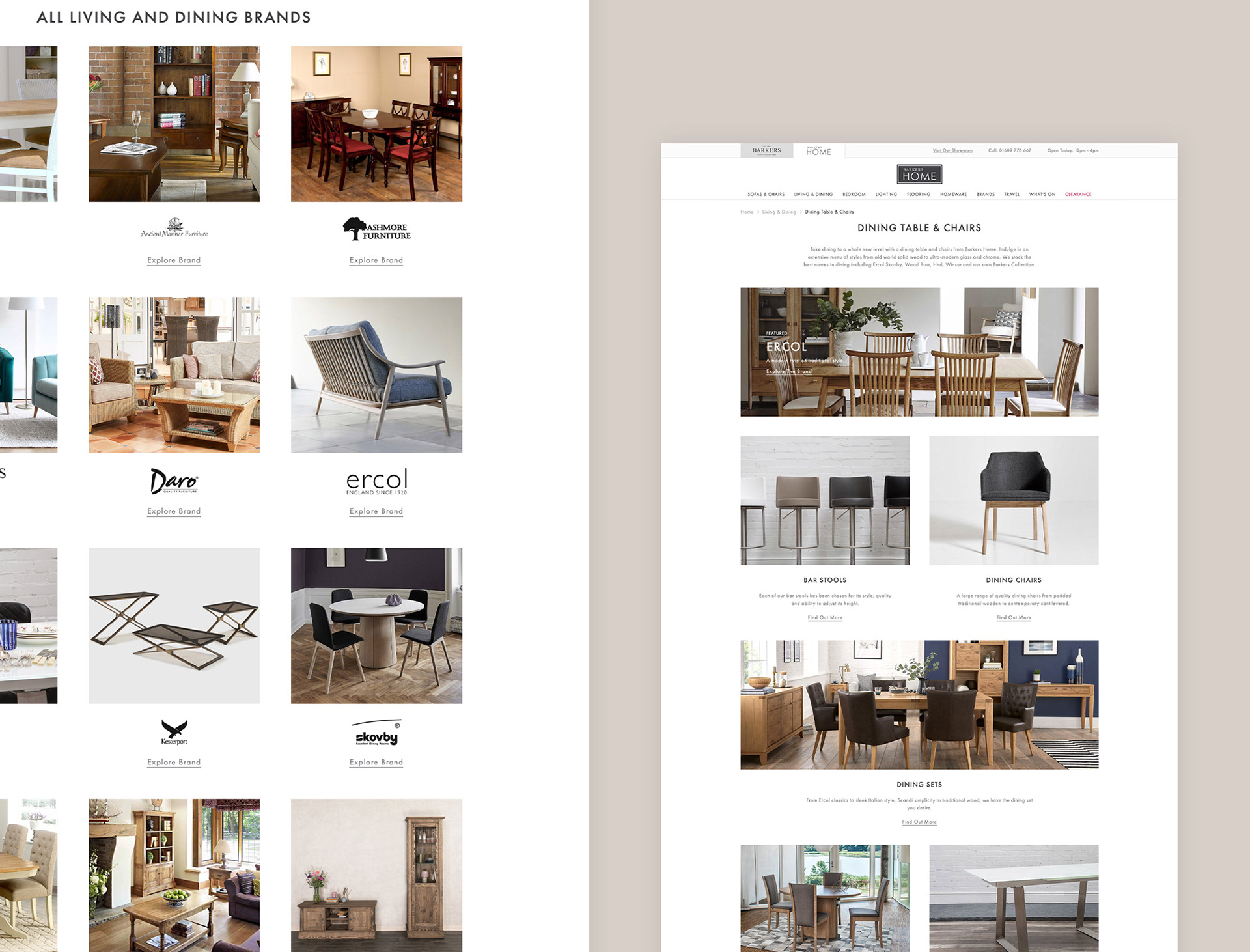
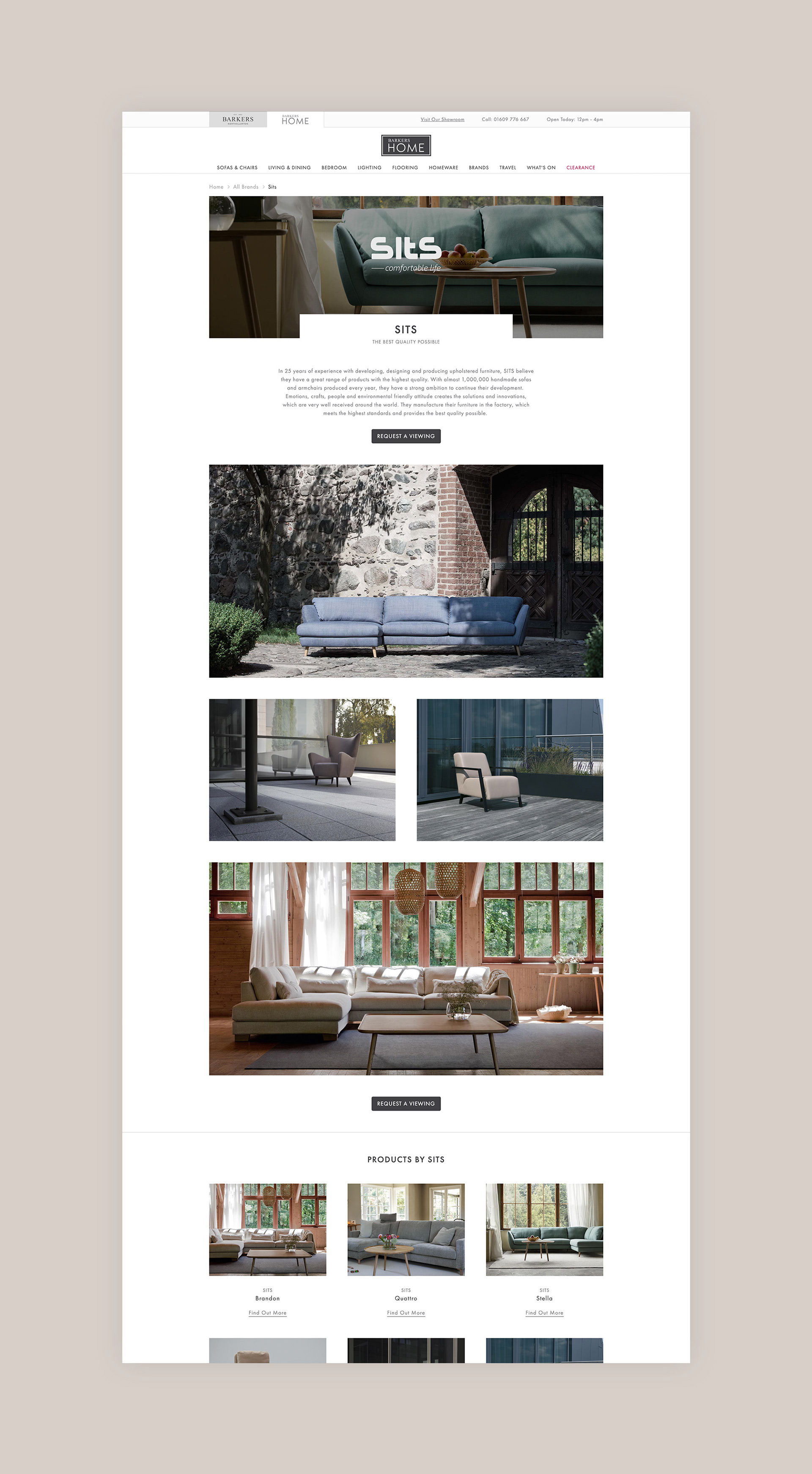
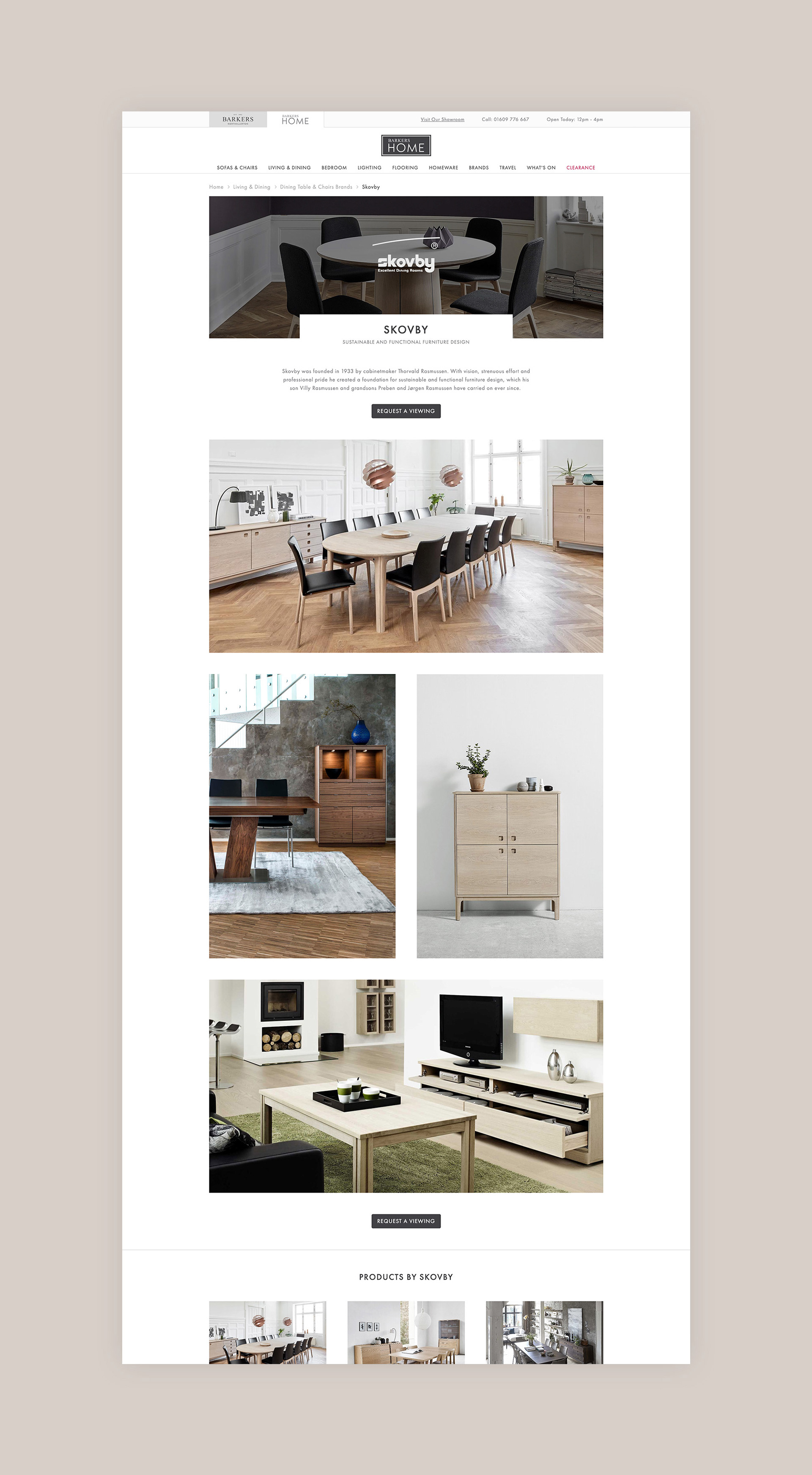
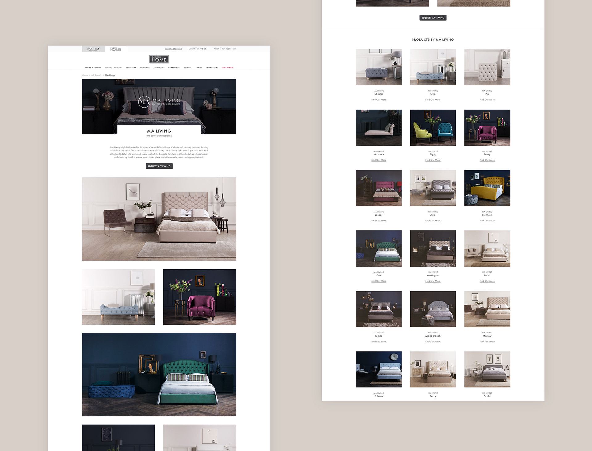
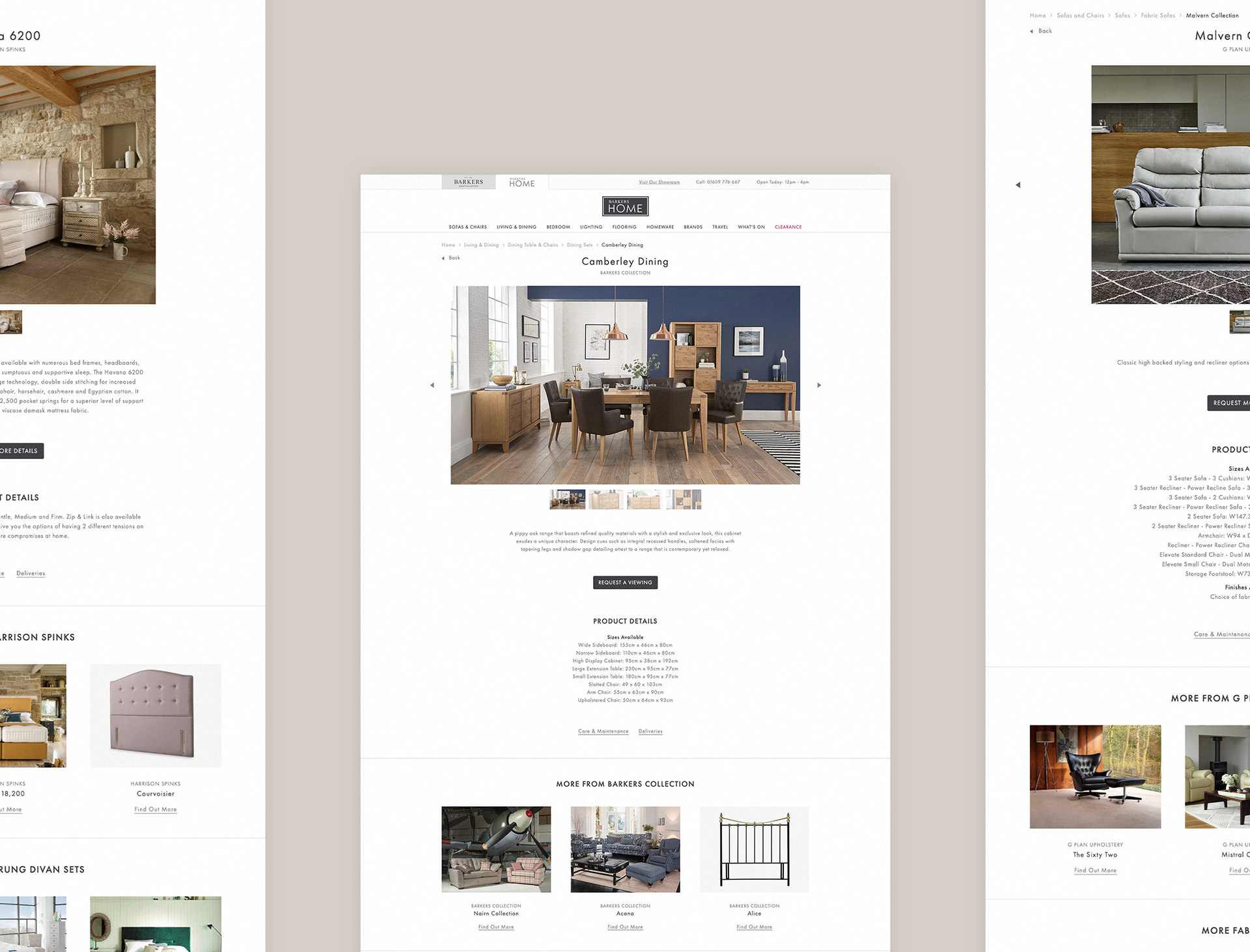
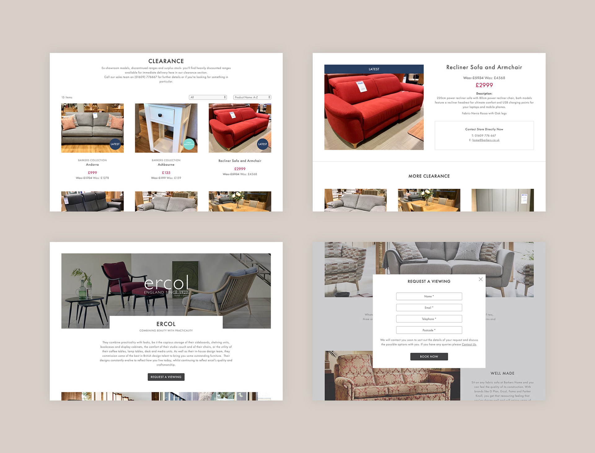
Barkers is split into two websites - one for the department store and one for the home store. Originally these were vastly different, from a completely different navigation and experience through to overall visual look. The entire site structure and hierarchy was redesigned, ensuring users could explore the vast content while being able to get to where they needed to within a few clicks. Pages for sections, sub-sections, brands and services were designed with consistent content display and order, creating an easily understandable flow.
Brand Refresh
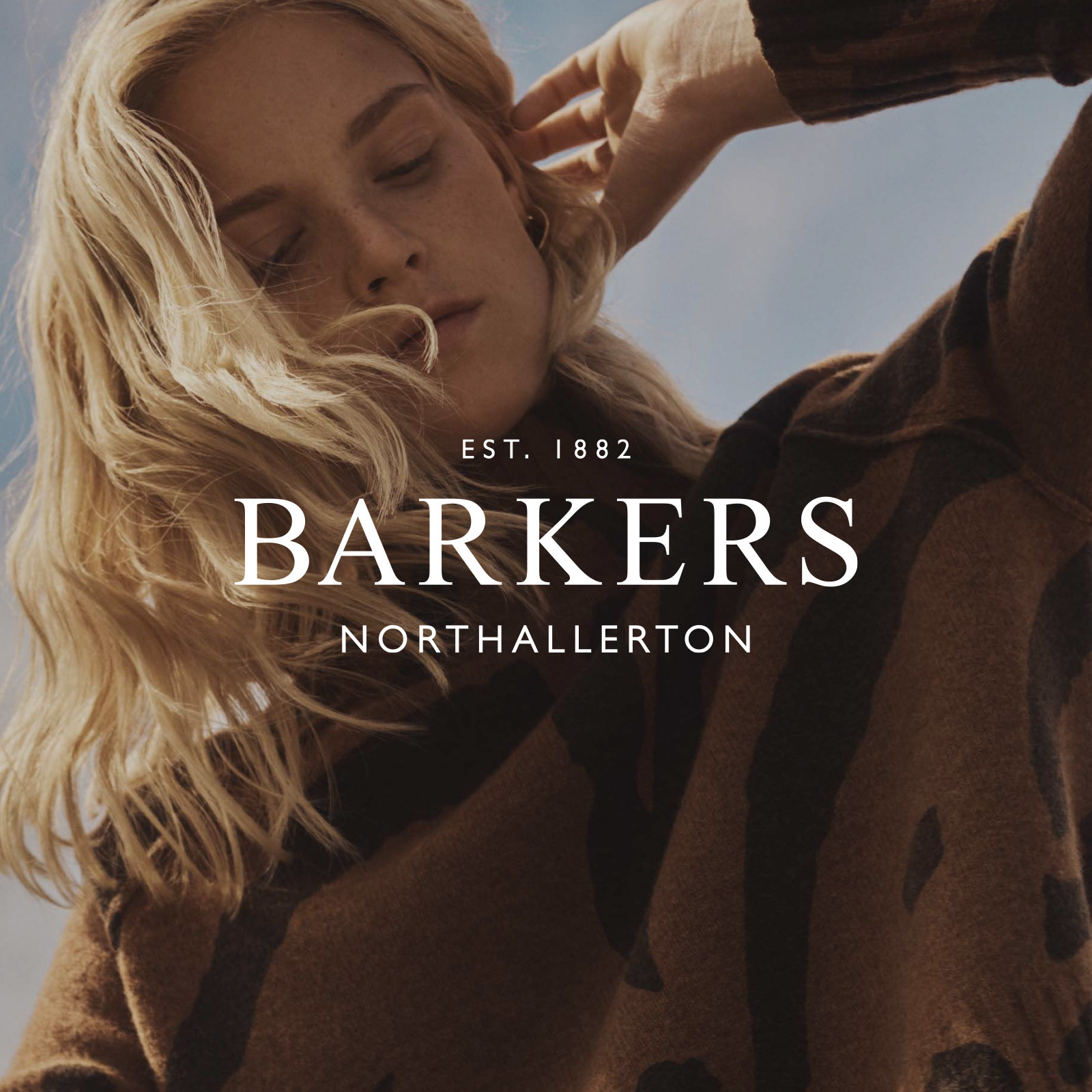
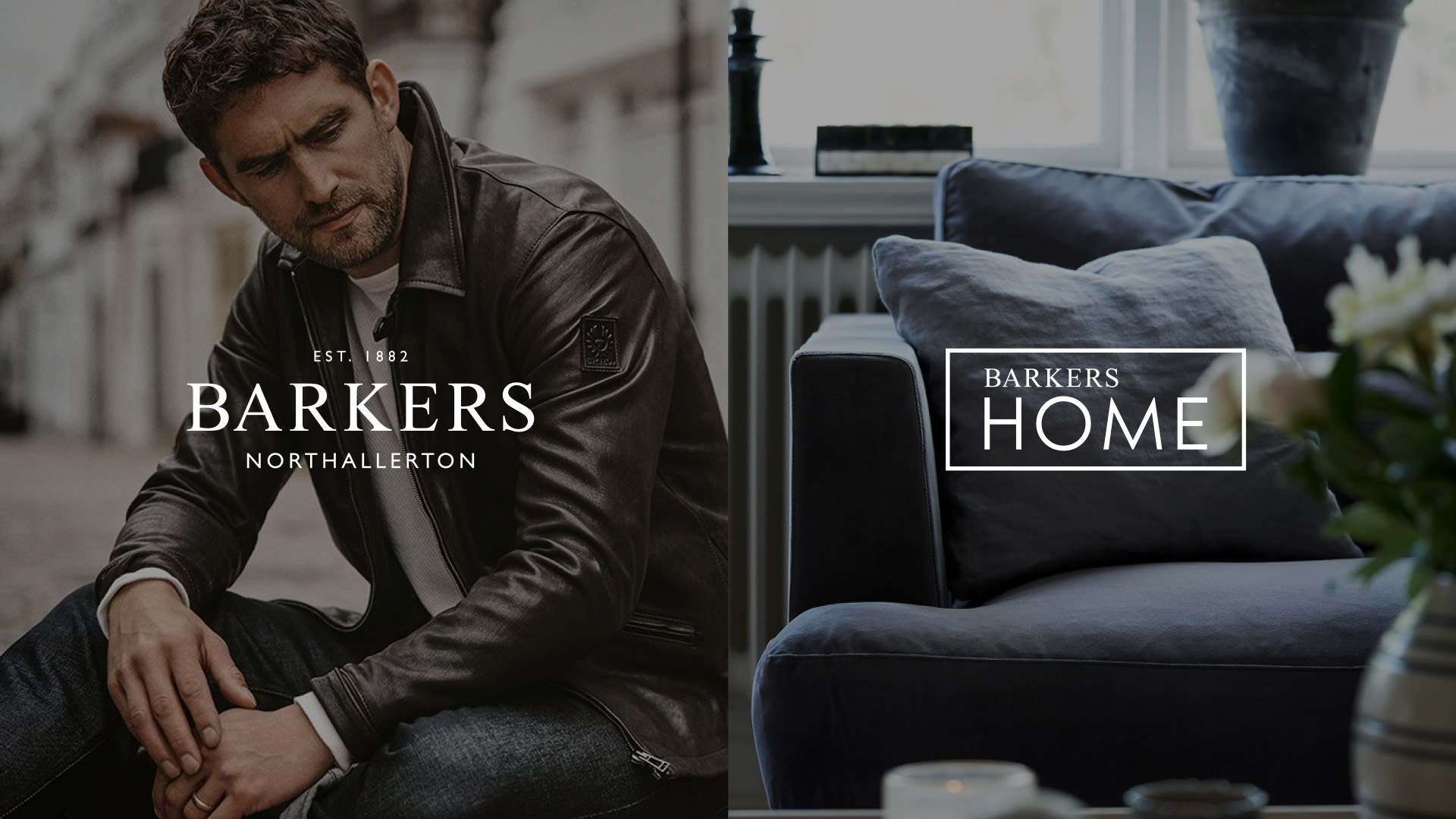
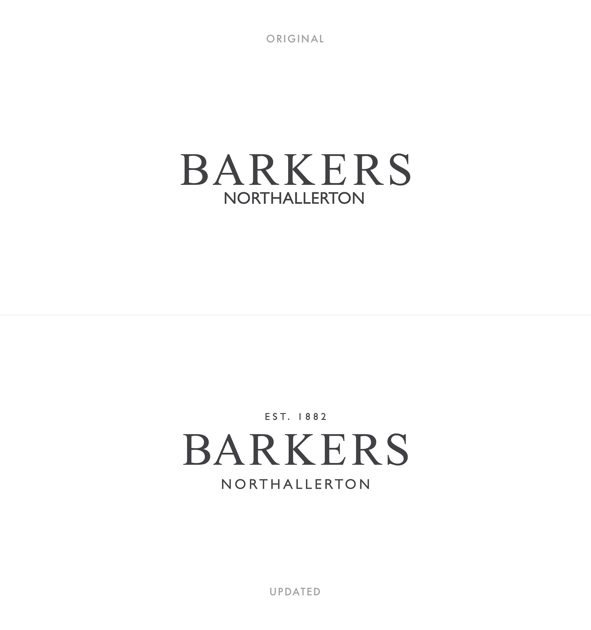
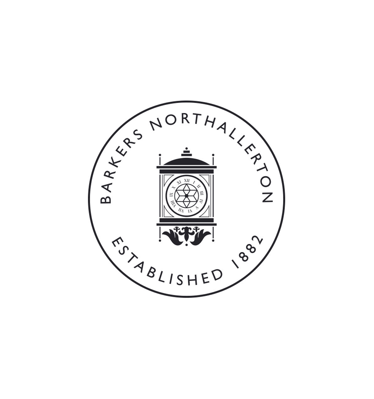
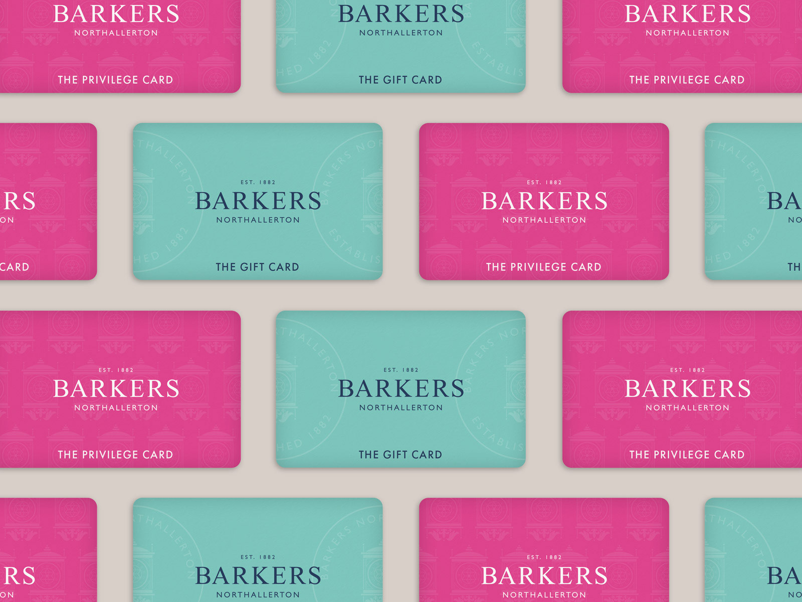
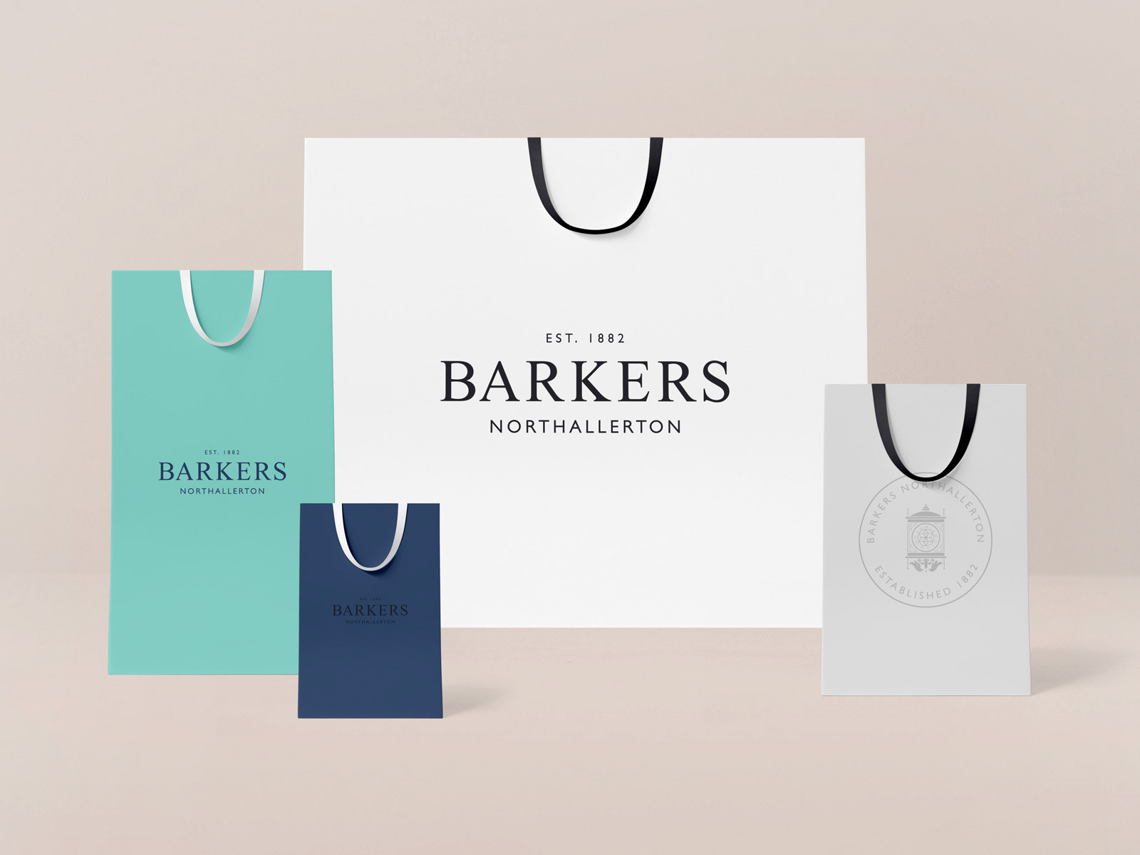
There was work into reviewing the current logos and giving them an update to clean things up and add more brand assets. This included resetting the letters and kerning, adjusting the sub-lines & including a brand stamp which uses the Barkers Clock. It was also clear that with two new websites, there would need to be in-store and lifestyle imagery to help give the brand some ownership amongst all of the stocked brands imagery. New photography was commissioned to get shots from across both stores. Product still-life was also setup to be replicated each season, allowing the Barkers team to have editorial control over visuals on the site.
Design Review & Update
With two new websites being developed, a consistent look was wanted across them both. After research and exploration, a very simple and clean look was decided upon. A very visual approach was taken to put across the diverse offering of products. Modules were simple layouts consisting of imagery, amble spacing and crafted typography. Spacing throughout the site was made to give considered breathing room to pages.
Completed at Agency Forty.