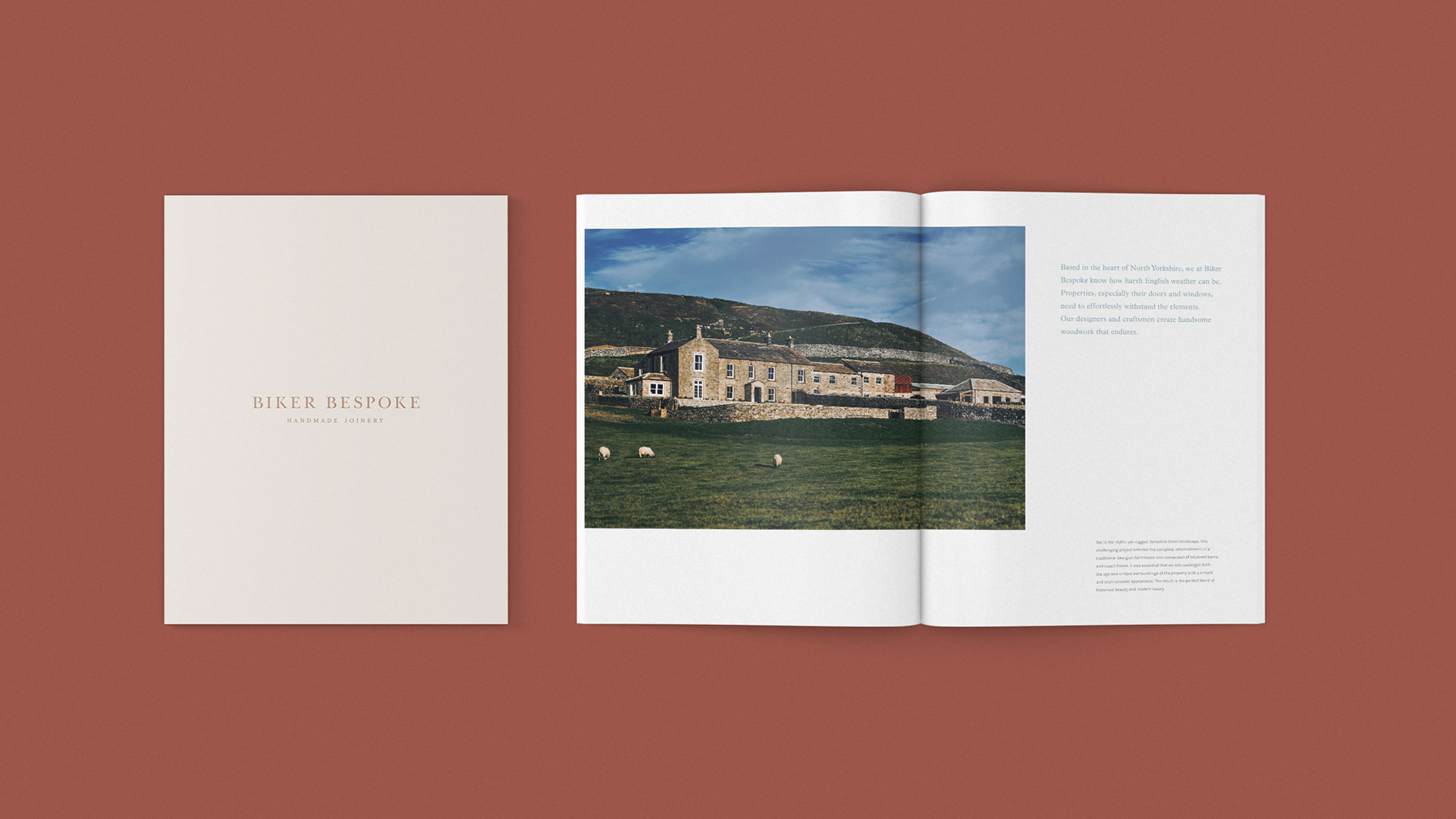
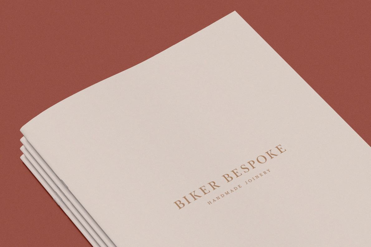
Biker Bespoke is the joinery division of the long established Yorkshire brand, Biker Group. With an expanding speciality base, a complete rebrand was required to attract the right customer and fully show the capabilities and quality of the brand. A new name, logo and full visual identity package was developed across all touch points of the brand, from the website through to magazine ads. Keeping the focus on the company's sense of friendliness, honesty and quality, as well as giving a the brand a timeless appearance.
Website:
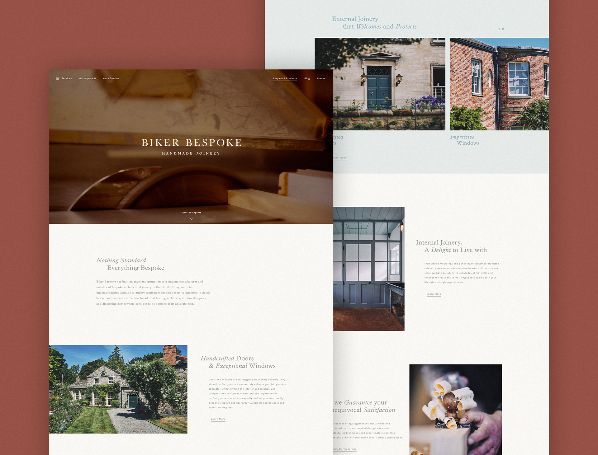
With a focus on high quality bespoke joinery, the entire brand had to be representative of this & their core brand values, from the logo through to the website.
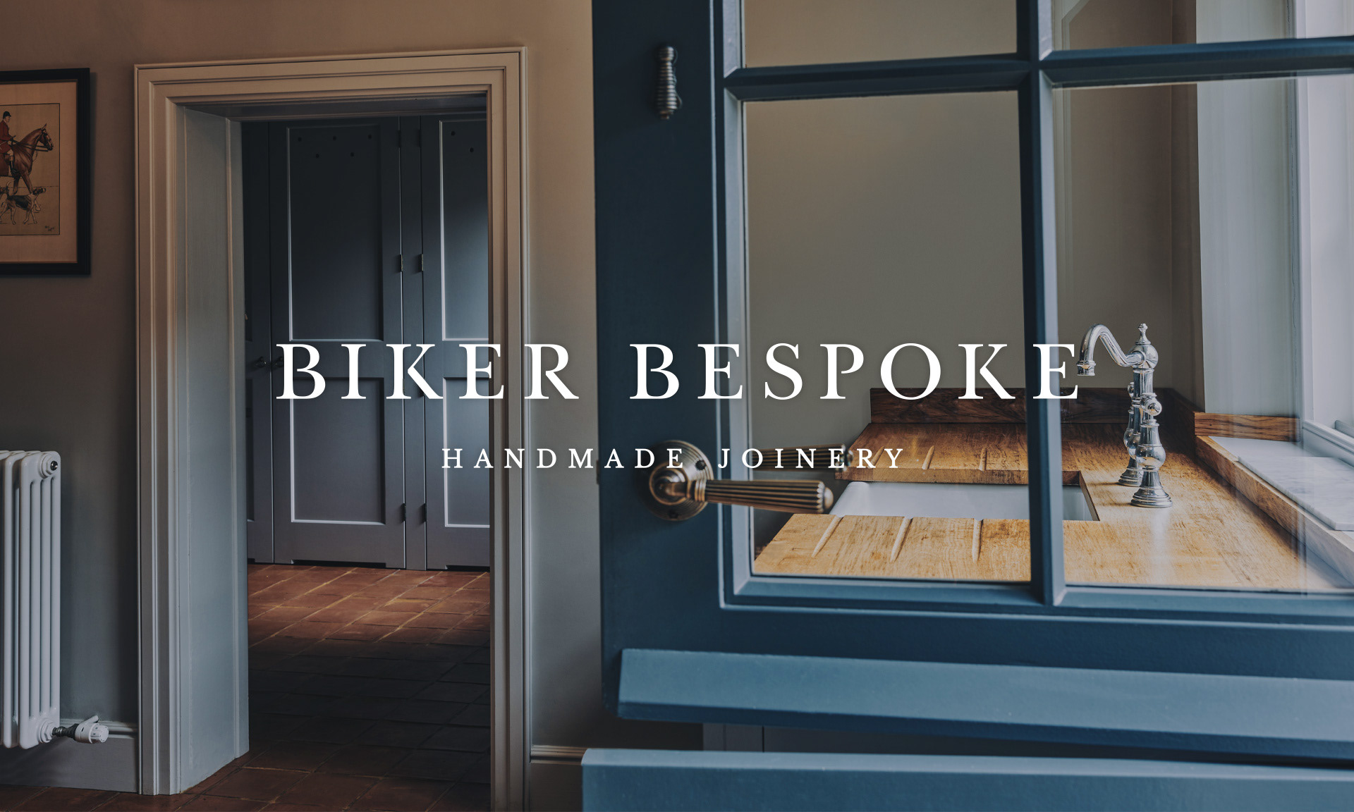
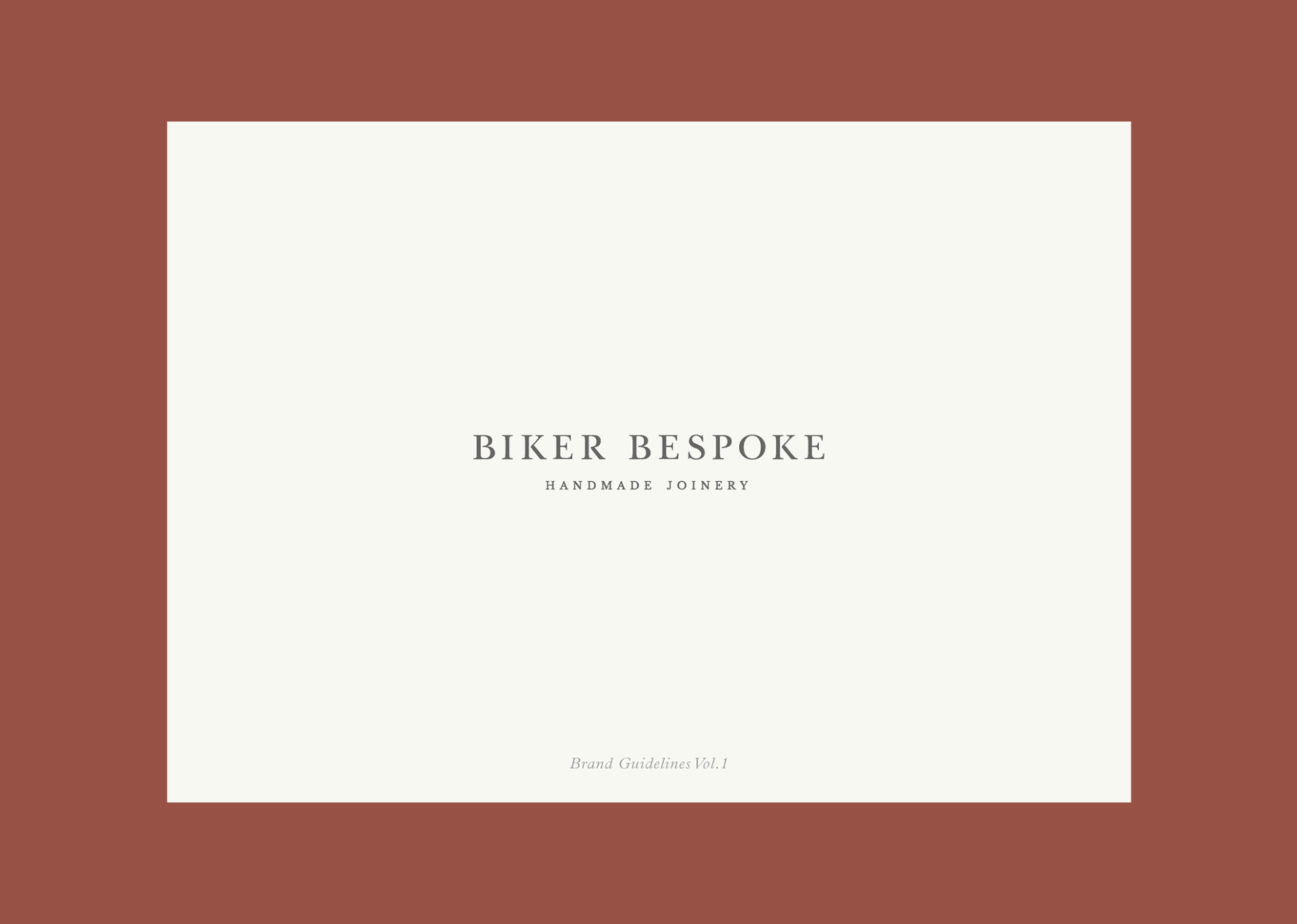
Brand Identity & Direction
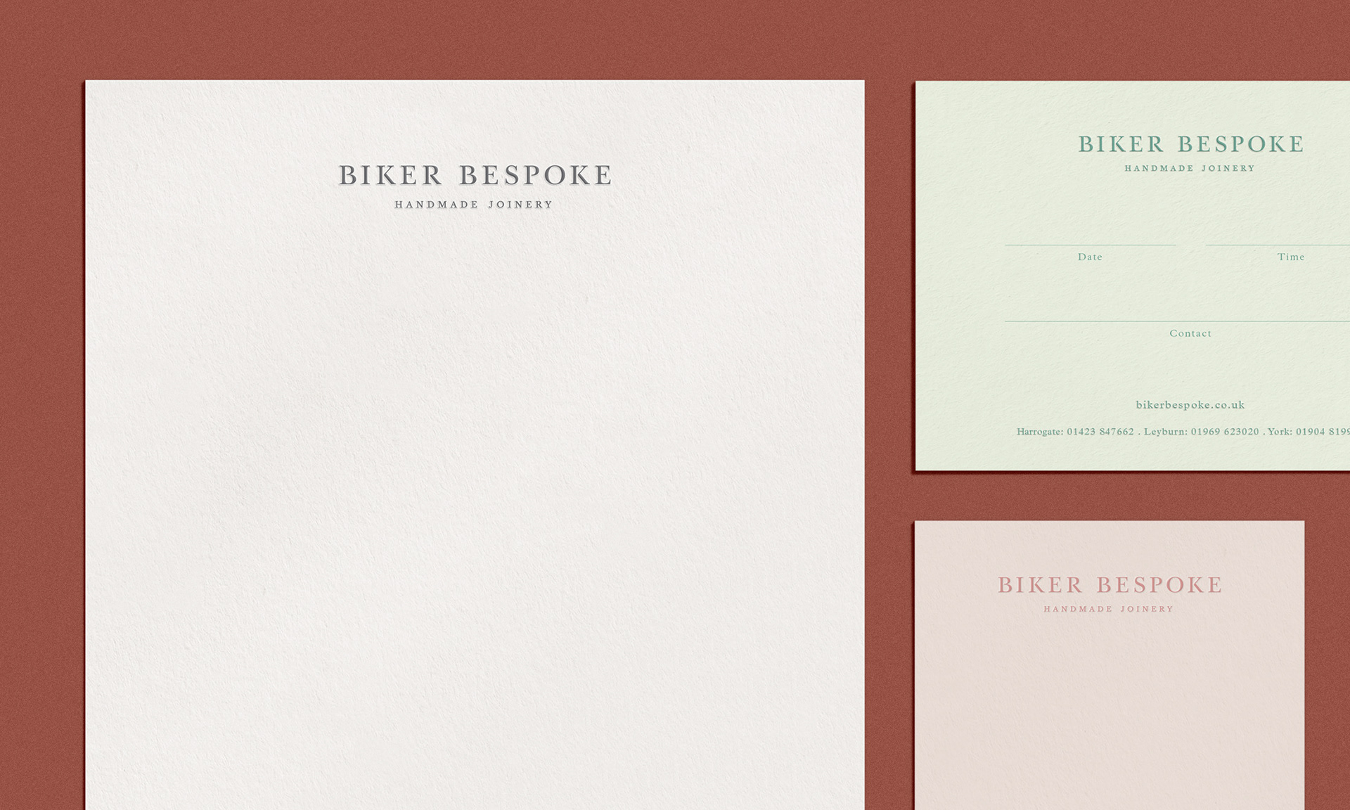
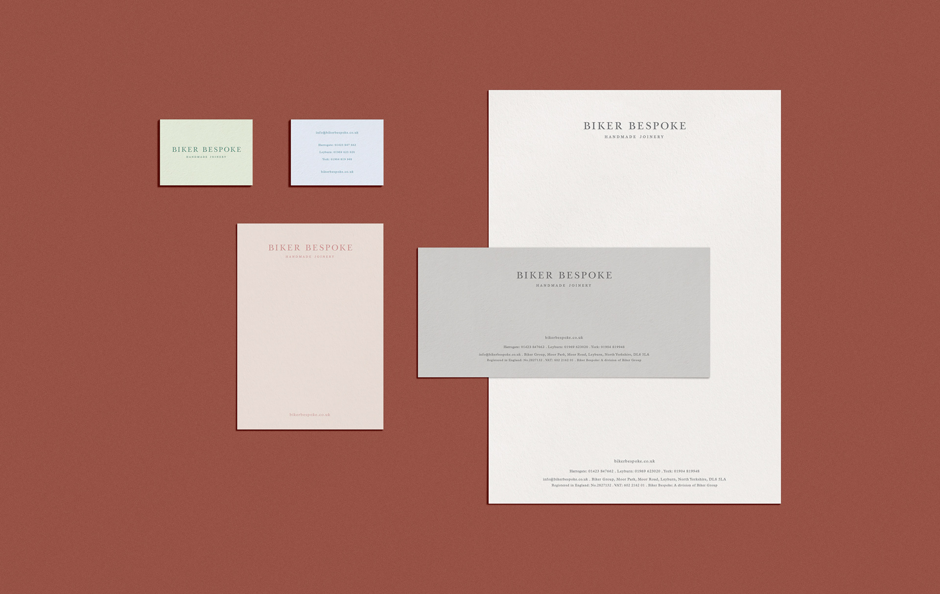
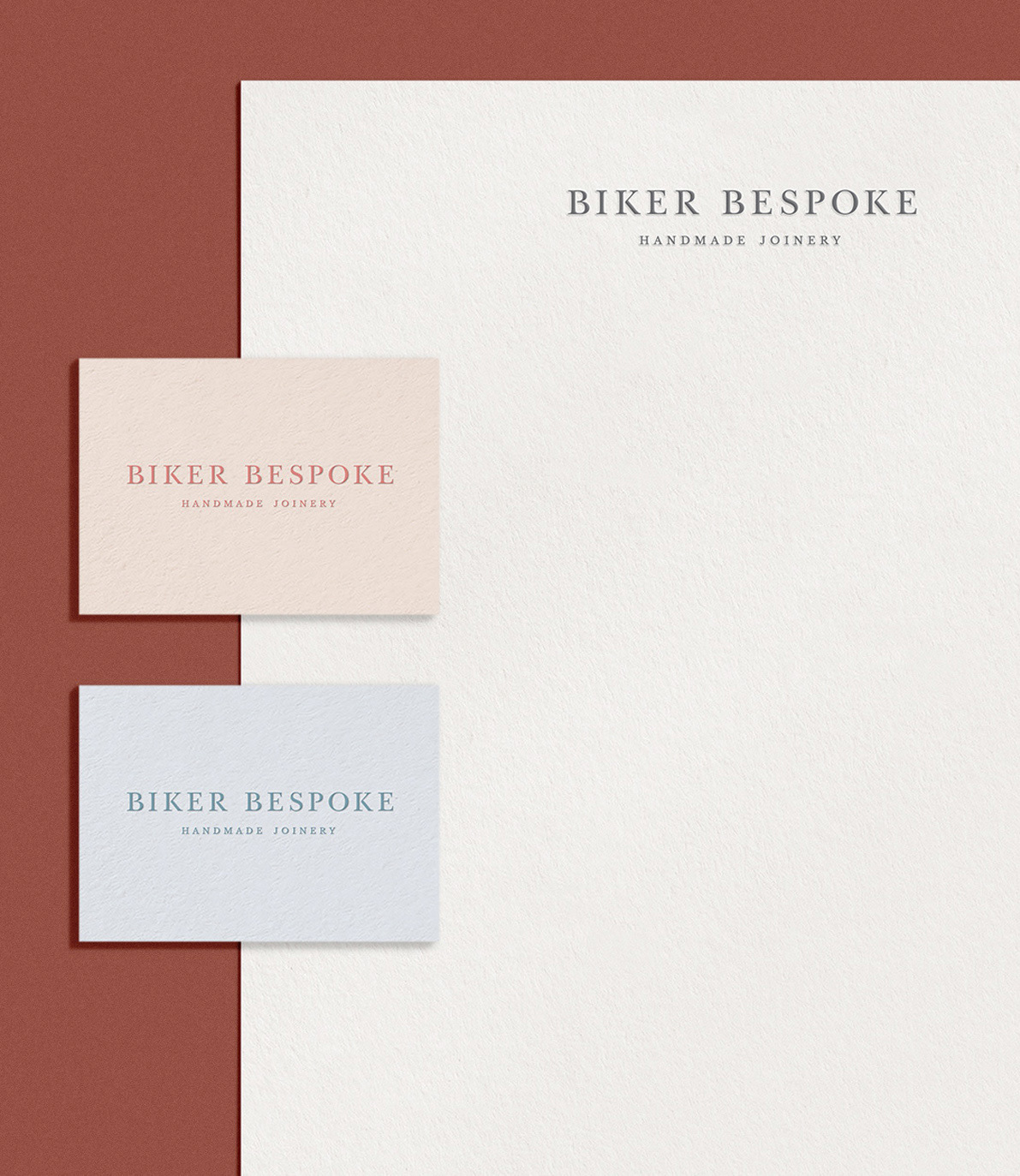
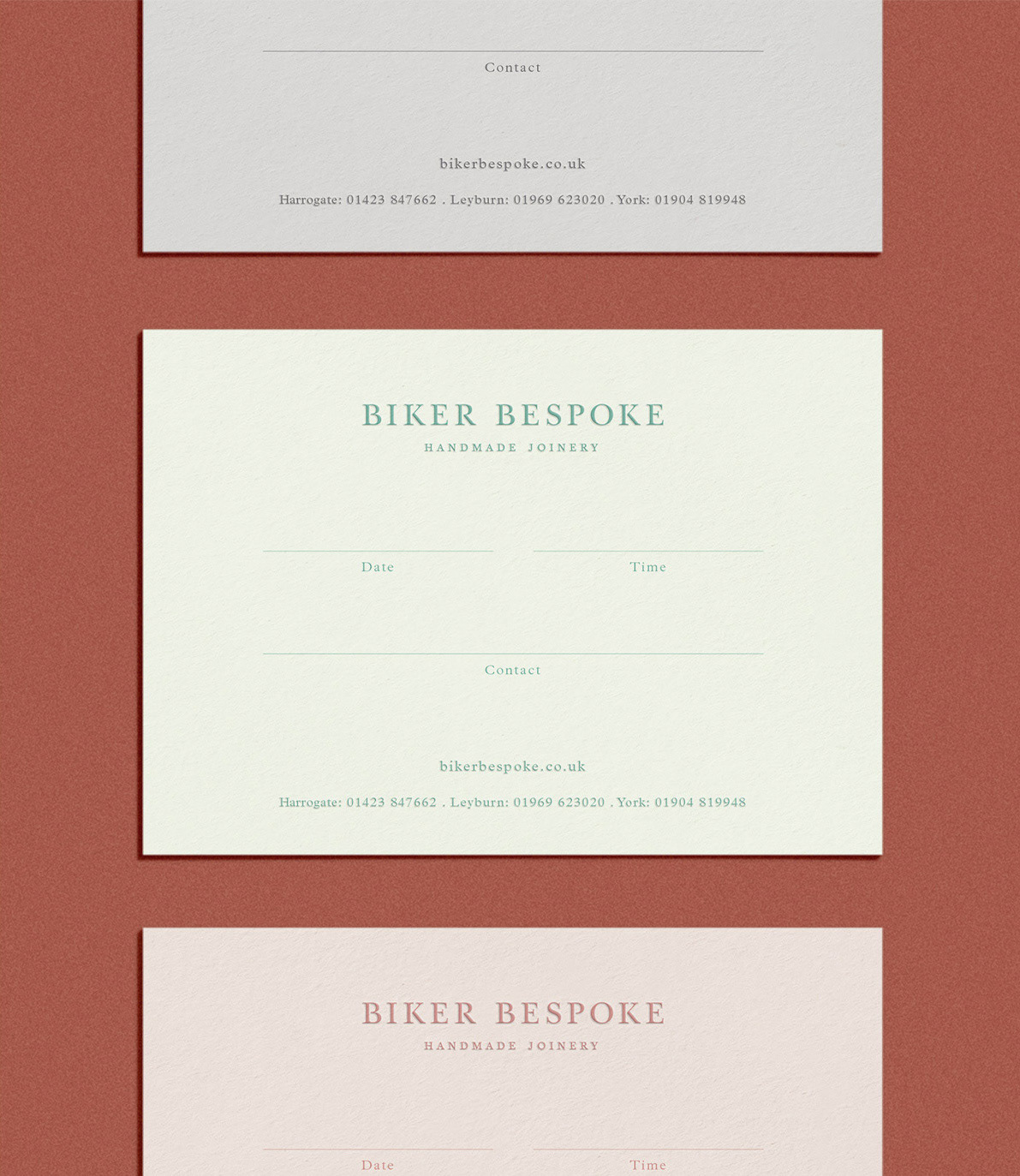
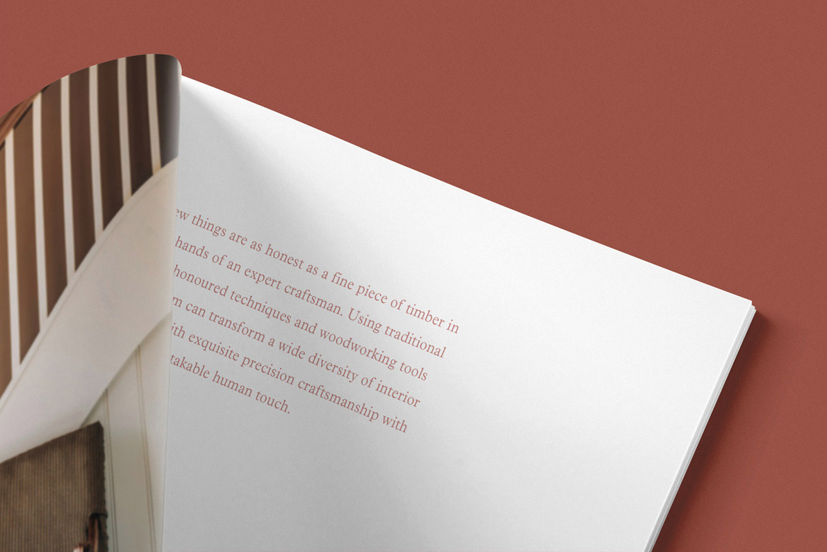
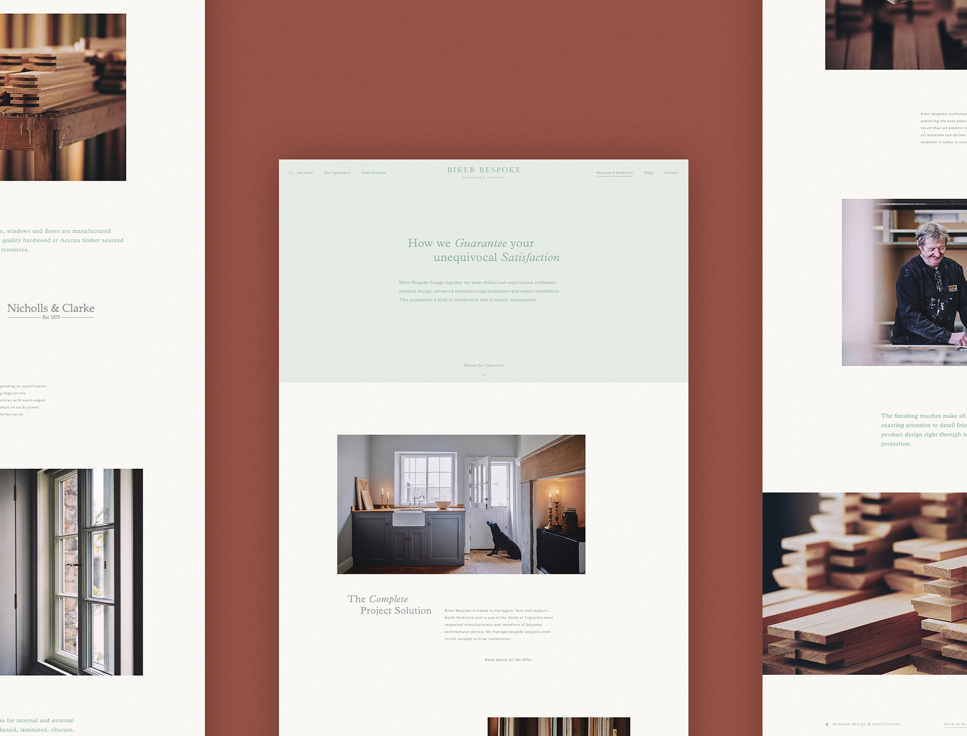
To begin the project, an in-depth research period took place, looking into the vast interiors market - from looking at competitors to customer analysis and persona development. All of this culminated in creating a solid positioning for the brand to be a luxury service and supplier at an affordable price. With a brand never truly defined, exploration into the possible routes was done, and eventually refined down into a crafted modern serif style. This was worked together with a pastel colour palette and simple layout to create a minimal and simplistic approach. A stationery set was developed using a variety of stock colours.
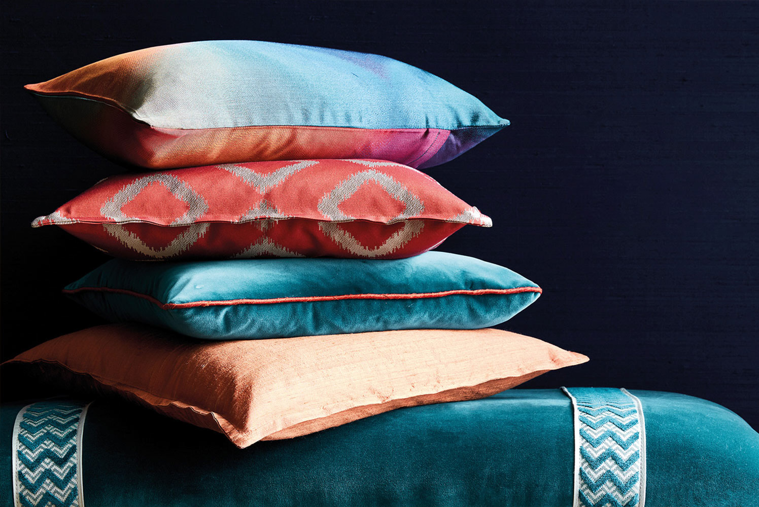
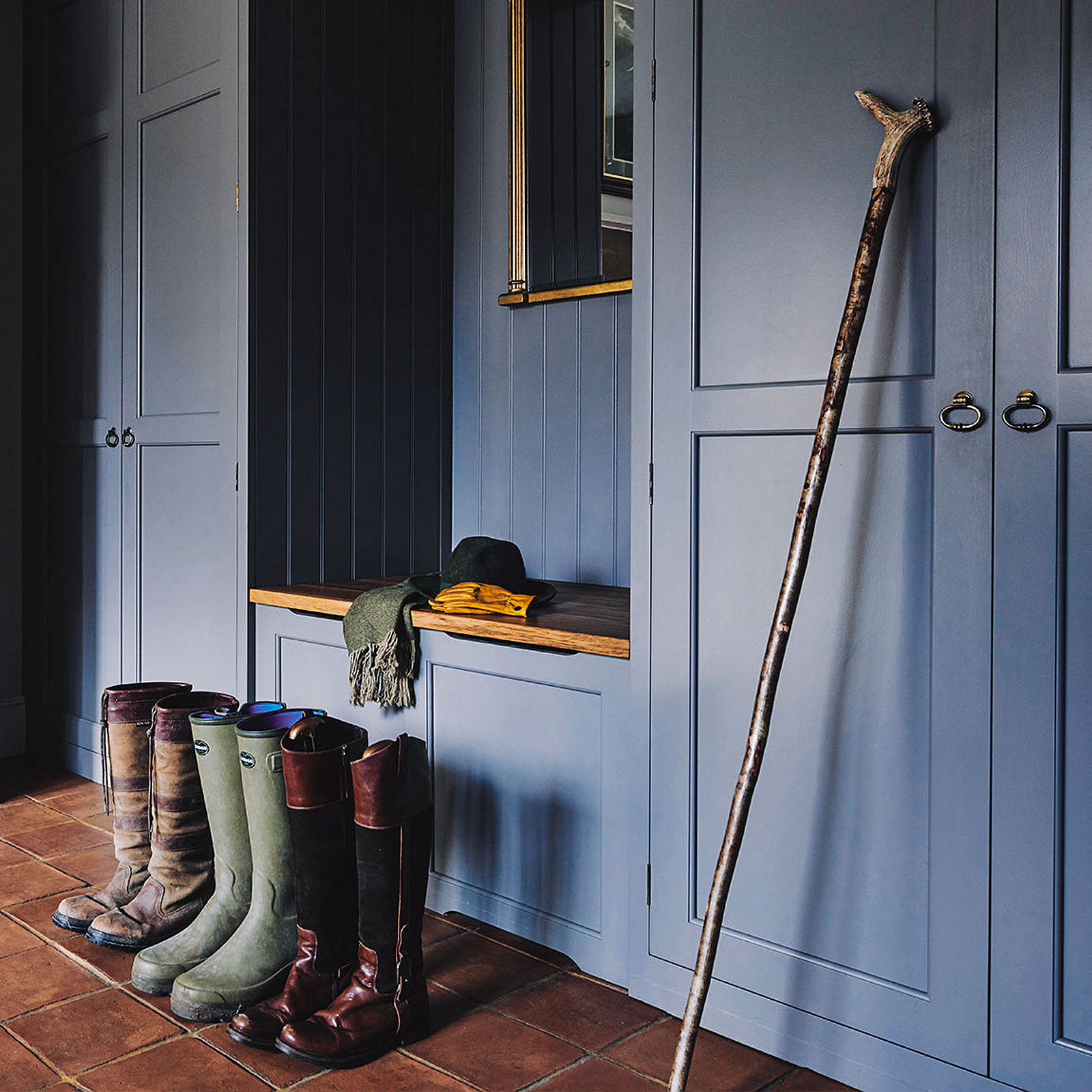
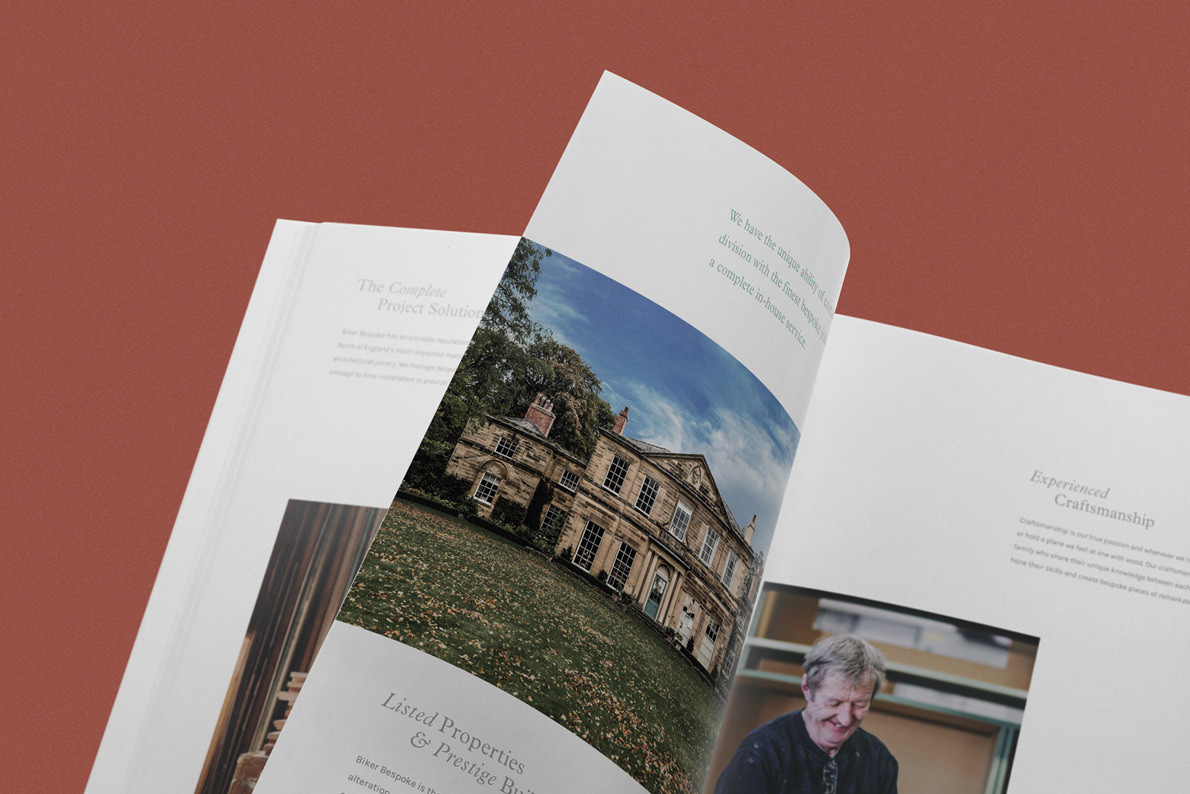
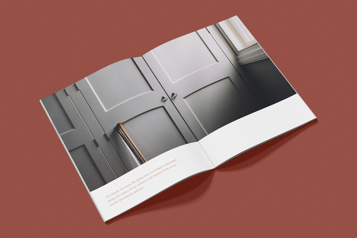
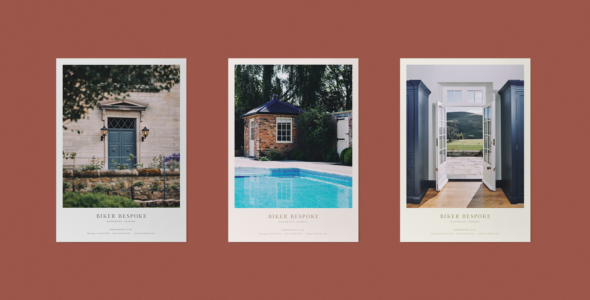
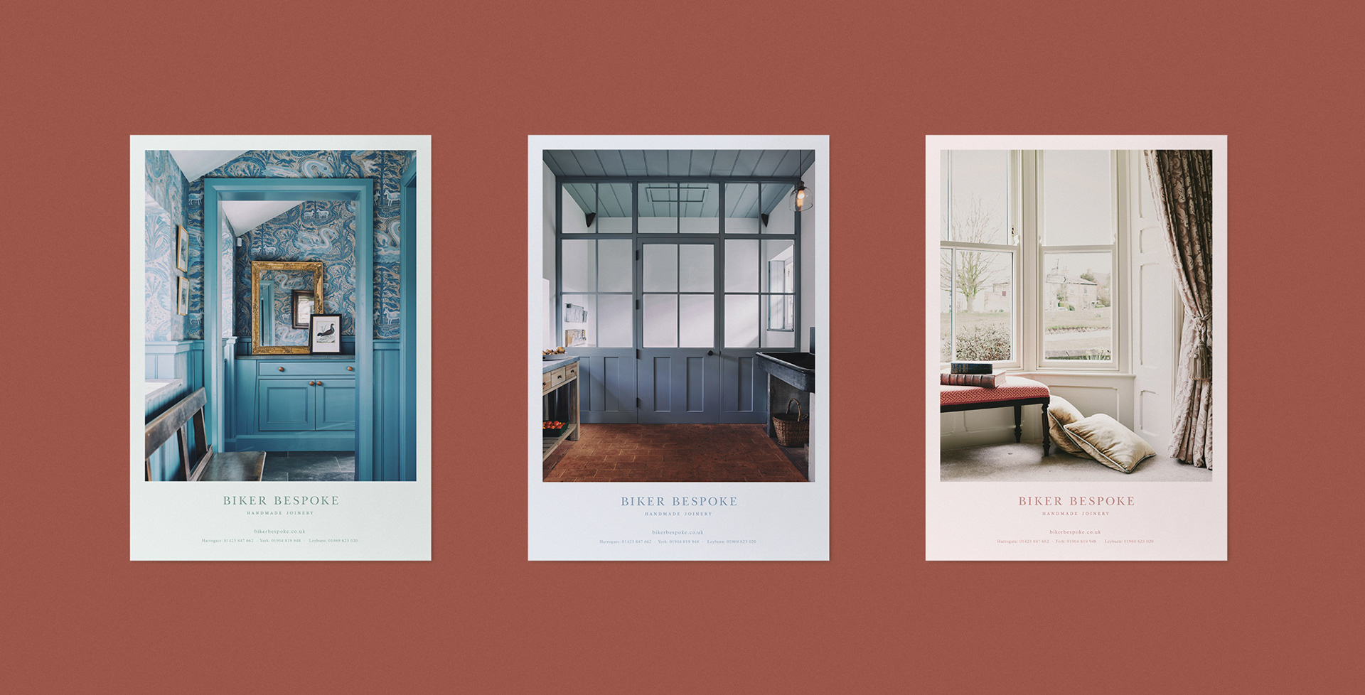
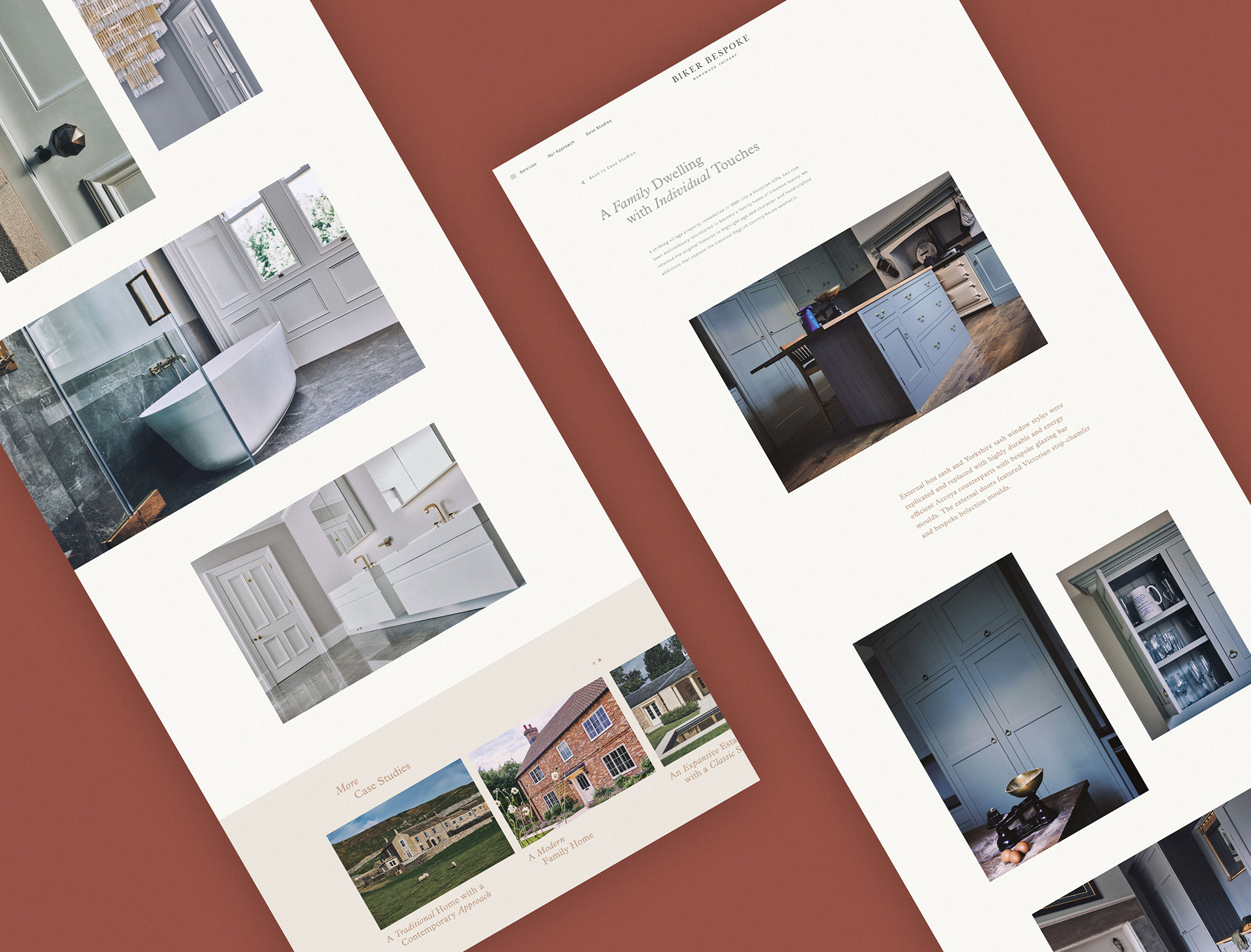
Photography, Brochure & Ads
Alongside a new brand identity, it was agreed that new photography would be needed to fully show the beauty and finished quality of products. A large number of shoots were done at previous customers' homes to gather together a vast archive of imagery to be used across all printed and digital material. A 50 page large format brochure was developed to showcase the variety and top products created by Biker Bespoke in the past. This was to be freely available for any customer who requested it. Ads were also developed
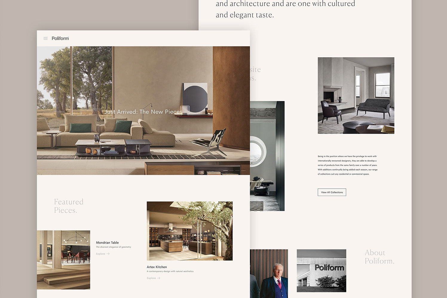
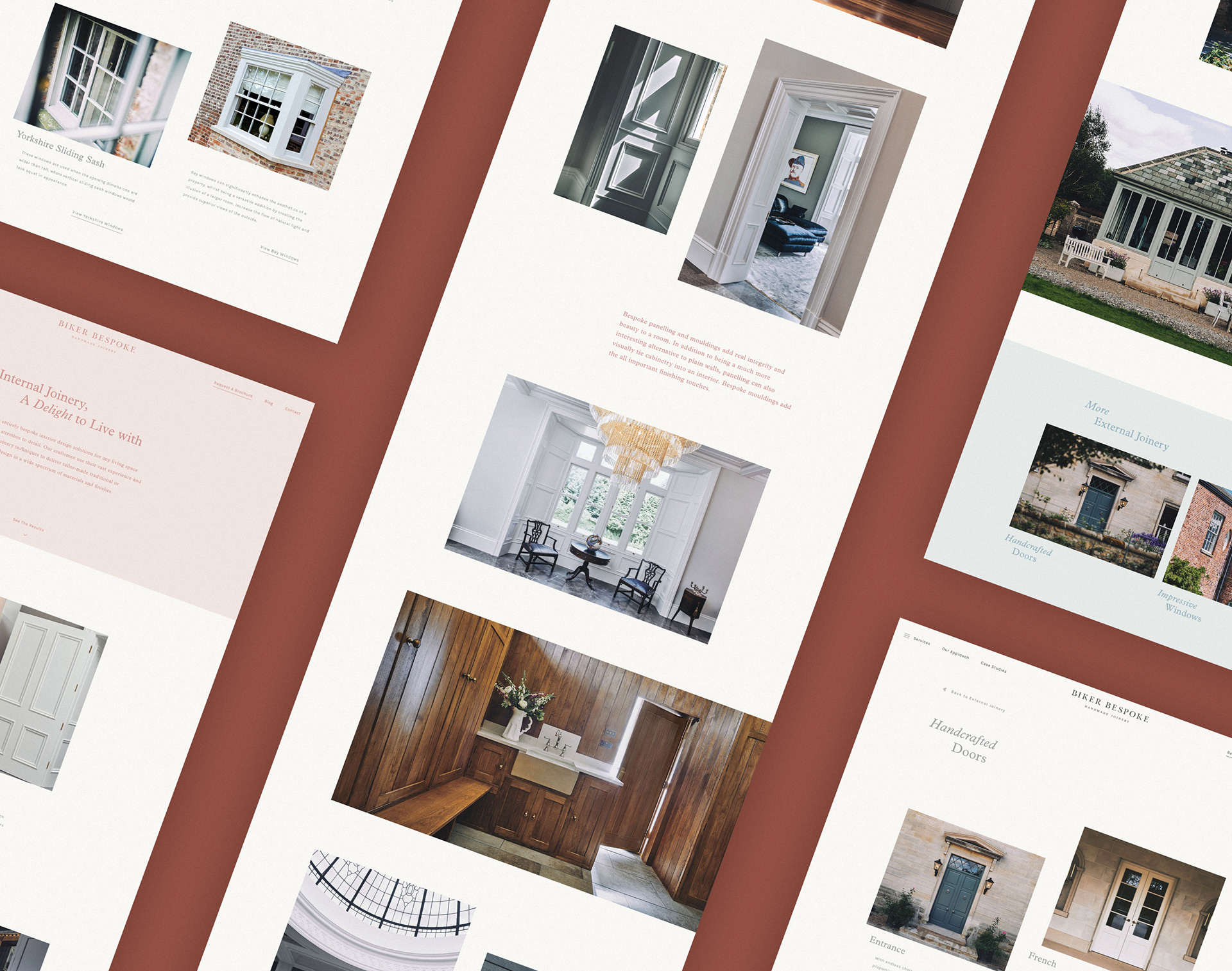
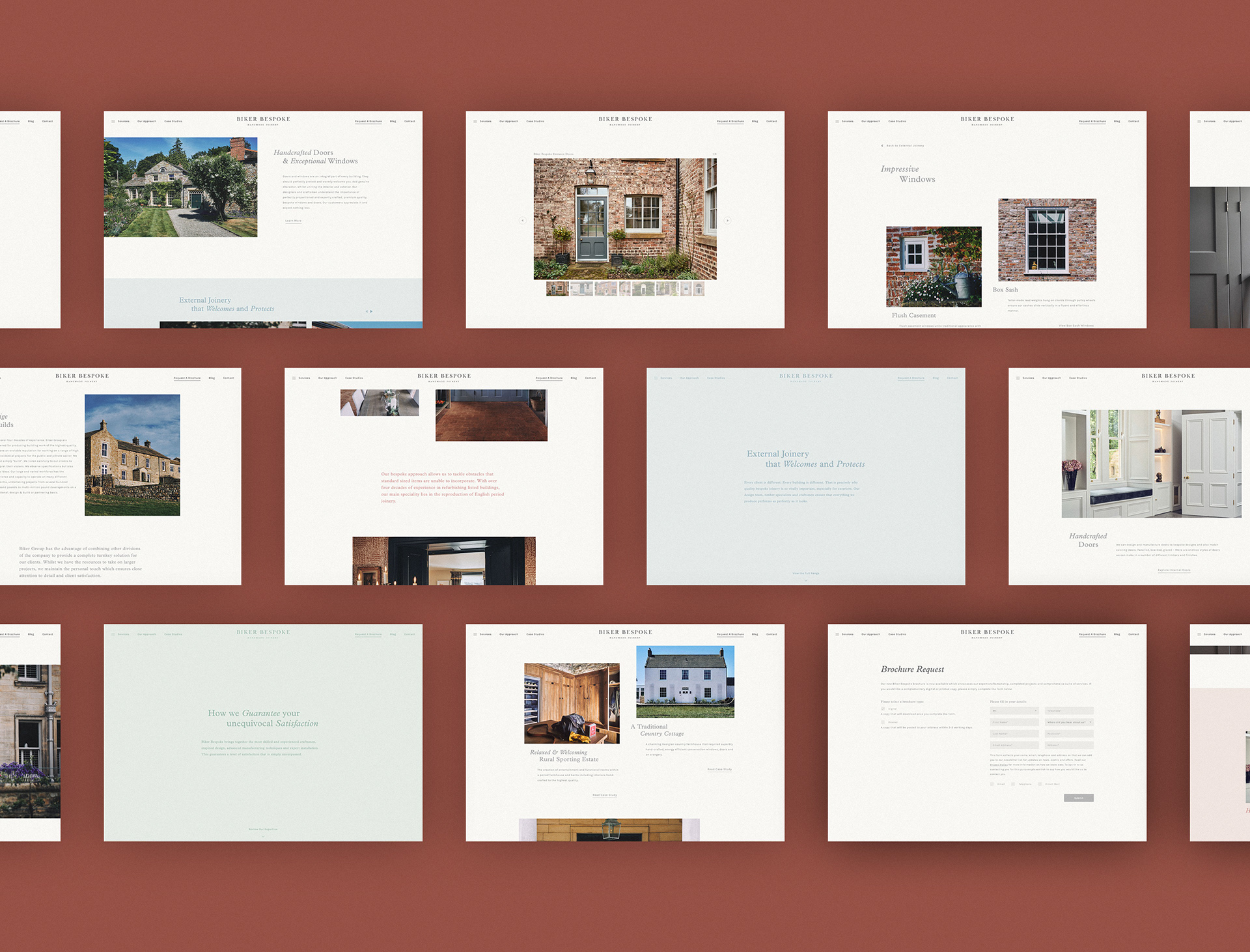
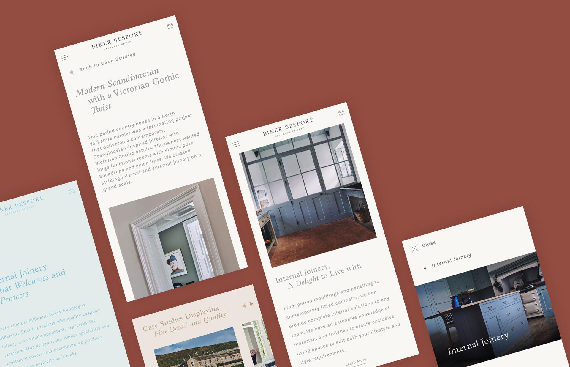
Website Architecture & Design
With the entire brand undergoing a redesign, the website was a large focus point of this as the existing site did not do justice to the quality of the product and service. Research was done into best-practice approaches from others in the industry and then adapted to what the user needs would be for engaging with this brand. This included in-depth case studies, about the business and their ways of working as well as the ability to thoroughly explore all the services they provide in a very visual way. The design was focussed on pulling together large imagery and crafted typography to sit in open spaces to create a light and warm tone which reflected the friendly and local approach of the brand.

Completed at Agency Forty.