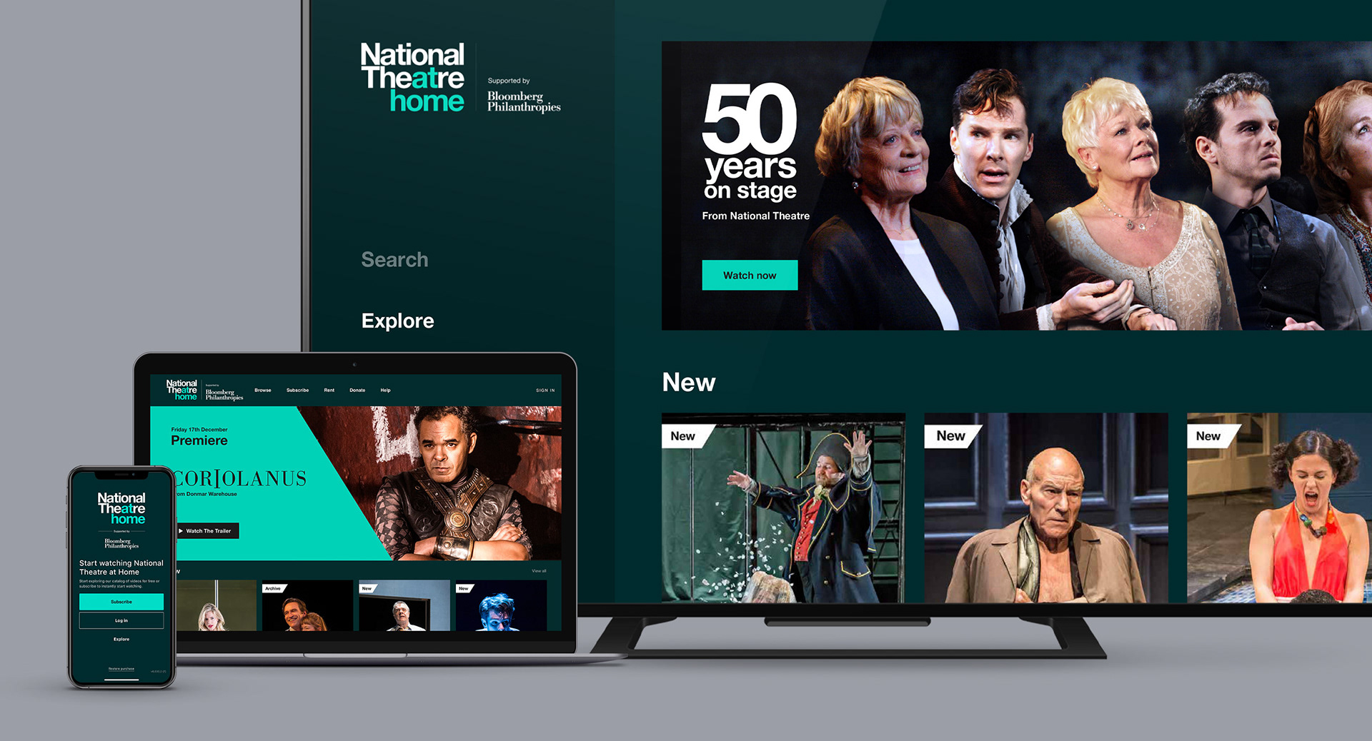
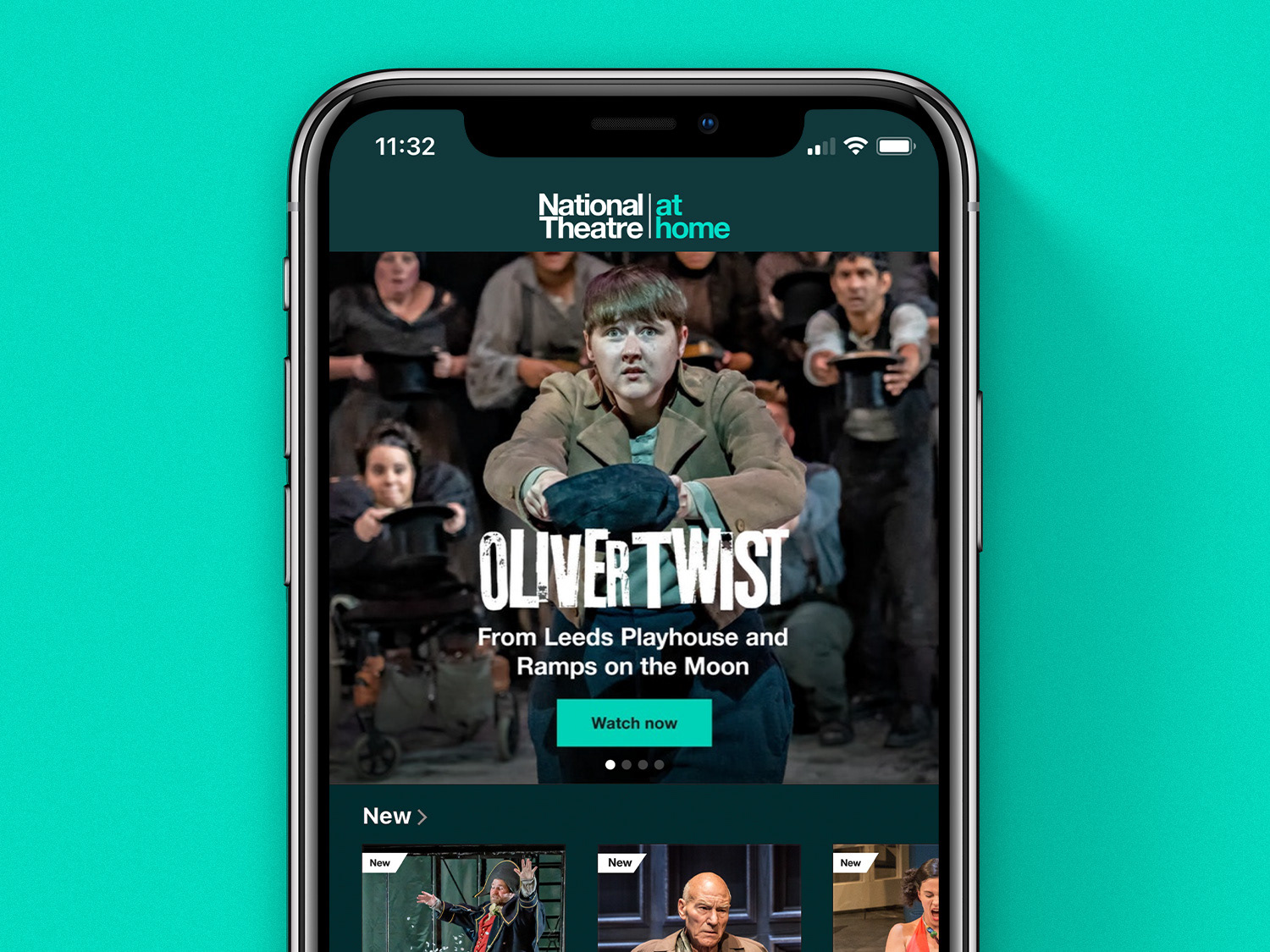
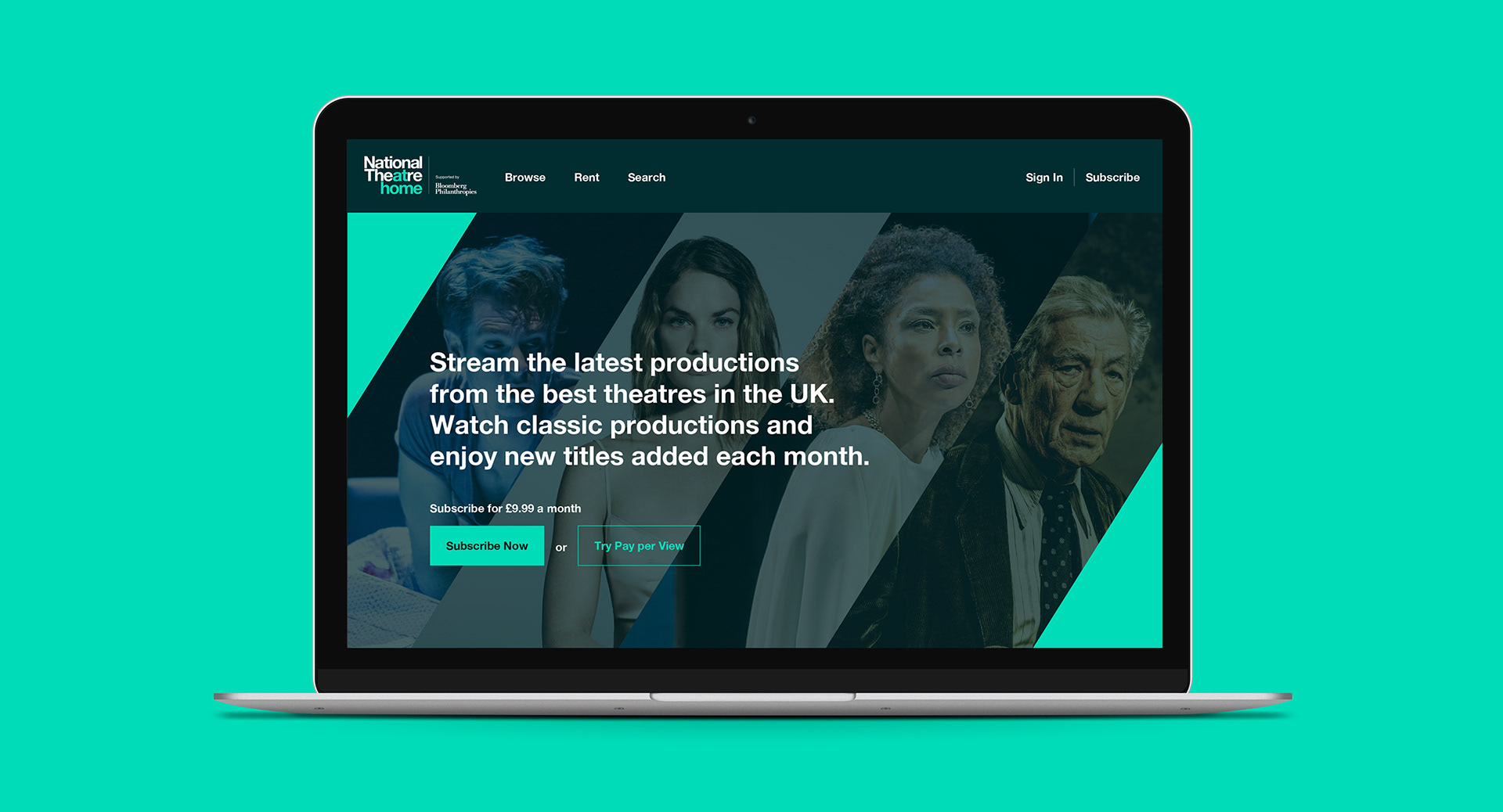
In mid-2020 National Theatre decided to launch their own video subscription service after having large success with a free YouTube version. With a time frame of only two months to create & launch this using the Vimeo OTT platform across web, iOS, Android & TV; they required an easy way of consistently creating all visual assets for the productions & extra content they plan to release throughout the years.
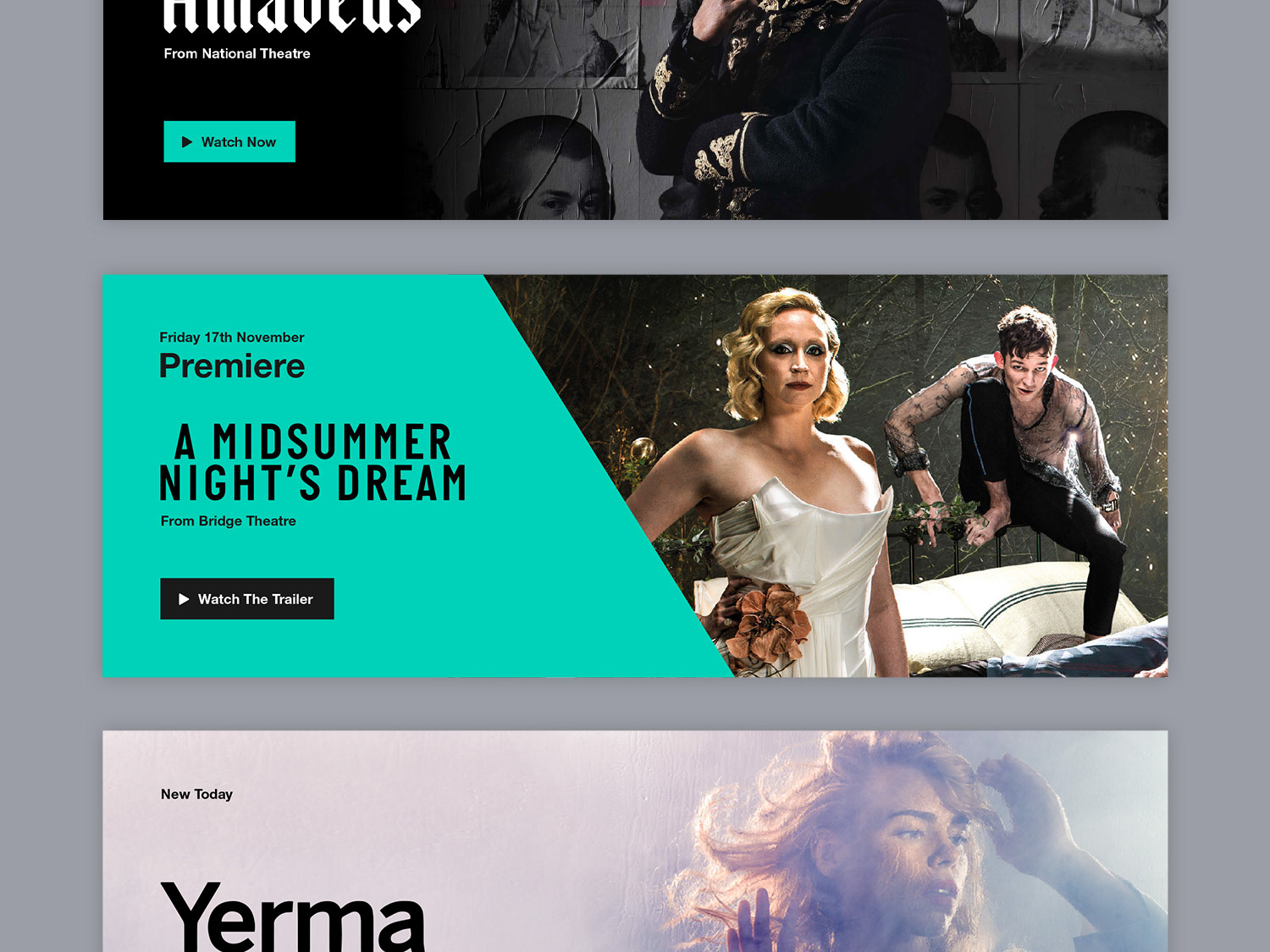
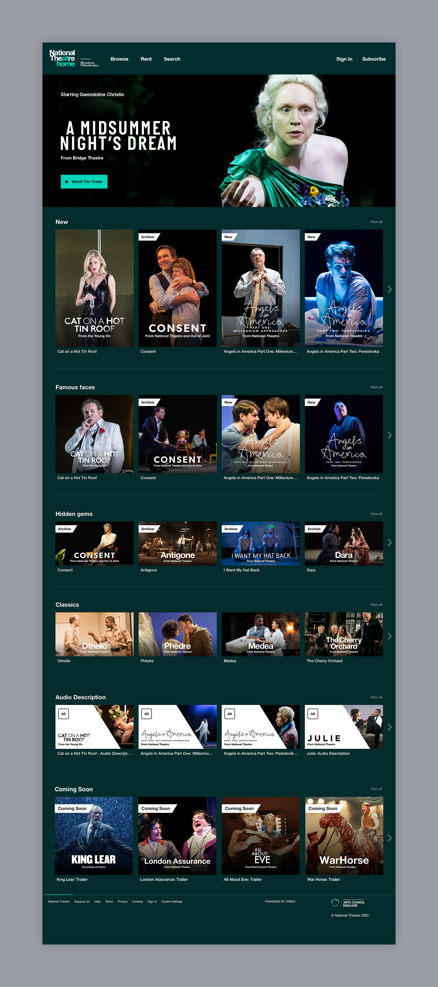
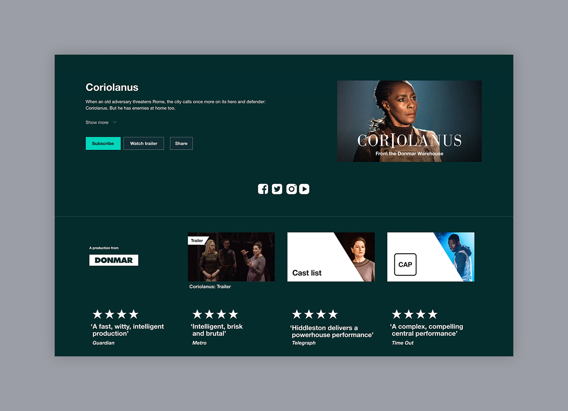
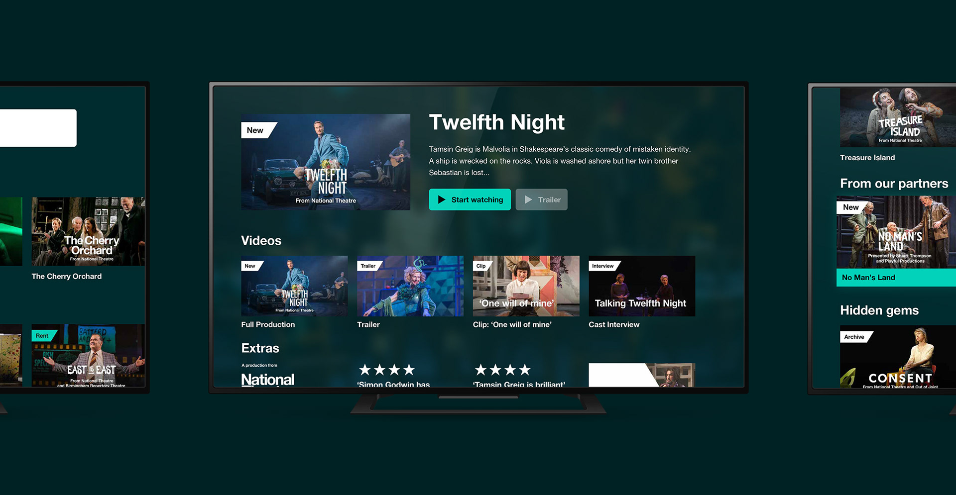
With a very fixed experience, the key focus was on creating a consistent approach for content thumbnails which was easy for users to digest & use to navigate around.
Design Direction
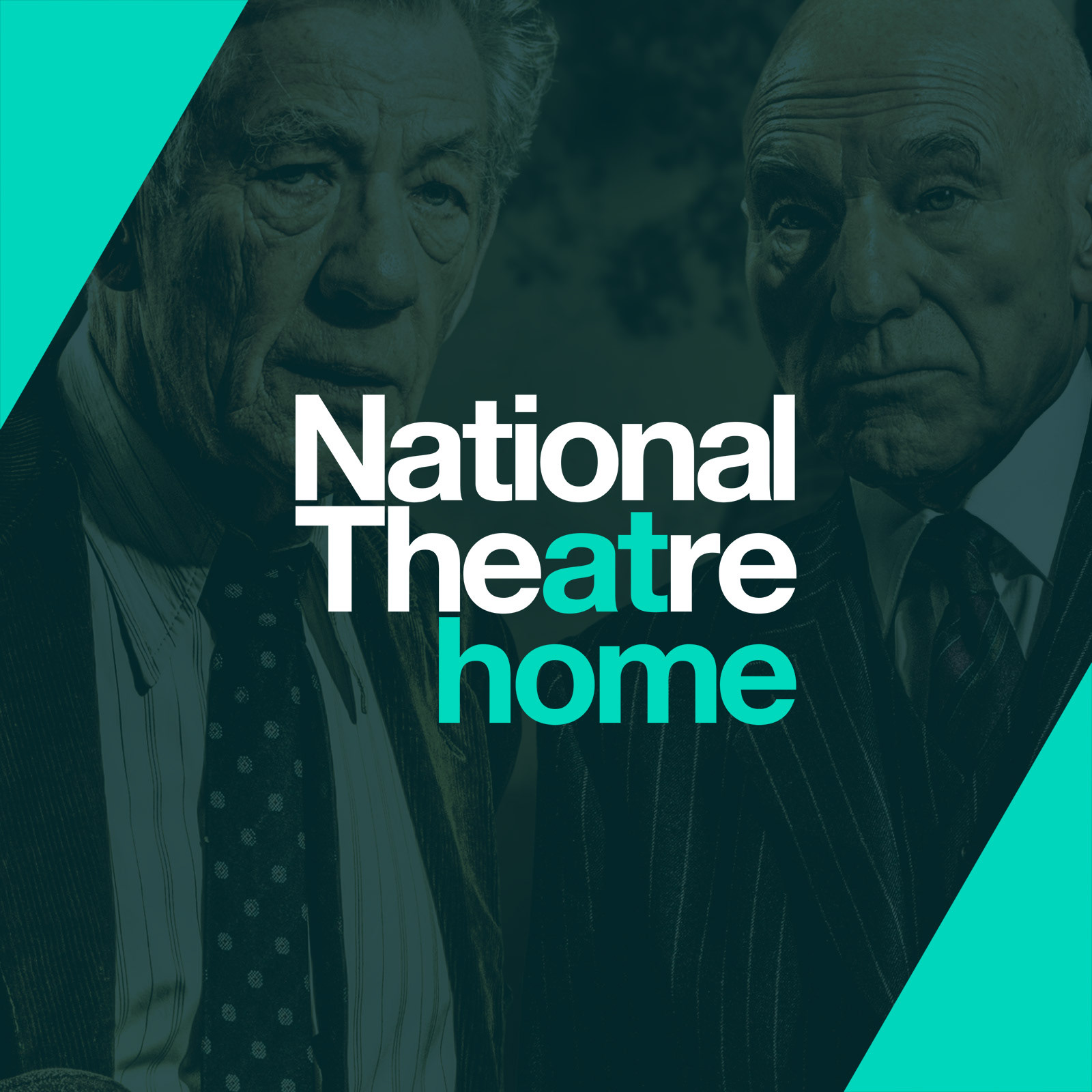
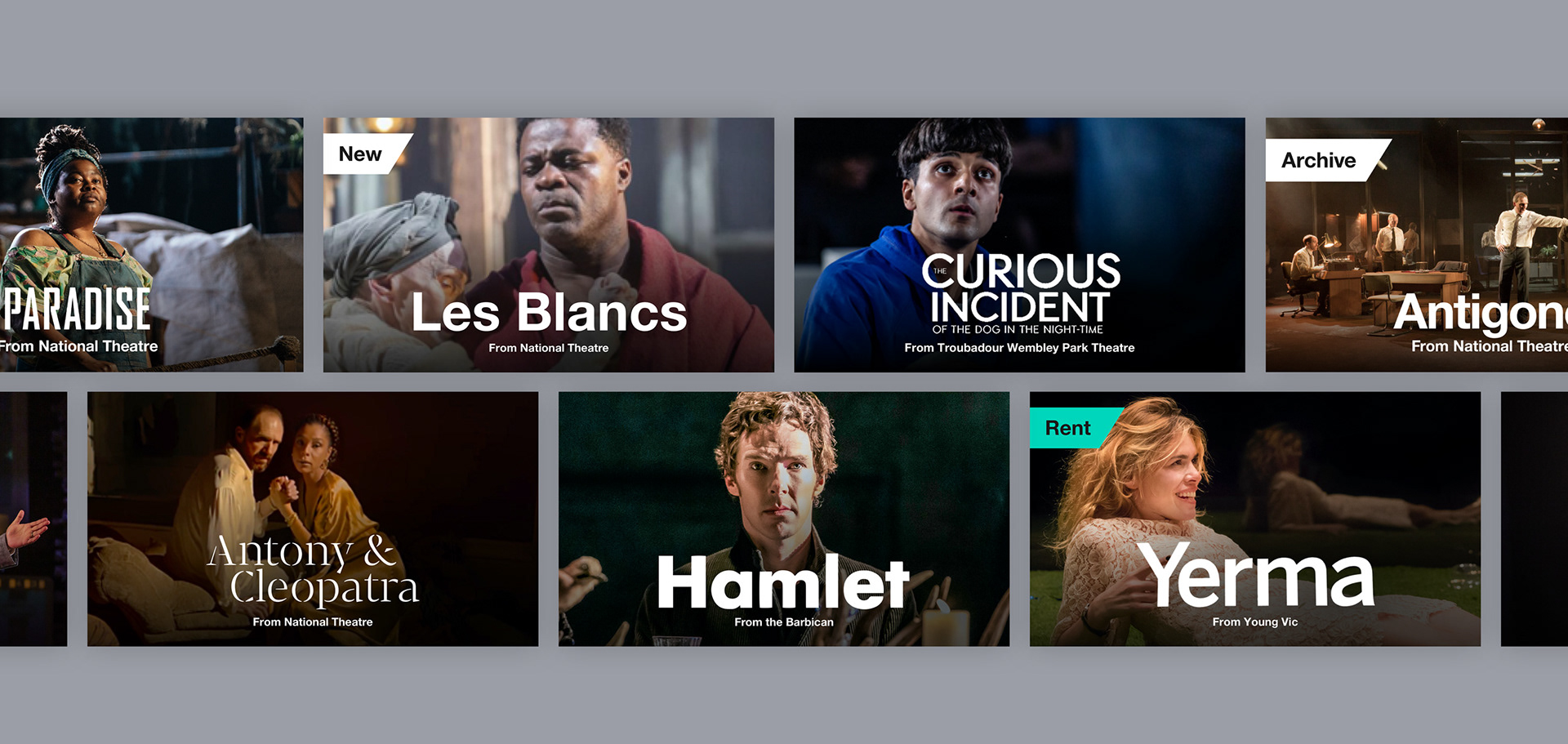
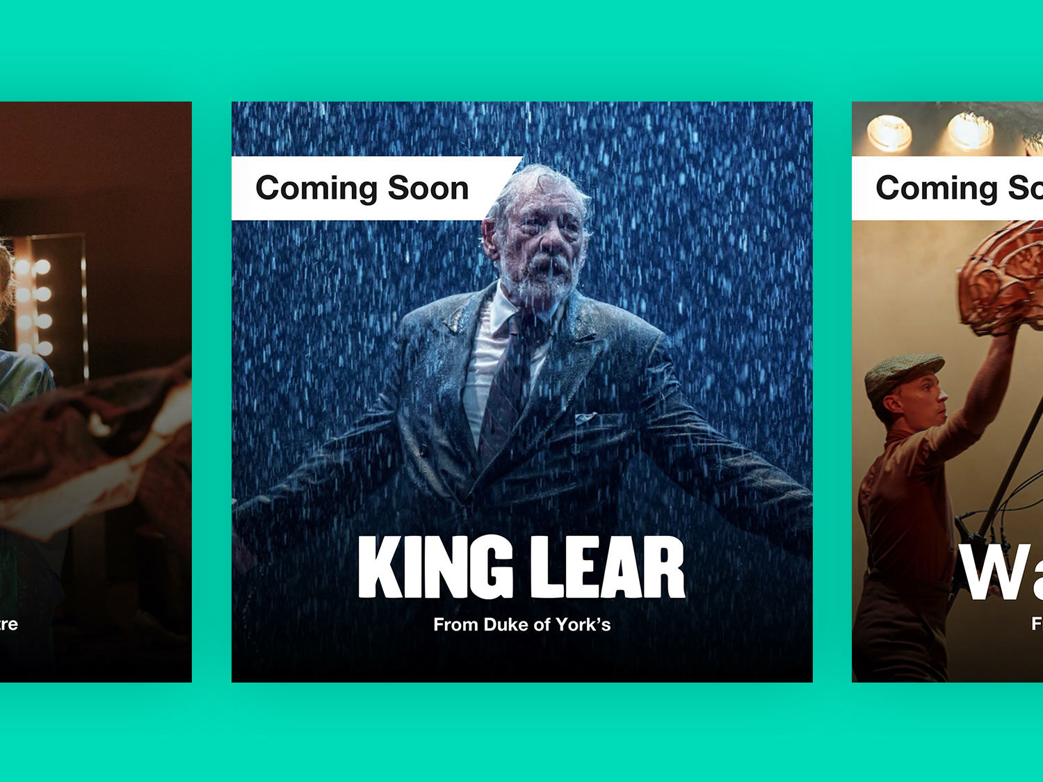
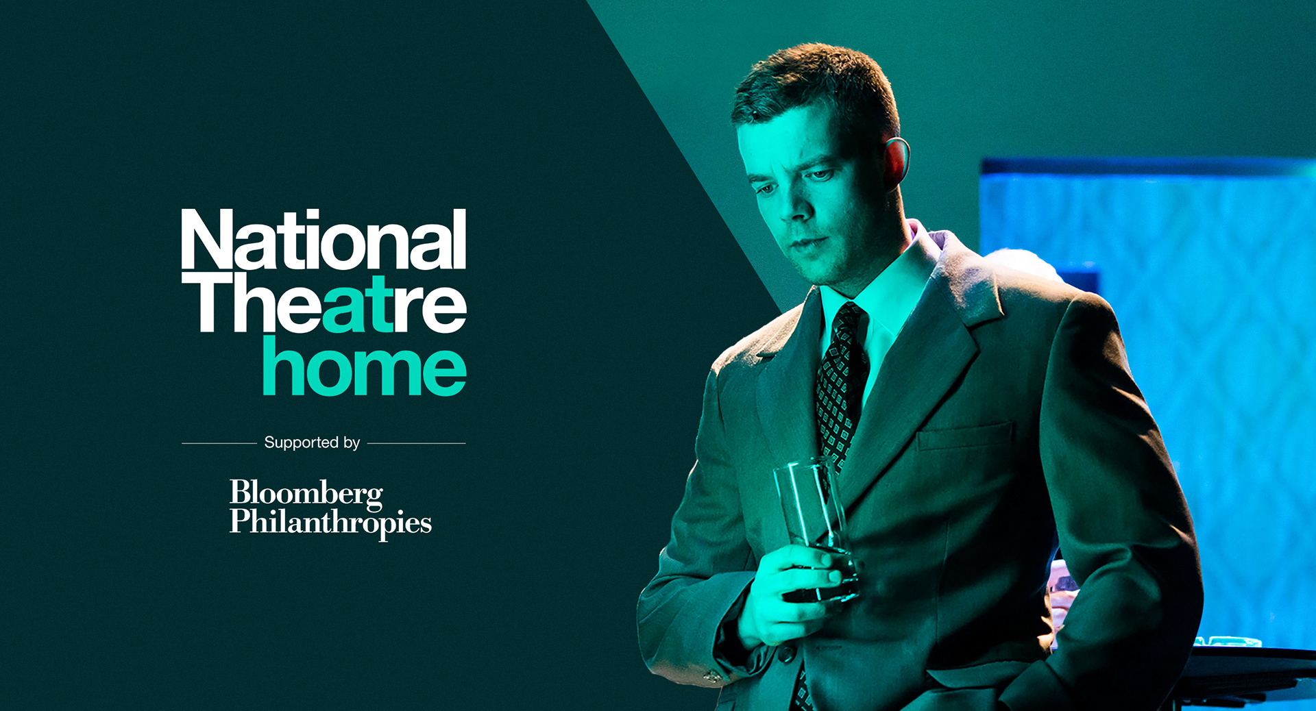
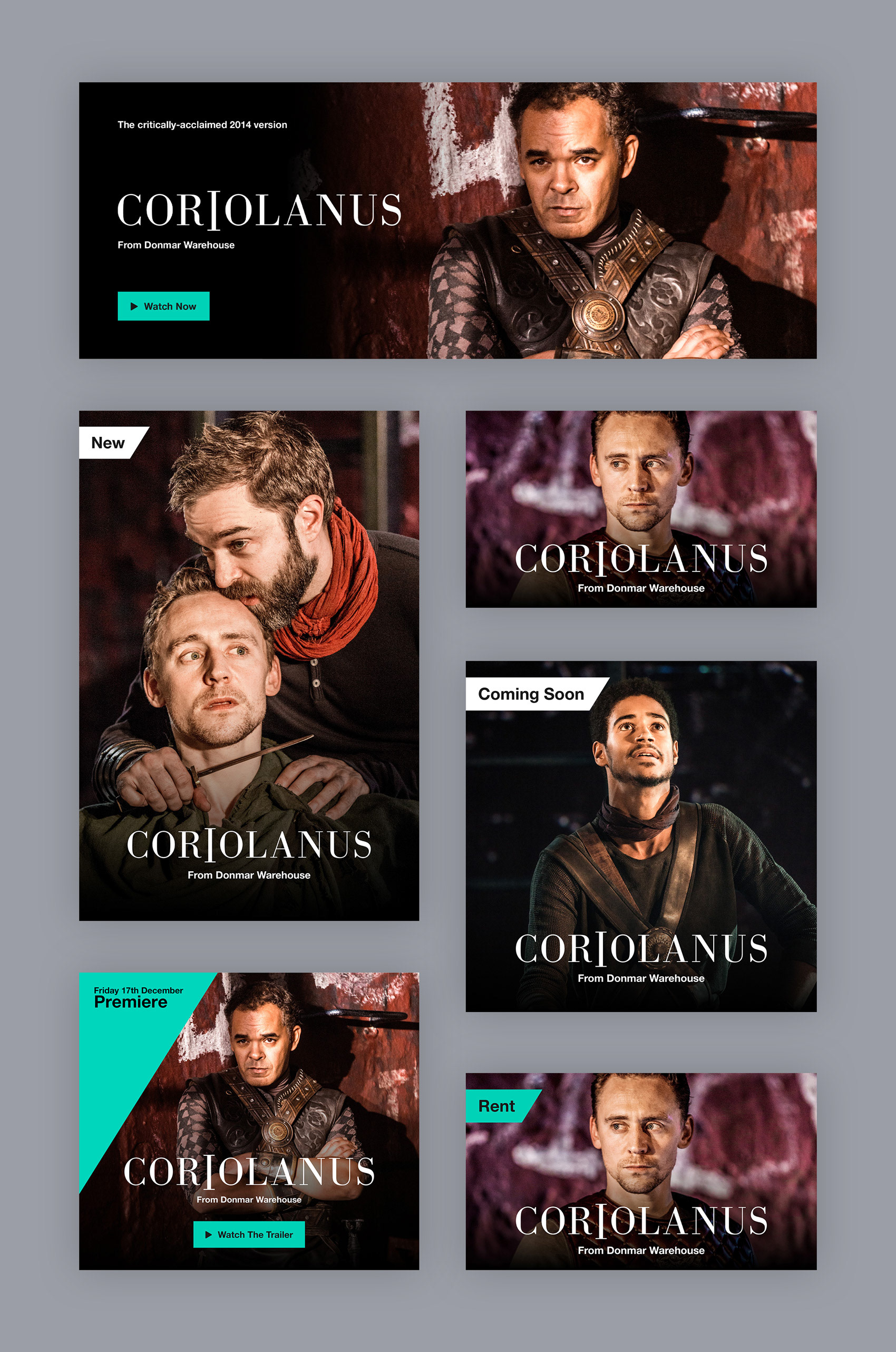
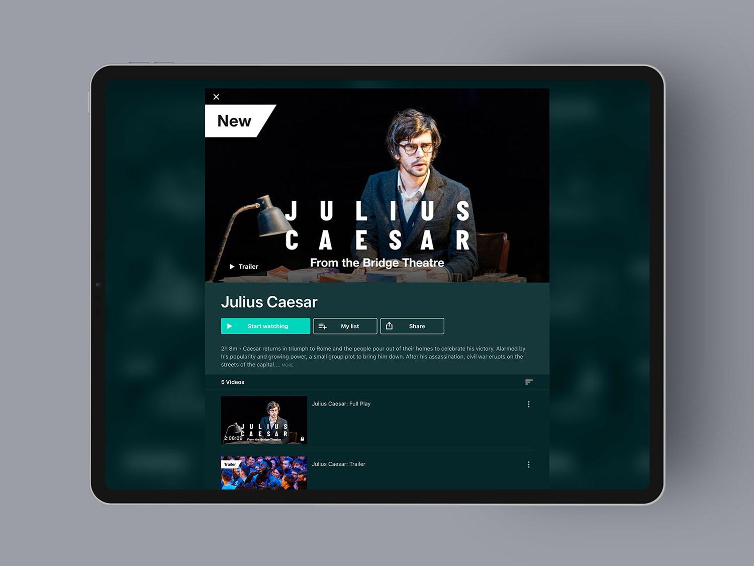
With the NTaH brand mark created in-house by the NT's creative team, there was need to extend it to work in a digital space and across the different design elements that were needed. This included a complimentary colour scheme, logo variations and rules around use for items such as an App icon and site header. In terms of the content, work was done to ensure it was easy to differentiate between content types such as New, Coming Soon, Featured and Rent. A large consideration of the design language how to incorporate the theatre partners & accreditations as well as individual production branding, ensuring it was all done in a way which is completely in-line the core NT brand.
Working within Vimeo's OTT Restrictions
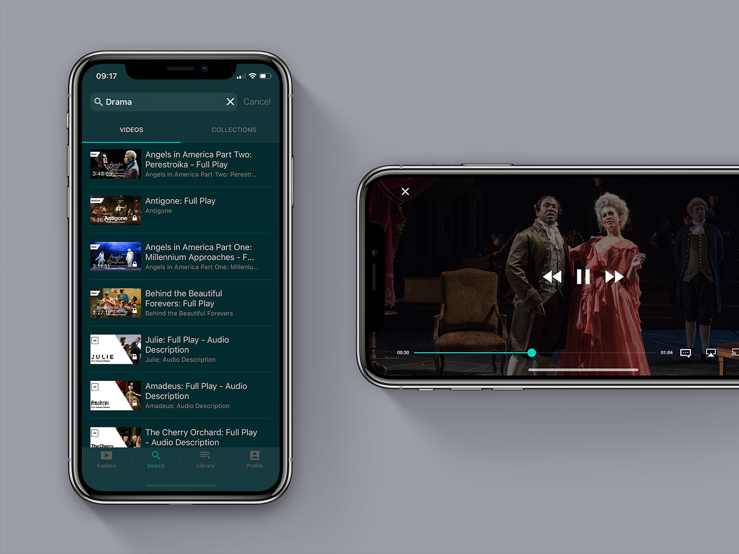
Vimeo OTT is very fixed in design & user experience, so only small edits could be done to the overall look and feel. All brand-focused visuals had to be done by the content itself, meaning the approach to design really had to be dissected & crafted in a way which helped users. This led to a deep dive into the platform & its capabilities & issues to work out the best way to help users navigate through the types of content in a way which made sense. This included choosing specific thumbnail proportions for special content rows, such as New, Coming Soon or some kind of featured rows.
Working Responsively
As the service was going to be available on desktop, as well as in App form for mobile, tablet and across all TV devices, consideration into size of text, logos and colours had to be considered. The thumbnail imagery was the same across all devices, so compromises had to be made to ensure all was still as easy to read on a small mobile device as it was on a large TV.
Completed at Ostmodern.