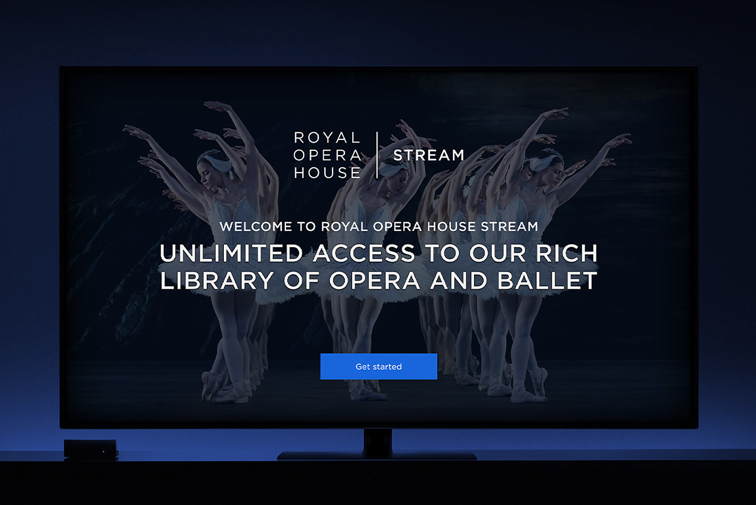
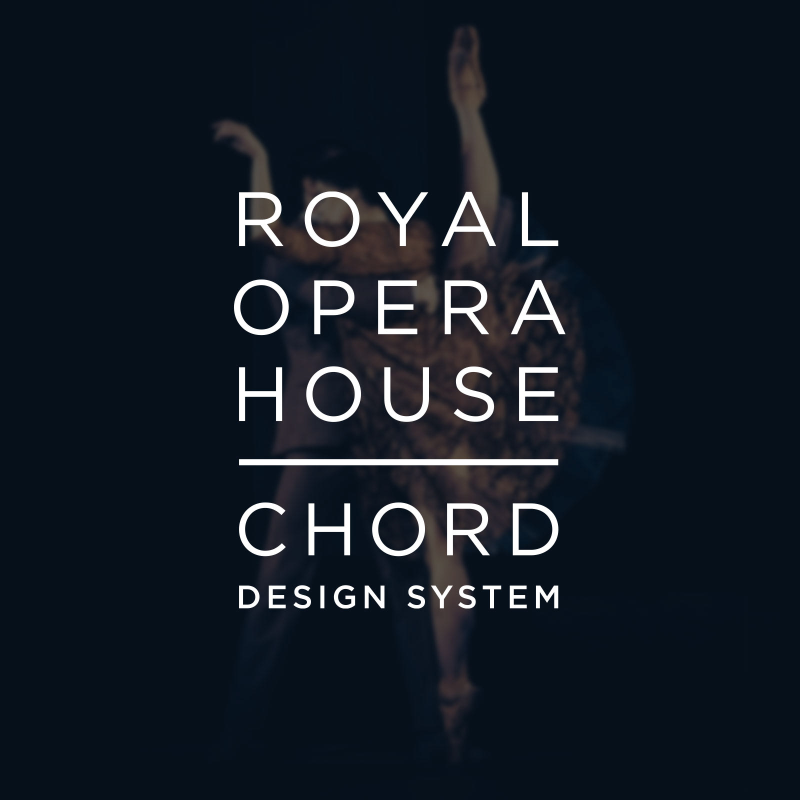
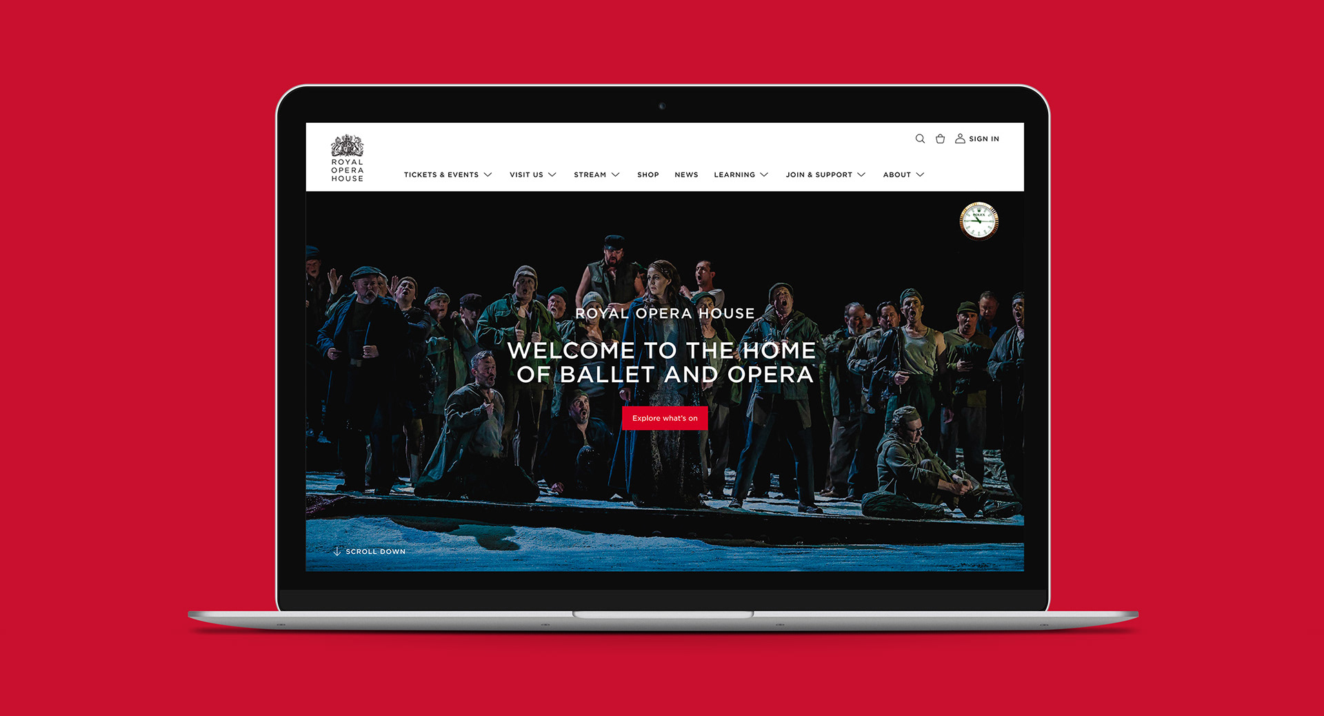
The Royal Opera House wanted to redesign their website to better reflect their brand vision and be in-line with the quality and direction of their print work. Due to the vast size of the website, it was decided that a six month project to redesign the front-end by designing and building a Design System from scratch was the right approach. This could also solve existing issues with the experience, remove all visual inconsistencies which had appeared through various iterations of the design, and also allow the move to a fully responsive layout. It could also act as the starting point to making development simpler in the future.
We were tasked with creating a consistent approach to the digital look, as well as align with the new brand look which had been developed to create a simpler visual style across all media.
Website Audit and Scoping the Project
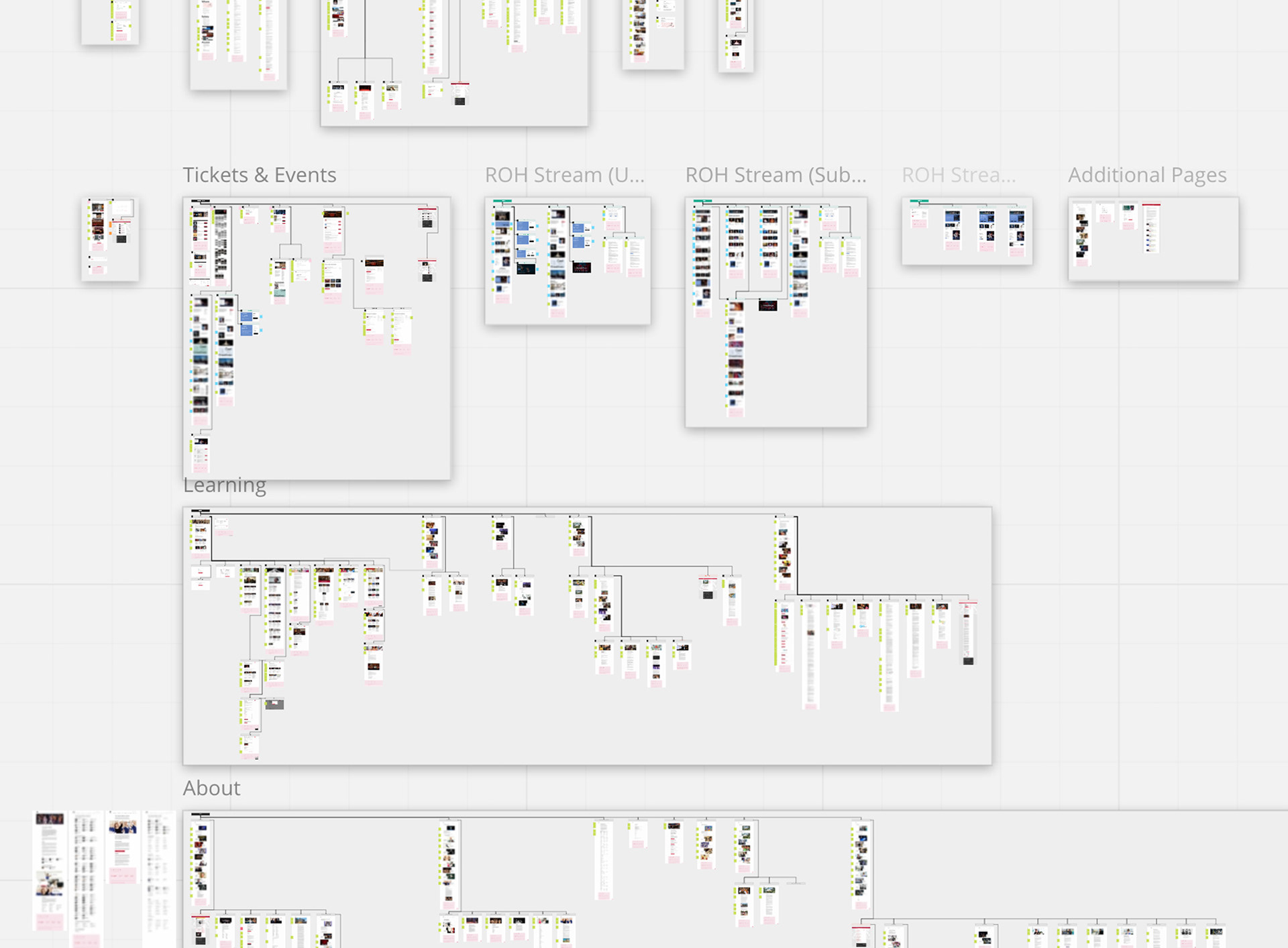
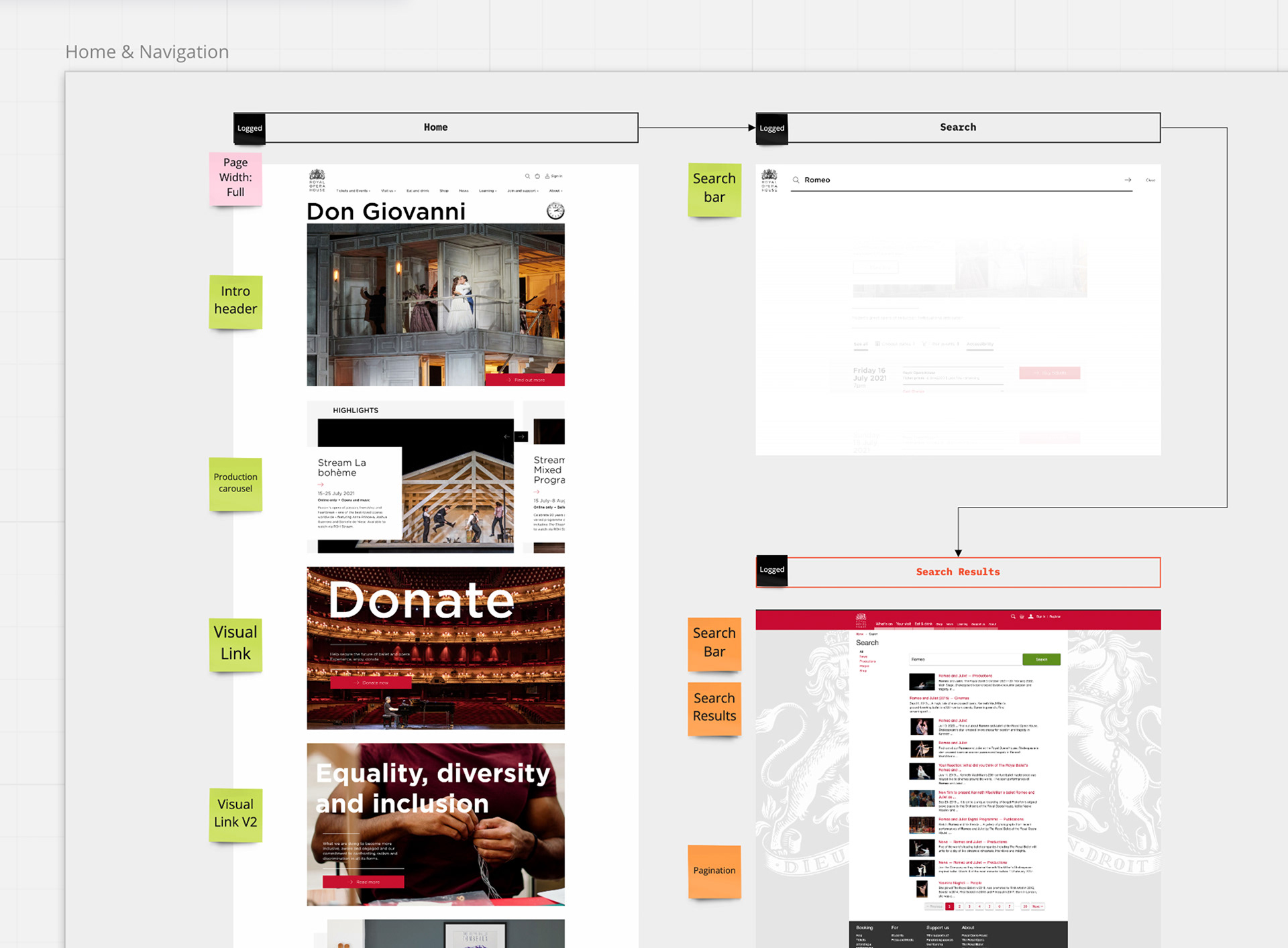
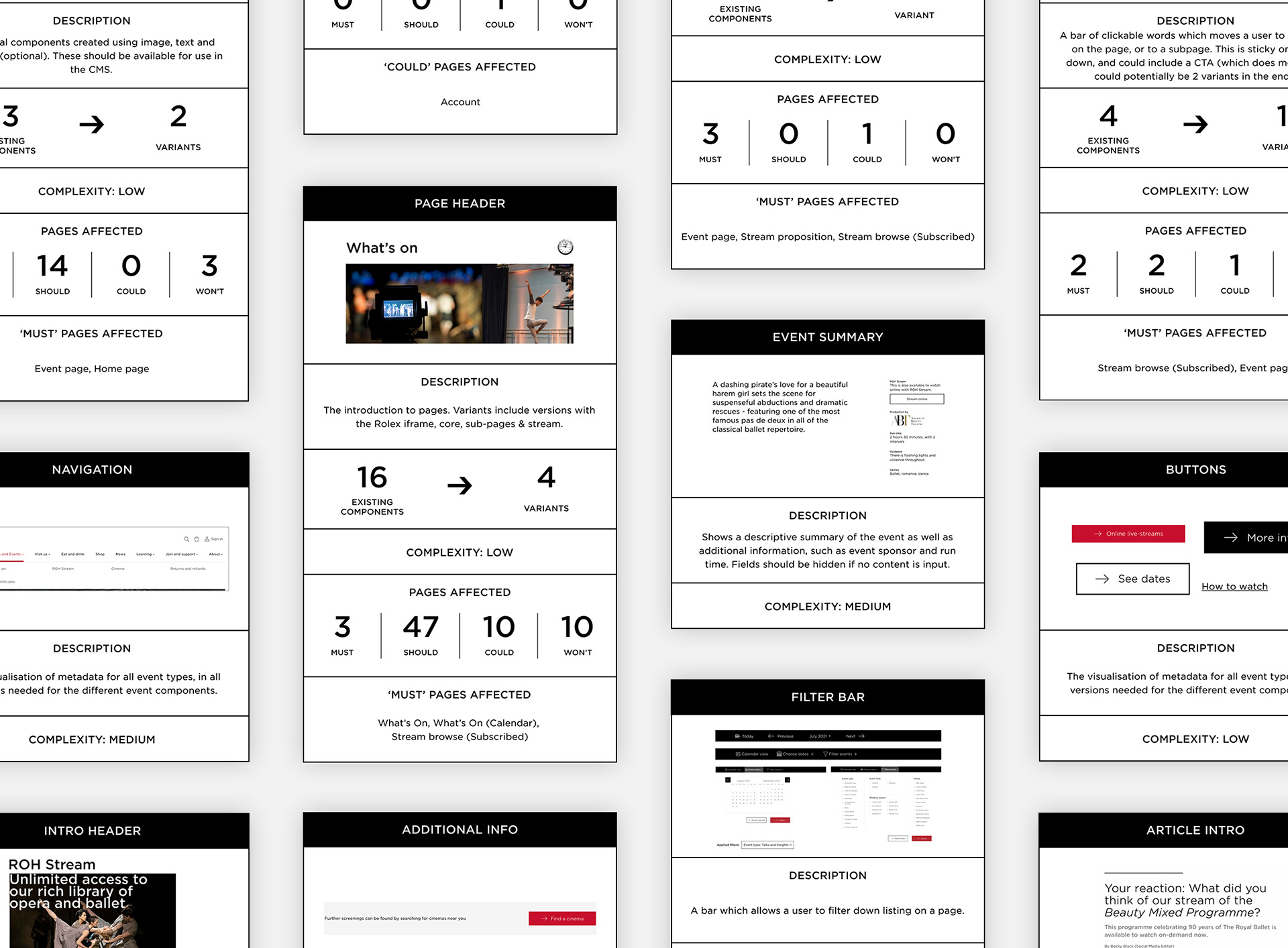
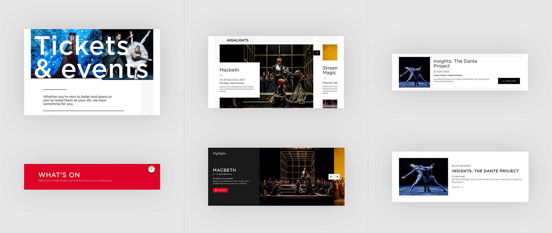
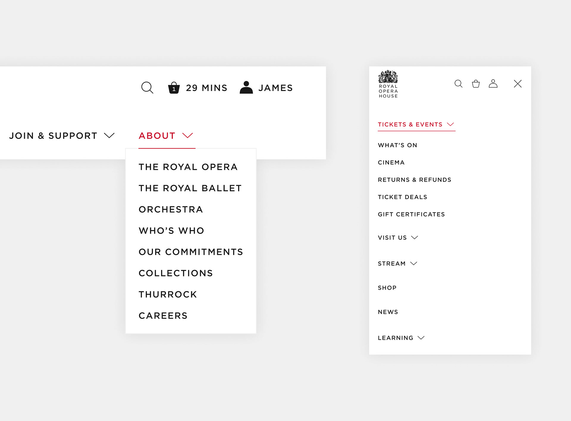
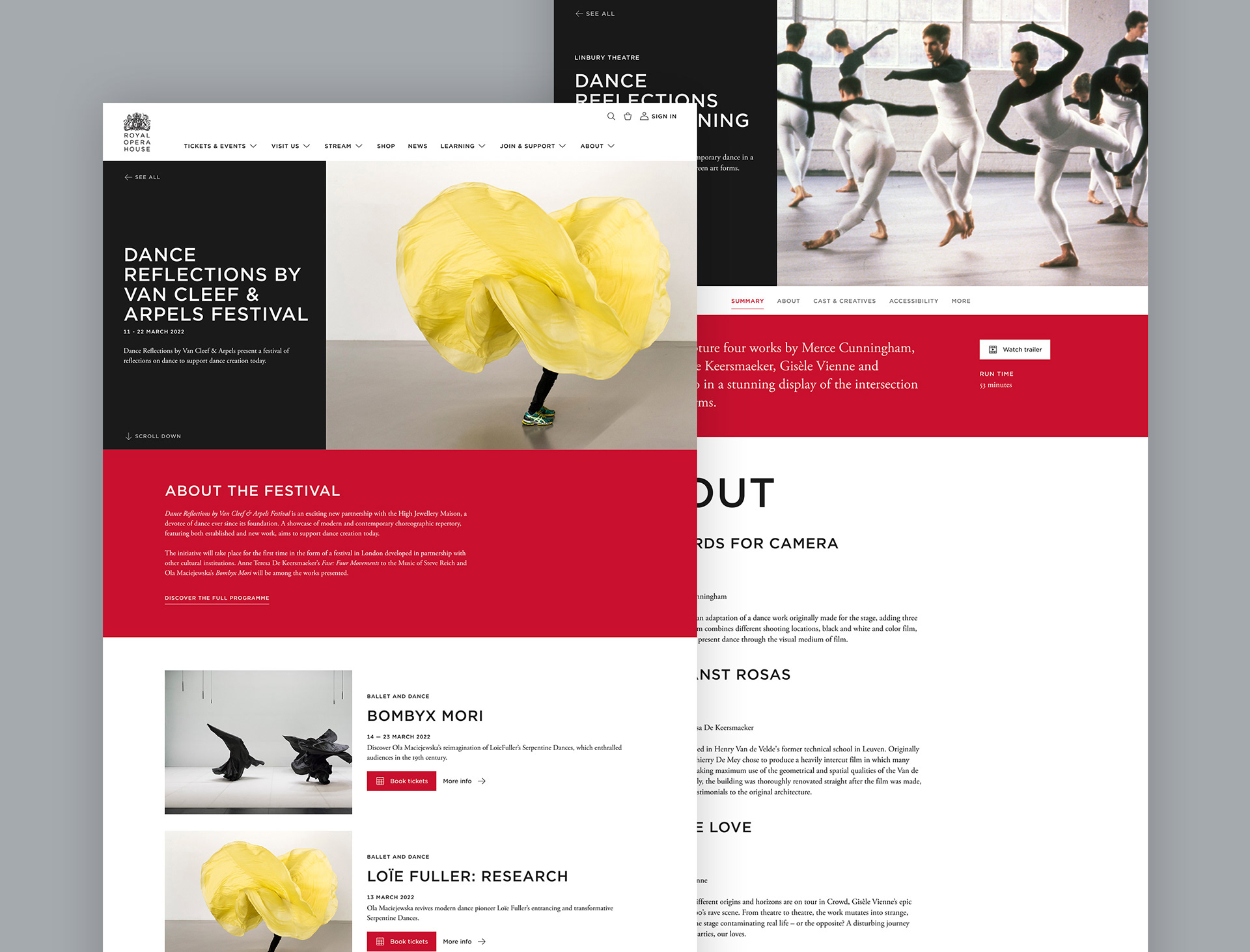
The first step was to do an audit of the existing website to pinpoint the problem areas to address and understand the order of priorities. Due to the site being worked on over a number of years, the main issue was multiple versions of the same components and inconsistent styling. The components were consolidated down into a much smaller list, with what pages they affect, how complex they were and how flexibility could be applied. These were then split down into two groups - ones which are reusable and should live within the design system, and ones which are only used in a single place, but needed to be redesigned.
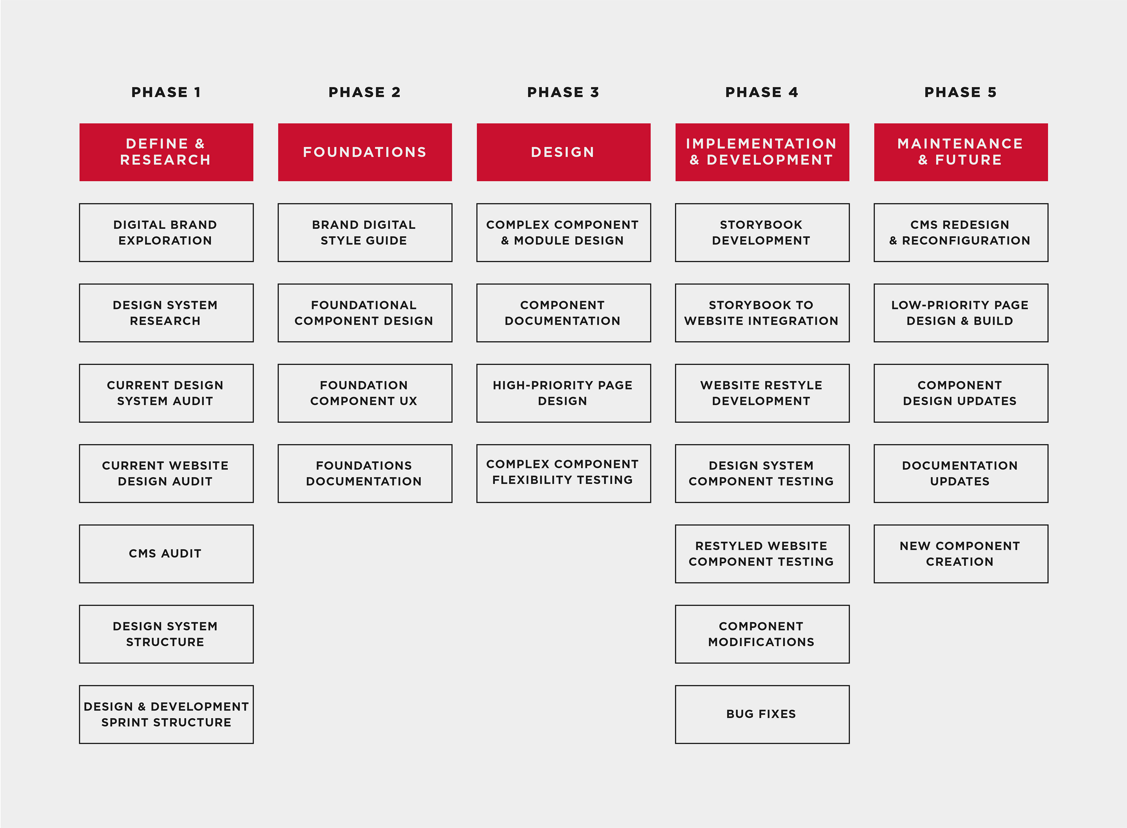
Starting the design system from scratch
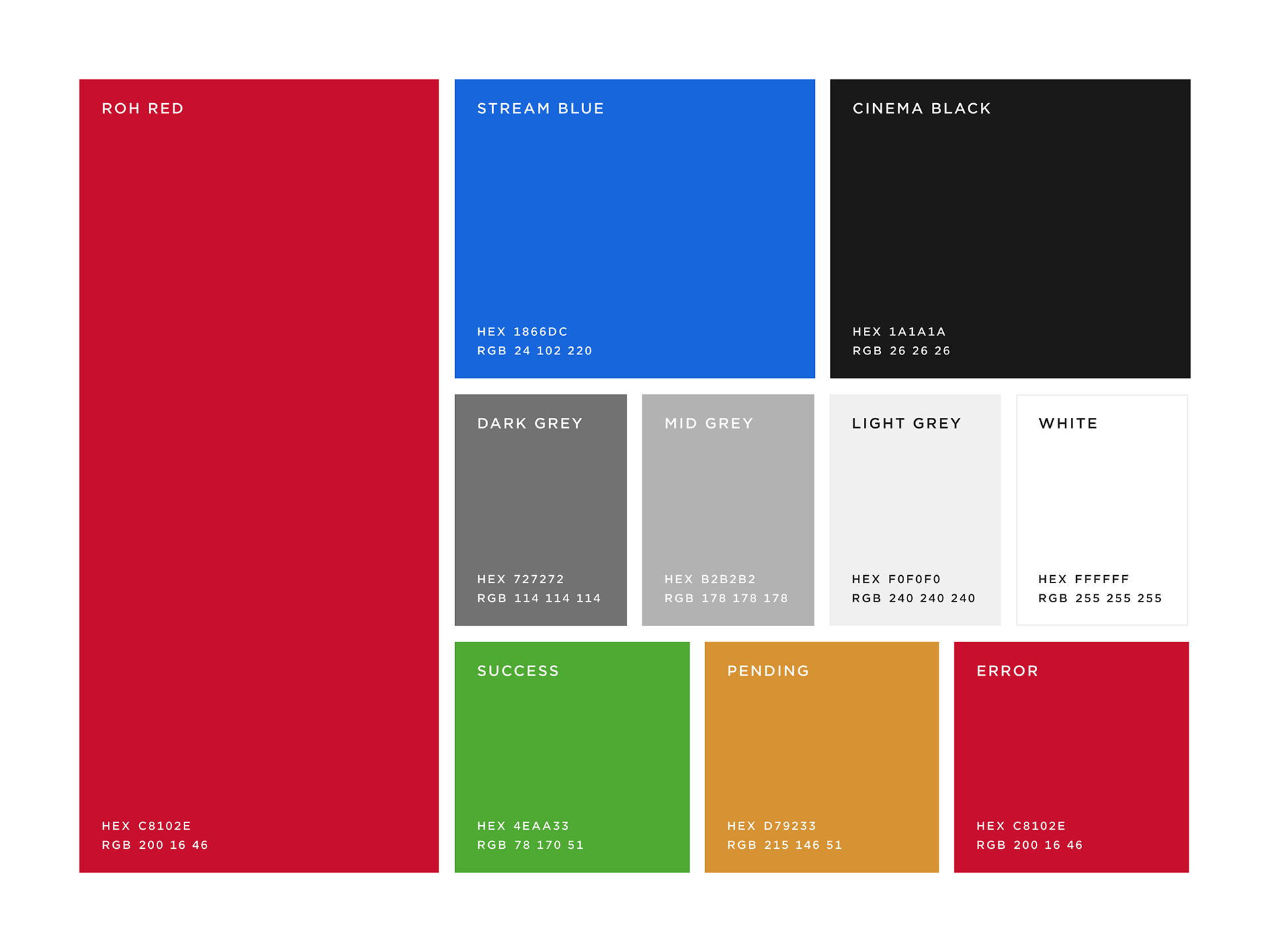
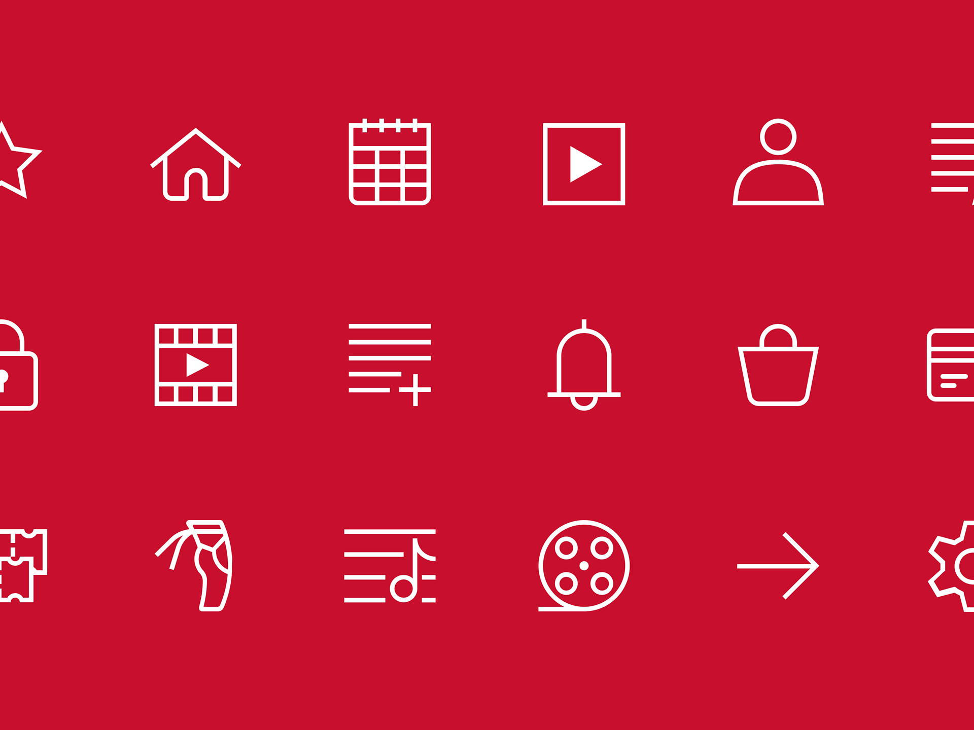
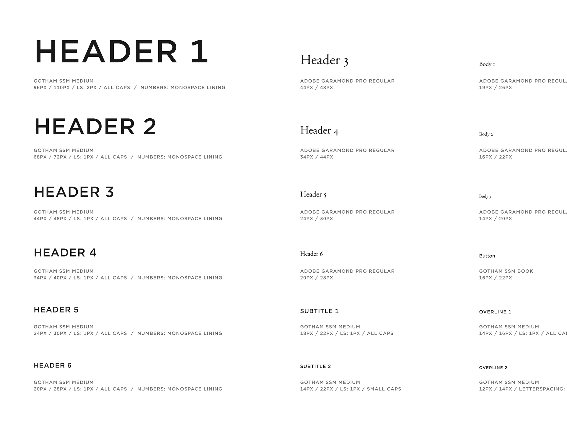
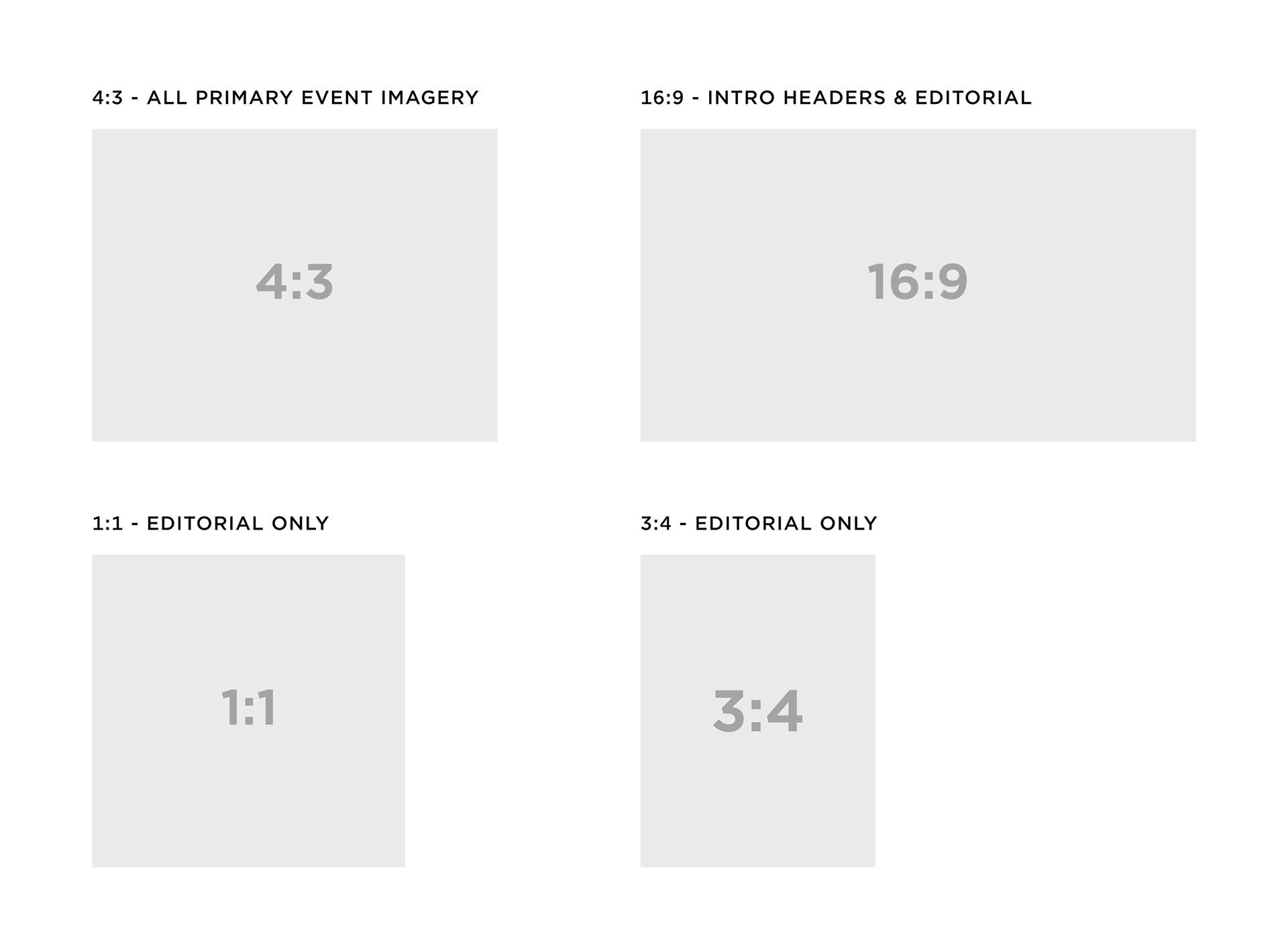
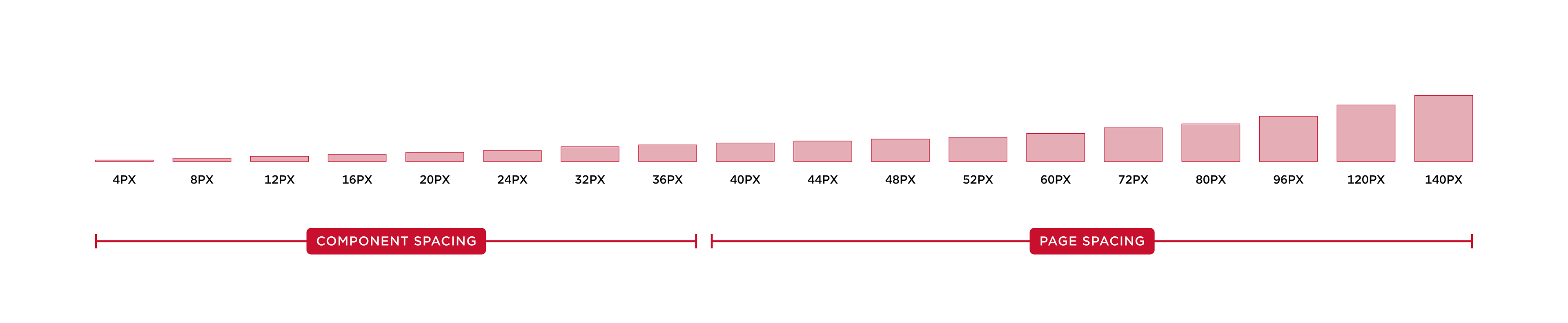
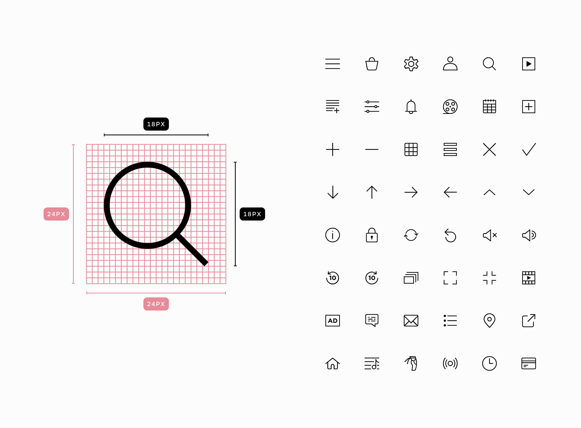
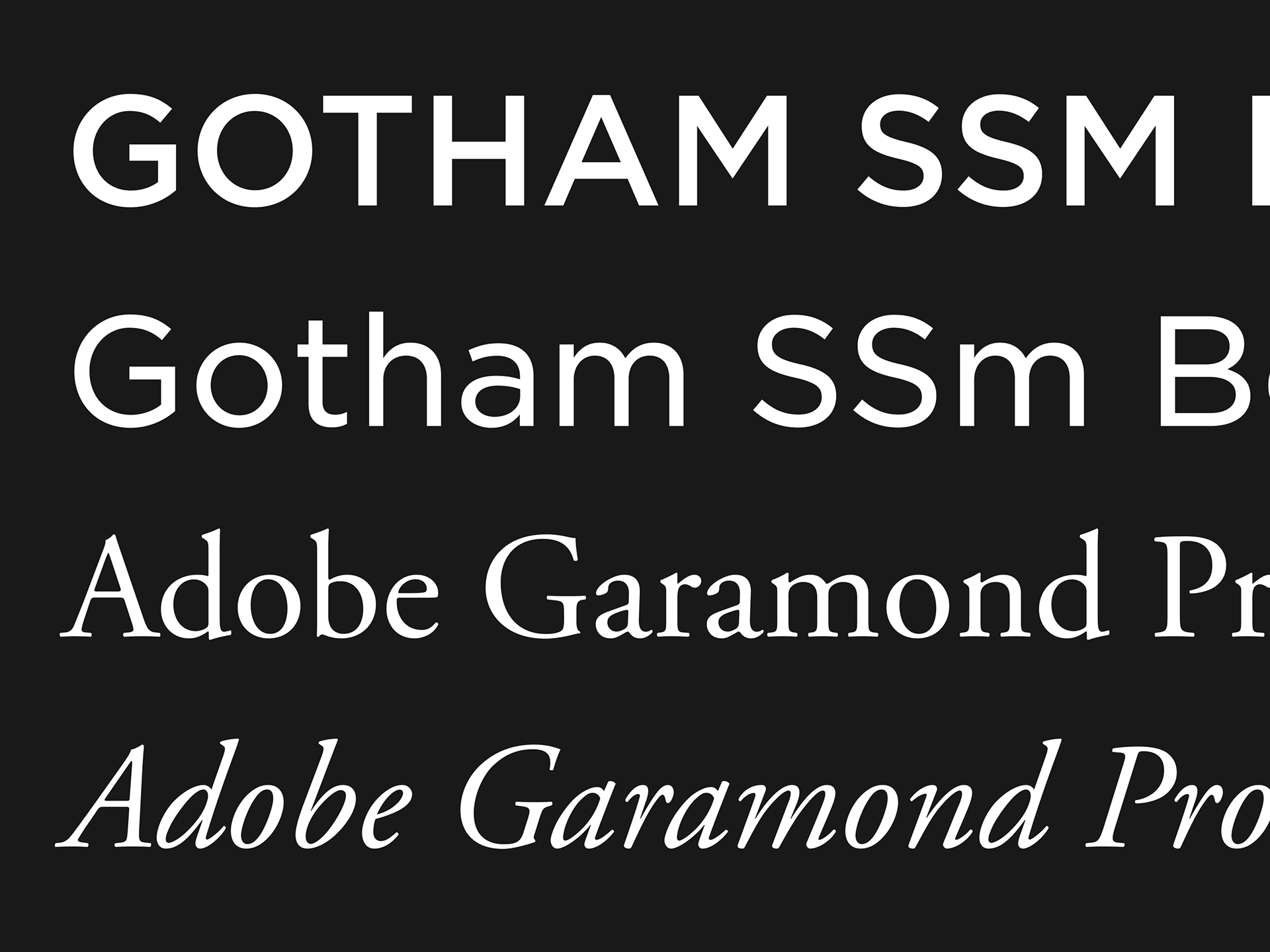
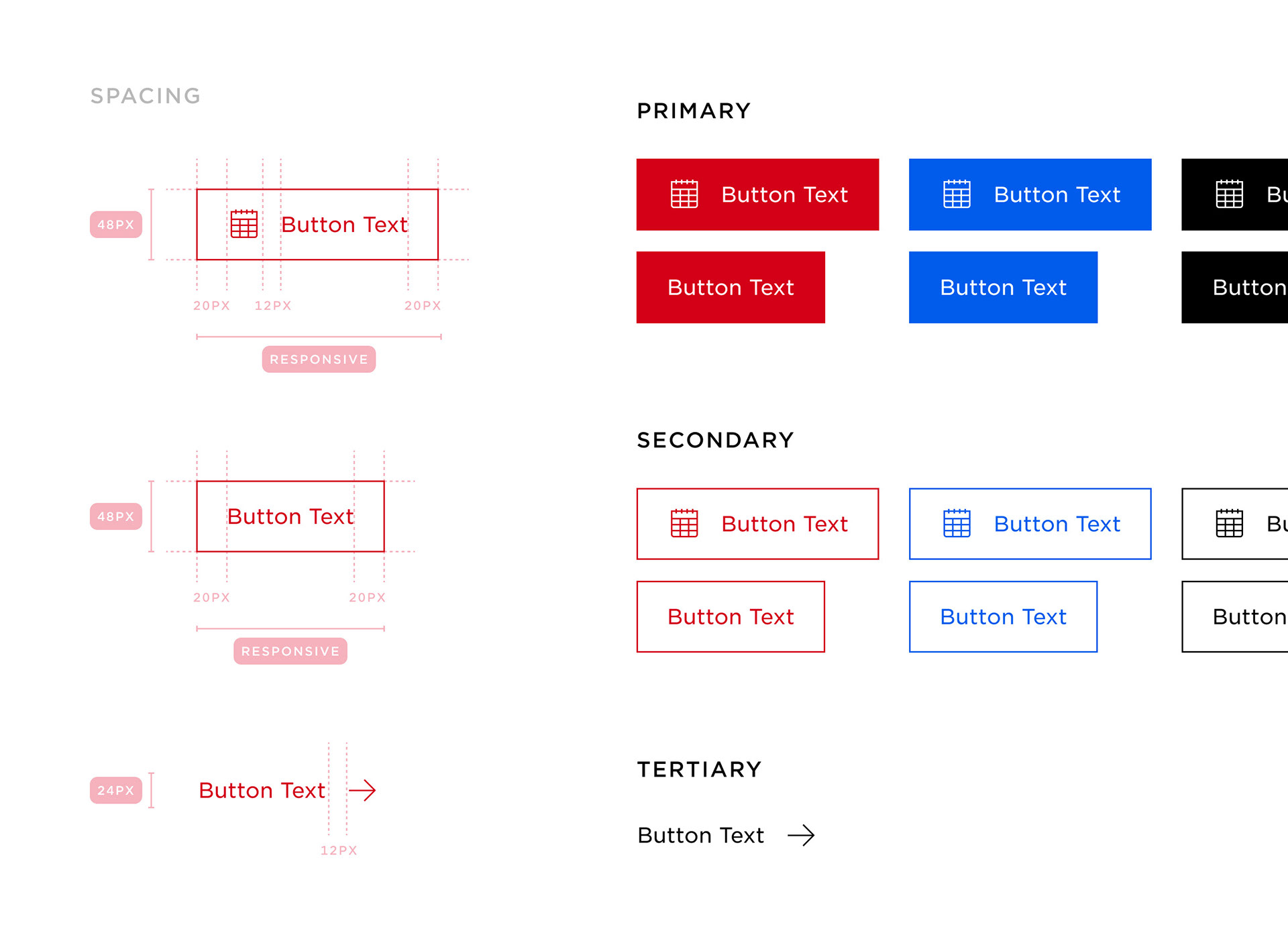
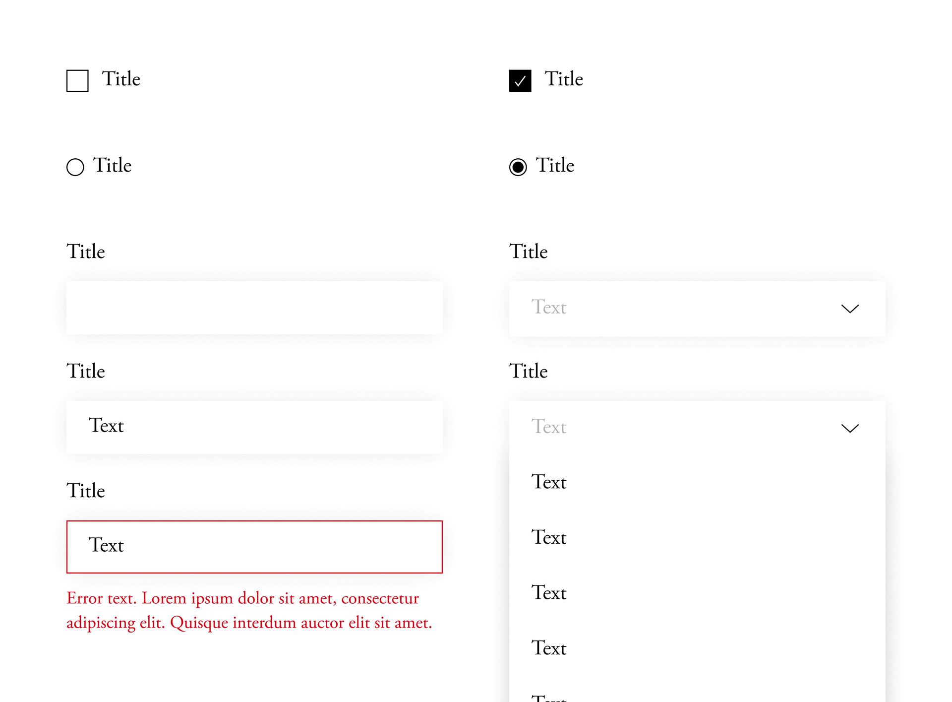
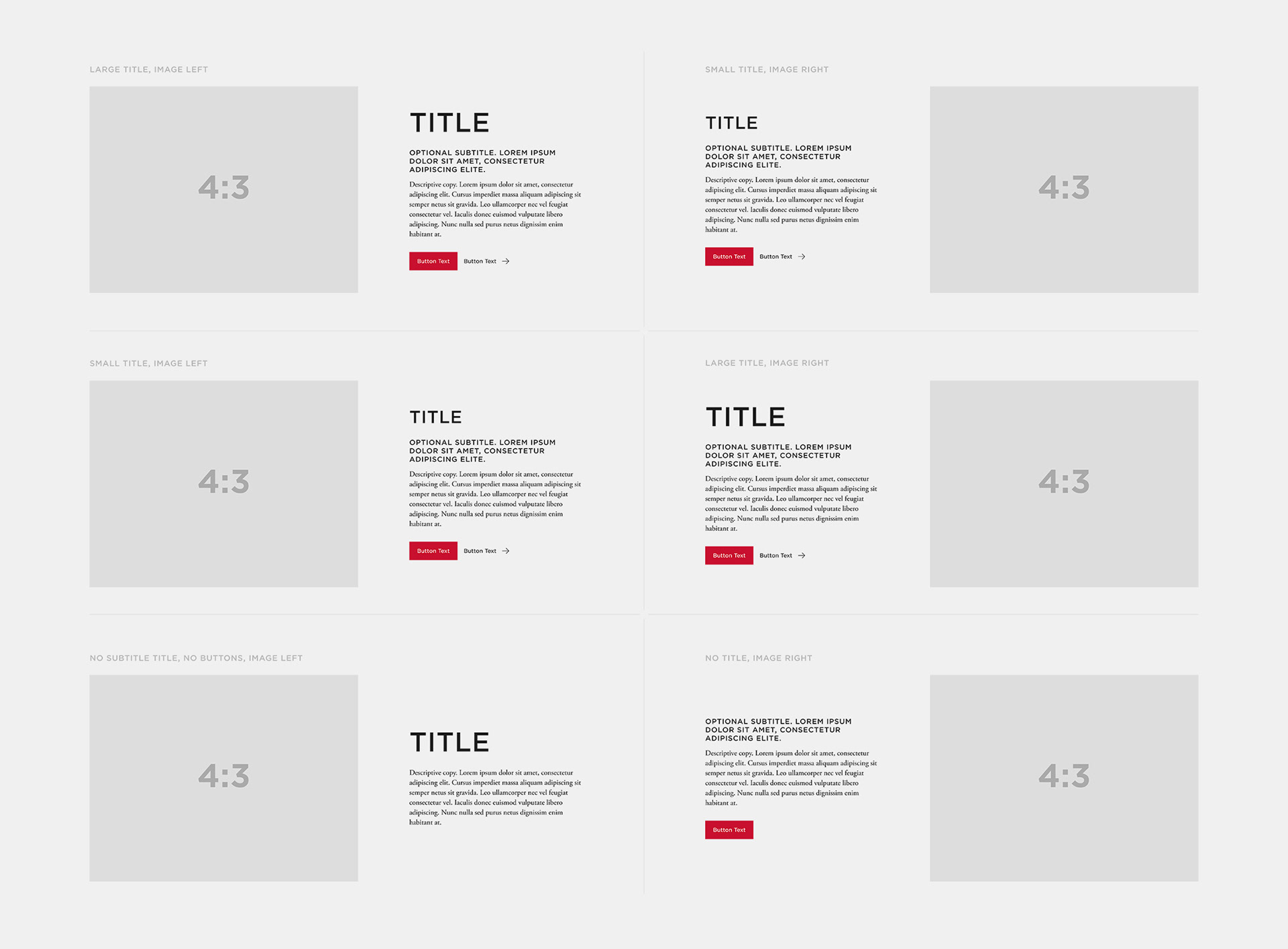
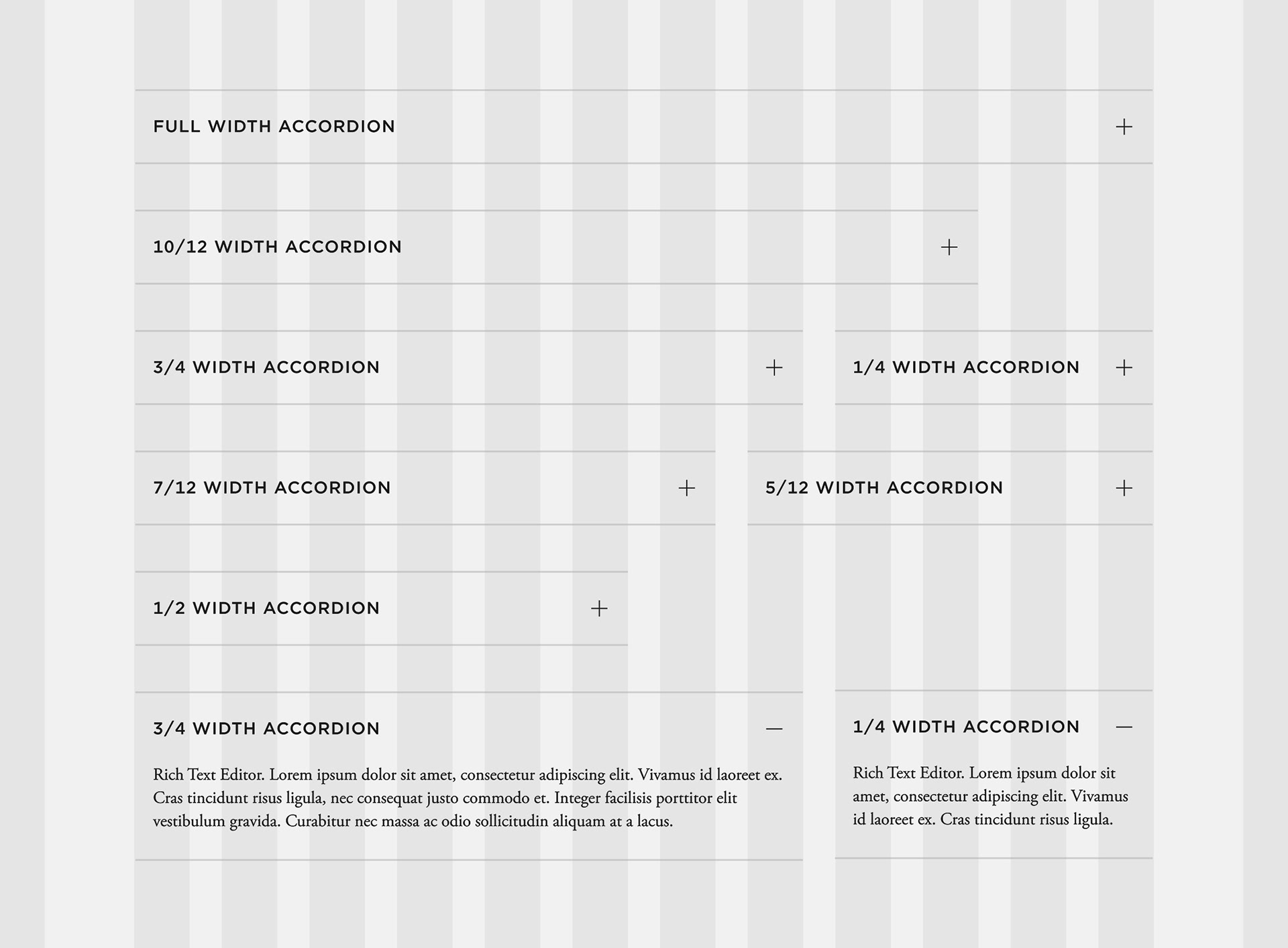
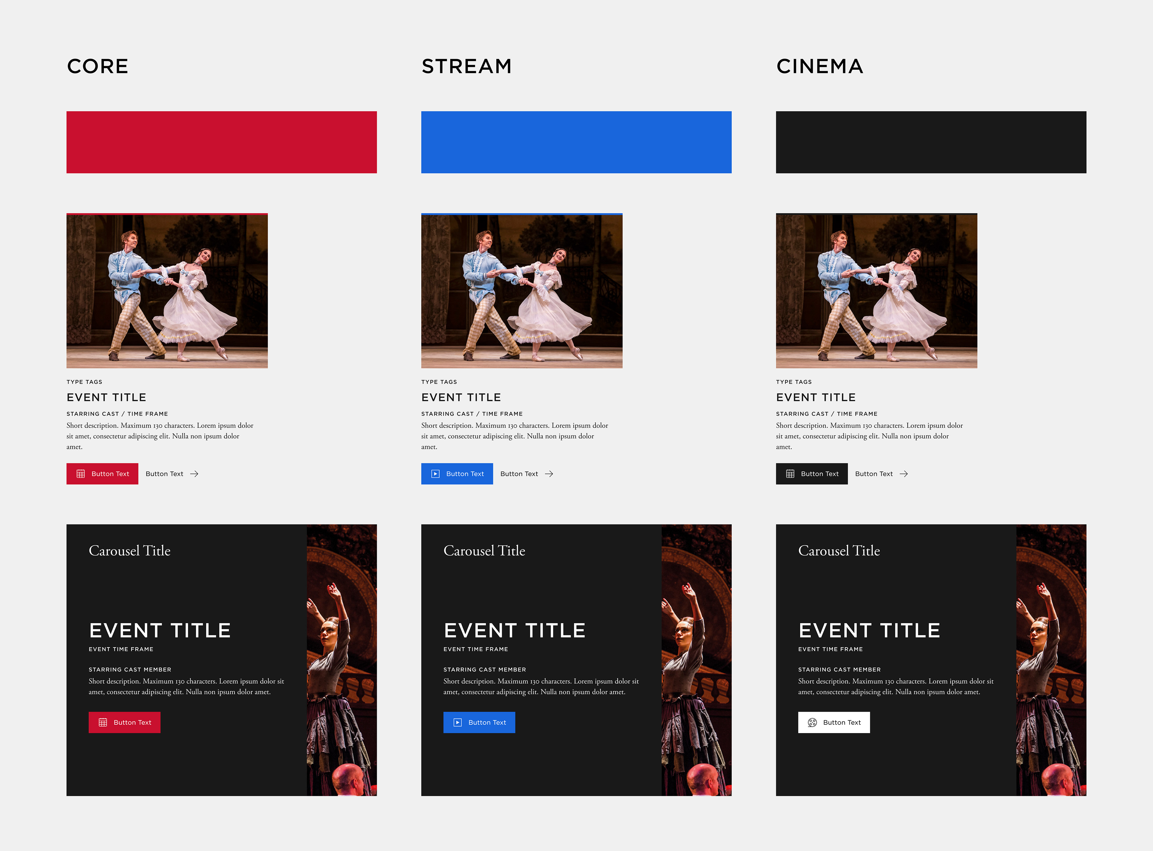
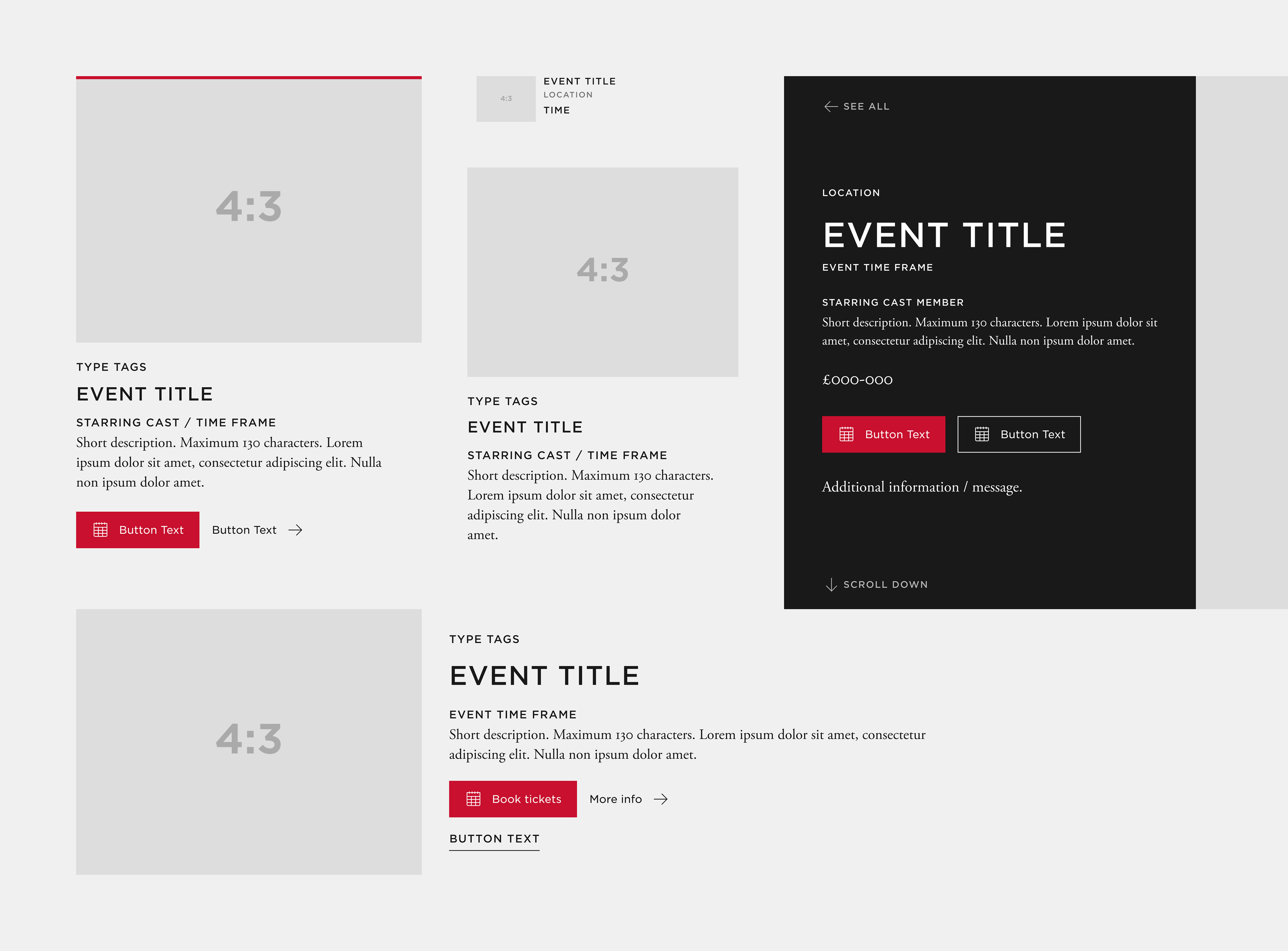
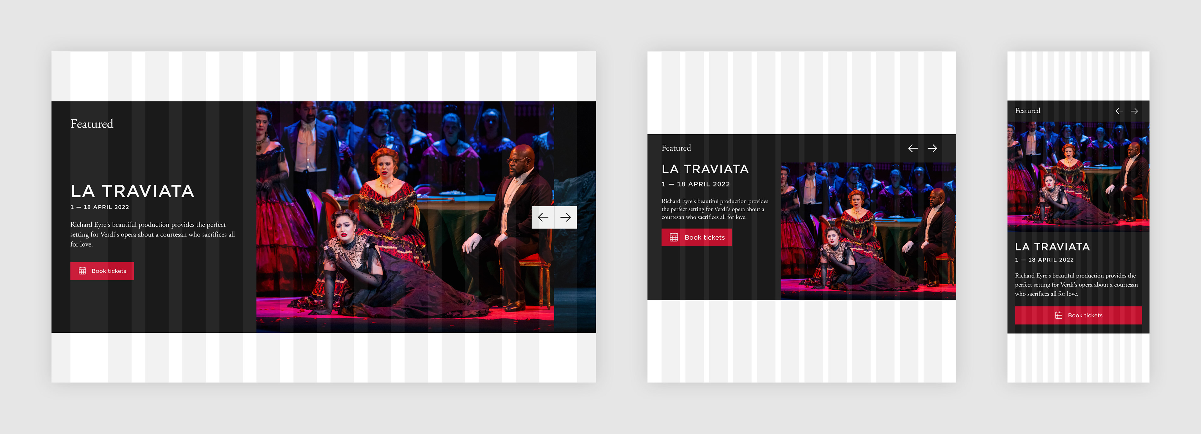
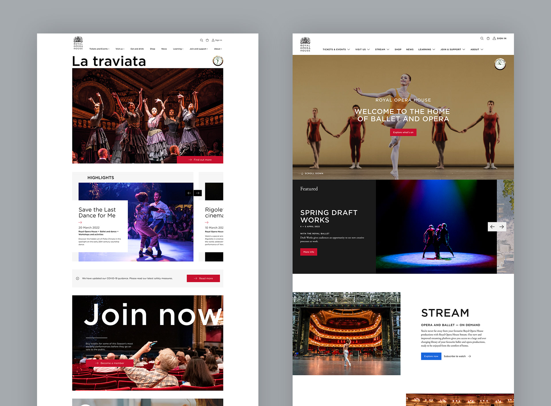
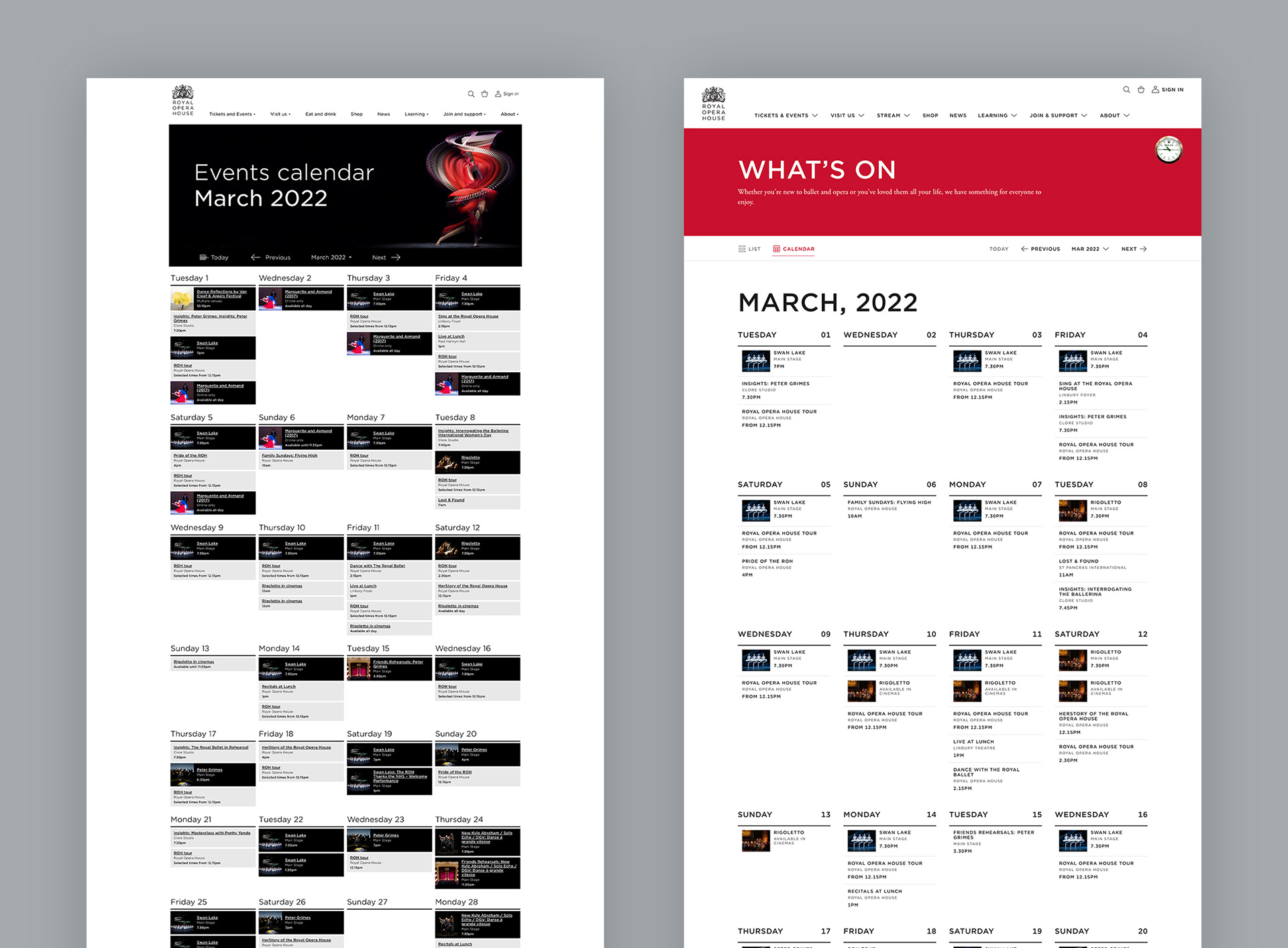
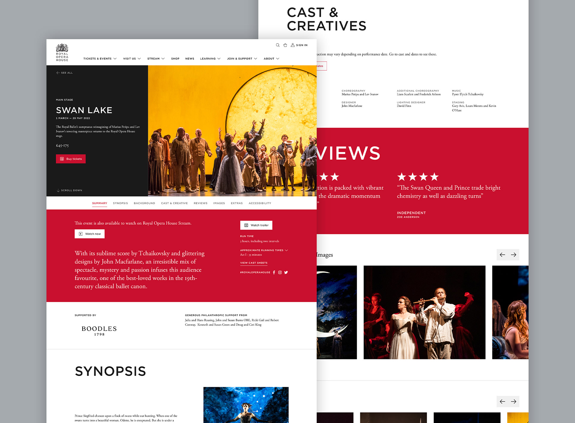
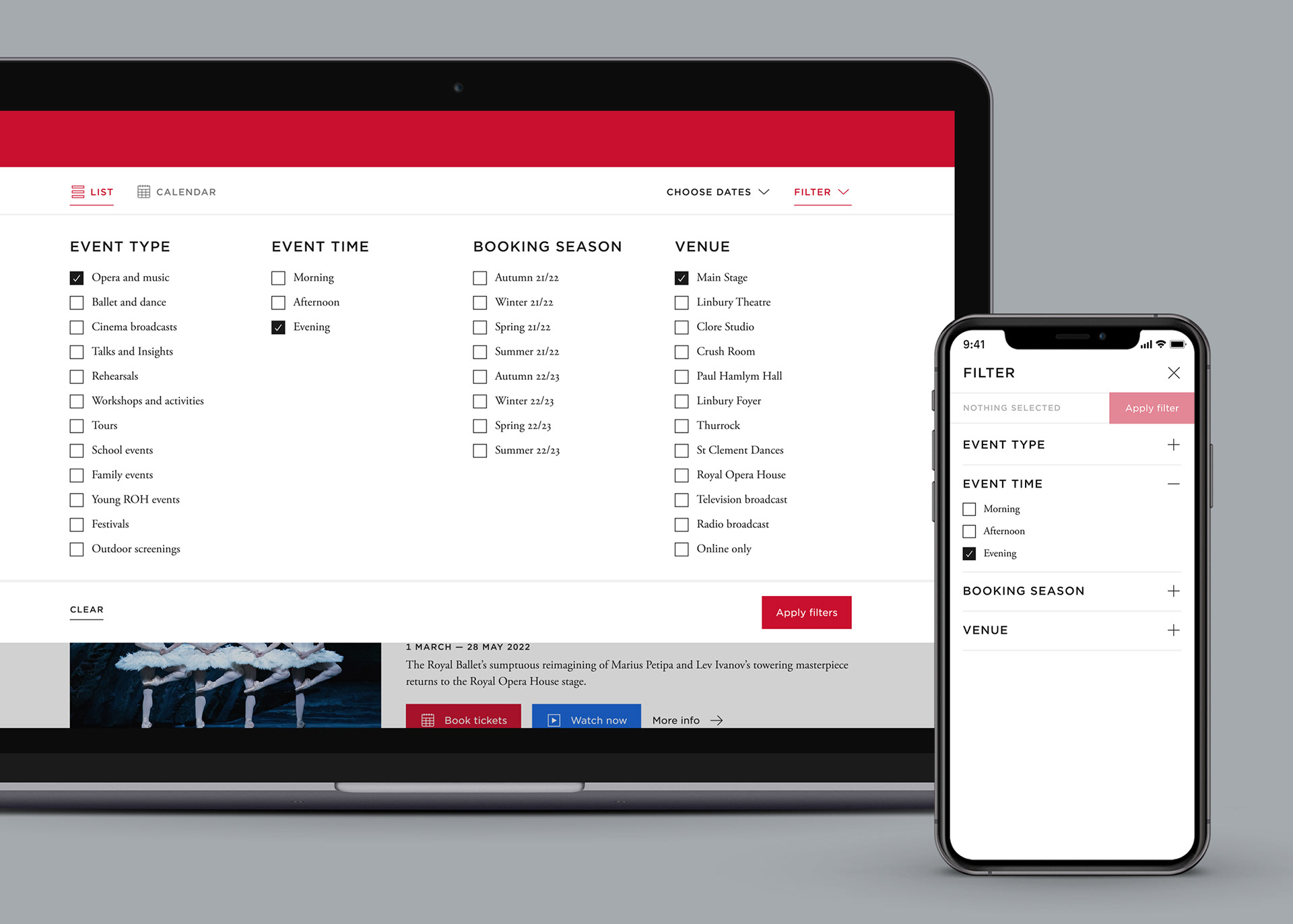
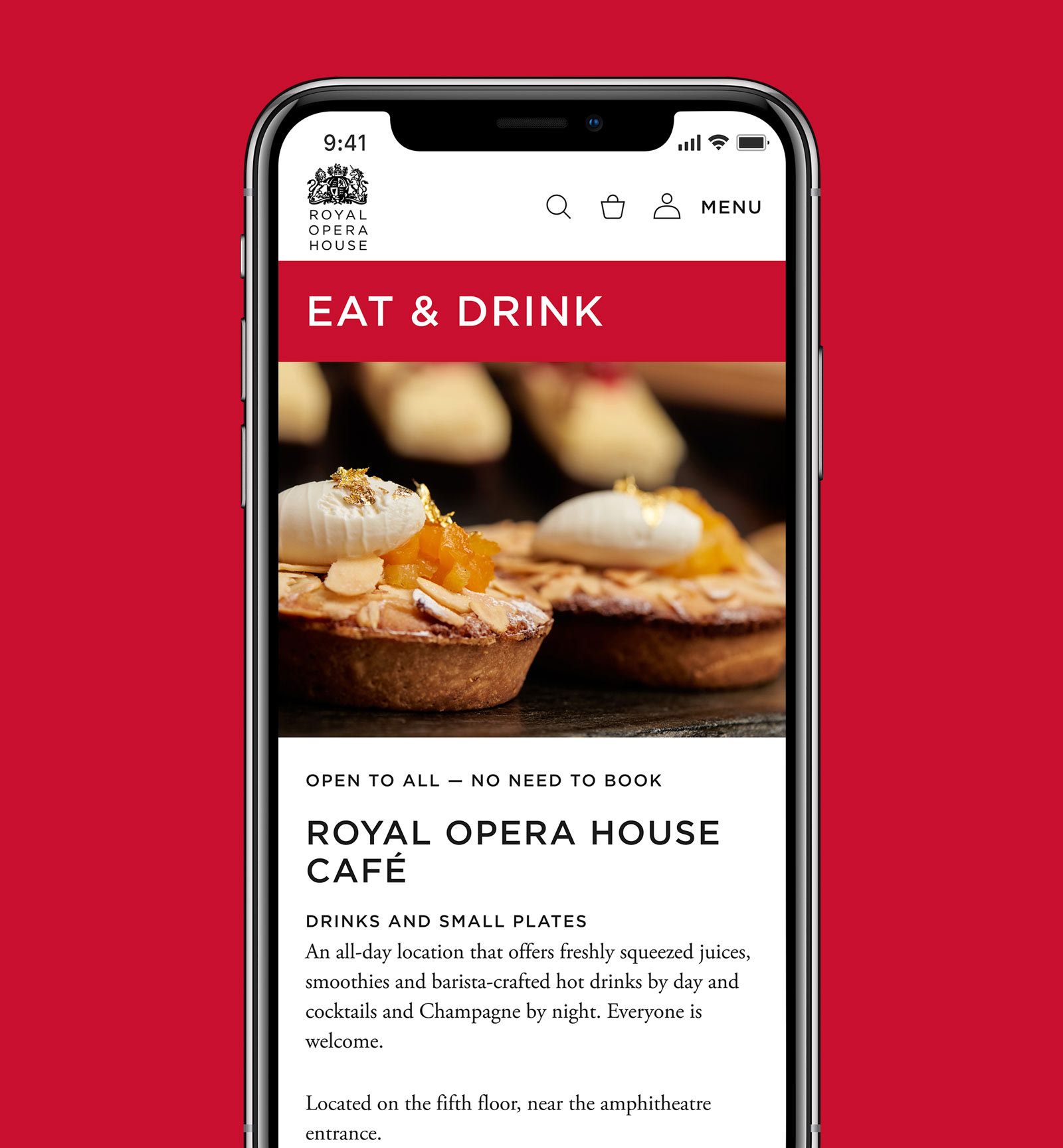
As a new visual approach had been established prior to this project within the Streaming Platform project, the overall styling was set but needed to be refined to work into a Design System build-up. Starting with foundations, a new approach to grid, breakpoints and spacing was created from scratch to allow for a fully responsive approach. Alongside this, new rules for typography, colour, icons and image were developed. Atomic components in buttons, tabs, input fields and user selection tools were also redefined.
Redesigning components
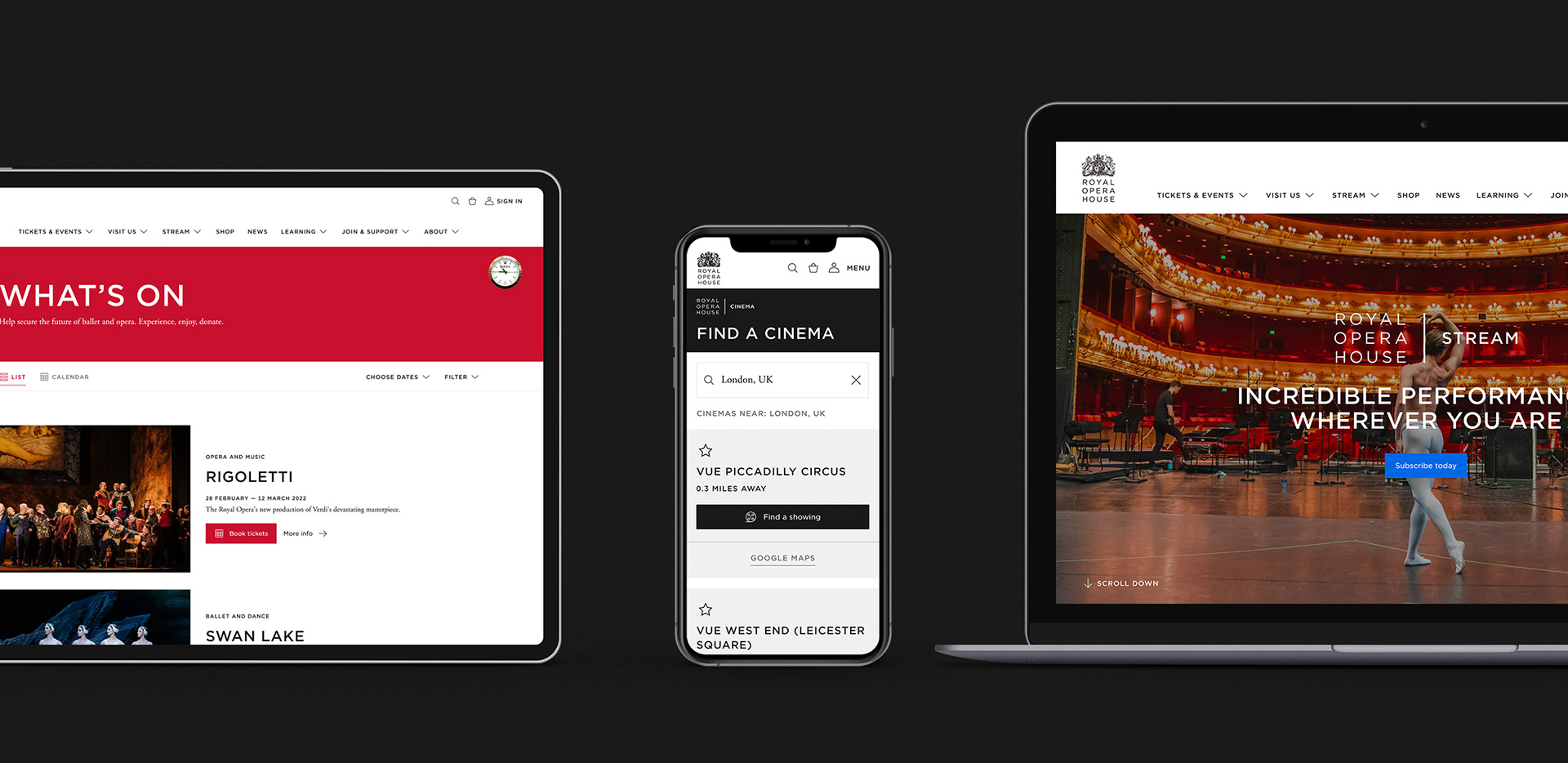
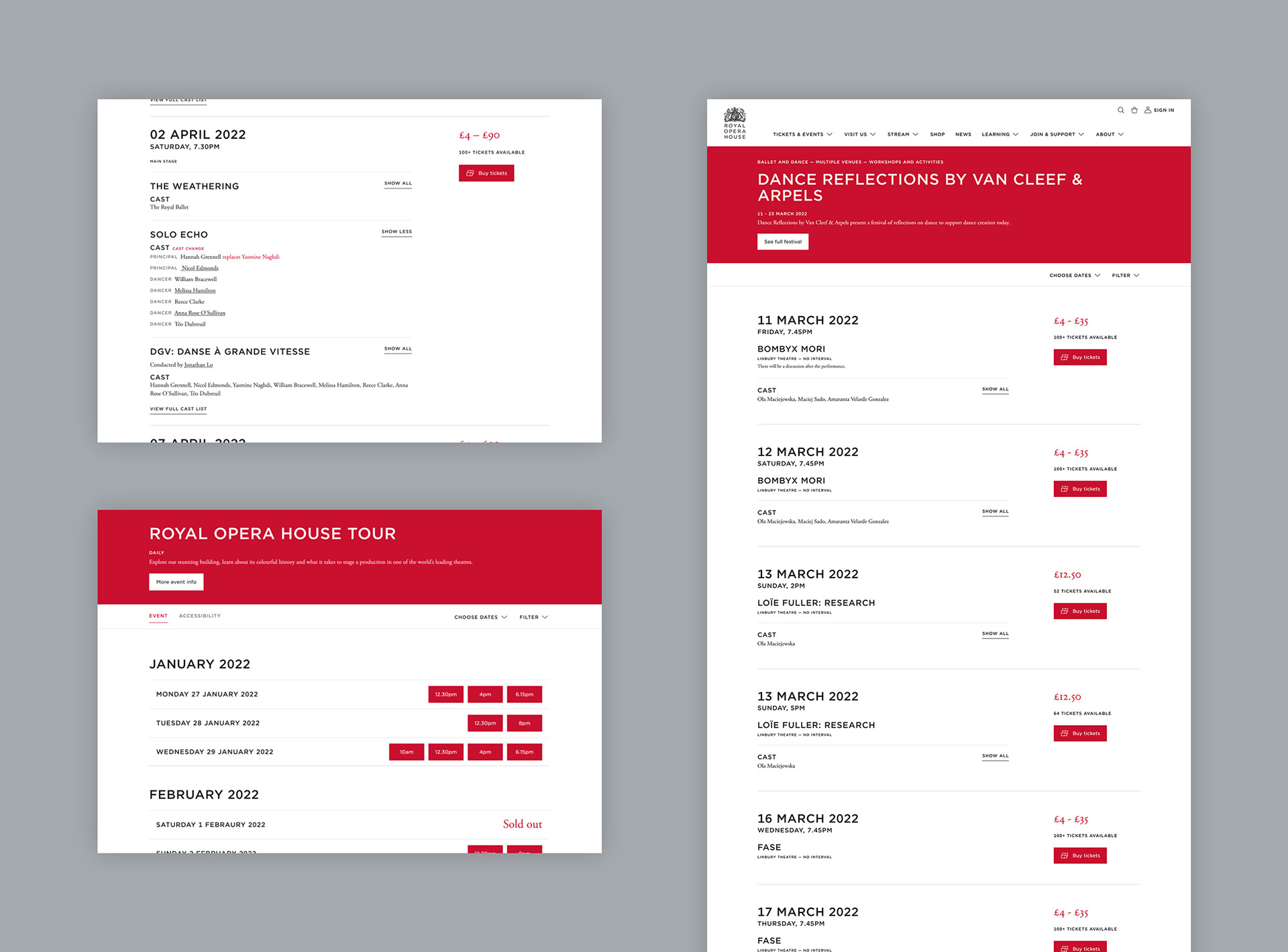
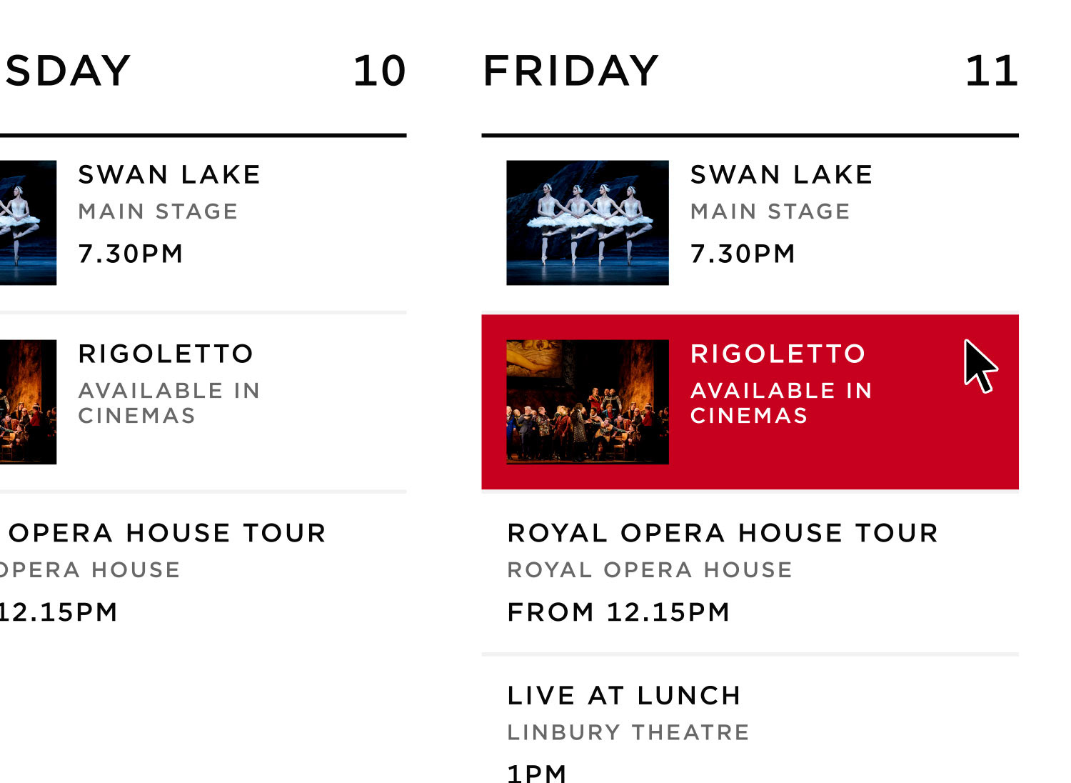
Through auditing existing components it was clear that a lot of consolidation was possible, with a single component able to be used in a wide range of scenarios by simply having flexible elements within it. Alongside this, there was work required to refine components to work better across all breakpoints and fix the mobile issues, as well as working into the amount of screen height each component should take based on function and to ensure the best experience for users. Editorial rules were also implemented to ensure typography styles, image proportions, spacing and maximum character counts could not be edited within the CMS, unless it is a flexible editorial component where this may be required.
Implementing the Design System
It was clear through the initial audit and CMS audit that there was a lot of duplication. As the new design system components were built on Storybook, the number of pages were simplified down into template types and rebuilt using the new components. Alongside the editorial rules placed on components, it meant creating new content could be done a lot faster and with the confidence that it would be of the right quality every time. This approach also meant that any changes to the foundations or components could be run through everything immediately rather than on a page-by-page basis.
Completed at Ostmodern.