Following 10 years worth of design, rebrands and product transformation, there was a clear need to unify the UI design language across NOW. While on the surface it appeared there was consistency, it was clear that there was an ever growing need for a source of truth for designers and developers working on the various platforms which the product sits on including Web, iOS, Android, Amazon, AppleTV, Roku and XTV. With many individual requirements per platform, and a variety of designers and developers moving in and out of projects, unifying the designs in a design system would be a way of future proofing and ensuring design and development decisions could be made with solid rationale.
The main aim of this project was to create a single source of truth of a unified design language which spanned all platforms, for developers building the service and for designers creating new experiences.
Initial audit and building solid foundations
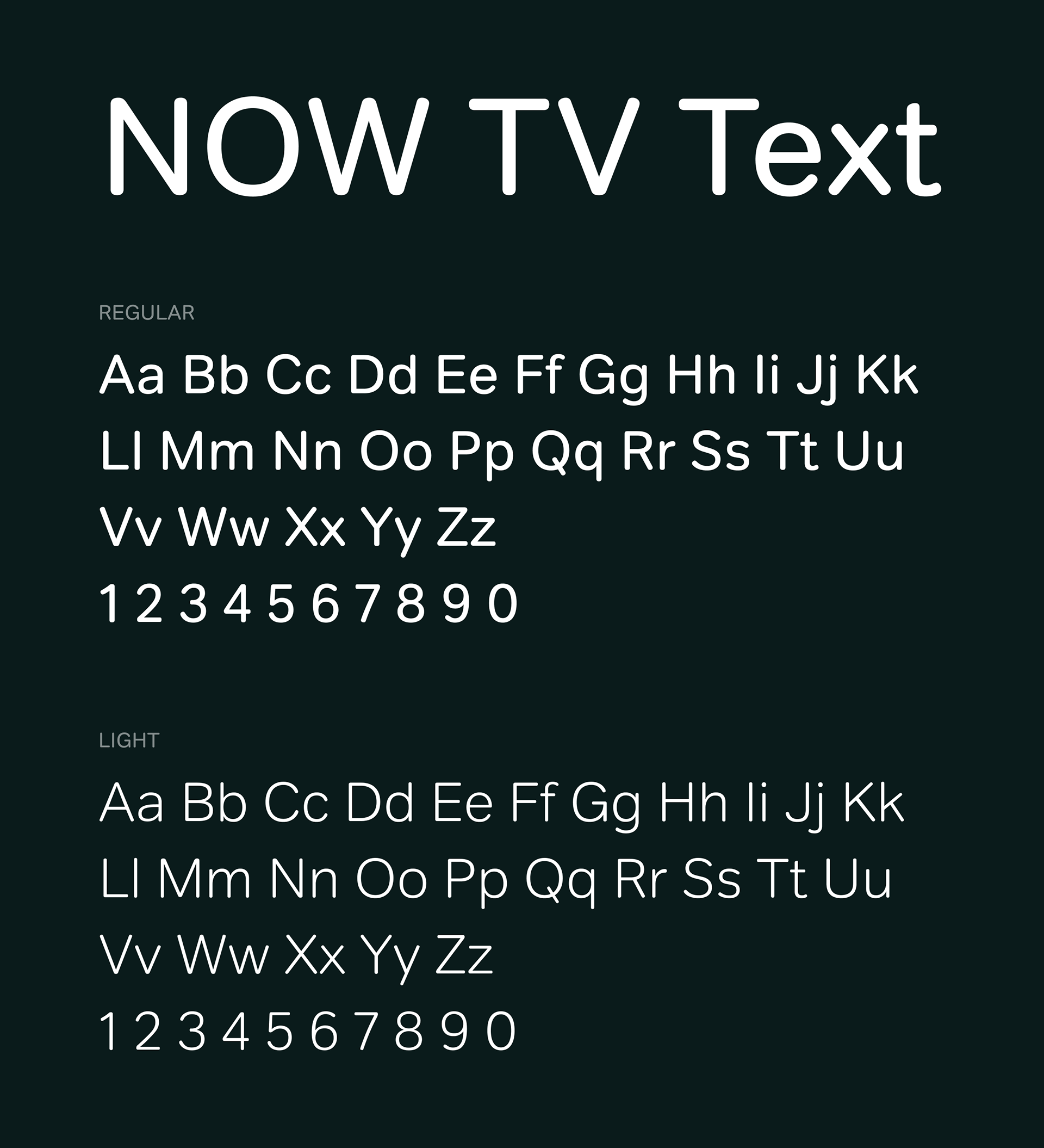
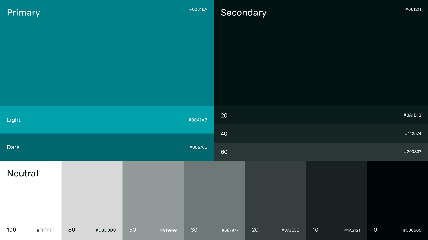
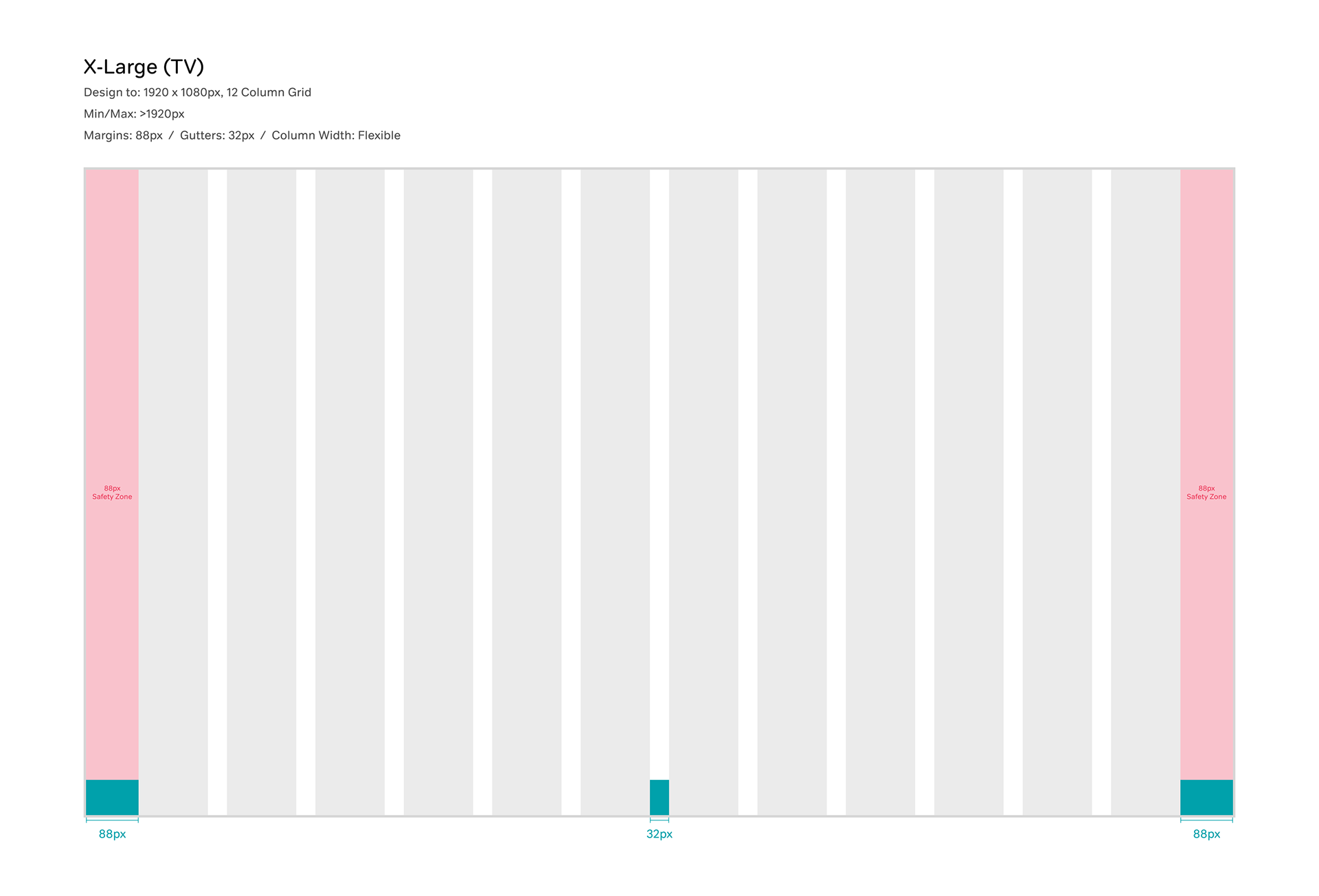
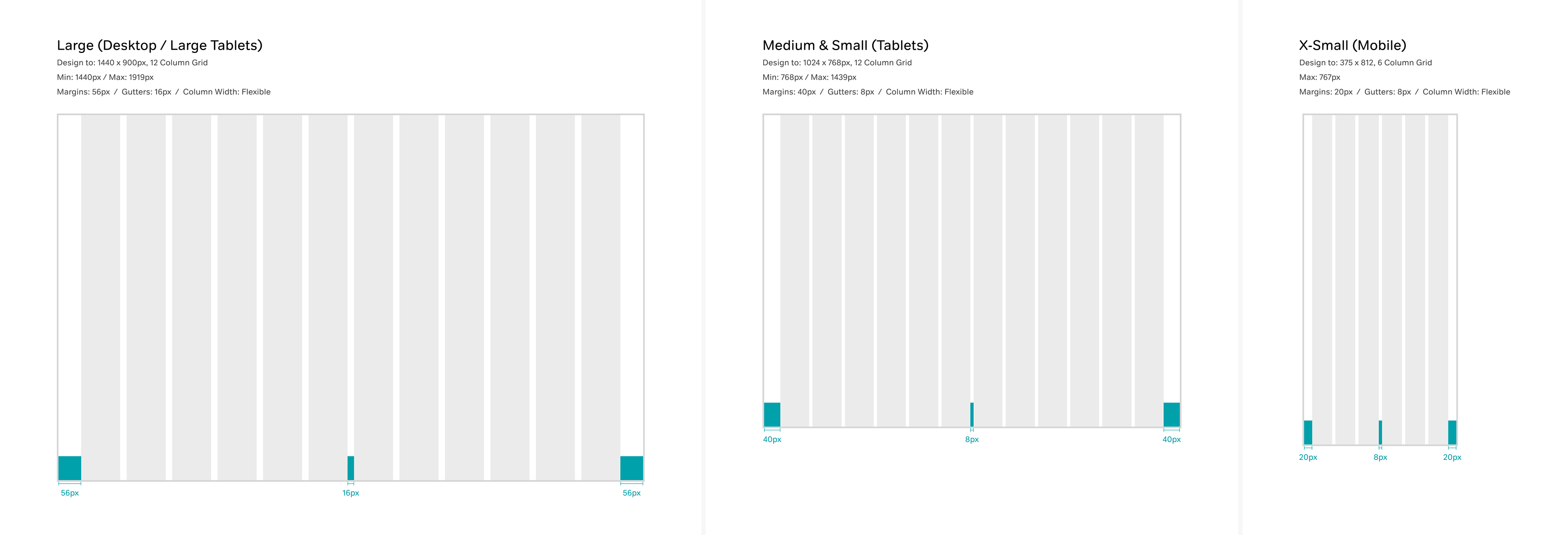
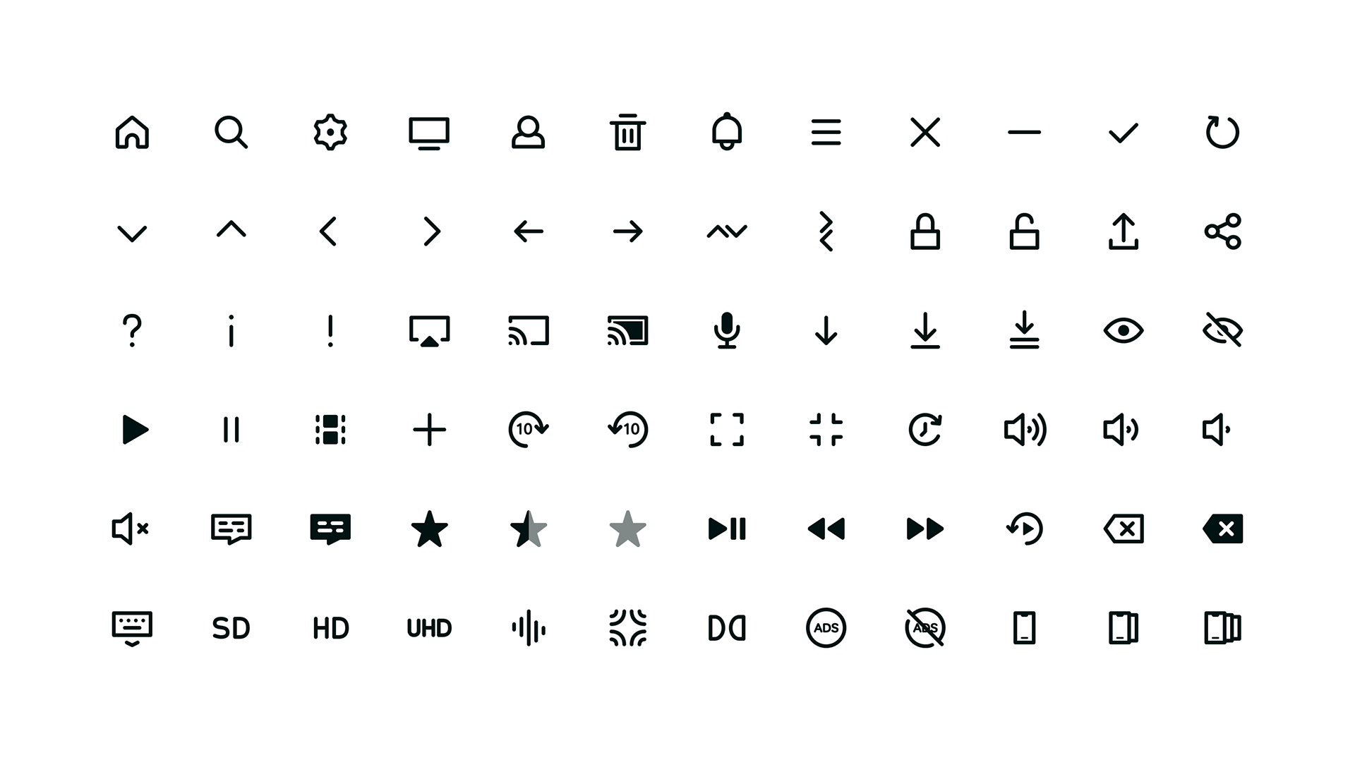
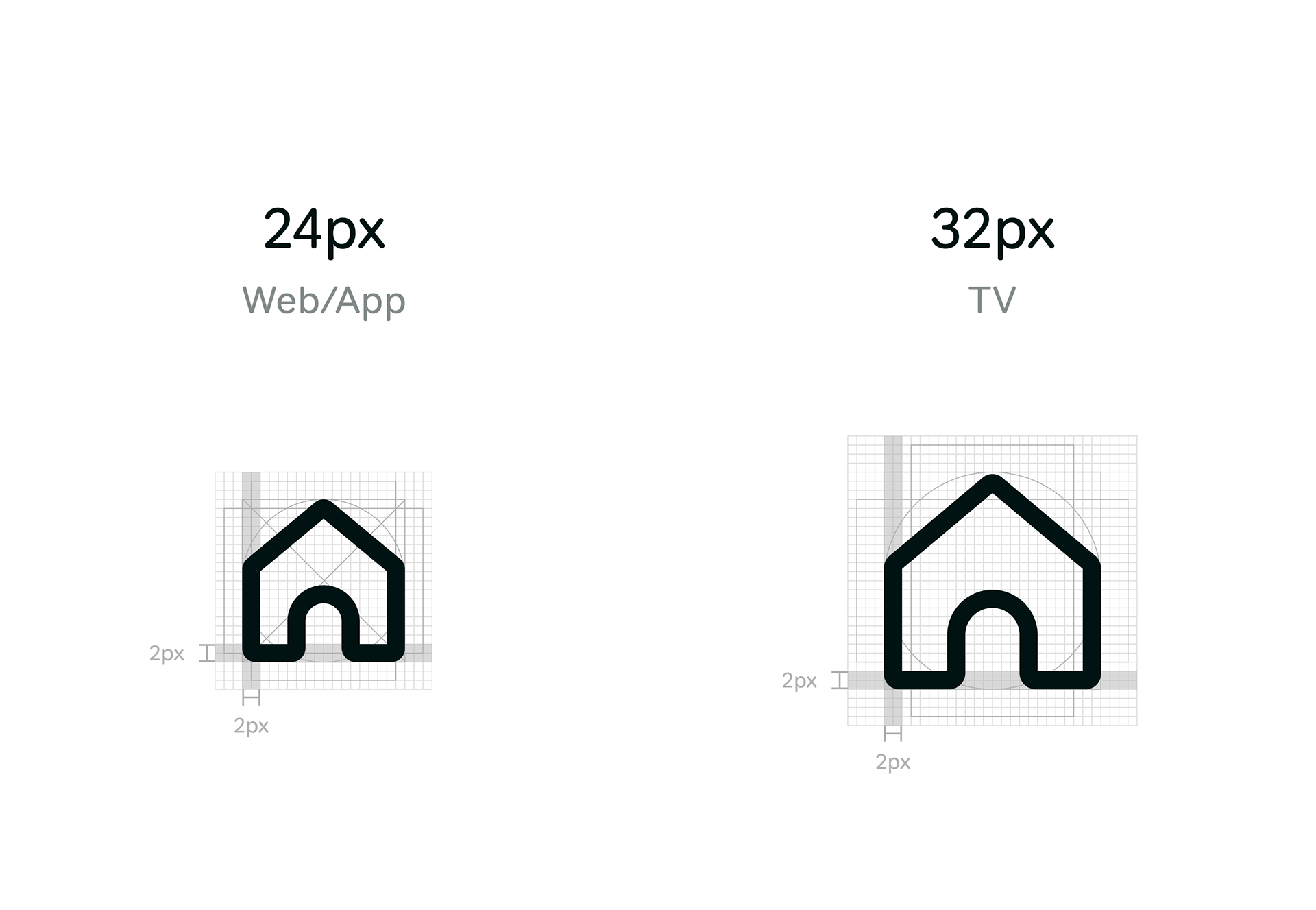
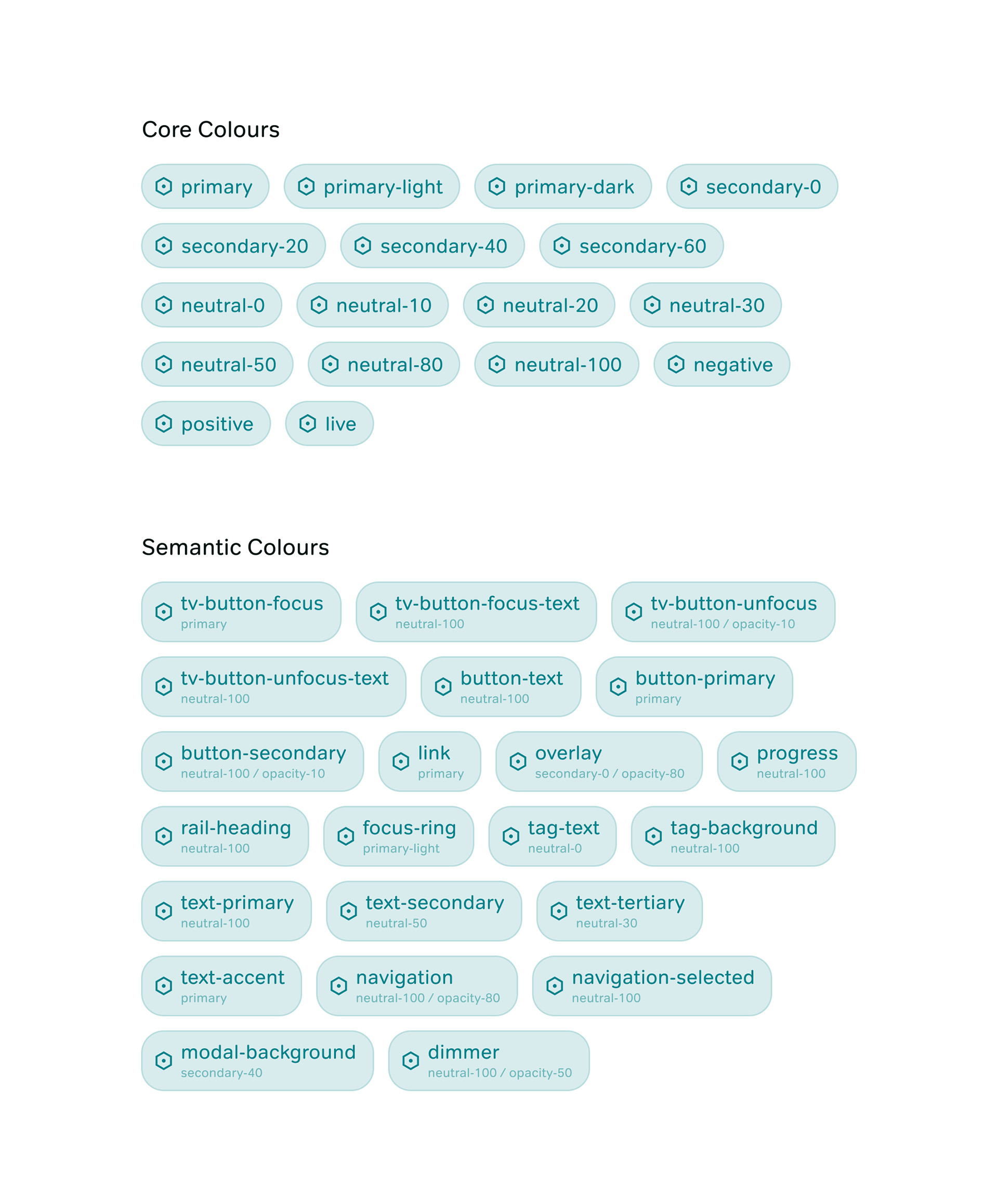
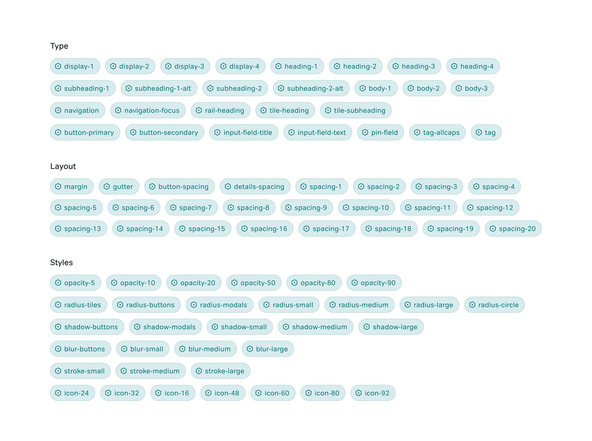
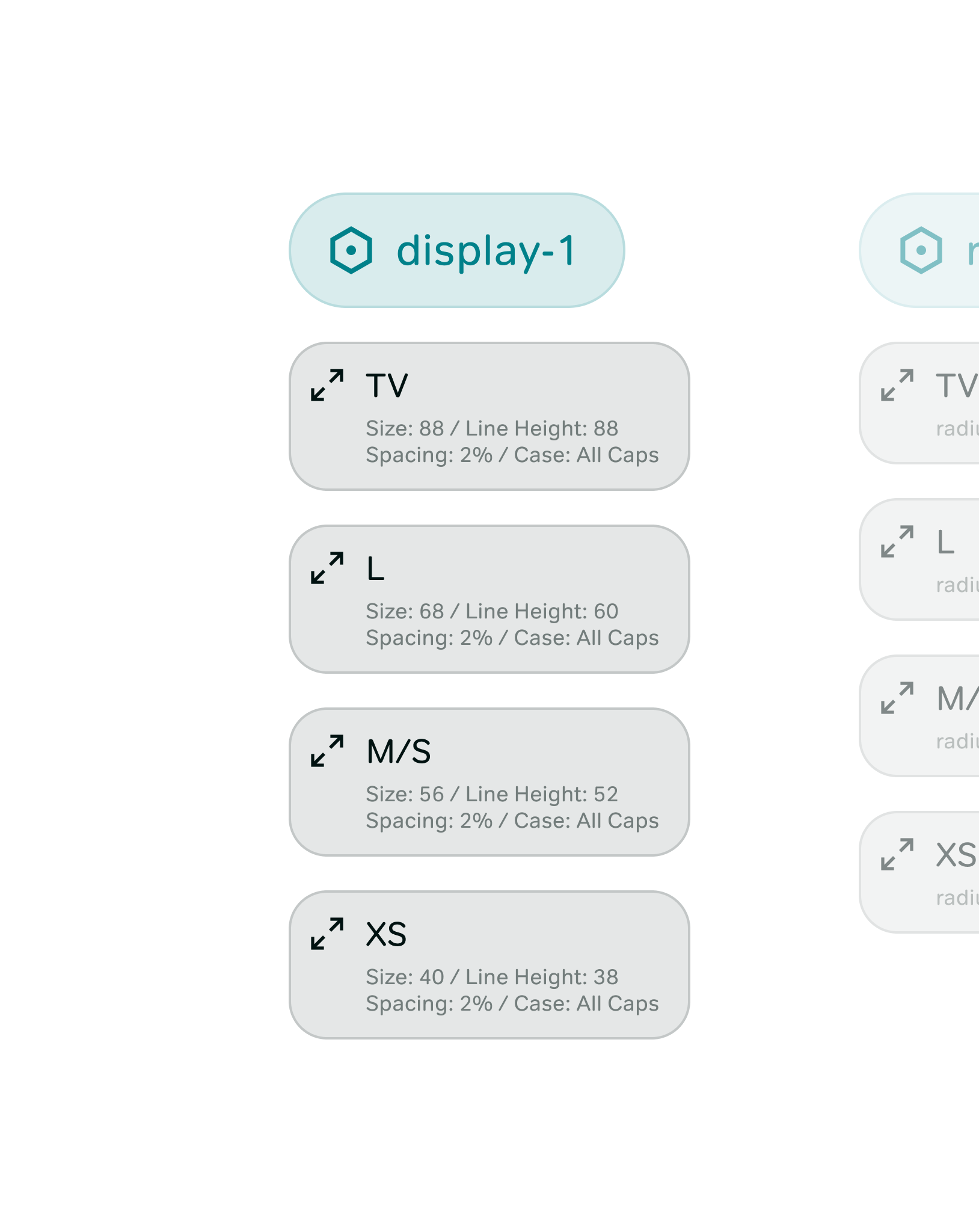
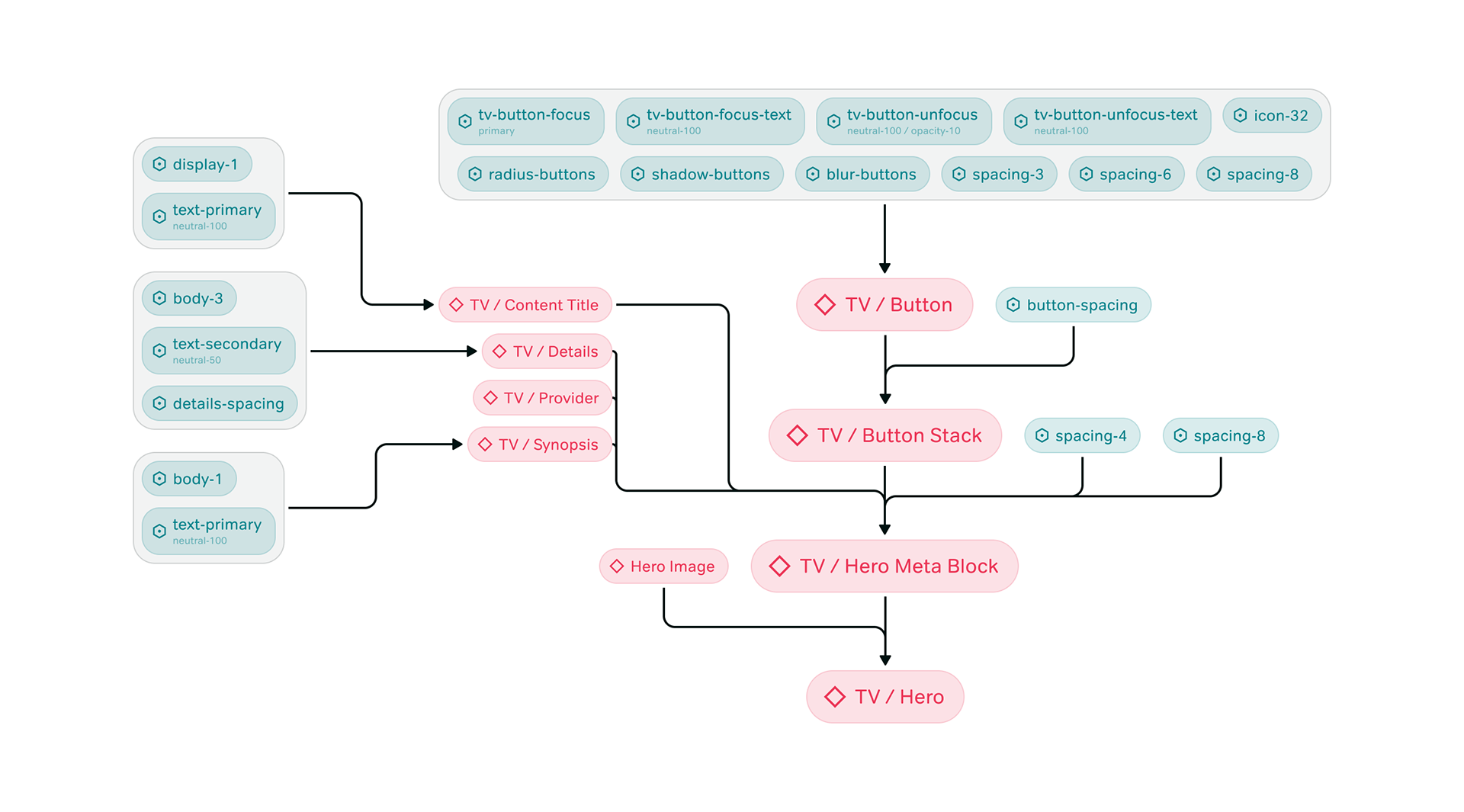
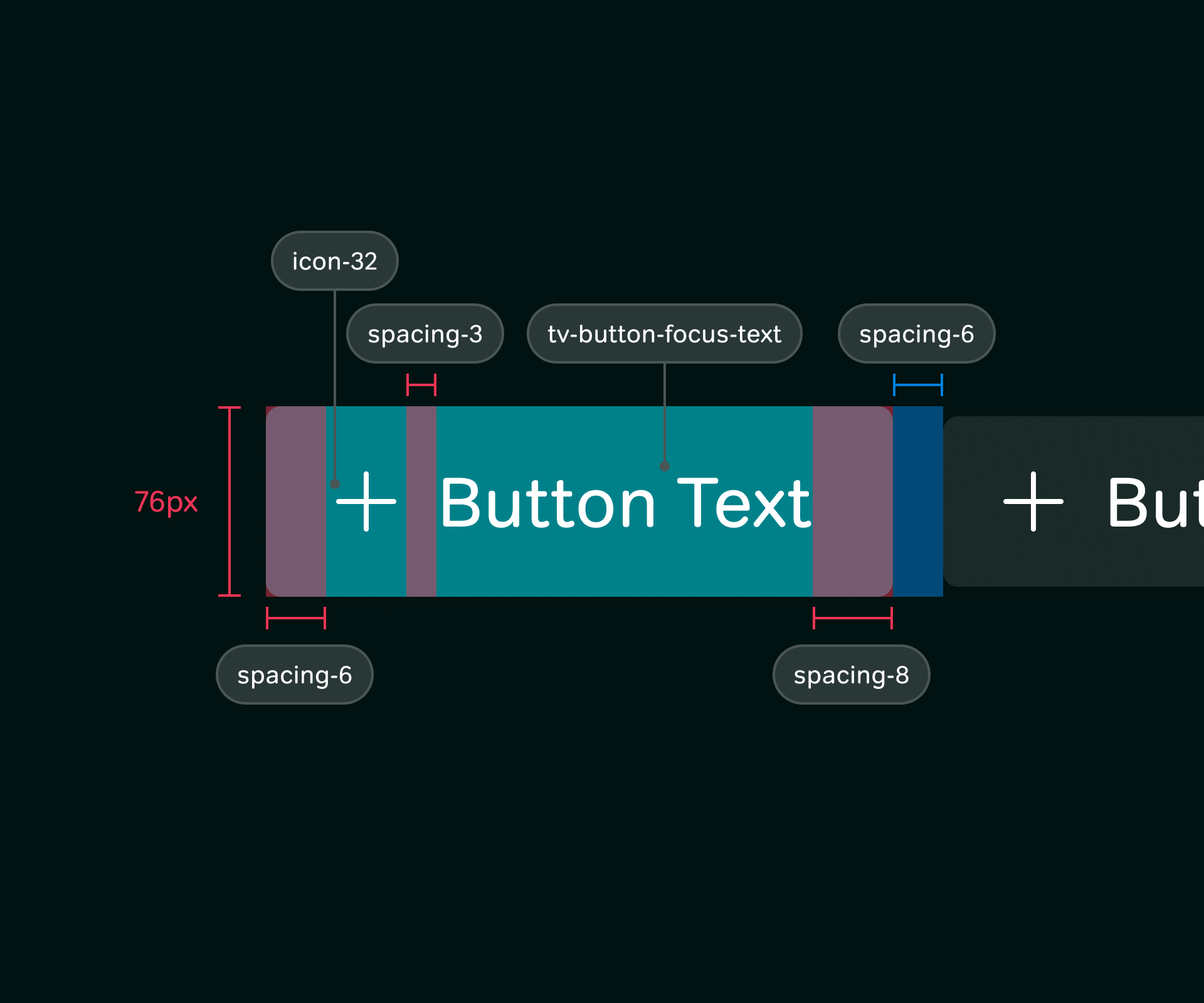
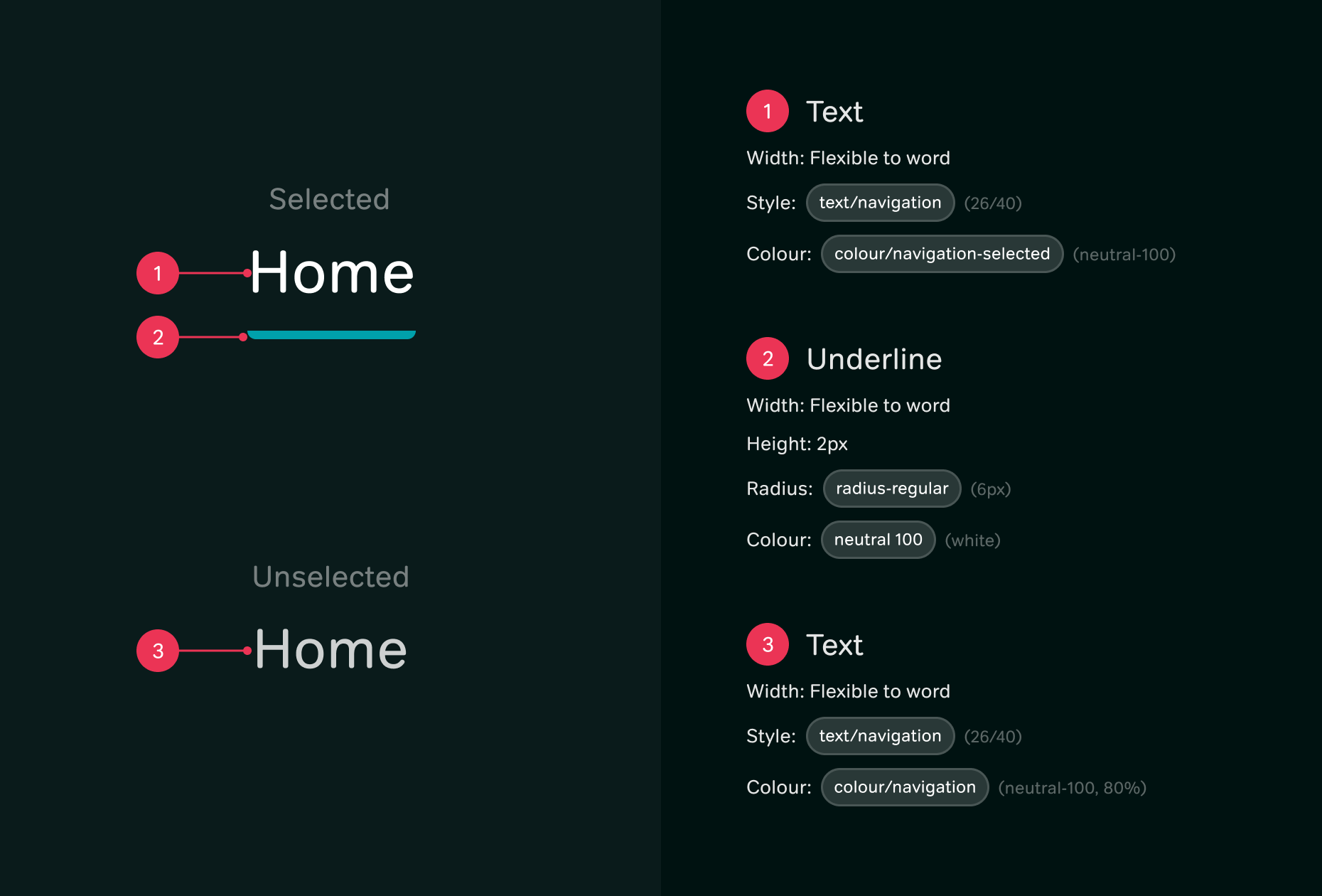
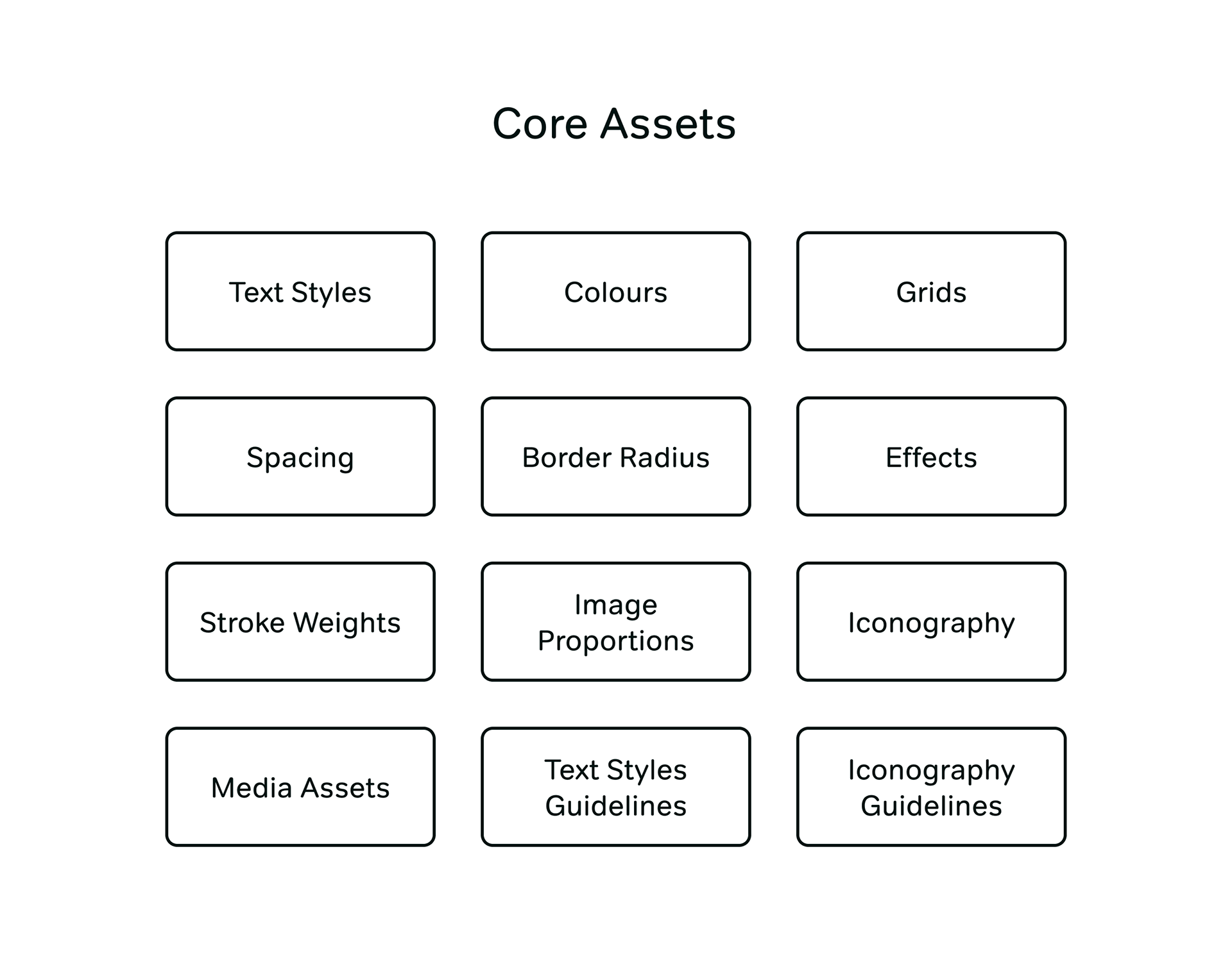
On first look, all of the design language seemed generally unified, however it became clear through audit that all platforms were at a different point within the designs development, and all had differing principles and rules in place. A full audit was done of the product across all platforms to identify inconsistencies which could be addressed by creating a unified approach. The colour palette was reduced down and regrouped to create easy to follow rules. Typography was reworked to create a systematic approach and ensure that key pieces of type were separated out to their own style, such as navigation, rail titles and buttons. A spacing guide was also created to solidify the practices that were being used. All of these, as well as styles, such as shadows and radius', were re-documented and tokenised. Recent iconography work was fed in to ensure the decisions in that work could be reflected. All of this together formed a Foundations Library which acted as the base to all platforms.
Rebuilding designs using tokens and components
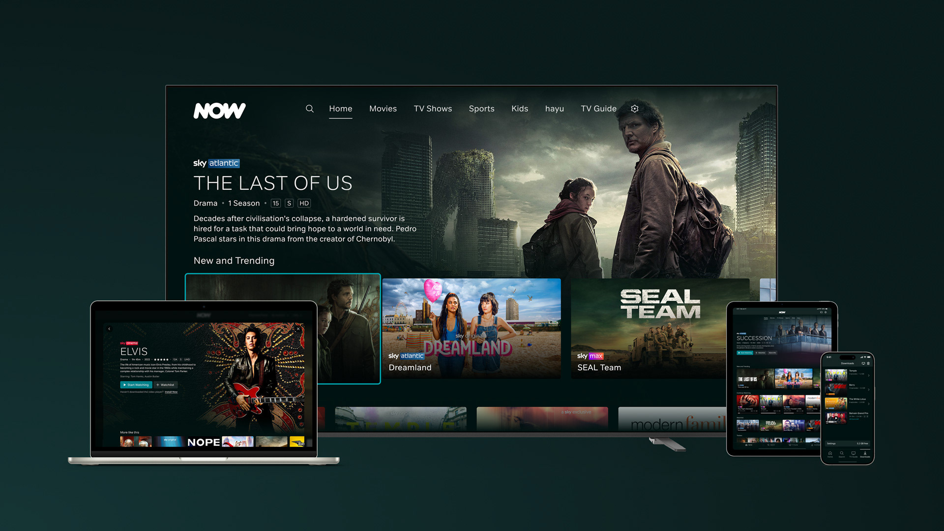
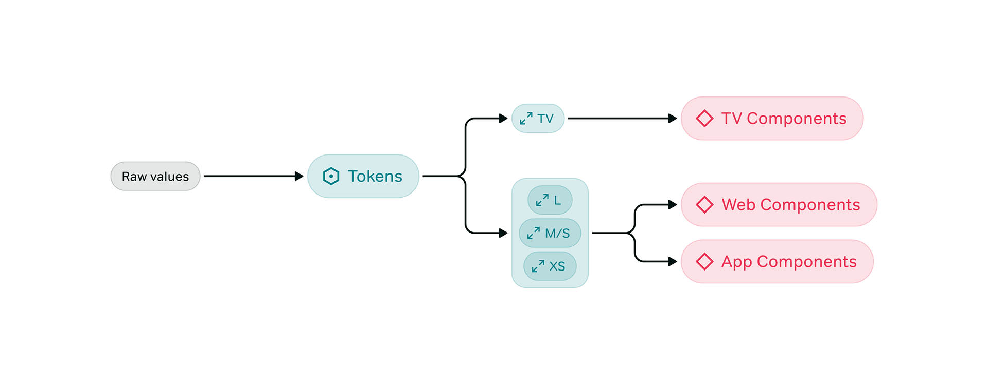
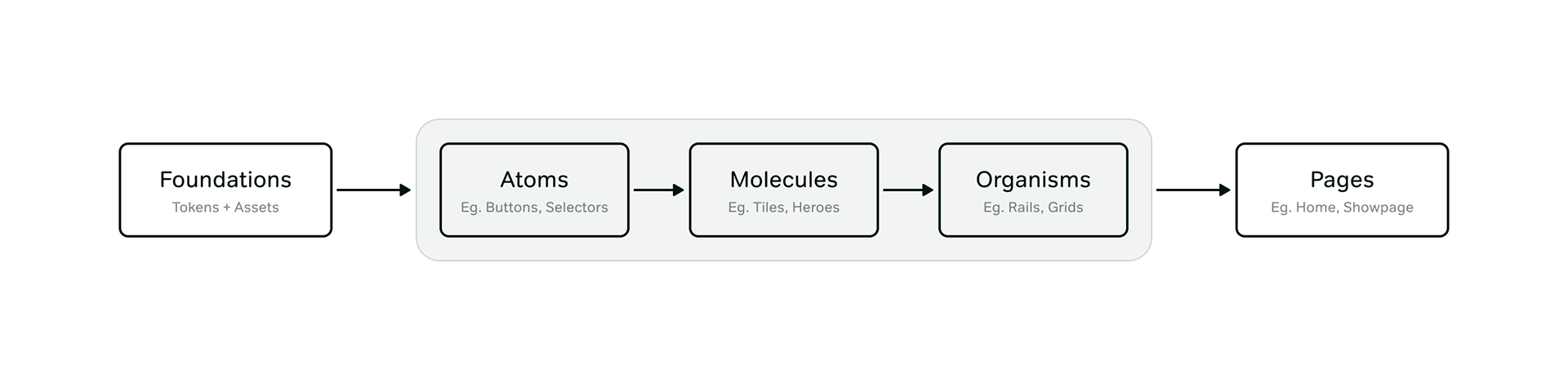
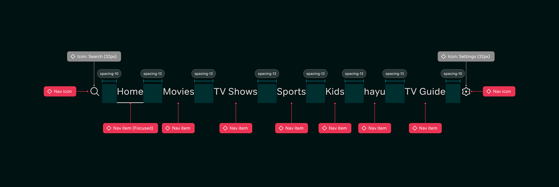
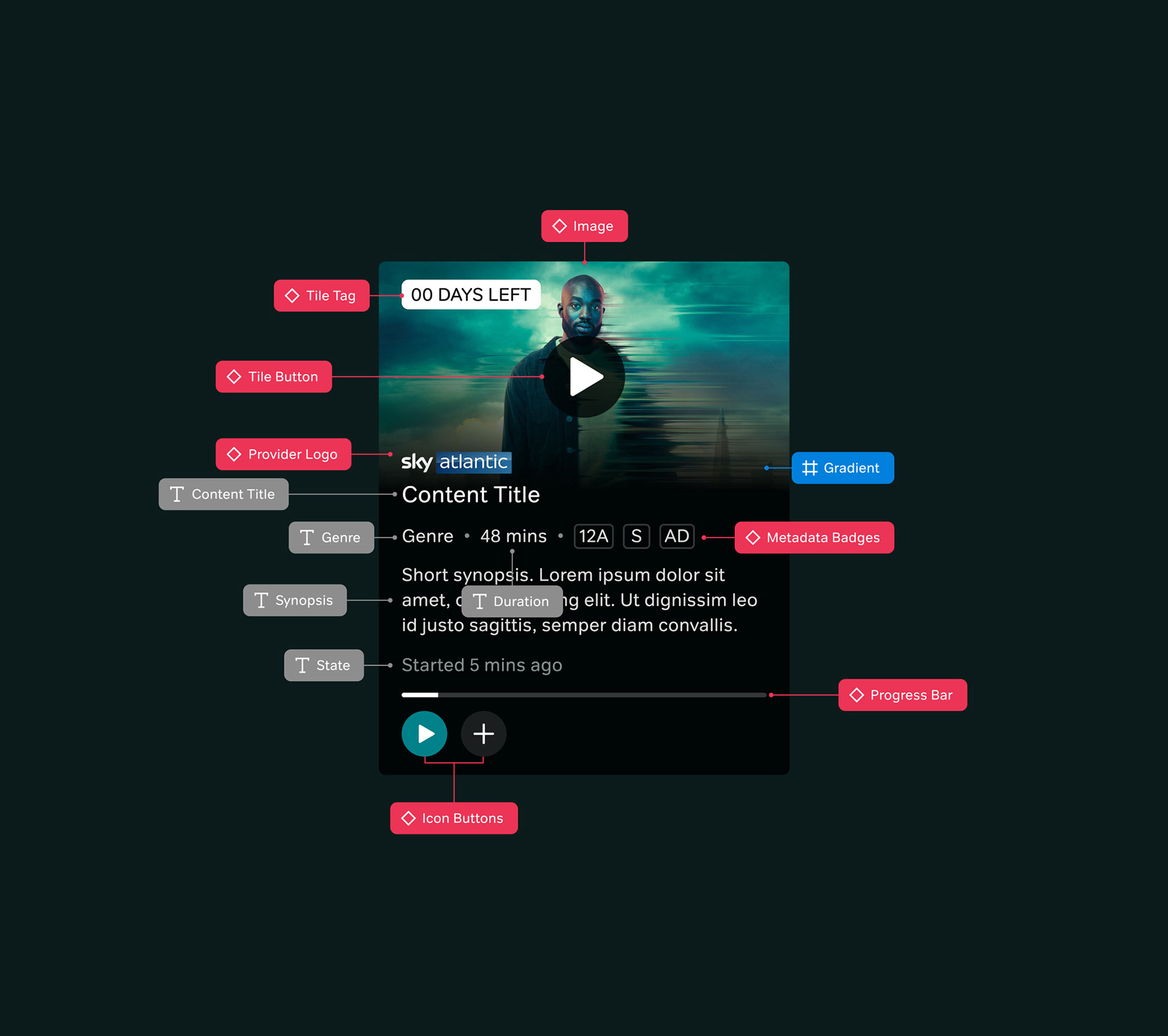
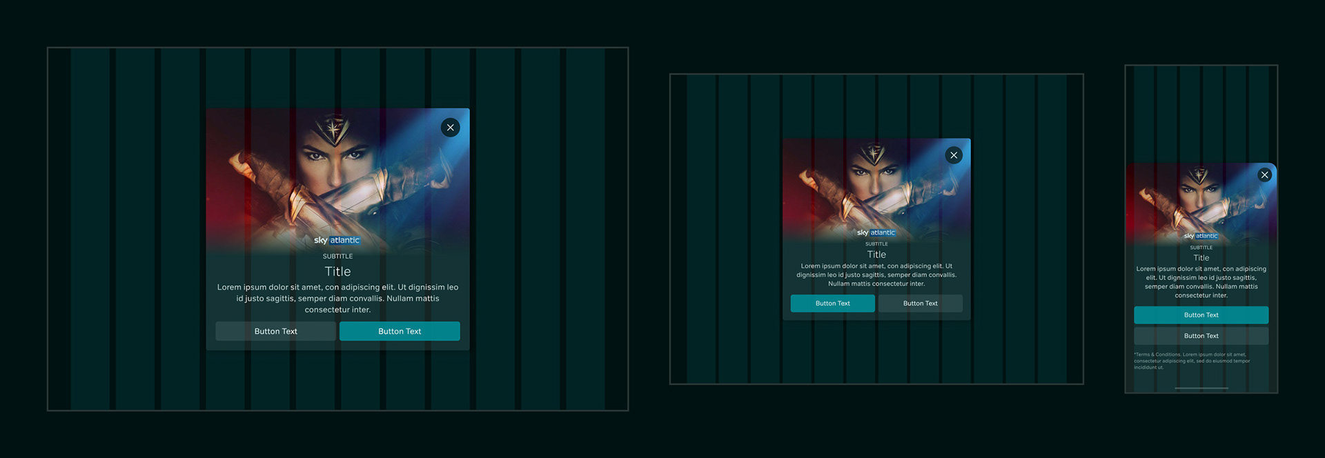
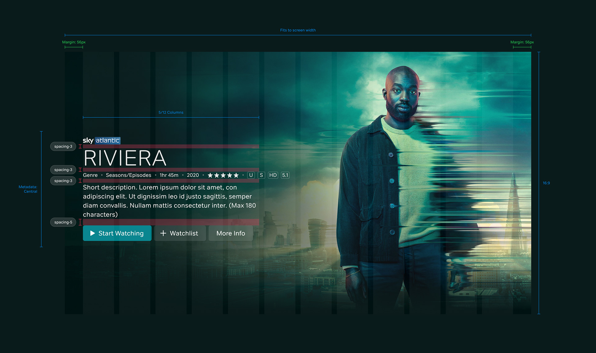
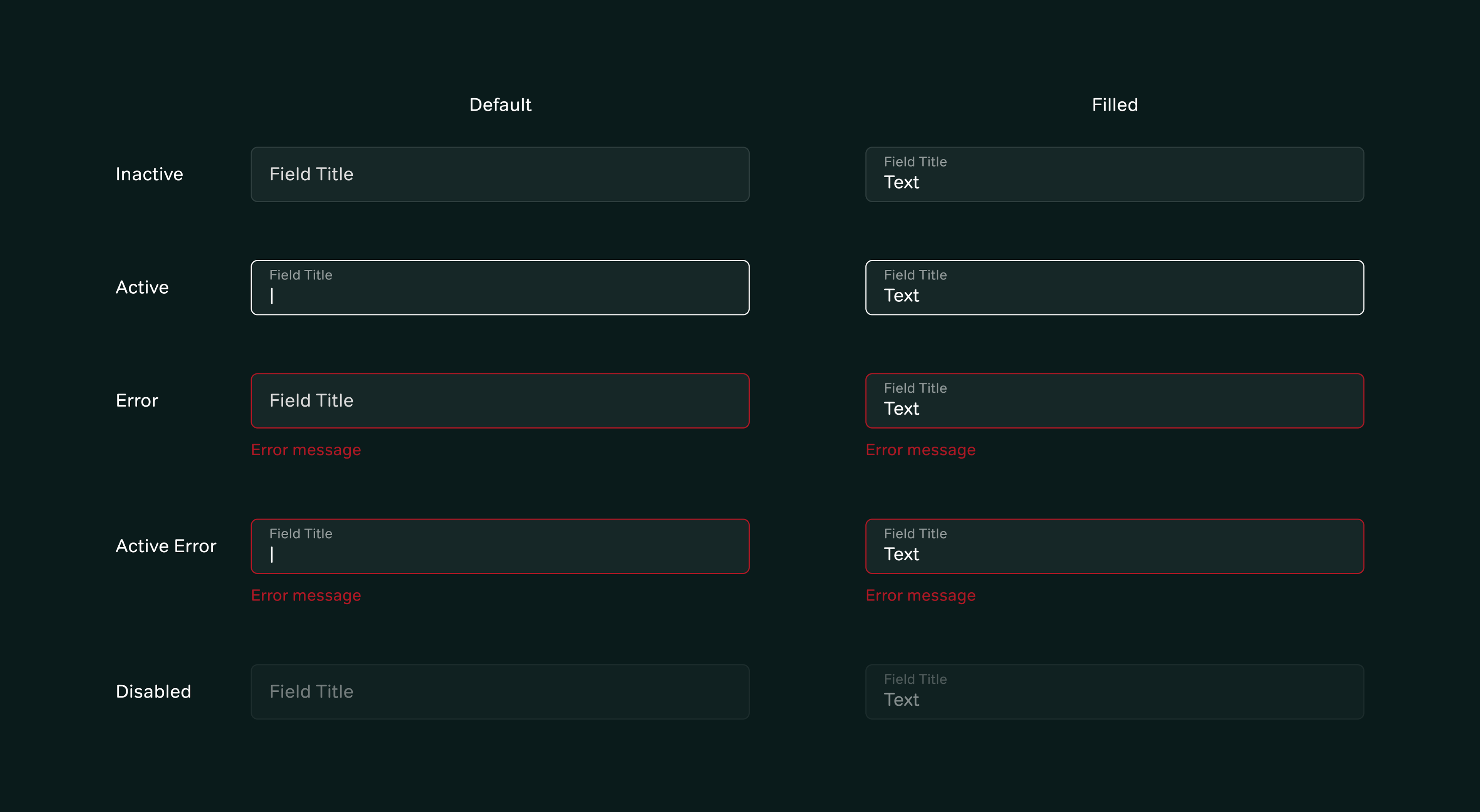
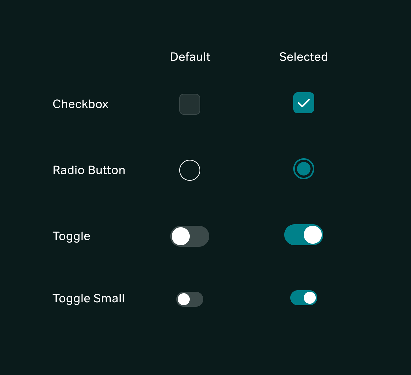
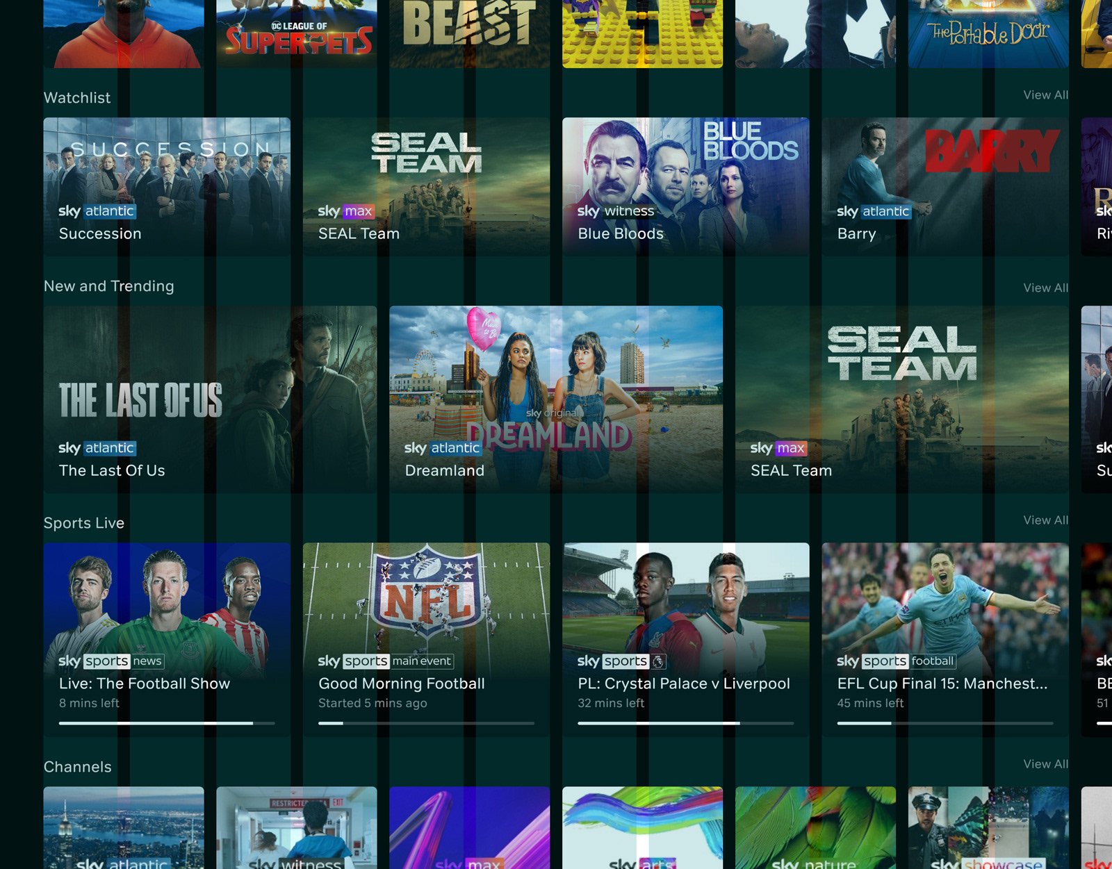
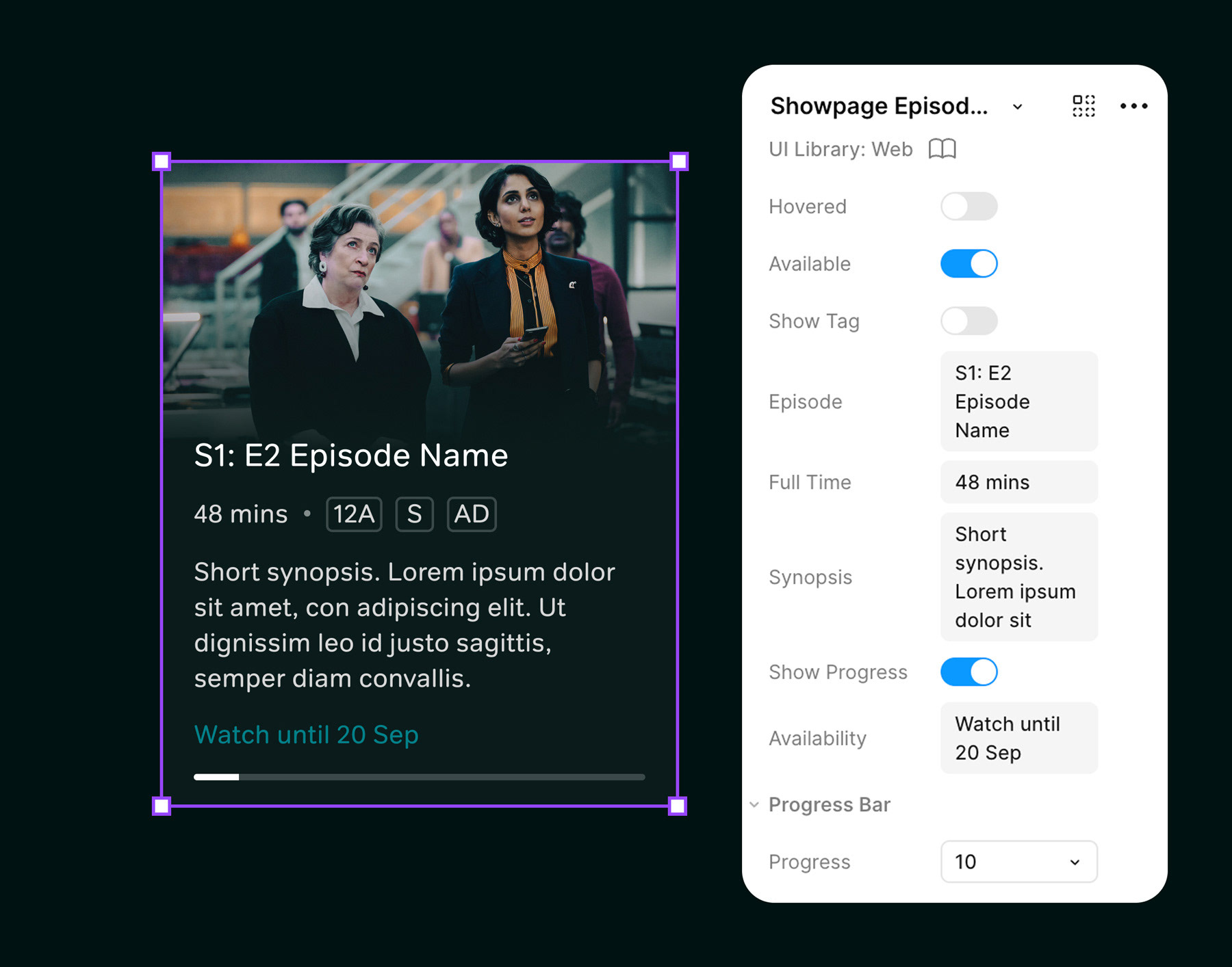
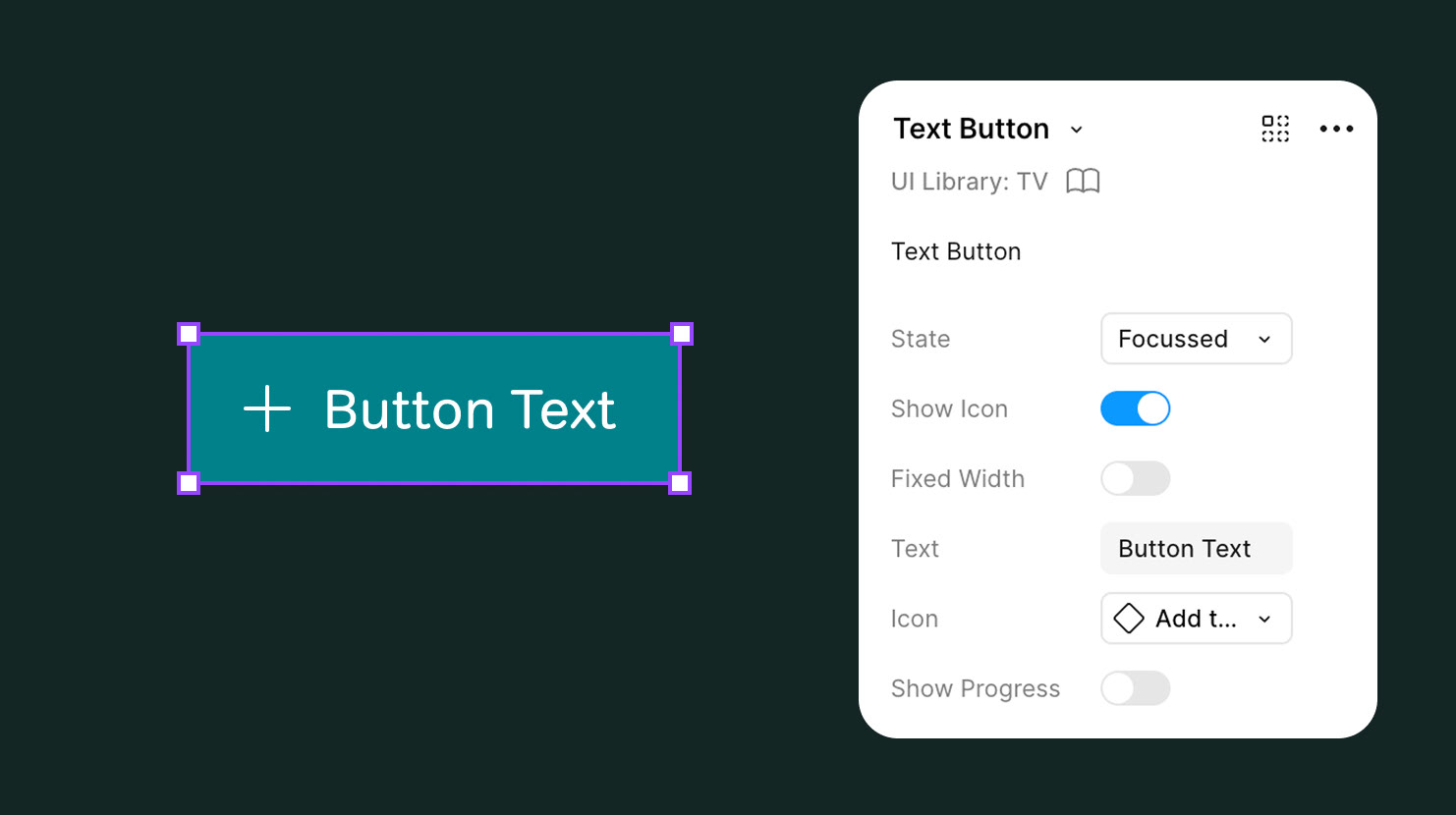
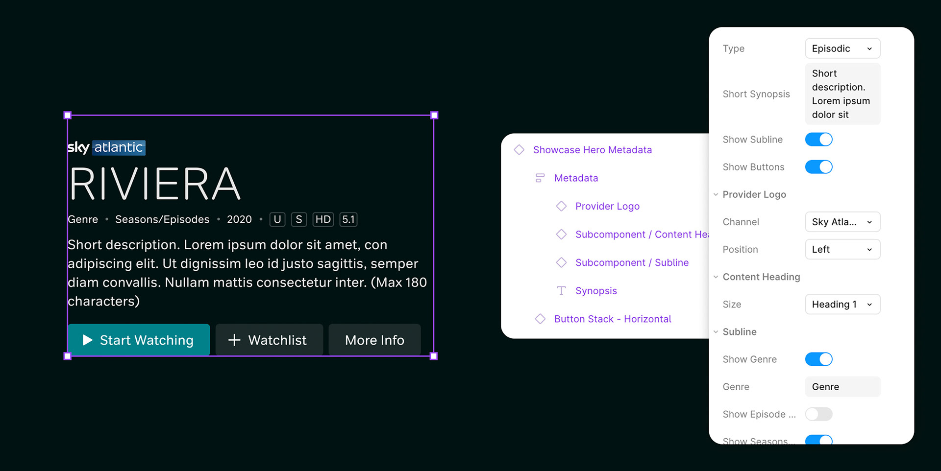
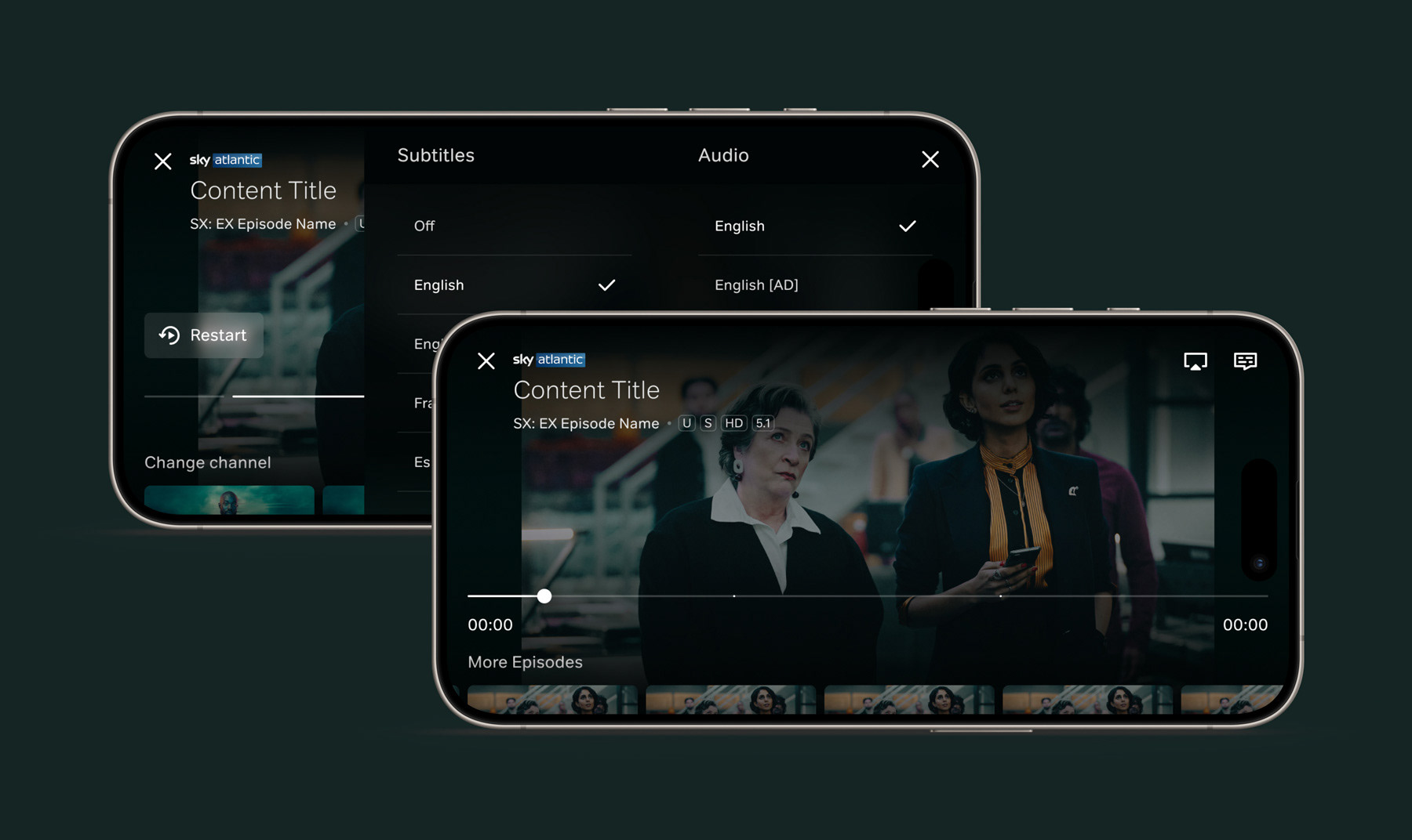
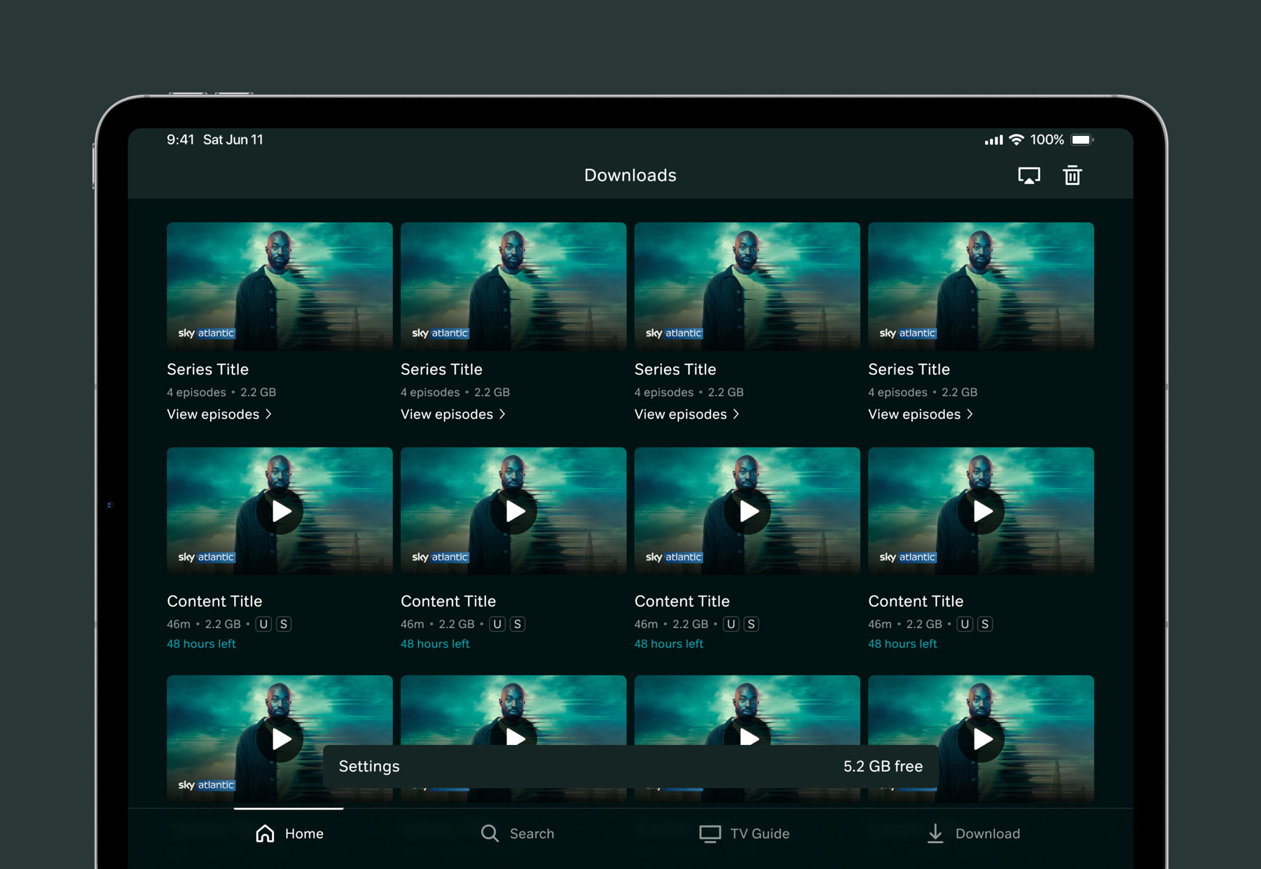
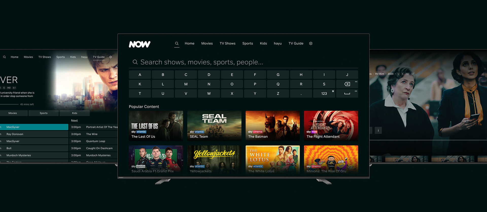
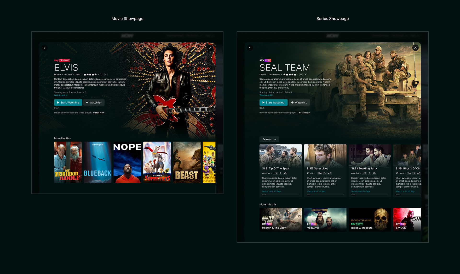
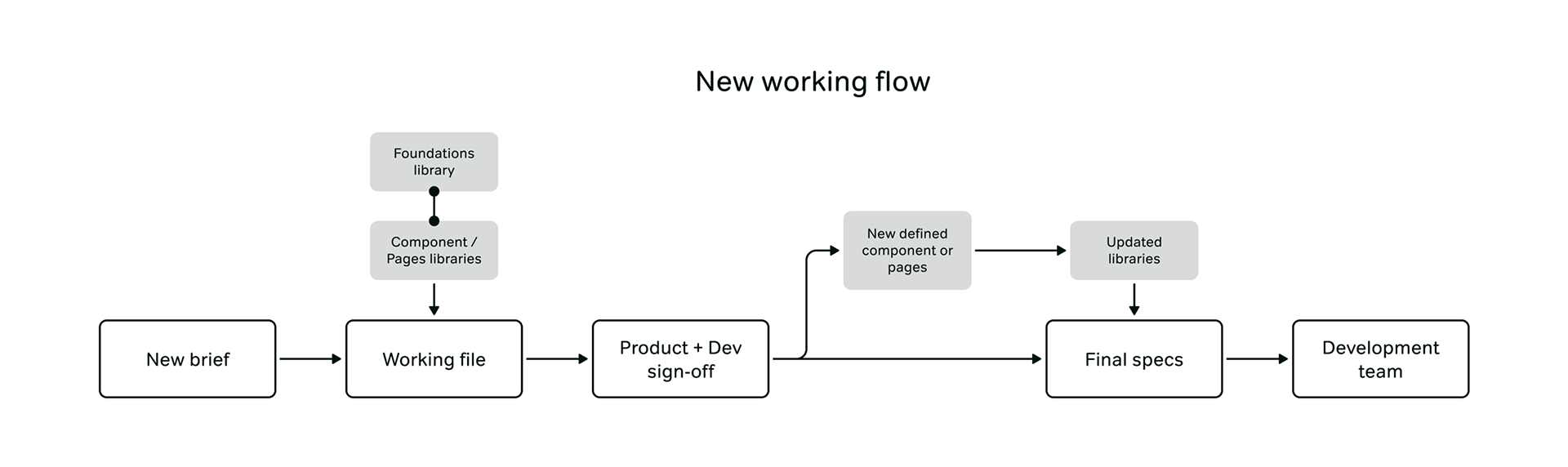
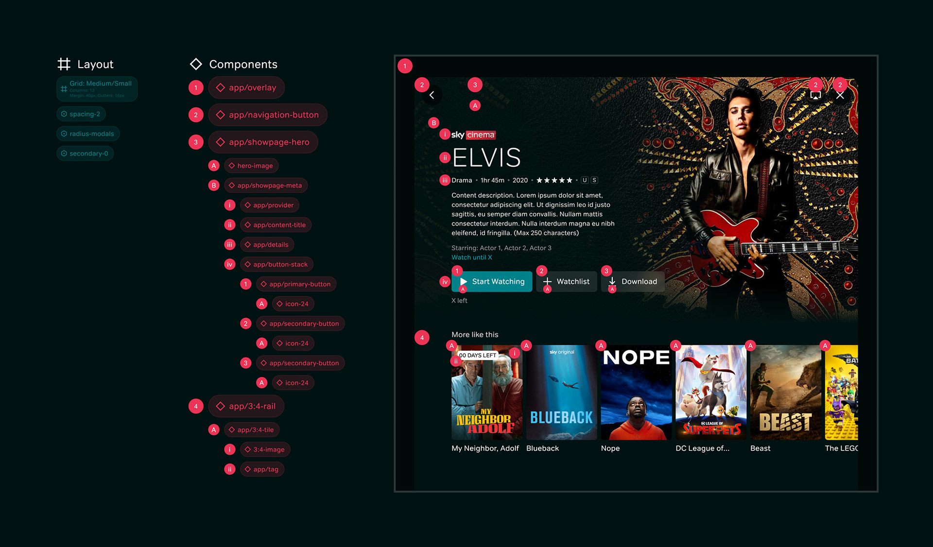
With the foundations redefined, the next part was to revisit all designs across Web, App and TV, and feed these in as well as creating an atomic approach to all components and screens, so any change at a foundational level or atomic component level would run through everything. The audit also showed where some platforms had components missing so this approach also meant these could be tackled and future-proofed. Base components, such as Buttons, Input Fields, Checkboxes and Progress Bars were taken first and worked across on all platforms so they were redesigned in the same way. Following this, components were taken one at a time and built out across all platforms, with all of their variants created to ensure complete consistency when moving between the different platforms.
Creating Libraries for Designers
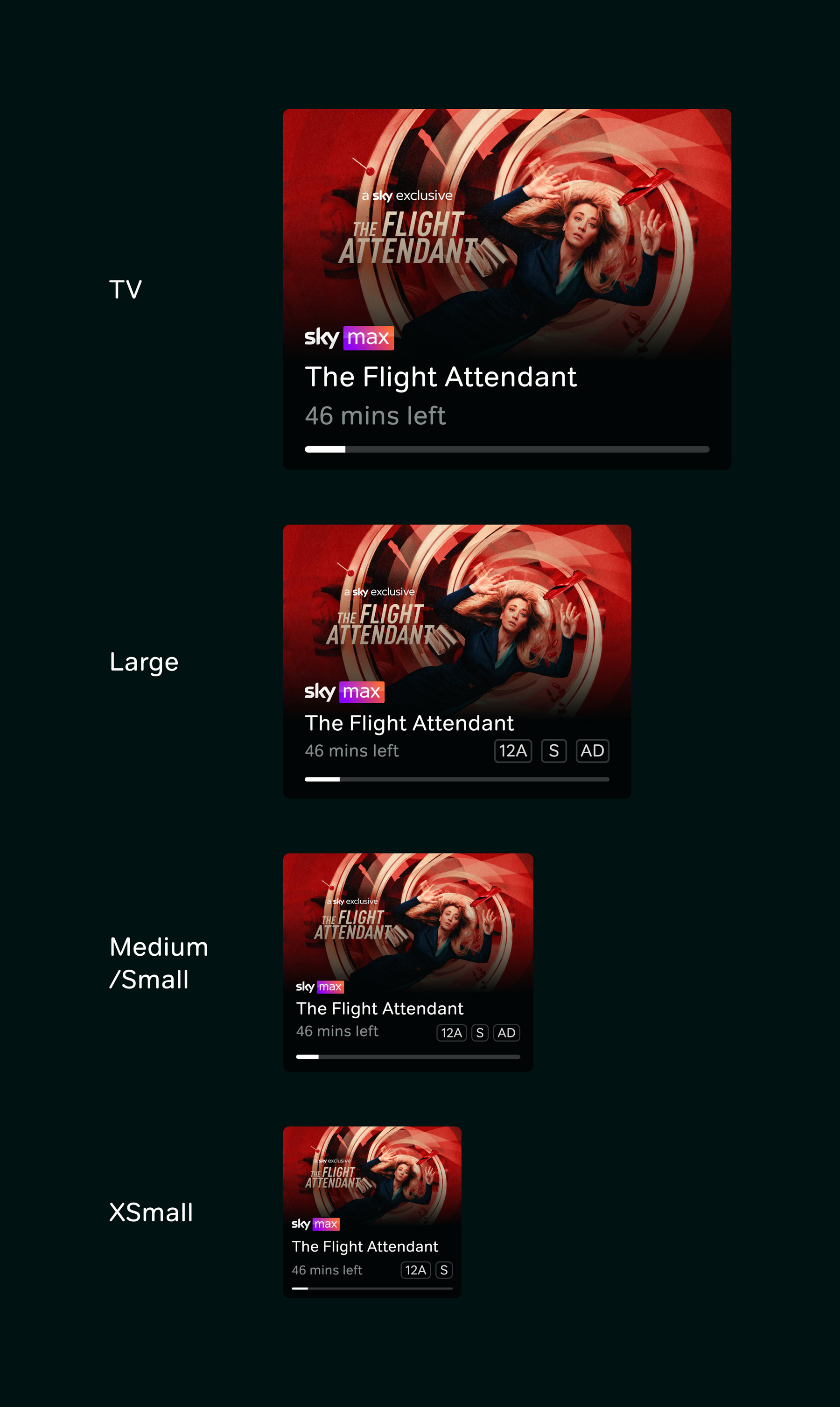
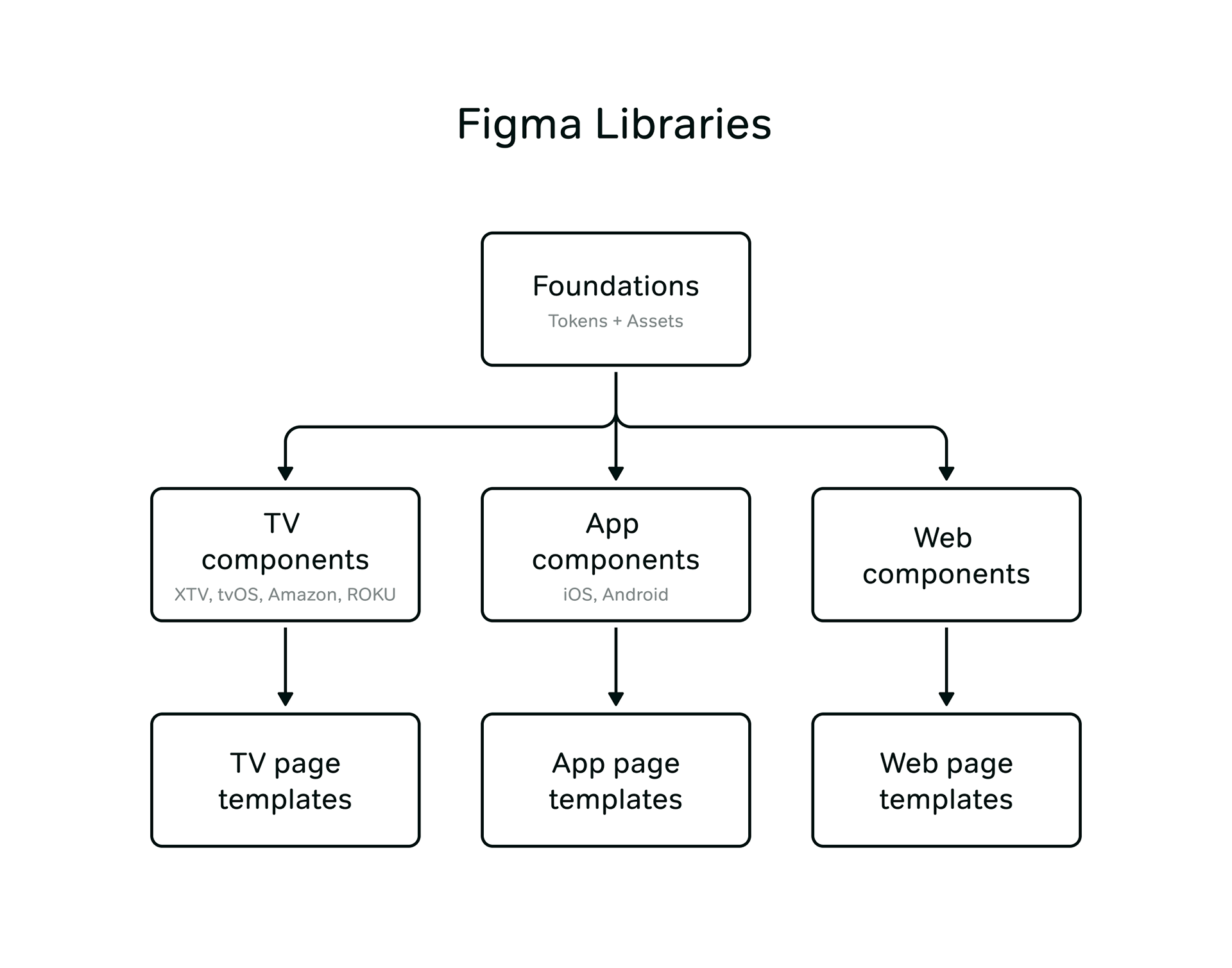
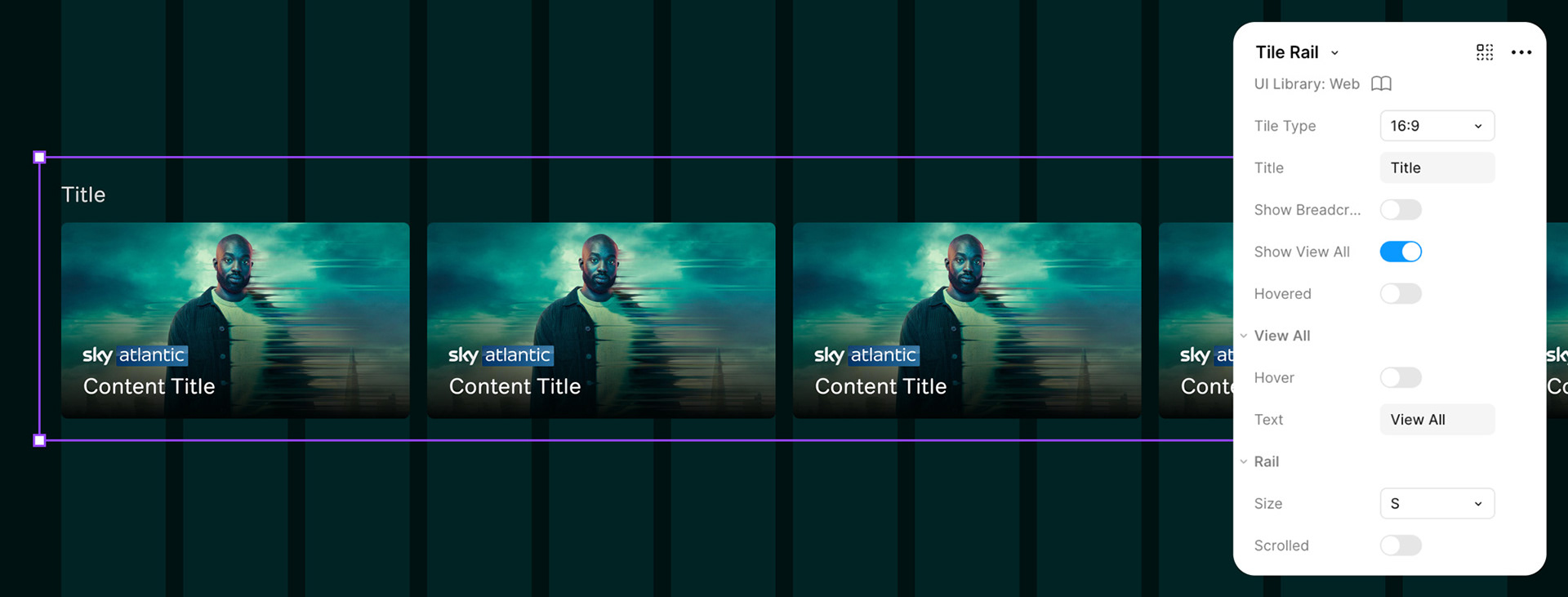
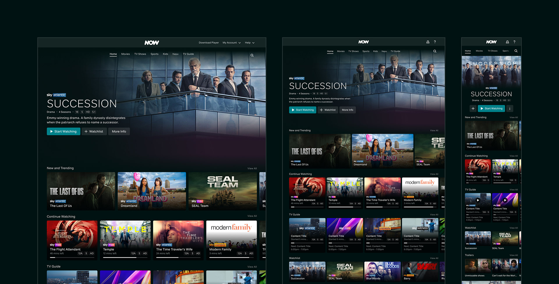
The main output for the design team was to create useable Figma libraries which reflected the most up to date designs for all platforms, in an easy-to-access form. This led to the decision to create libraries based on platform, with three key libraries to start with - App, Web and TV. Splitting this way meant that each individuals platforms nuances could be respected and be very clear to designers which version of a component is correct to use in what circumstance. Once these were in place, page template libraries were also created, meaning all designed elements within the service were accounted for and full pages were available to simply drag and drop into any new work.
Feeding the Design System into Build
With the atomic way the system was built up, it meant it was easy to transfer to development. With all designs now using the libraries and tokens, it meant inspecting the files was a lot easier as they were all linked into the Foundations and there was a universal language. With tokens already defined and components redesigned using these, it meant developers could inspect existing builds and reformat into the new approach. This also meant any components built could be reused in future work, saving time, and meaning that any future changes to existing foundations or components could make an impact very quickly.
Completed at Sky (NOW).