With NOW available across multiple platforms, alignment in the purchase journey was needed to create a more unified experience. Due to the different requirements from these platforms, such as native billing and tech restraints at time of implementation, these journeys diverged. The aim of the project was to create as much of a consistent experience as possible, regardless of device. Alongside this there was work to do in proposition clarity for users, and integrating in a new proposition, so user testing was included to ensure all of these moving parts could work together seamlessly.
Updating the experience to create a simple journey which is engaging and clear, across all TV platforms.
Auditing designs against new requirements
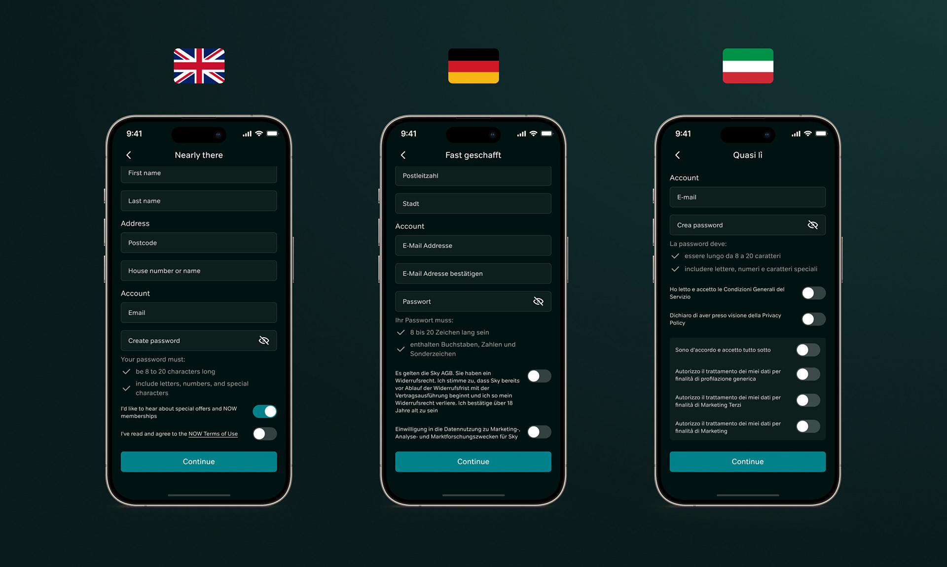
As well as the clear customer needs, there was an overarching business need to align these journeys to ensure all of the legal requirements were met, including cross-territory in catering to the Italian and German market. Existing TV journeys diverged heavily, while on App it was a case of improving the flows, visual execution and aligning to legal requirements. Alongside this, additions over the years, such as different membership types and billing methods, meant various elements had been added after initial designs so were not well considered. The aim was to ensure the experience was scalable and flexible to any future changes to proposition.
Redesigning core elements
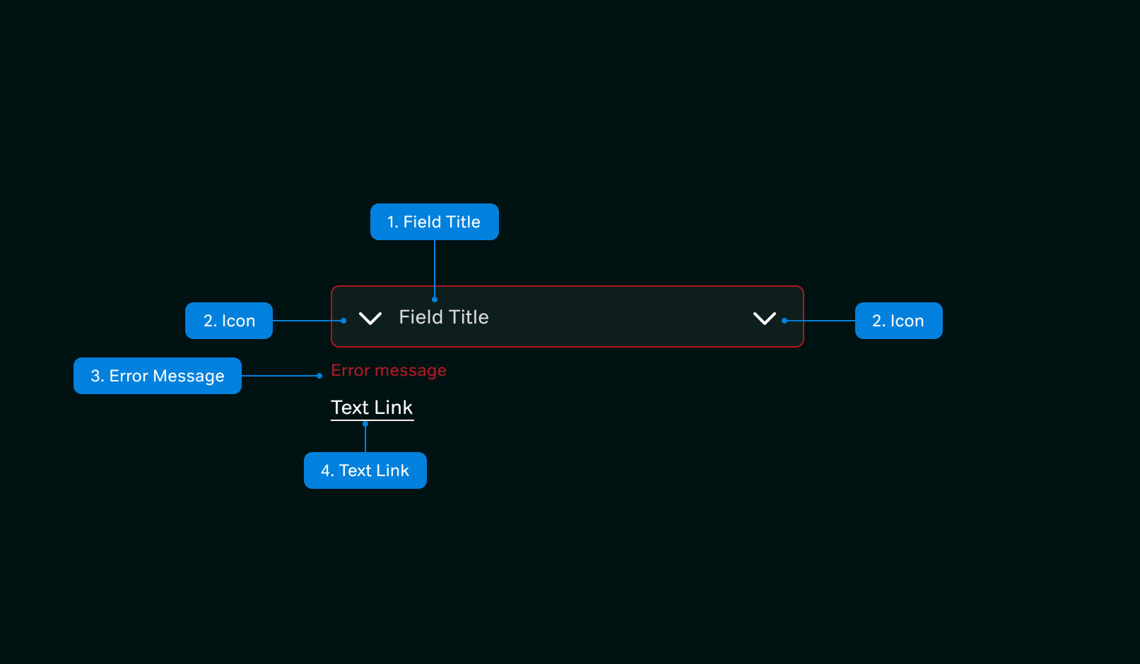
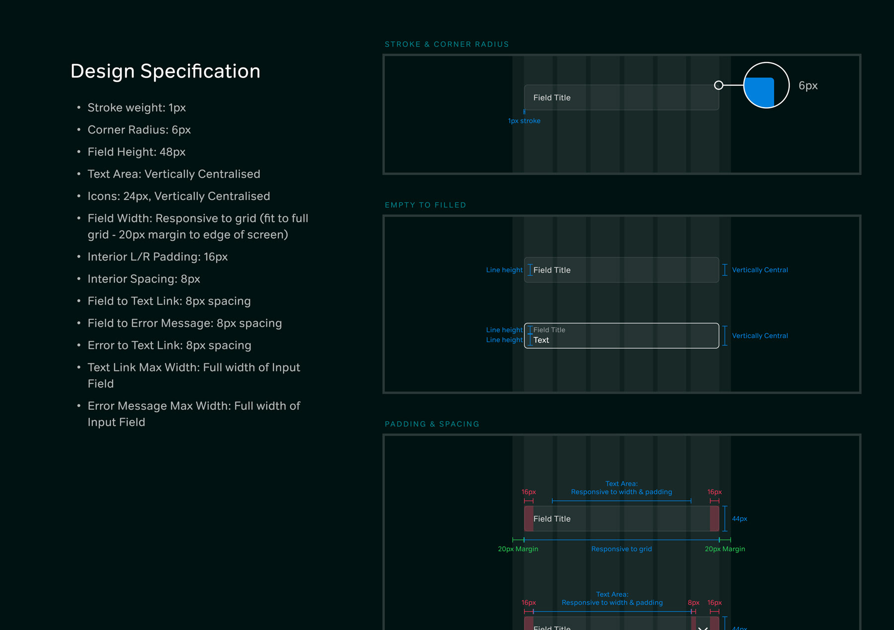
With the new requirements detailed, the existing designs were revisited to identify the pitfalls. It became clear that a lot of the requirements that had come about were down to some key elements not being designed and documented properly. Across App, all designs for functional elements such as Input Fields, Selectors, Notifications and Keyboards were revisited for a better experience, including creating a set of rules for designed elements vs native elements.
Creating a single App experience
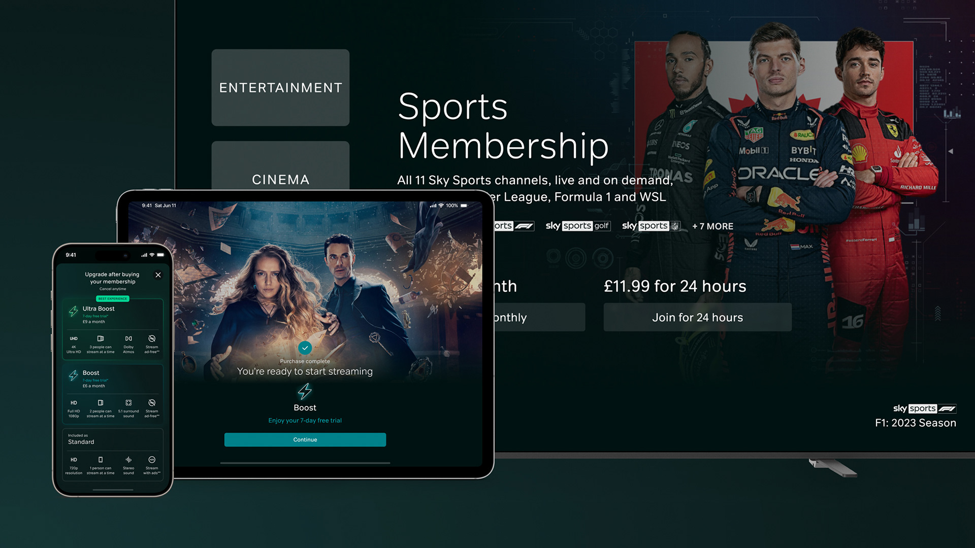
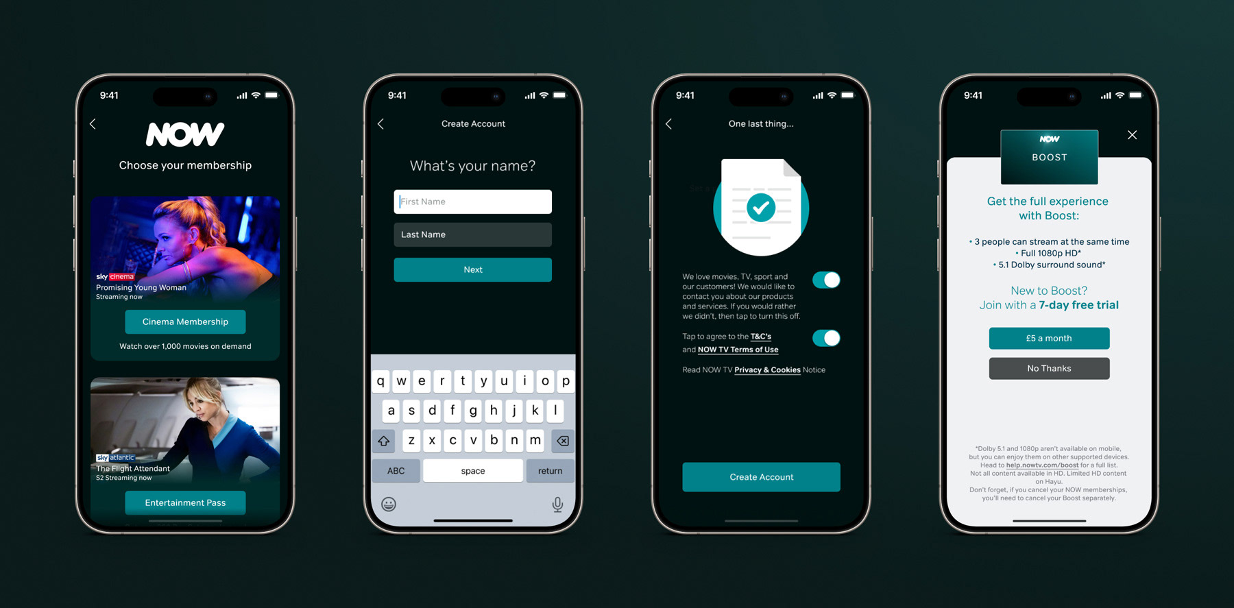
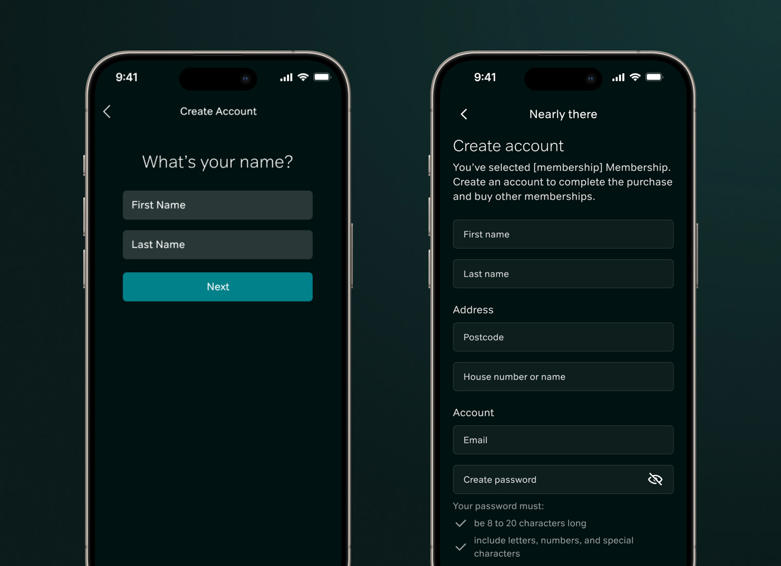
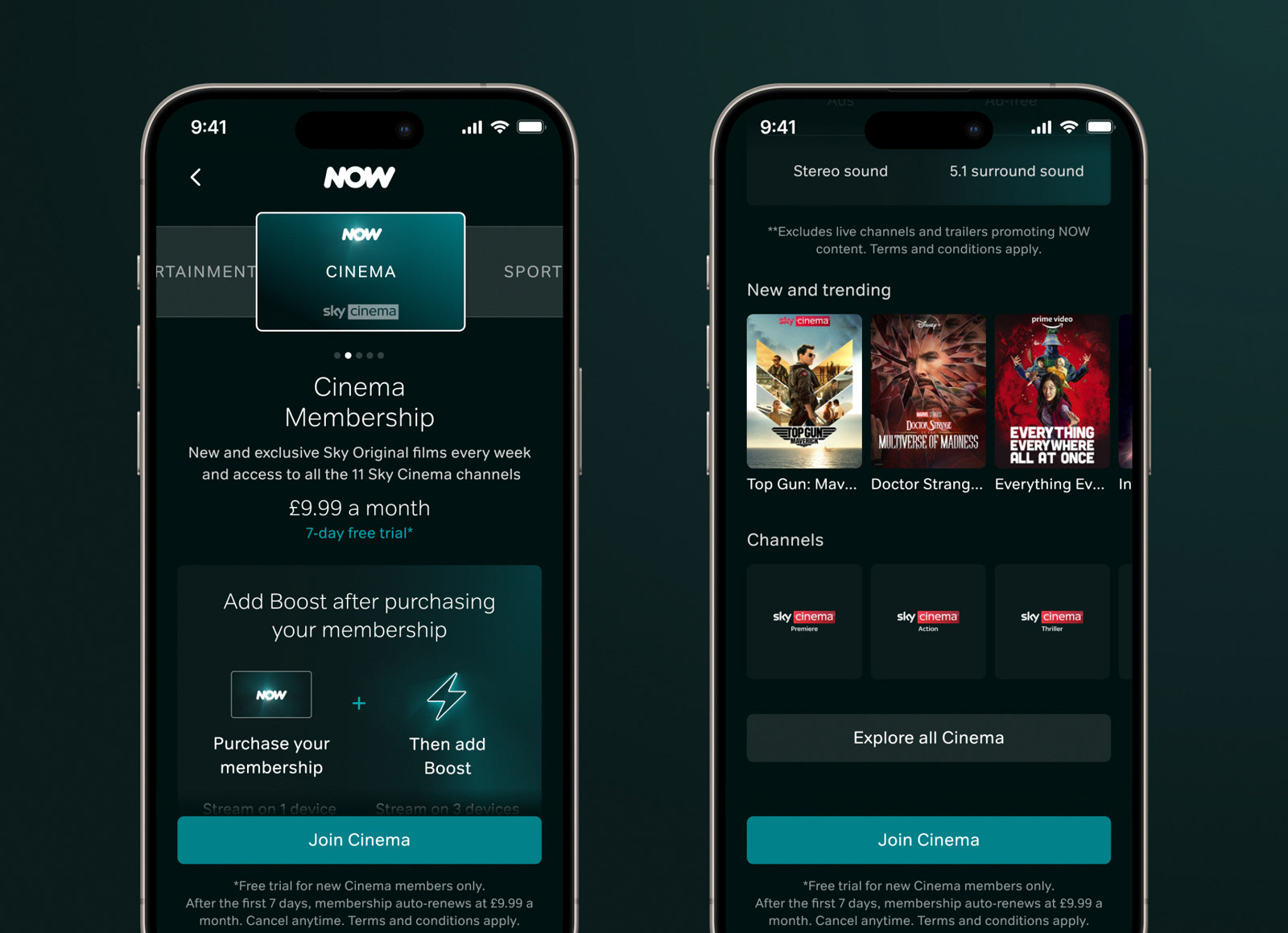
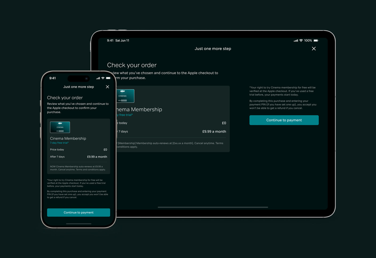
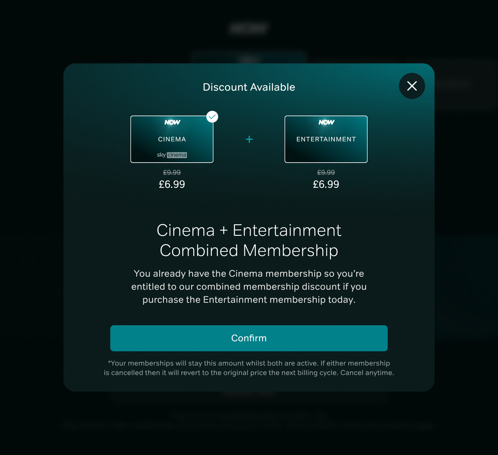
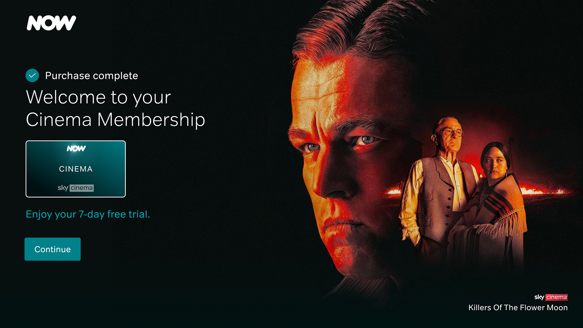
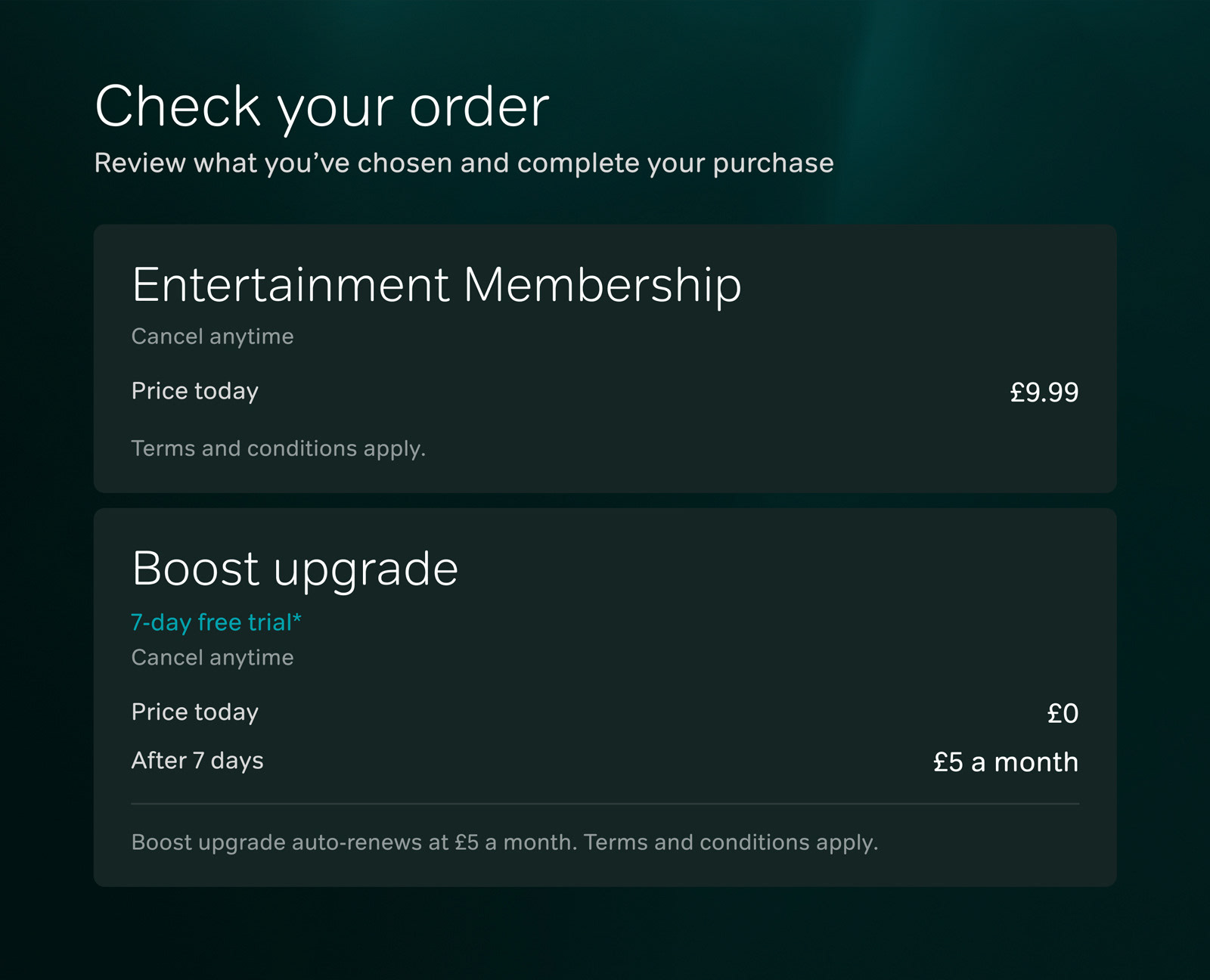
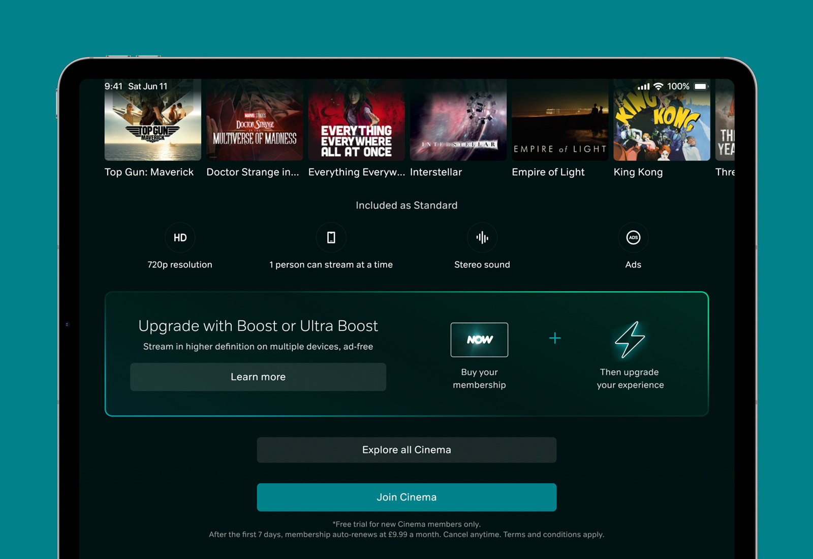
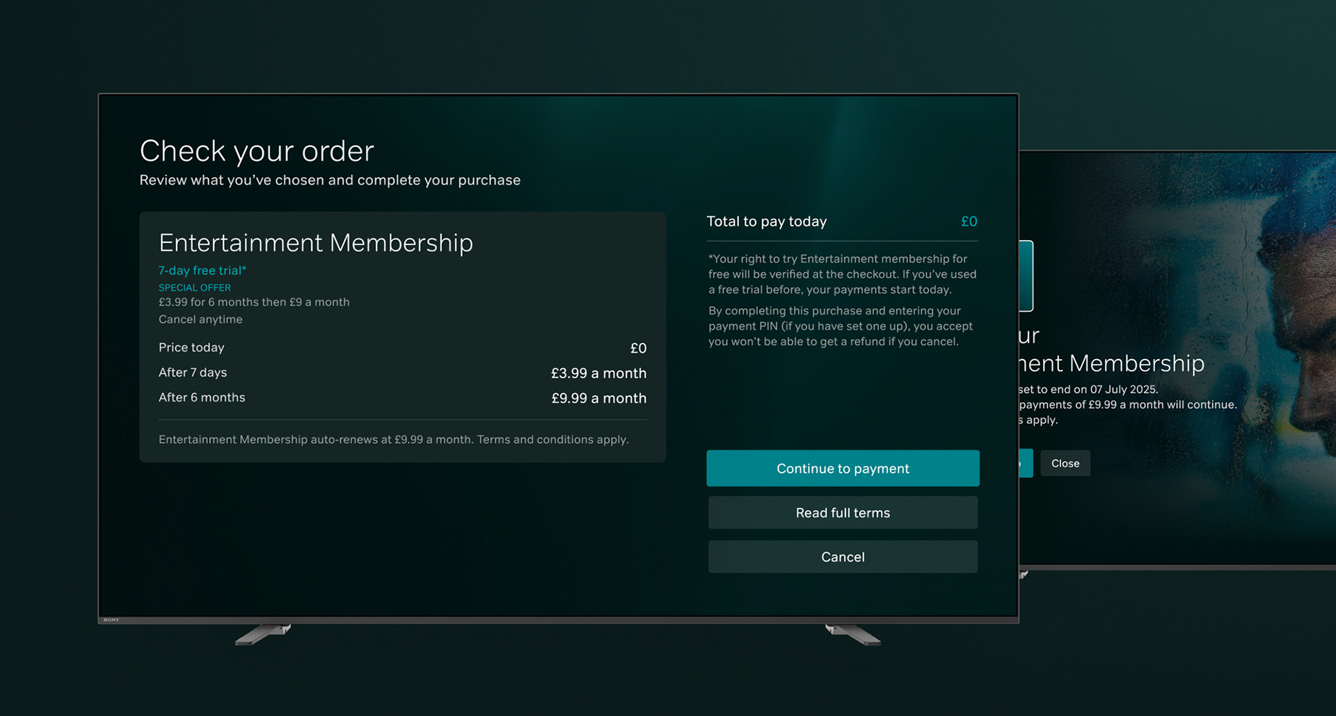
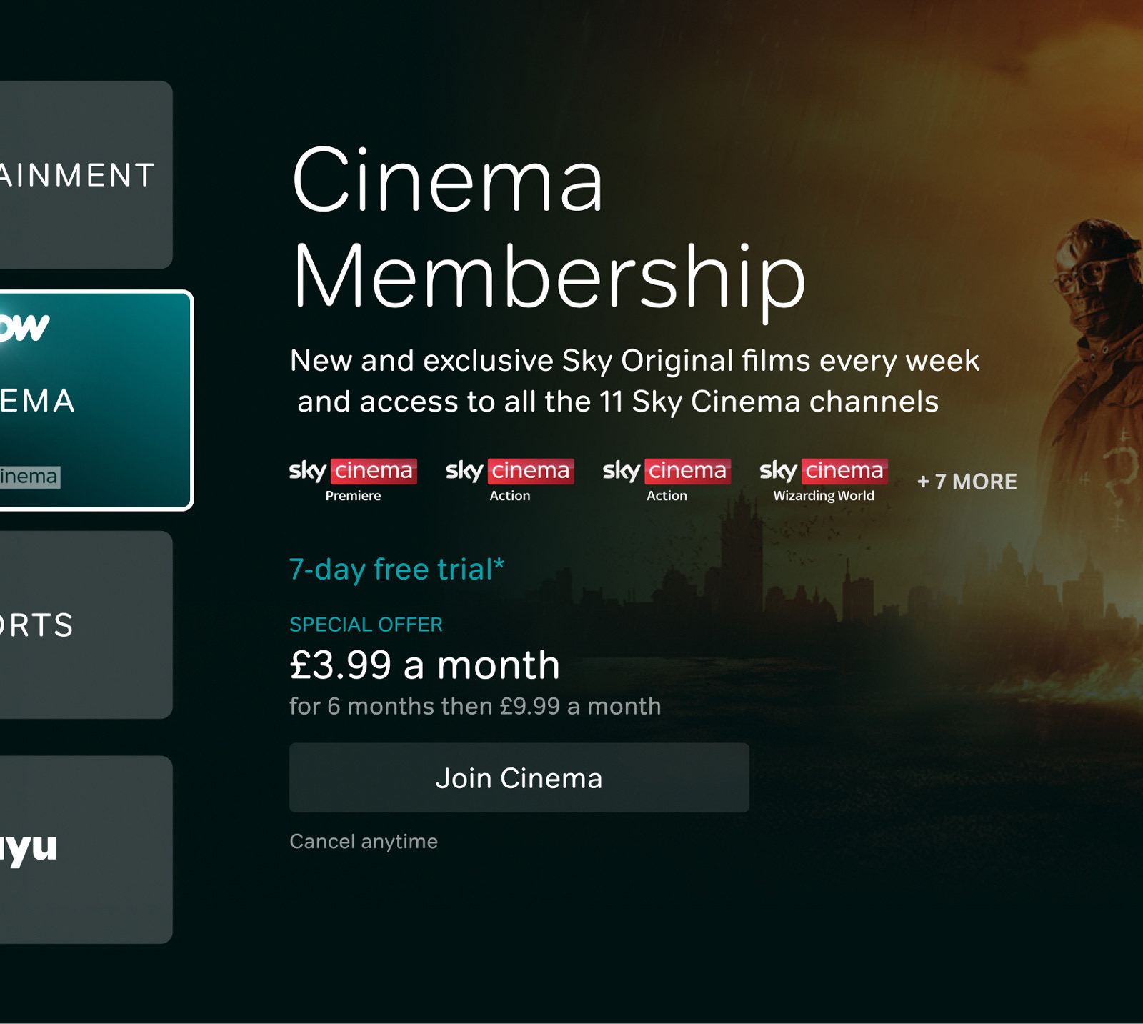
The App experience pages and flows were reworked to cater to 3rd party and direct billing customers across iOS and Android, across the three territories of UK, Germany and Italy. This also included aligning screens for new vs existing customers. The subscription options page was completely reworked to be more immersive for users and in-line with the new brand direction. The upsells, checkout and account screens were all redesigned to have a more streamlined experience and better visual execution which was in-line with the new premium feel of the brand refresh. Alongside this, new additions were made based on user testing, such as a purchase success page to reaffirm the users actions.

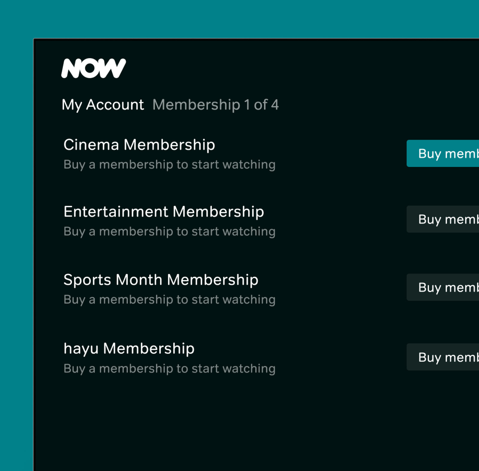
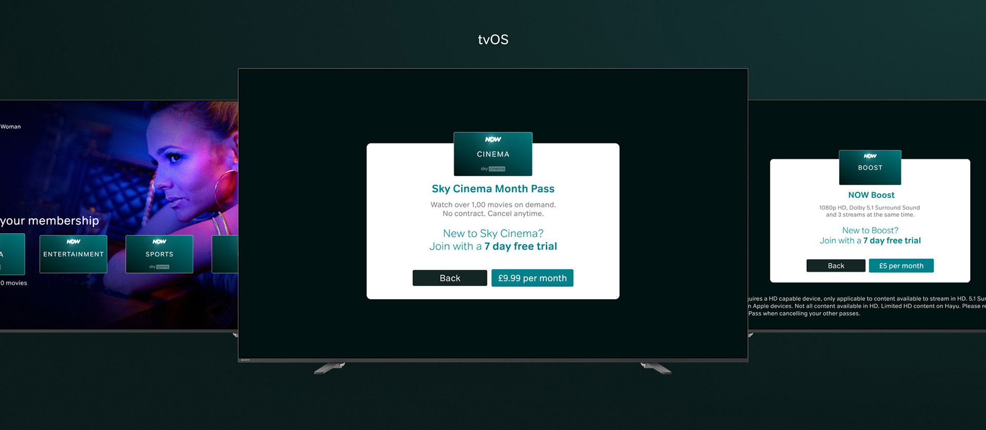
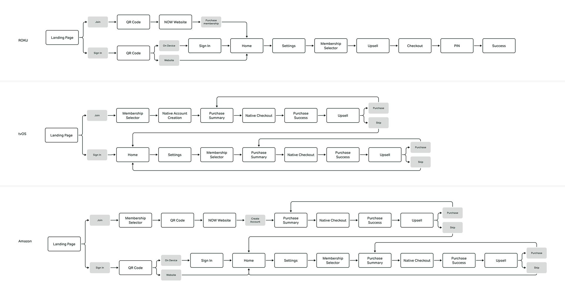
Aligning the TV experiences
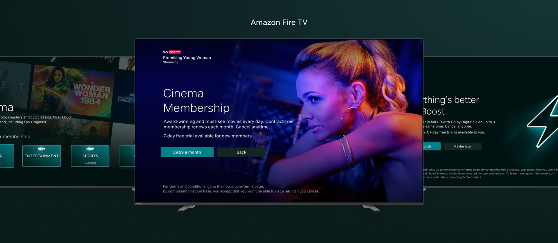
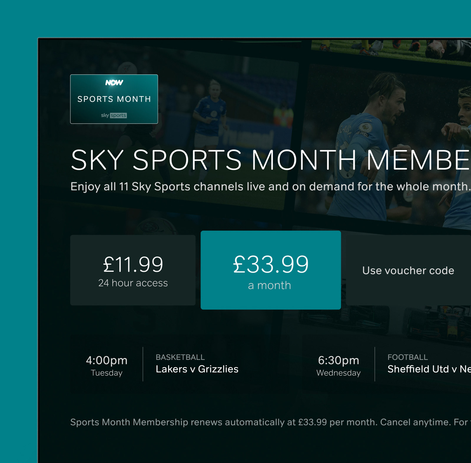
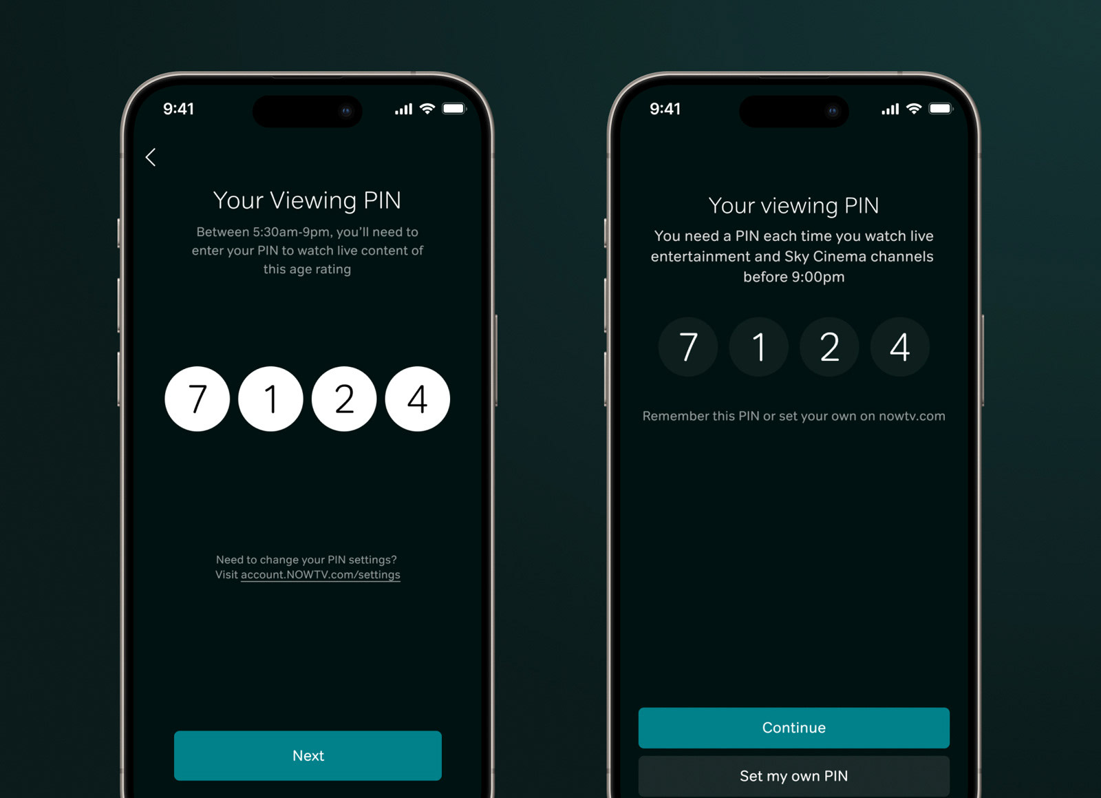
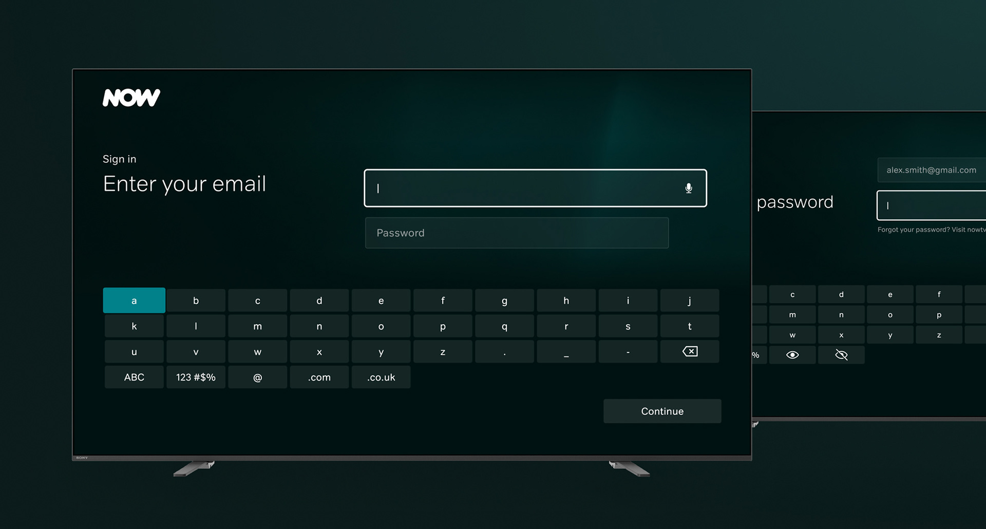
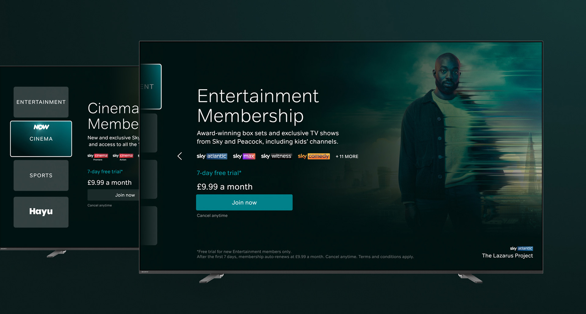
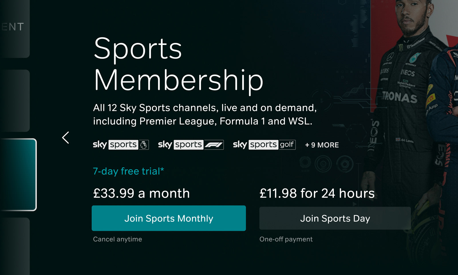
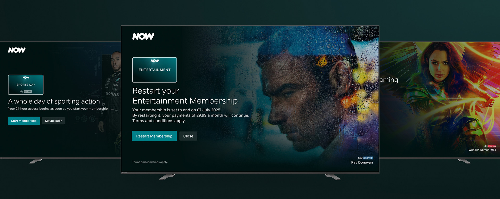
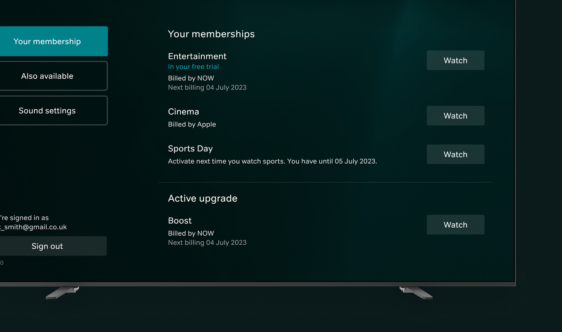
Flows for new vs existing customers were worked through to ensure all scenarios were covered and the experience was as aligned as possible. Sign in on-device was added, and on tvOS the ability to also sign up. The journey steps on each platform were aligned as much as possible within the restraints of each native billing setup, with all pages redesigned to reduce number of steps and simplify the experience. The subscription pages were reworked to feel less disjointed and include key information users highlighted as important in testing, such as channel listings per subscription. Upsells were removed from in-page and given their own position in the flow. PIN, Billing and Terms pages were redesigned so key and legal information was visible.
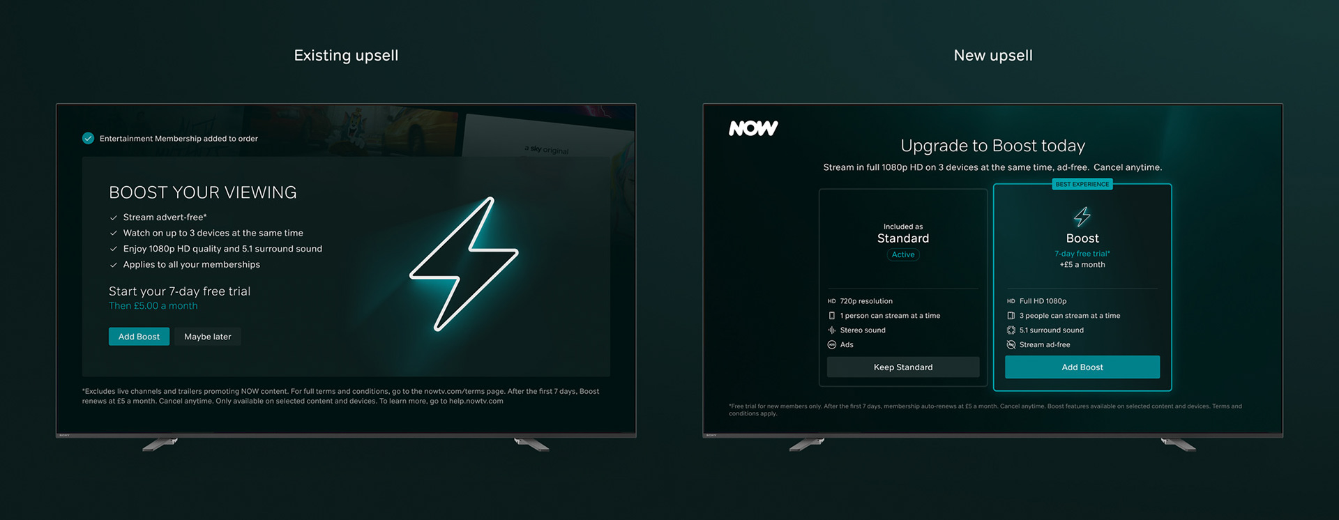
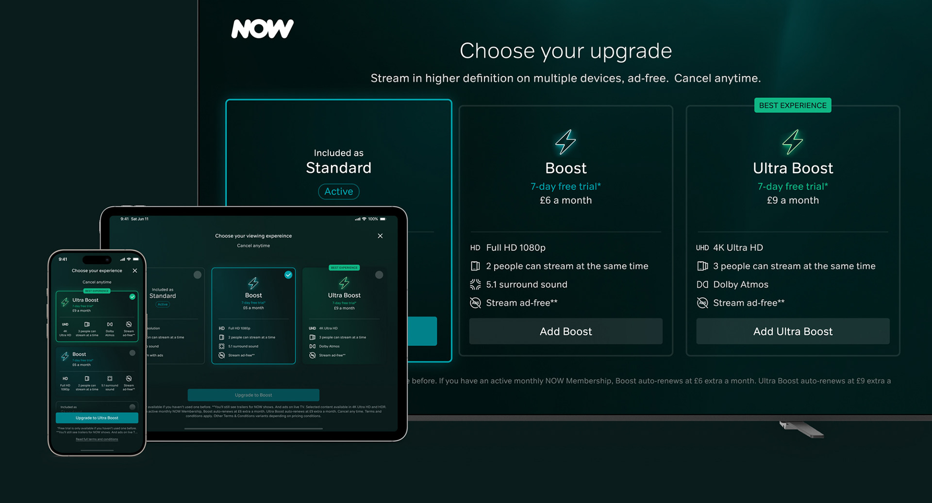
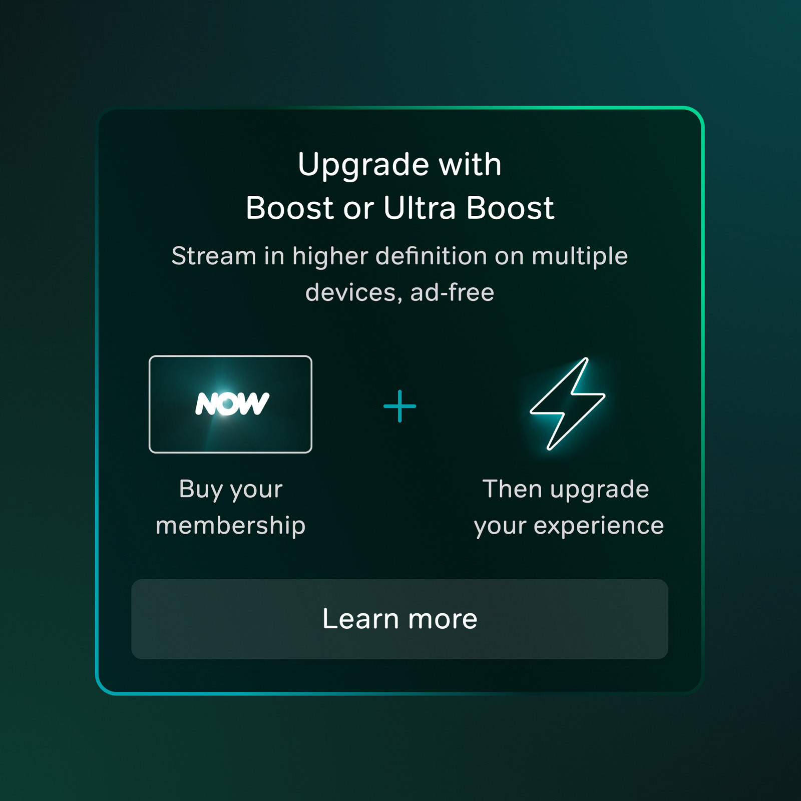
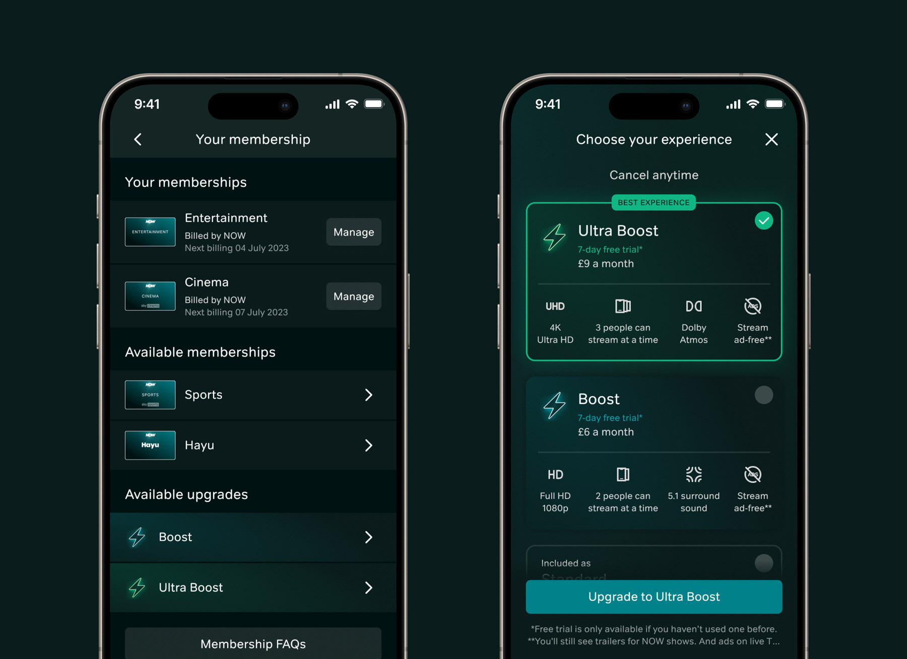
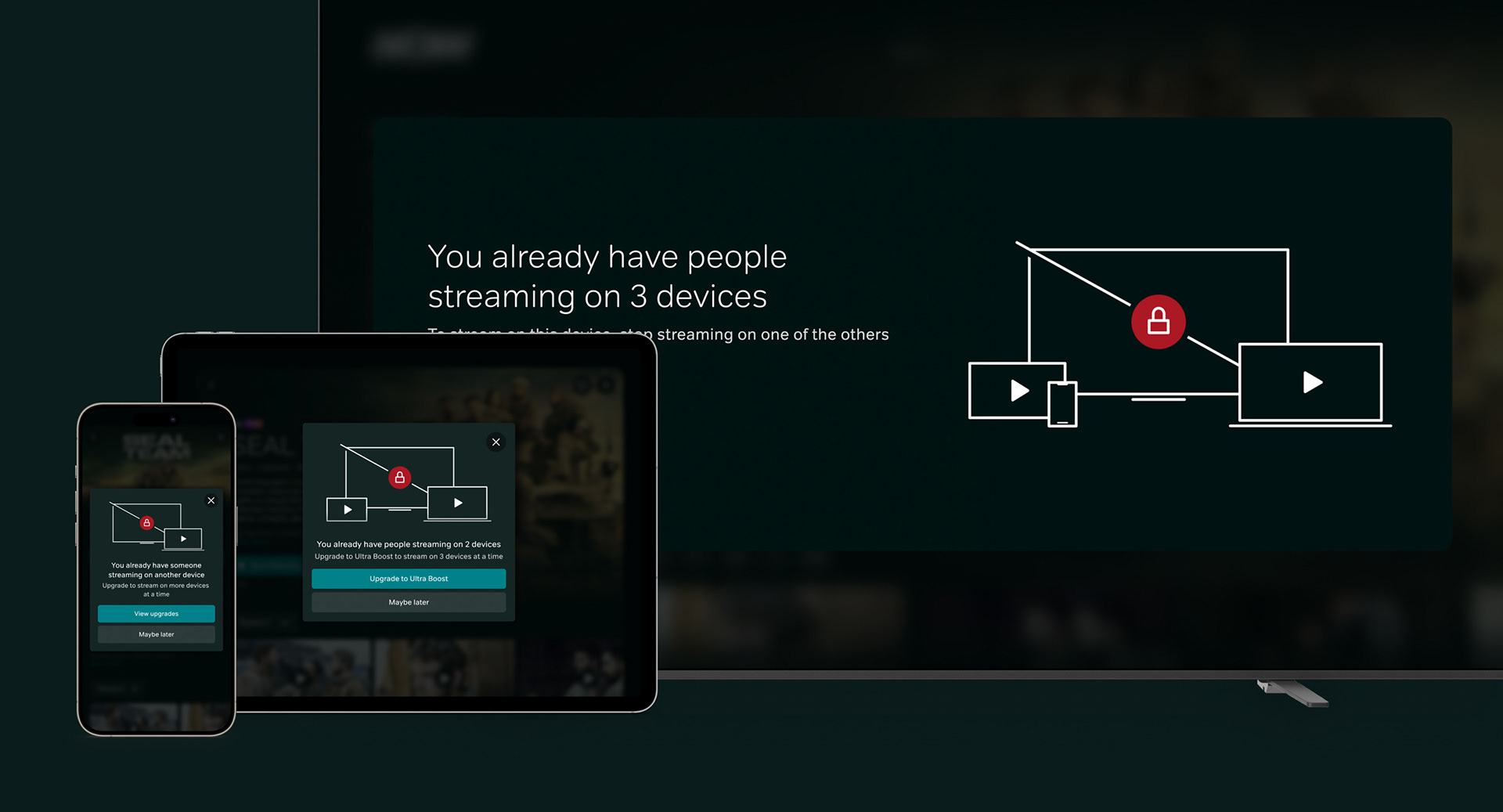
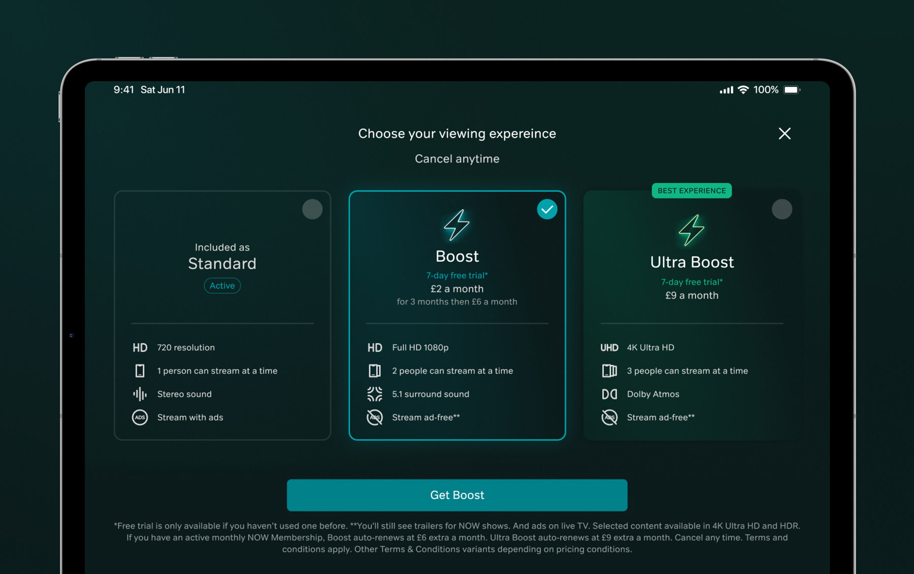
Integrating UltraBoost
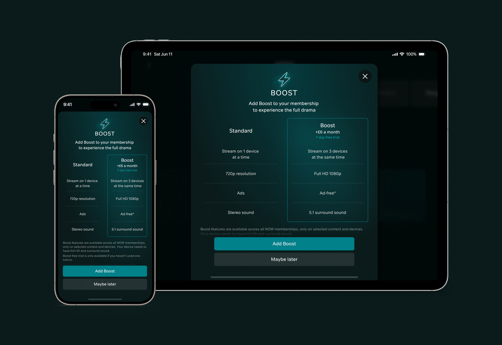
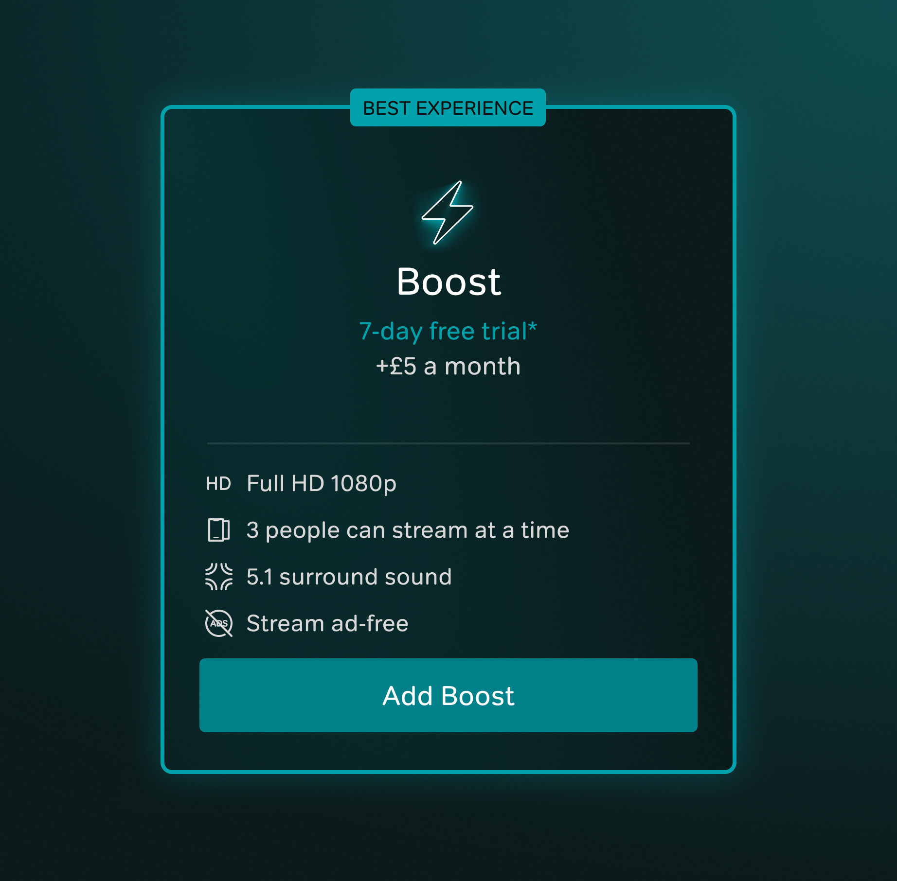
With the core experiences across both App and TV worked out for a phase 1 of the current proposition, additional work was done for a the future proposition of a second tier of viewing experience, due for release the following year. This involved revisiting the upsell information and selectors, conducting user testing to get the right interaction method, USP layout and copy to ensure users had a strong comprehension of the 3 tiers available and how they differed from one another. User testing was conducted across both platforms to understand the usability implications of this new proposition, with feedback integrated back into the designs to create as much of a easy to comprehend journey as possible.

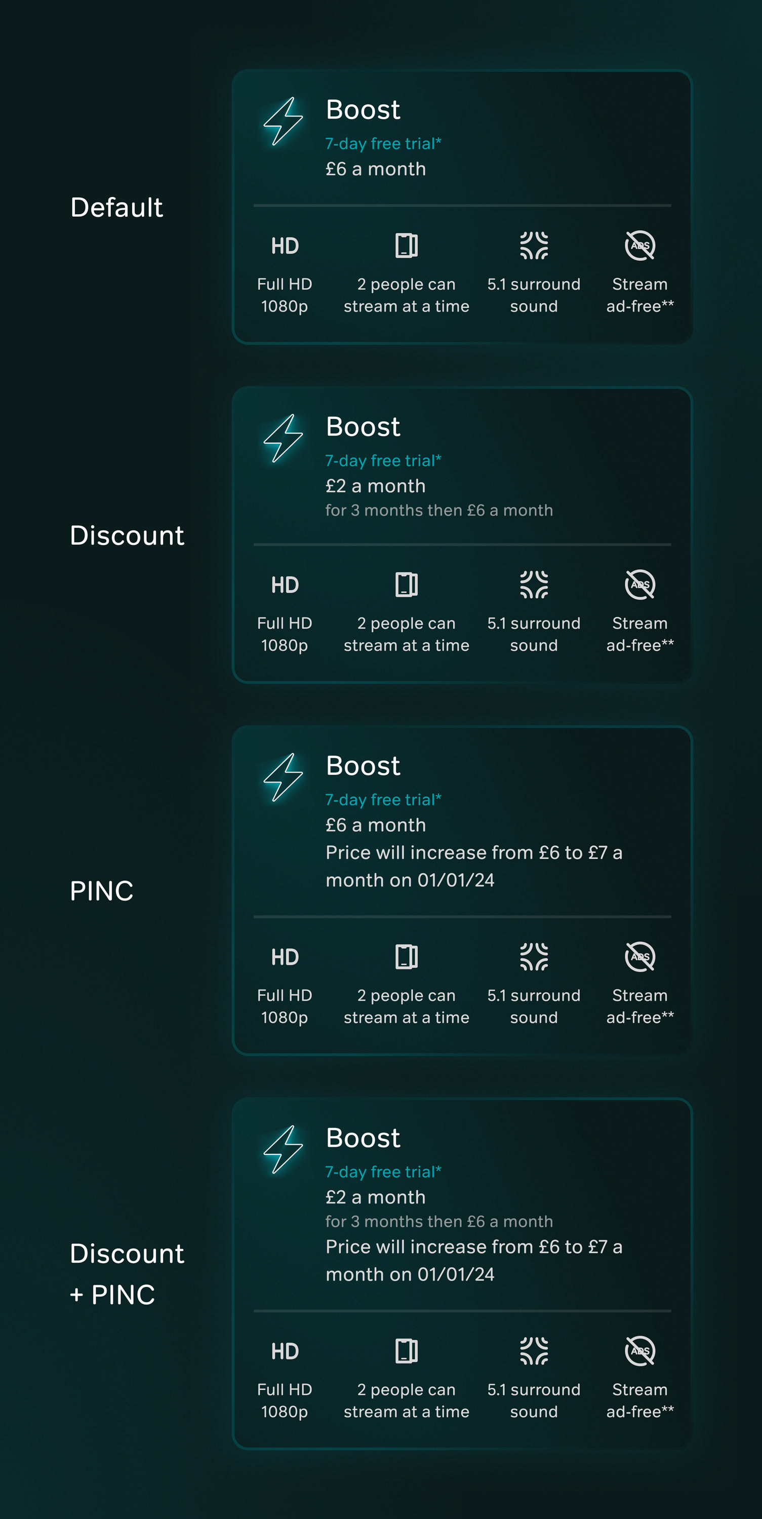
Pricing & hybrid billing
Within this project there was the complicated task of ensuring all components which had pricing could be scalable to standard pricing, limited time offers, price increases, discounts and bundles. Alongside this, the different billing methods per platform had to also be considered. This included billing directly to NOW, native billing such as through your Apple App Store account or Amazon account, and the edge-cases of users who were hybrid, in any combination depending on what device they were on.
Completed at Sky (NOW).